Final design for magazine
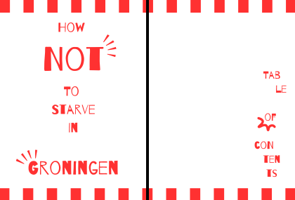
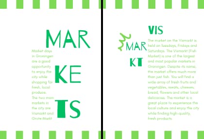
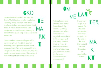
This is my definitive choice for the style of the magazine. I experimented a lot with typography and the placement of it, with colour, text placement and small illustrations, all to add to the “market” and “foodie” feel. I wanted it to feel fresh, artisanal and happy/ engaging as well. I think the style fits Groningen well, since Groningen is bright, fresh and authentic, without feeling pretentious or high class. I think the “markety” feel adds to the idea of Groningen for the common folk, showing the city’s appeal for those who aren’t rich, like students (target group).
Definitive product: performance + print
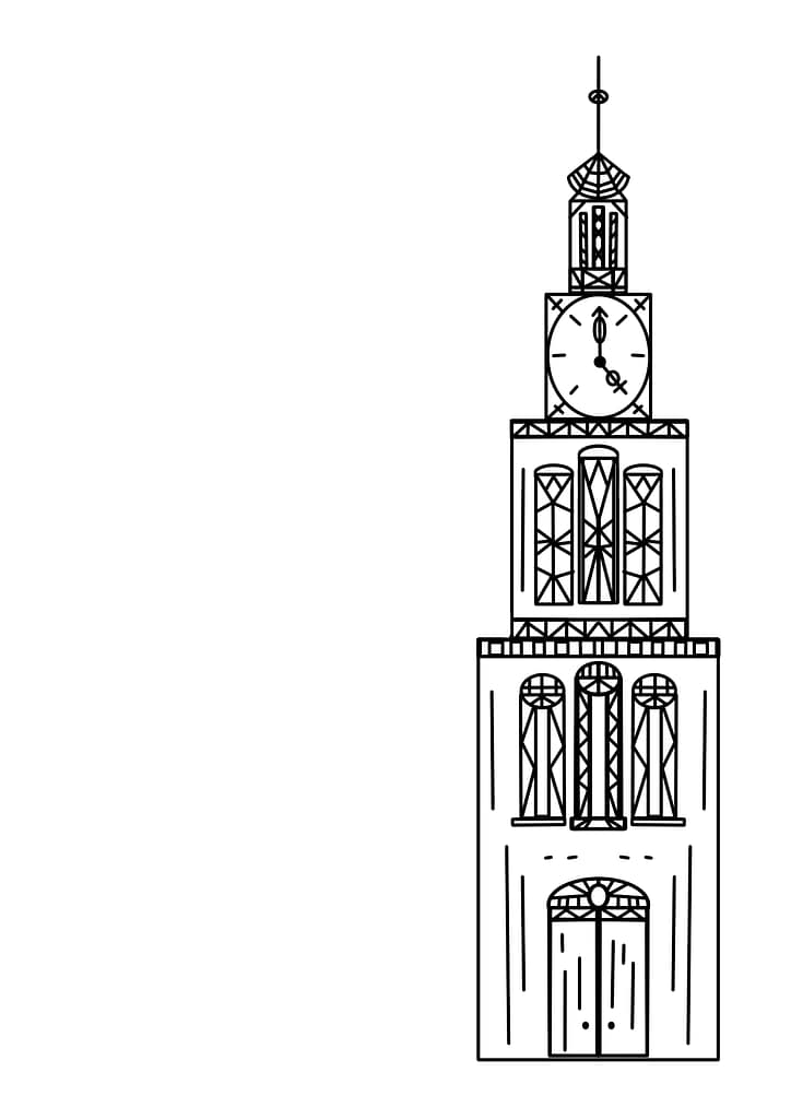
Since Michiel gave me permission to finish to project in a way I saw fitting for my personal style and expertise, I made the following spoken word performance. The performance is visualised as a print, since a visual/ textual sub-product was a requirement. For this print I made the illustration myself.
You can find an image of just the illustration here:
And here is the seperate text as well: