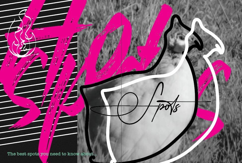
I decided to continue with the design I made for the specific audience. I received the feedback of Maaike that my work was too consistent and can become more interesting if I create more contrast. I did this by changing size, colours, positioning, creating white space and just adding some “free hand” elements. I think my magazine turned out very well. I had a good foundation and it was easy to make some changes, however, I felt like after printing, my magazine still missed that “wow” effect. Every page is still quite predictable, so I wanted to change one spread to something a bit more random or surprising. This is why I decided to work on the chapter opening spread, because even while I tried to break the rules a little, I still broke them within the grid, if that makes sense? I think I needed to still experiment a little more with what could also be possible.
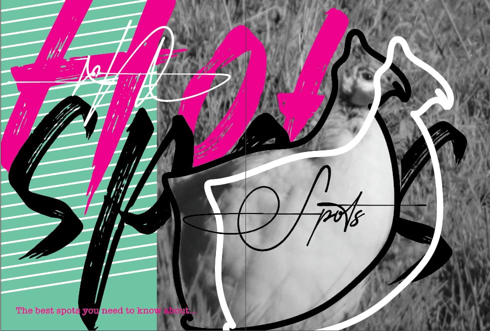
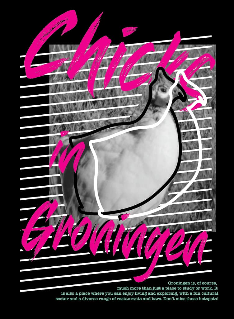
The chapter opener above is the printed one, but here are the other things I tried.
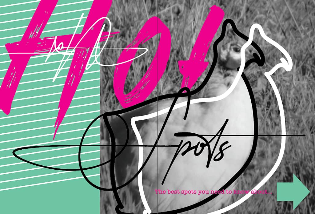
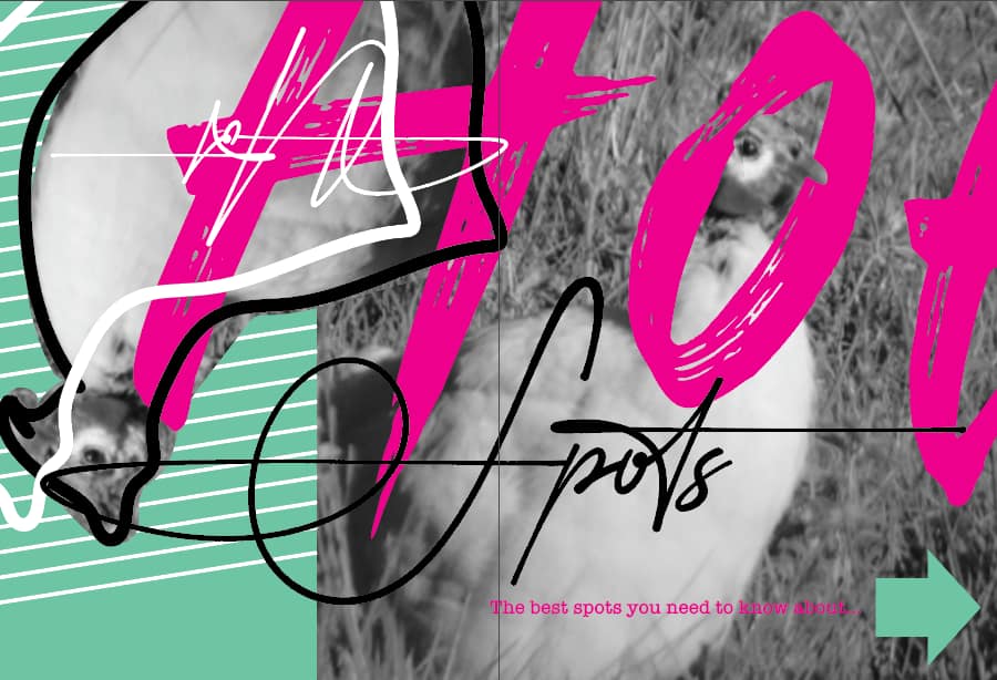
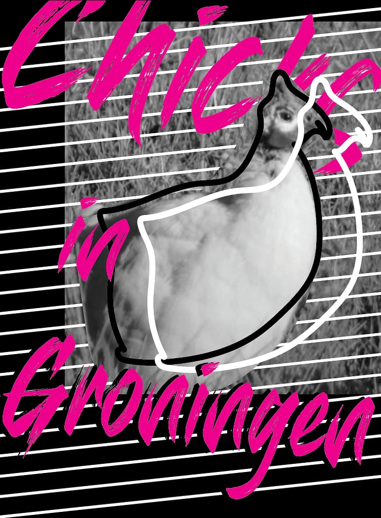
So I tried to make the chicken super big, because it’s so random and might make you look at the page a little longer, I also wanted to create some depth because I felt my magazine lacked that. Then I also added the arrow since it comes back in the end of the chapter and it also hopefully pushes the reader to open the page.
Then this whole happening got me inspired to also create a different cover, because my magazine is directed to girls, chicks, why not put the chicken on the front?
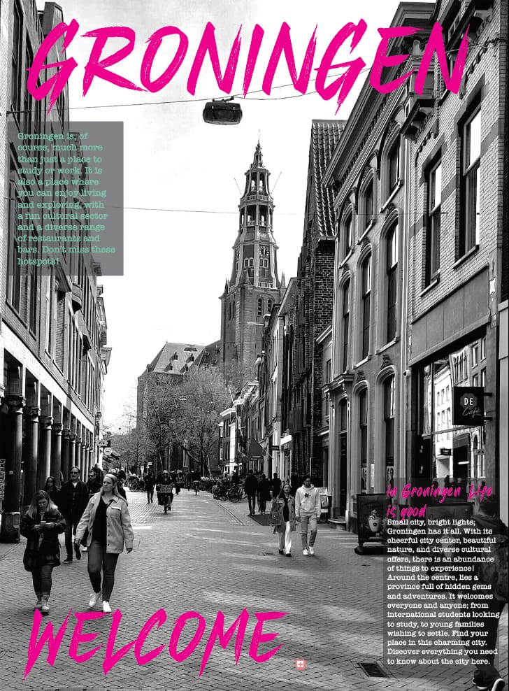
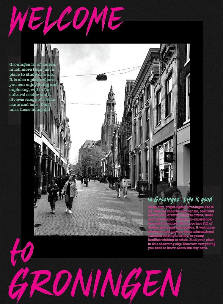
Then I also had some other options of which I chose at first:
I think this block I’ve learned about basic design rules, grids etc. And now it’s time to break the grid a bit more often.