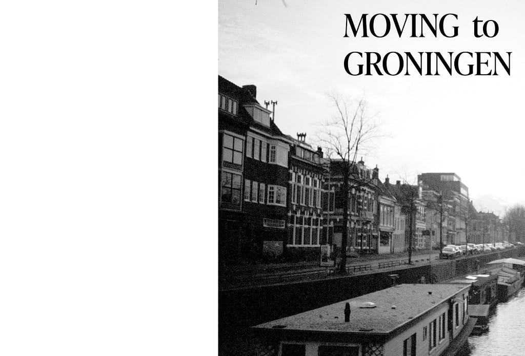
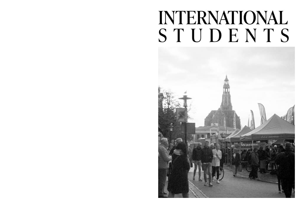
Typography
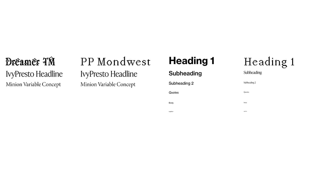
I experimented with different font pairings, and tried out serif and non-serif fonts. I decided to go with the serif fonts and choose a more interesting heading font, since the composition is already so minimalistic. Initially I was thinking of going with the “Dreamer TM”, then I decided to create my own font, but it didn’t look good with the layout and I ended up going with “PP Mondwest”, which still has an interesting effect, but not so complex that it looks out of place with the layout.

Grid layout
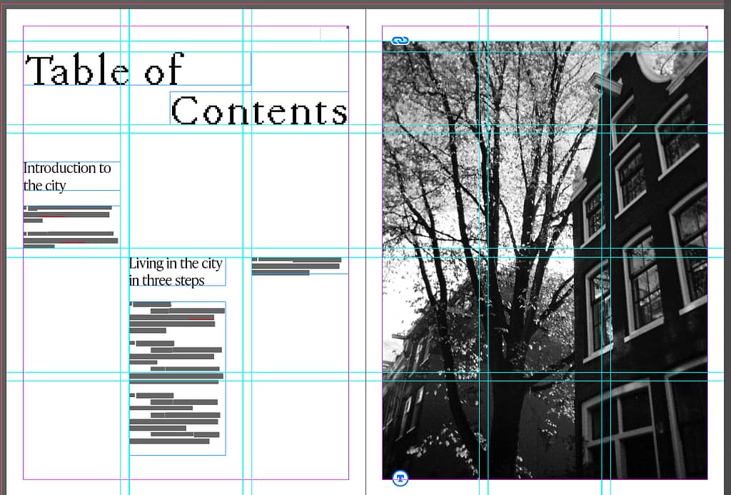
For the grid I did a very simple 3 column layout
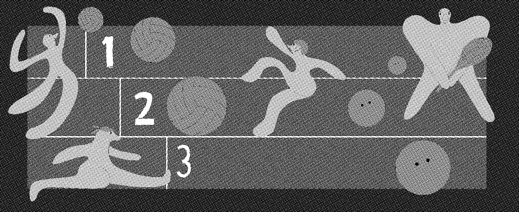
Infographics
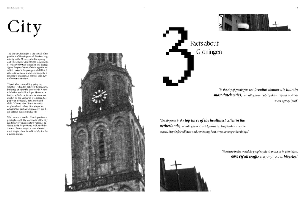
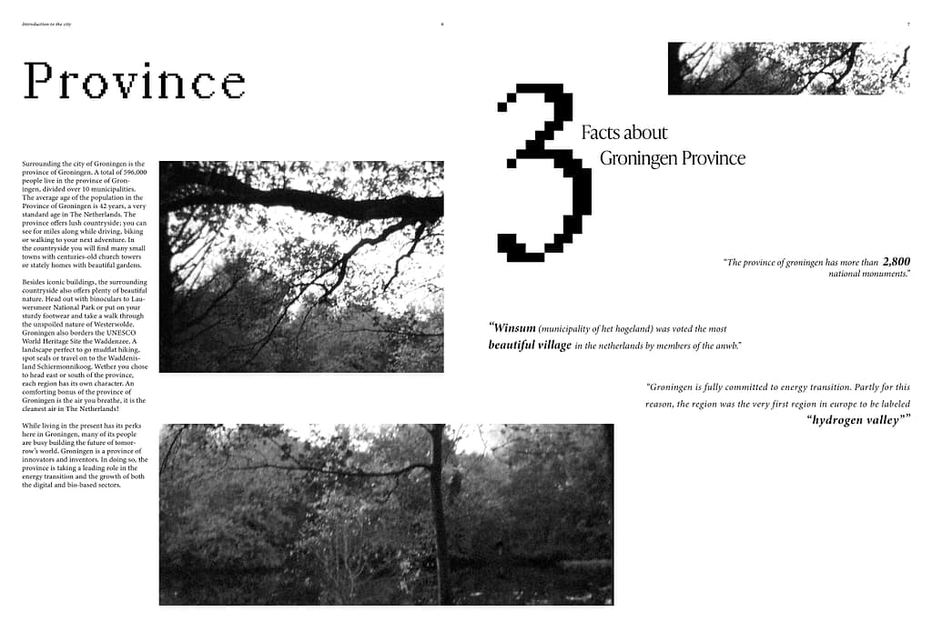
These were my first 2 infographics (right page of both spreads). After some feedback, I realised that I needed to tie the information together more.
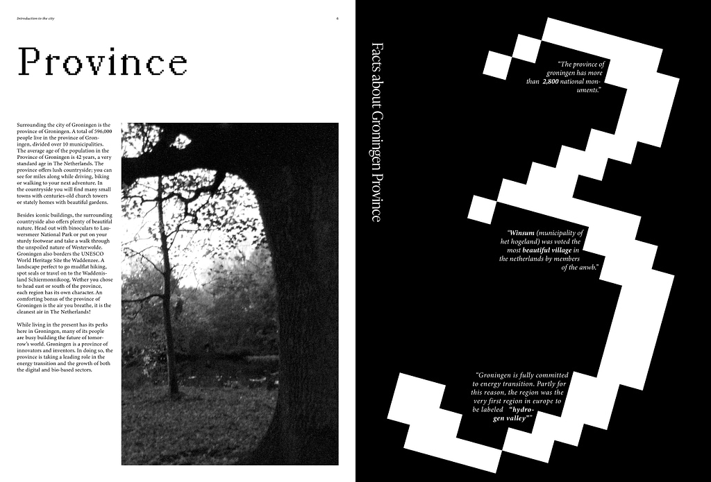
I decided to go for something with more contrast, black background with white text. To make the composition more dynamic I used the big 3 and tilted it a bit to the side.
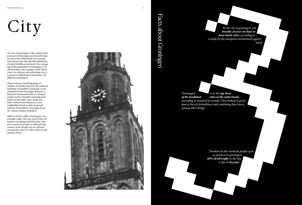
Second infographic with a horizontal composition.
Illustrations
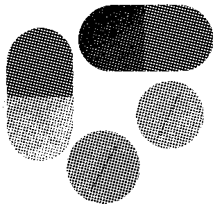
I added a bitmap effect to both illustrations, I was inspired by the font “PP Mondwest”, with the pixelated look, and I wanted to incorporate this into the spreads.
Cover
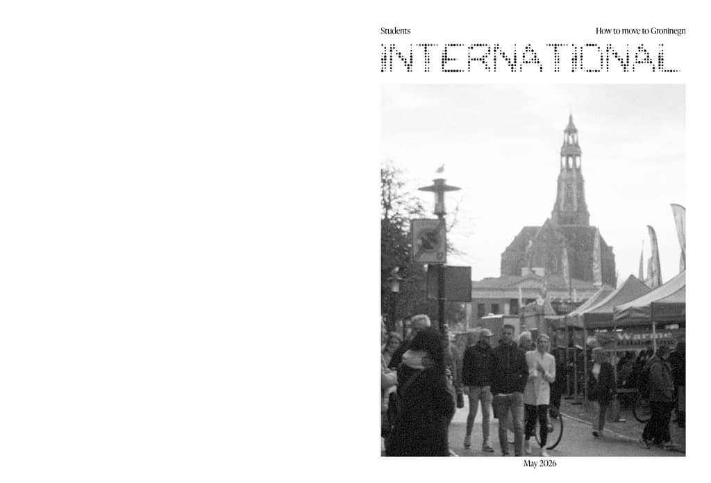
For the cover I experimented with different pictures I had already used throughout the magazine, as well as fonts that were also used. I tested layouts, position and size of the text. After testing out how all the elements worked together, I ended up going with the final one.