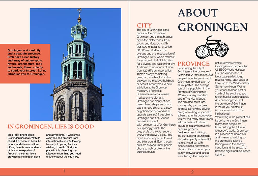
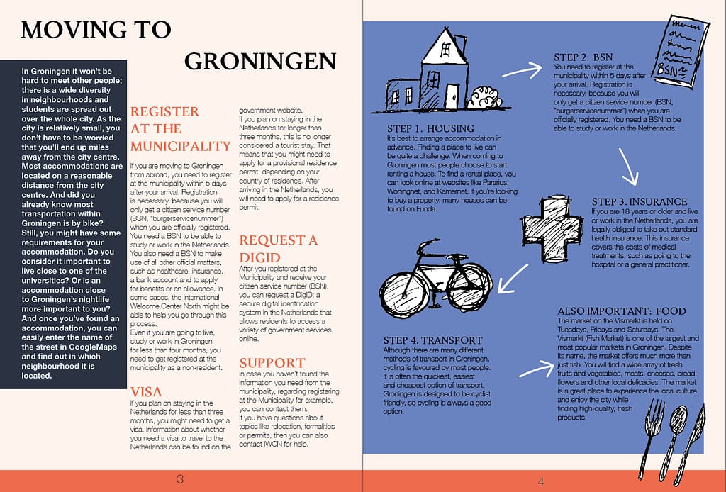
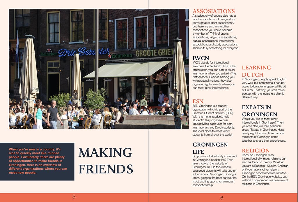
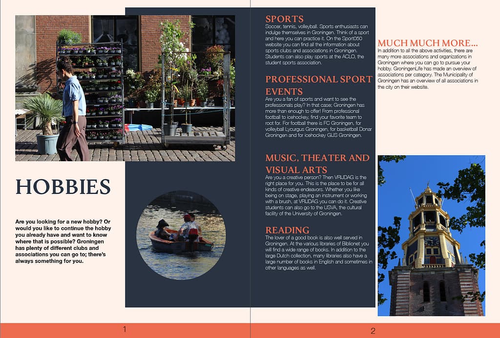
I gathered info from the website and chose the chapters I wanted to make. For every subject I used a spread. I added or left info as I worked on the layout to make every thing fit. And I walked around the city with my camera to make photos.


Proposal 1.
For the first proposal I tried to keep it neutral, consistent, typical magazine layout vibes. I used specific colours to hint to the dutch colours. I used Helvetica as the main font and Jenriv title for the titles.
Proposal 2.
for the second proposal I wanted to do something more maximalist, I thought, young women who want to go wild in their student life, a bit artsy… Hard to navigate but readable still.
I love the vibe, but I still think my layout could be more experimental, I think it might be still too basic, I tried adding more layers to match everything, at the same time, the font is overwhelming so maybe a more chaotic layout would just be more chaotic and not necessarily more interesting. I’ll wait for the feedback on this.