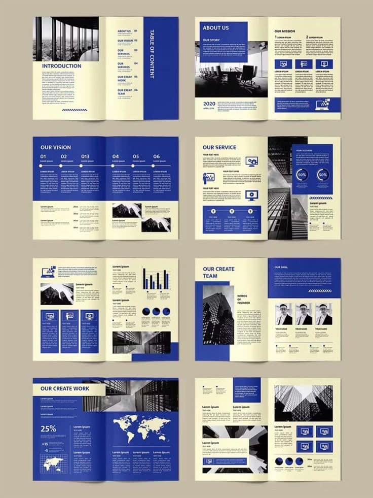
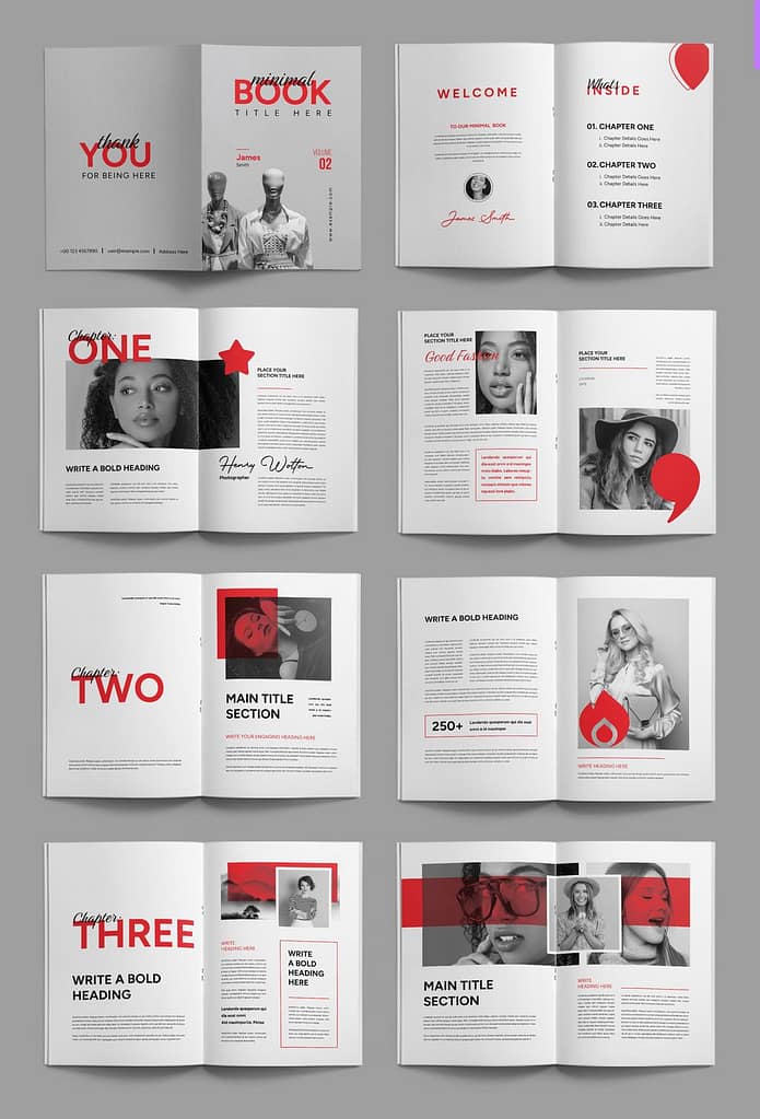
Inspiration for proposal 1
For this proposal I will make it more of an overview of the website, primarily focusing on students.
Using a two color scheme works well with a neutral design
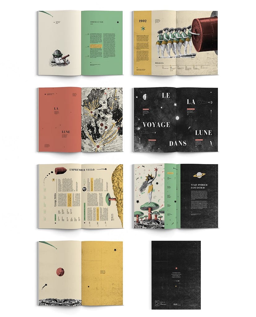
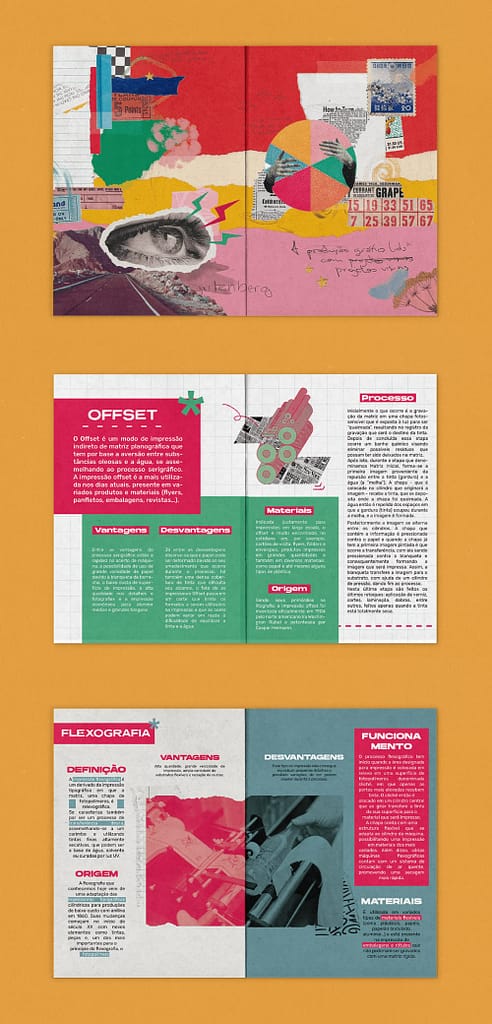
Inspiration for proposal 2
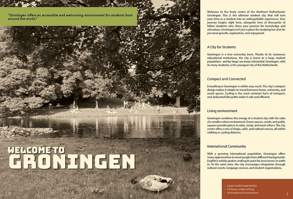
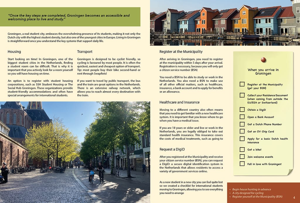
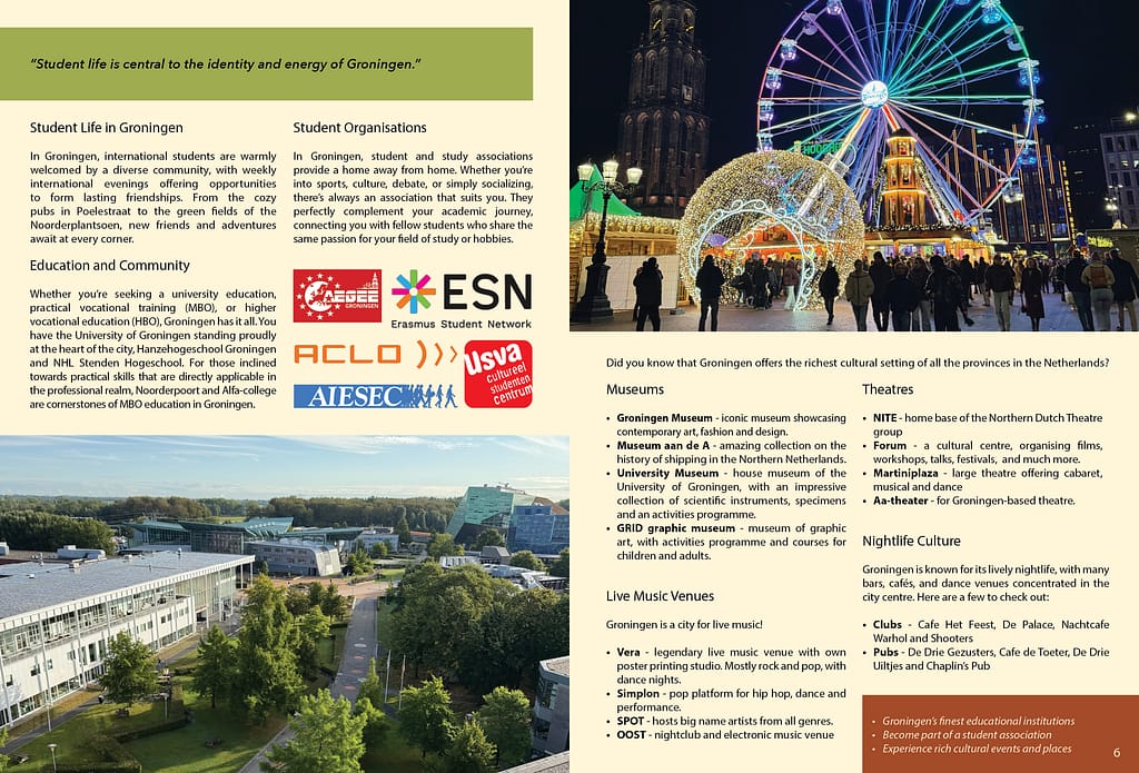
My target audience are for students looking to study/live in Groningen, so that would include information about student life, universities, nightlife and culture, and practical matters to consider before and after coming to Groningen.
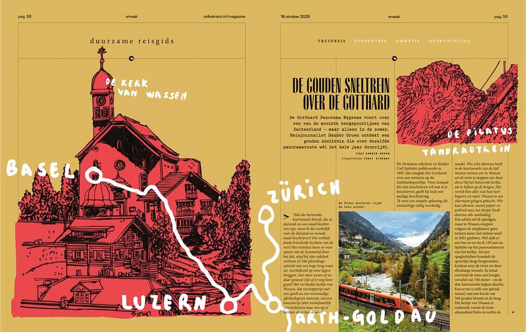
I want the layout to look adventurous; with colors that represent the atmosphere of Groningen and illustrations that lead the viewer around the spread (bottom image). Illustrations spread out along with text (top left) can be a nice way to create space, keep the design simple yet provide the necessary information. I liked the overlapping graphic elements to create sections within text so the imagery can play around it (top right)
In this proposal, I want to try;
- Working with written typography when it fits.
- Using bold colors in my illustrations and pastel colors for the other elements
Proposal 1:
Proposal 2:


