Target group: all kinds of students. (Coming to or are already in Groningen)
Taking a look at the website:
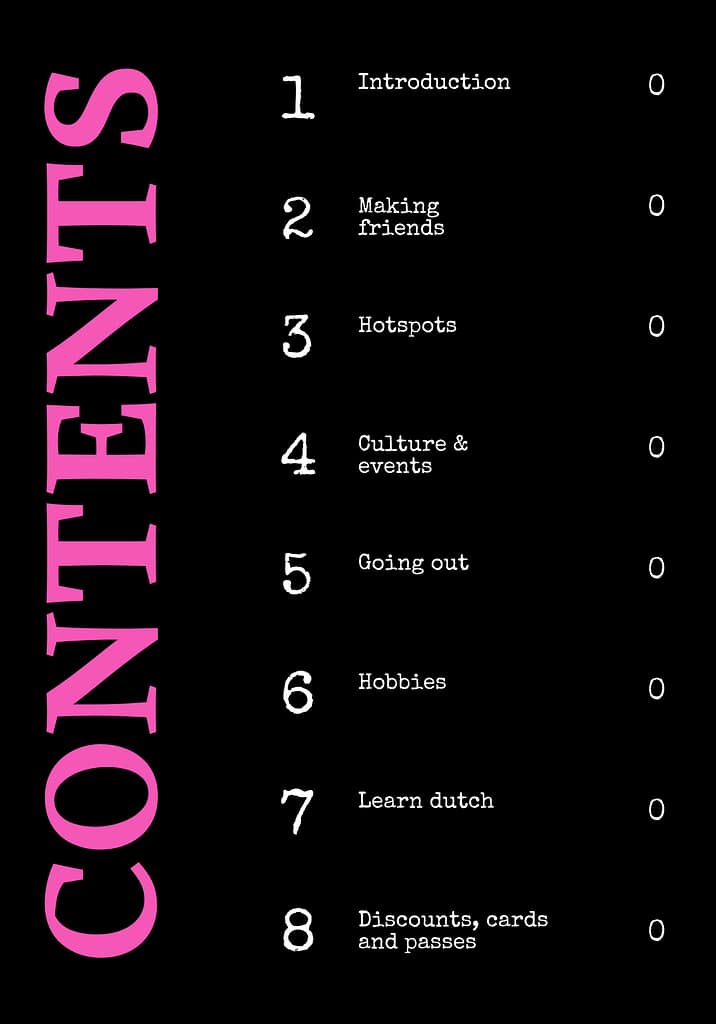
-Text: you have a introduction to the site, and then you have the 5 main theme’s.
Whithin those themes you have different headings and just text with information.
Below those texts you see 3 points to which you can also click on to view more information. (But then you go to other sites).
You also have a part on the website when you scroll down that gives you correct information. There is a title: “Find the right information”, headings in a black format with white letters and then the subheadings which are the same size but then just black letters. Then you have a key phrase under that about the subject.
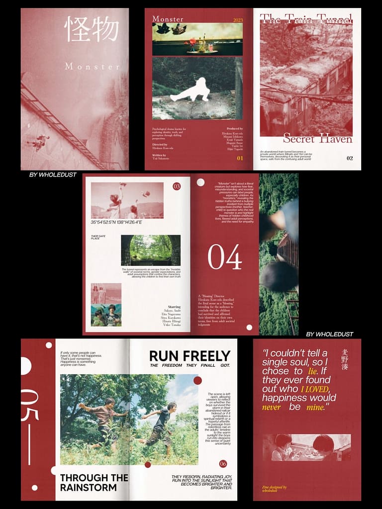
inspiration:
l
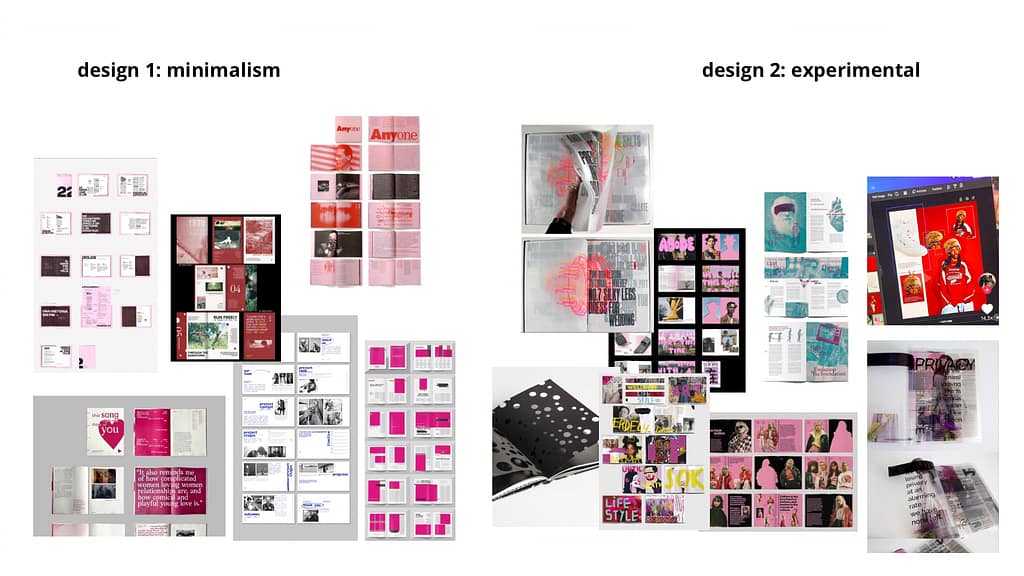
I think I want to Go for the experimental type of editorial booklet, because it looks more fun and I think it would be better for the theme Groningen and its sub-themes. But I always am overdoing it, so I want to lay it low, so there will also be a bit of minimalism to it.
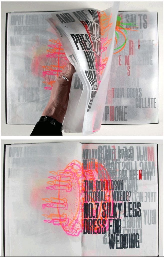
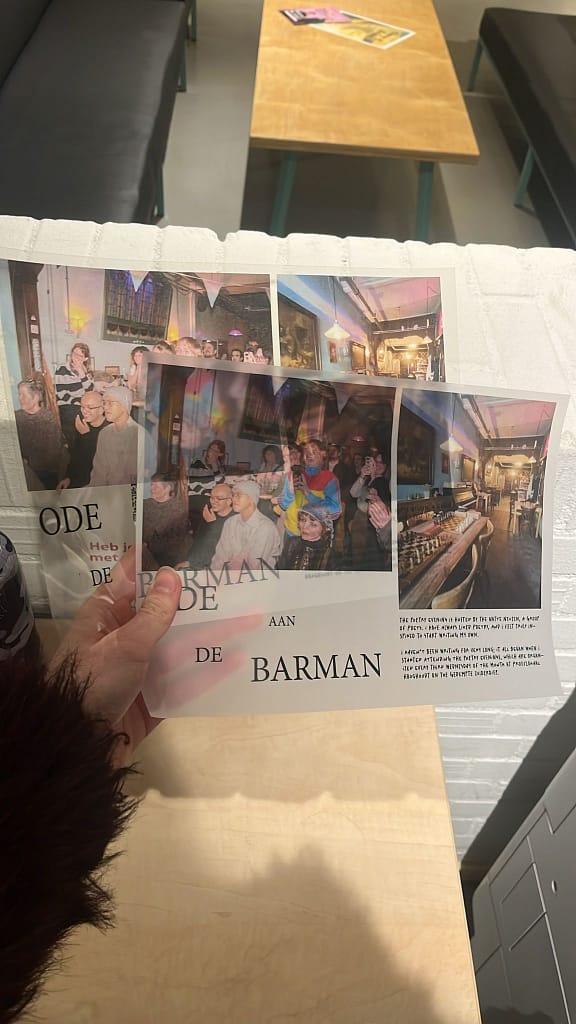
(I also want to experiment with layering different types of text or imagery on eachother, there is this see-through paper which you can print on and it looked really cool, Linde inspired me with another booklet she made!)
Sketches:

Photo’s:
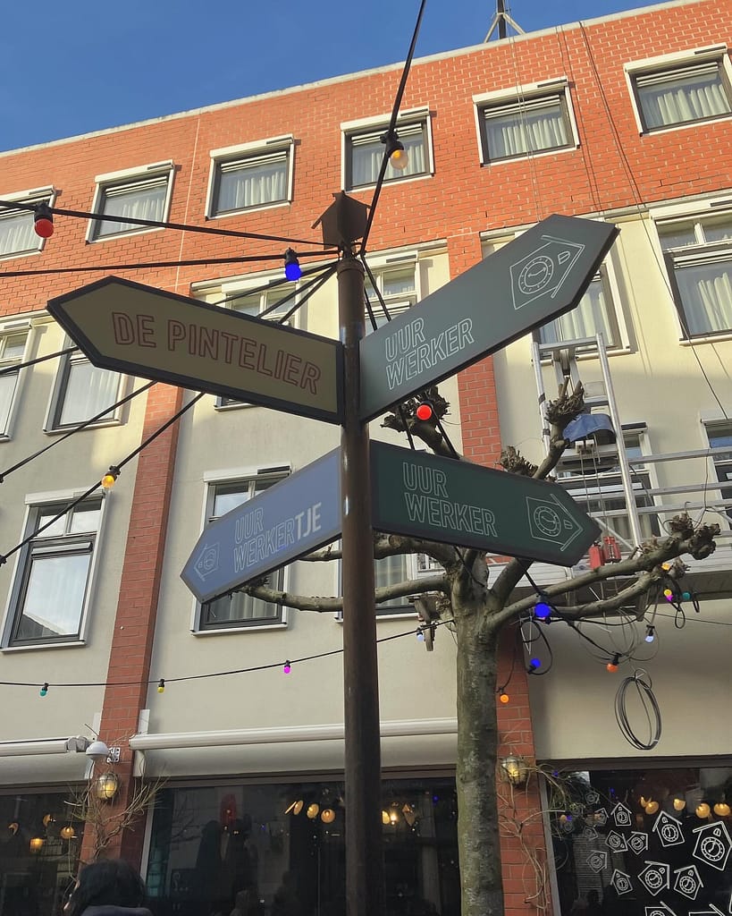

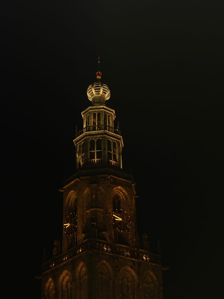
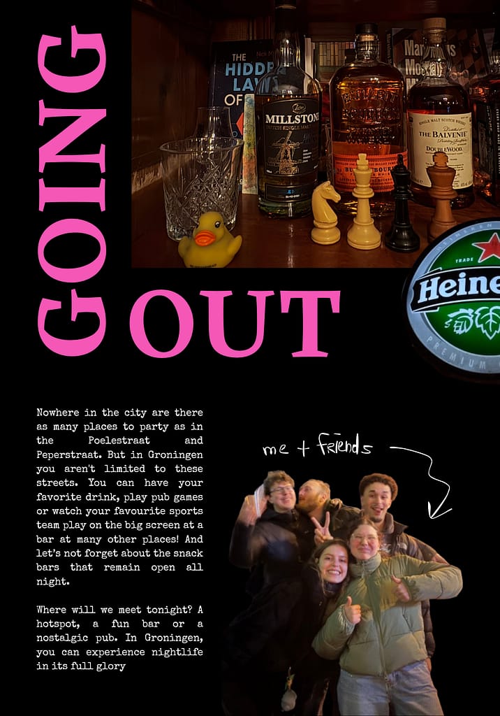
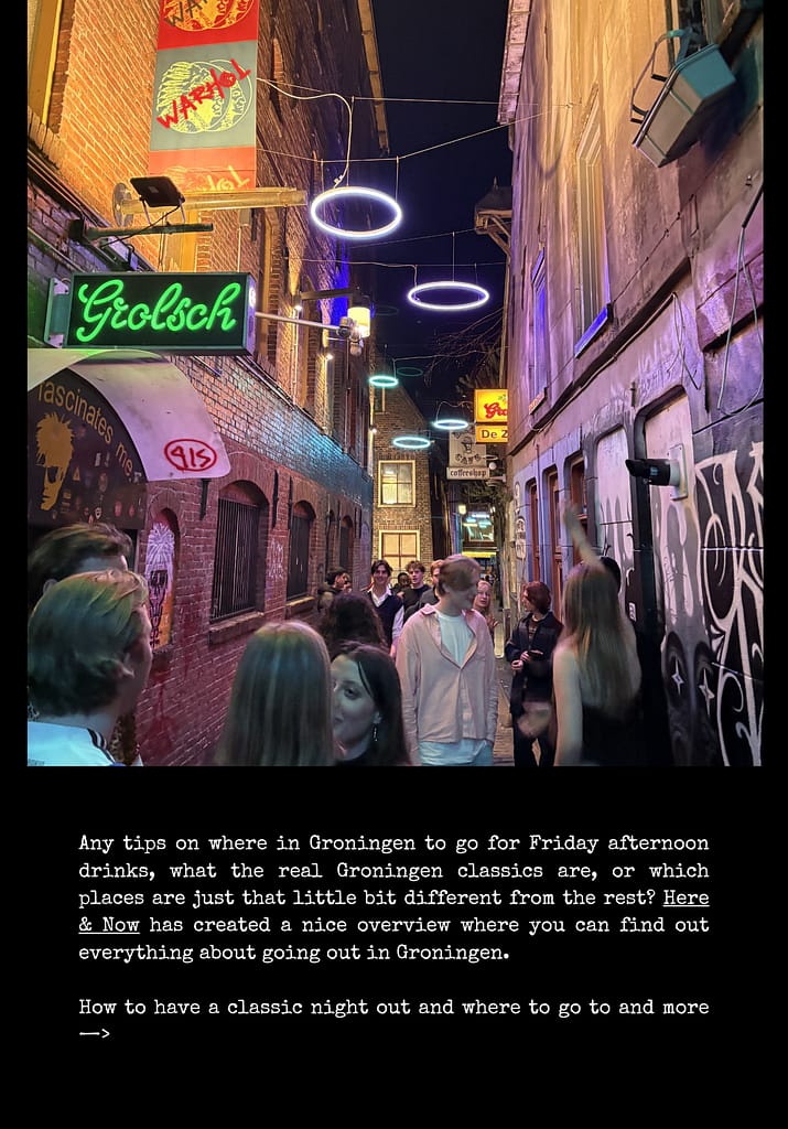
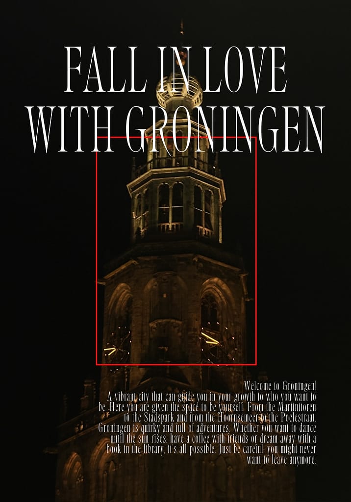
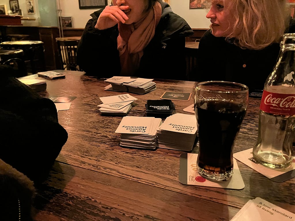
I have already made a lot of photos during the day and night of a lot of hotspots in the city for students and just everyday city life.

Experiments:
I wanted to try to make the first pages still experimental but also minimalistic. I want to make the theme’s right, and When which should be, But for now I did the
theme of discover groningen, but I think I want to do maybe 2 main theme’s and then the sub-themes to that.