- COVERS
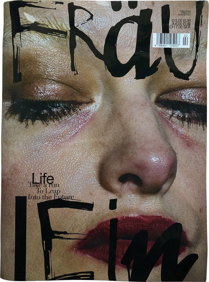
- The cover fascinates me the most because of the very raw image. The texture of her skin and messy lipstick make me wonder what the magazine would be about. I’m guessing womanhood.
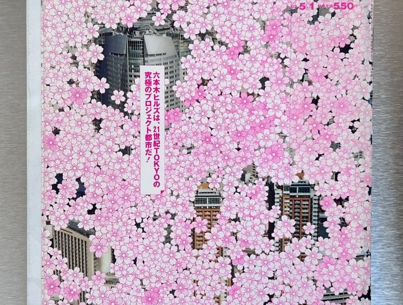
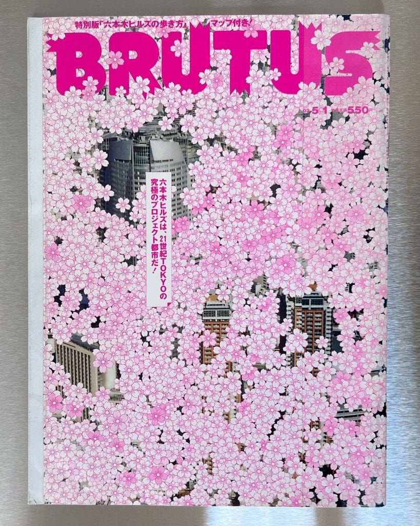
- I love the overwhelming sakura. I love the colors and the magazine cover is almost like a painting to me and something I would properly display on a shelf.
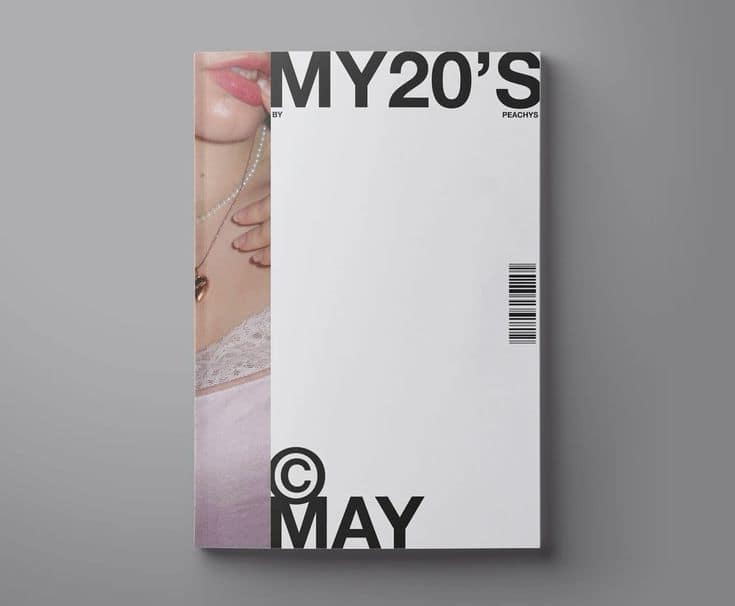
- The big white space here is very intrueging to me. It gives me a feeling of being able to breathe.
- I have no idea what’s happening on this cover and that’s why I love it.
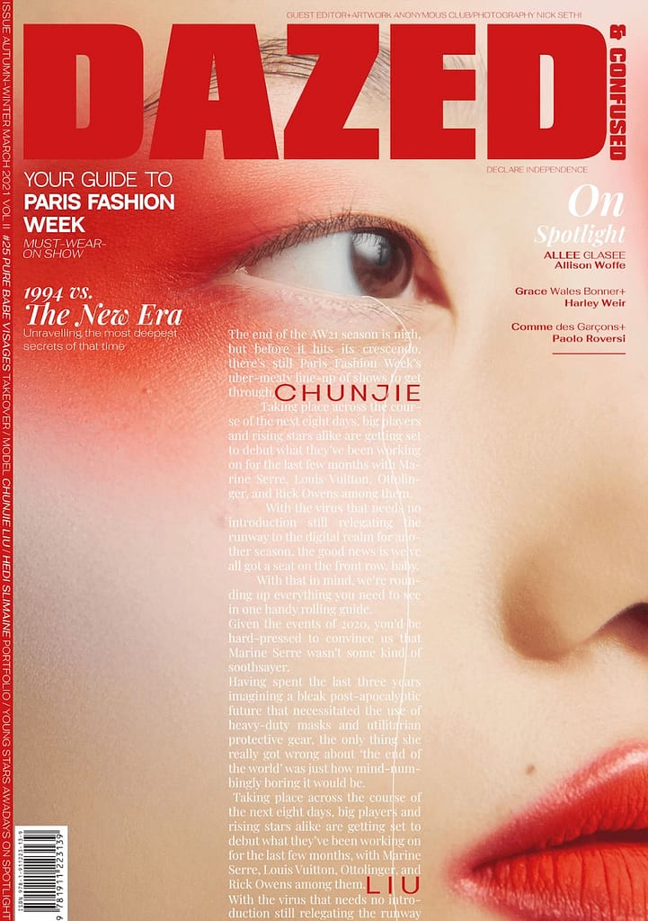
- The classic typography combined with the red make-up look and title give me a very sensual feeling which I like.
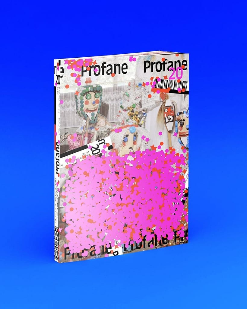
- With this cover, I love all the elements of it really. The colors, the tyography and the hierarchy of the text which is pleasantly unusual to me.
2. TEXT/GRID SYSTEMS
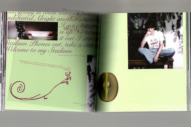
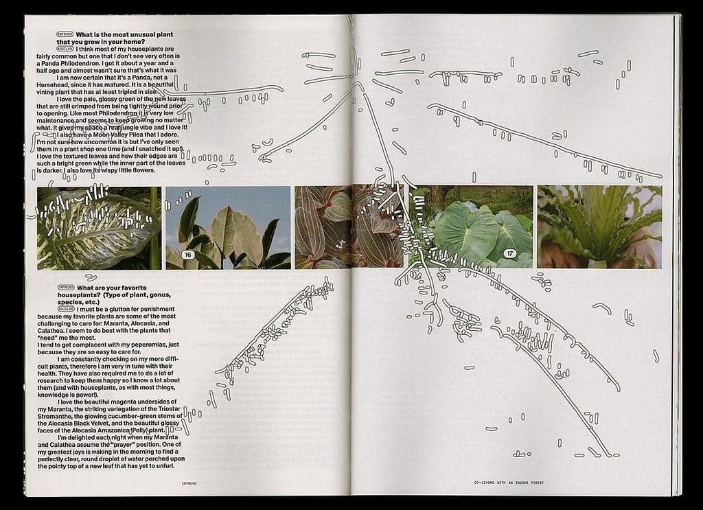
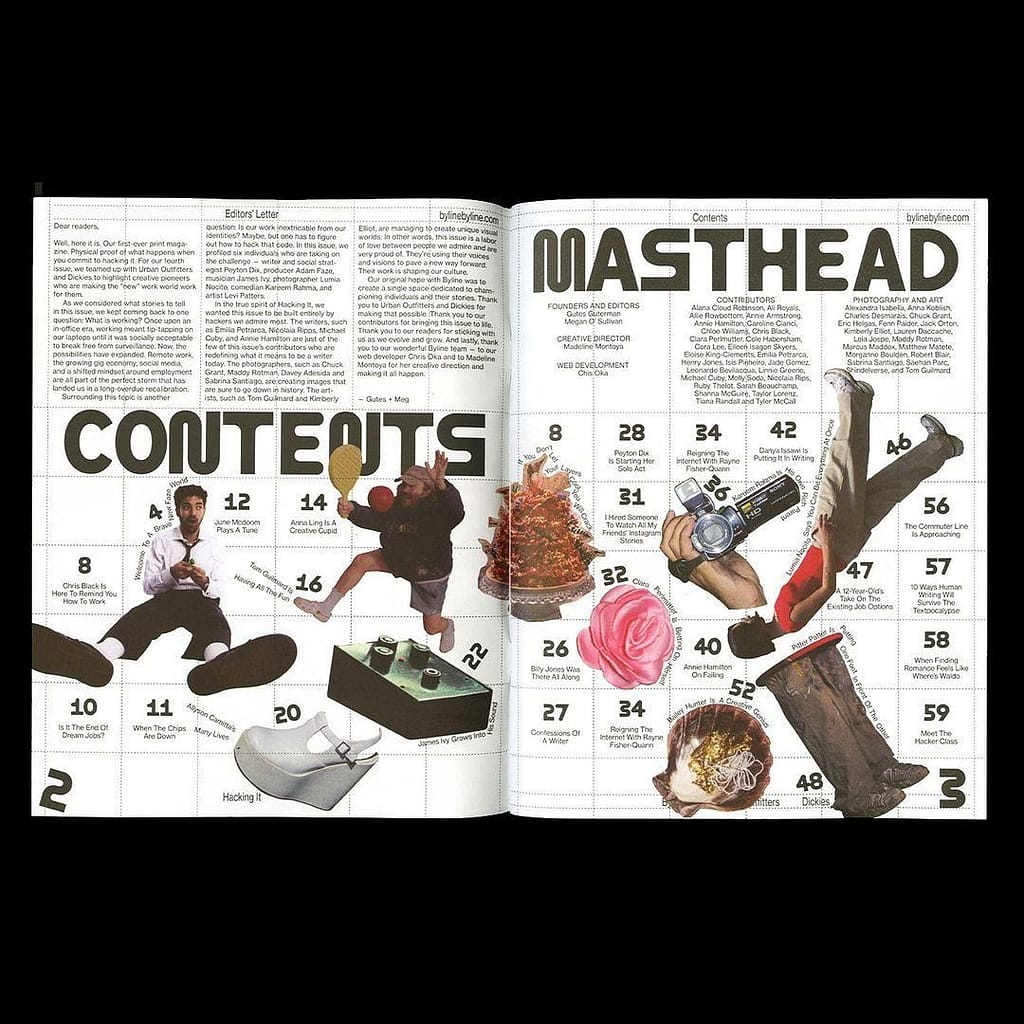
- This spread to me is very unusual because all of the elements such as image, text and illustration, are all not a on place I’d expect them to be traditionally and that’s why I like it so much.
- I love the way in which the illustration adds to the imagery of what the spread is about.
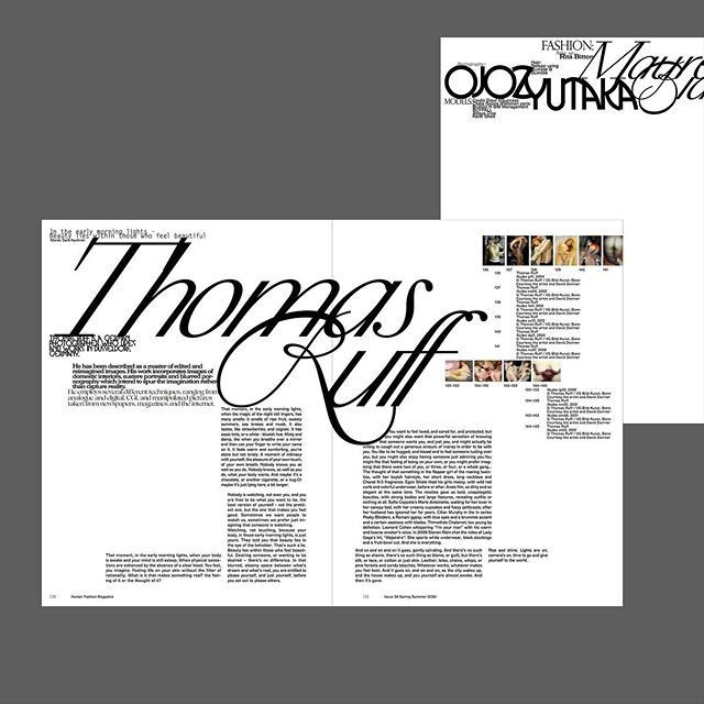
- I like the serif and bold title combined with clear but ‘off’ grid system. Because of the black and white it’s still very clear and neat but because of the text placement it’s not boring.
3. PHOTOGRAPHS
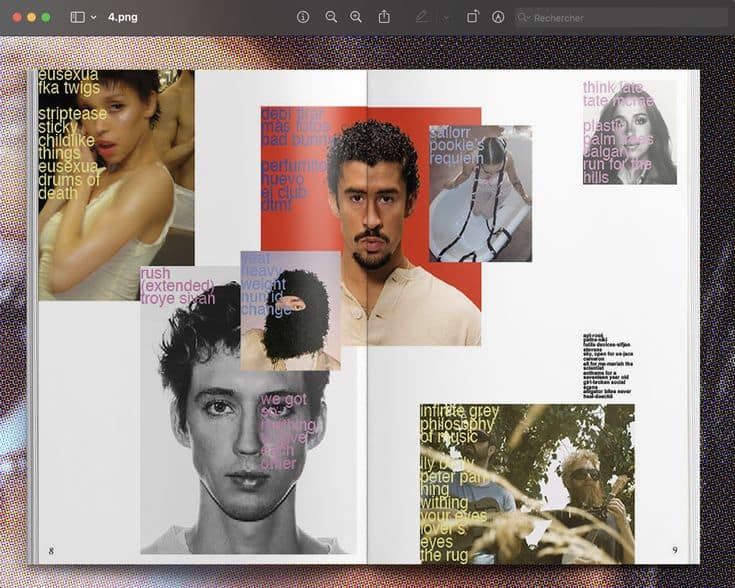
- The way in which the photography is almost displayed as a sort of collage to me is very funky.
- I love the sort of collage style combined with overlaying text on this spread.
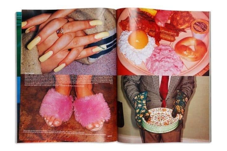
- The way in which the images are zoomed in which makes me see details more vividly I find very cool.
4. COLLAGE
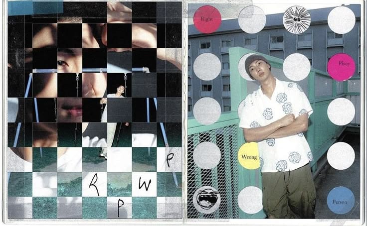
- I like the clear compositioning of the images here. It gives me a bit of peace processing the images.
- The layeredness of the images here gives me kind of a diary feel which I like.
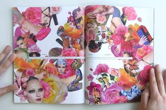
- The organic compositioning matching the original images itself makes me feel like im looking at a bouquet.
5. INFOGRAPHIC
- I love the bold and funky typography and the slightly chaotic display of the visual elements and how they’re still combined with an actual grid in the background.
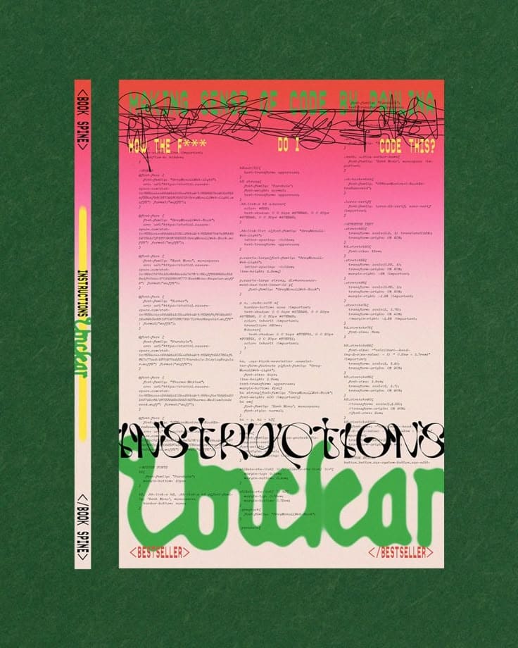
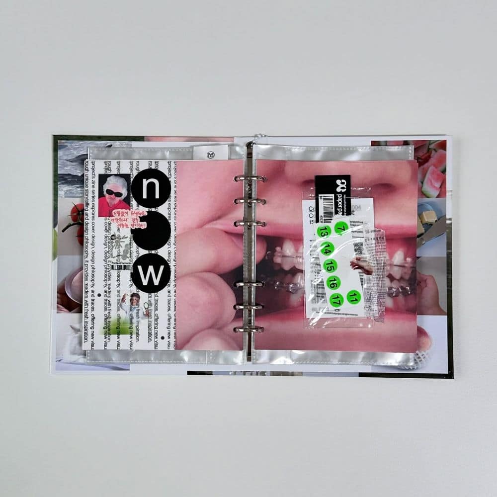
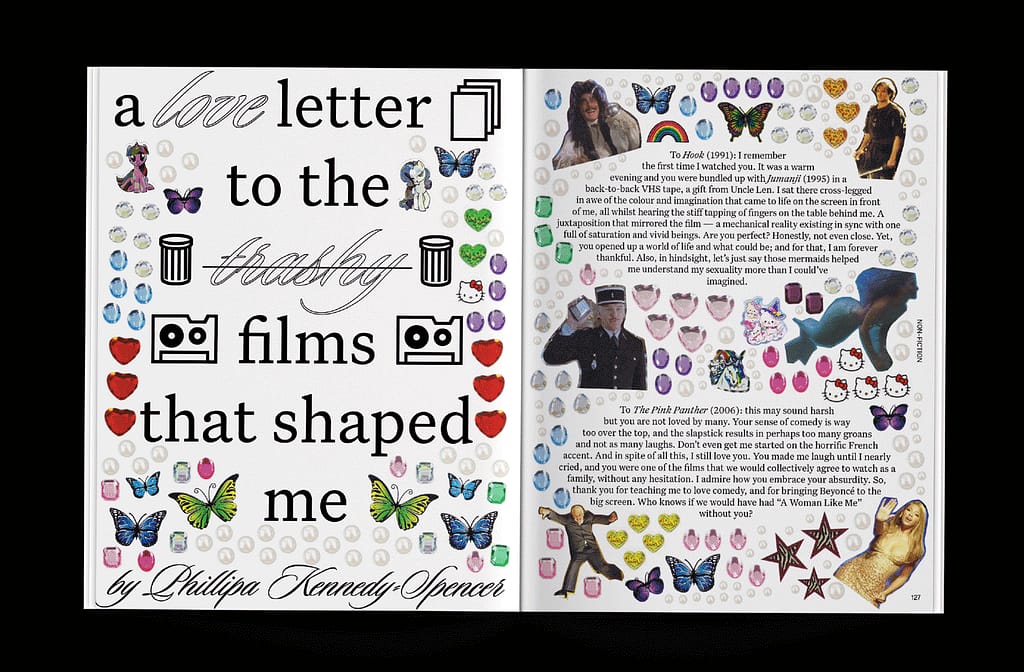
- I don’t know if this is an infographic but I love the childlike look with the stickers.