Proposals
The magazine I’m making is going to be an informative magazine about the “culture and events” page from the website International Groningen. The target group that I want to reach is students and young people that live in Groningen and who want to explore more places in this sector.
Proposal 1:


I used more neutral colors for this design, light blue, black and white. I also used a more simple, neutral font and clear photography of buildings in Groningen. This design is very general.
Proposal 2:
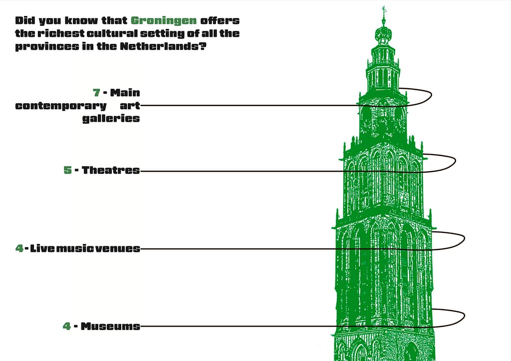
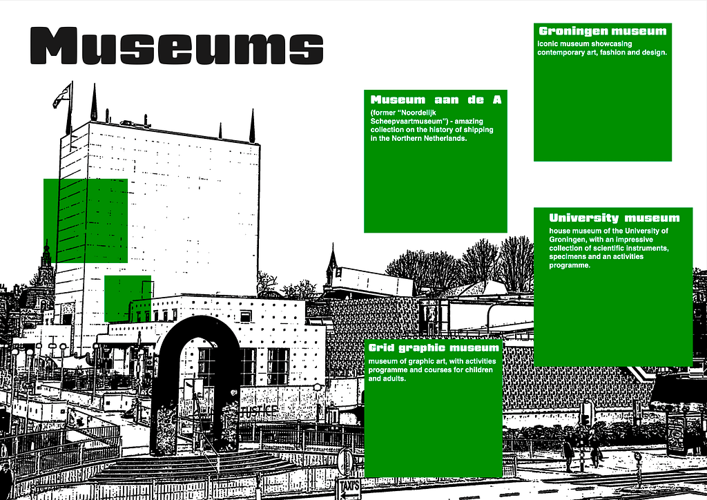
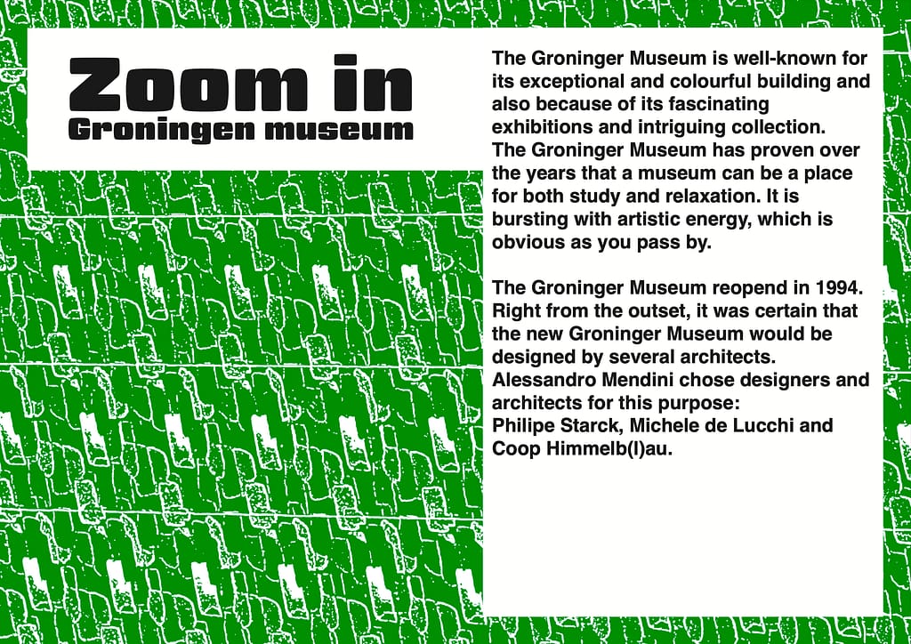
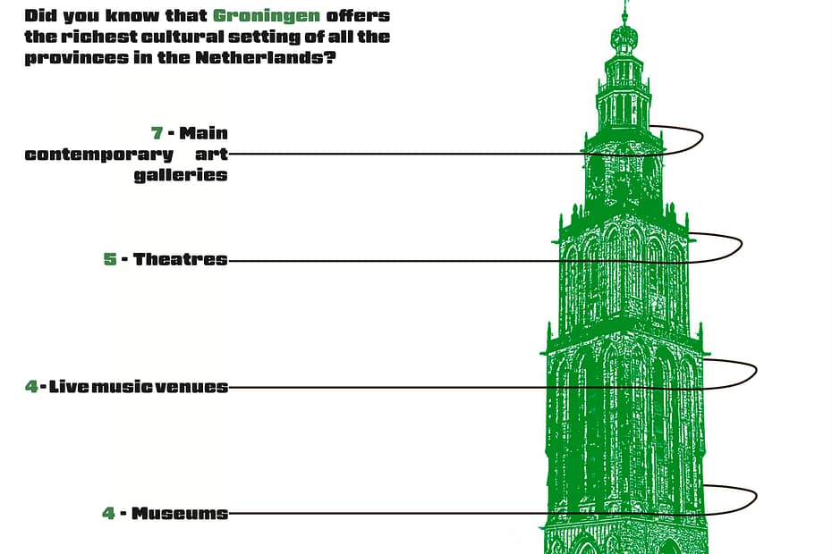
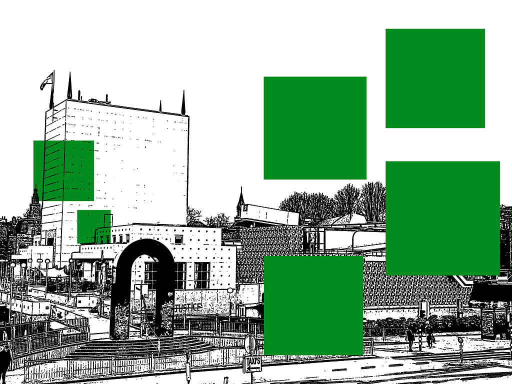
For this proposal I used colors that represent the city’s flag, green and white. I used a more expressive, readable font to make it a bit more interesting to look at. I also experimented more with the photography, I used a filter that makes the photo look more like an illustration. This design is more targeted to the people that live in Groningen and has a more playful and fun look.
Process
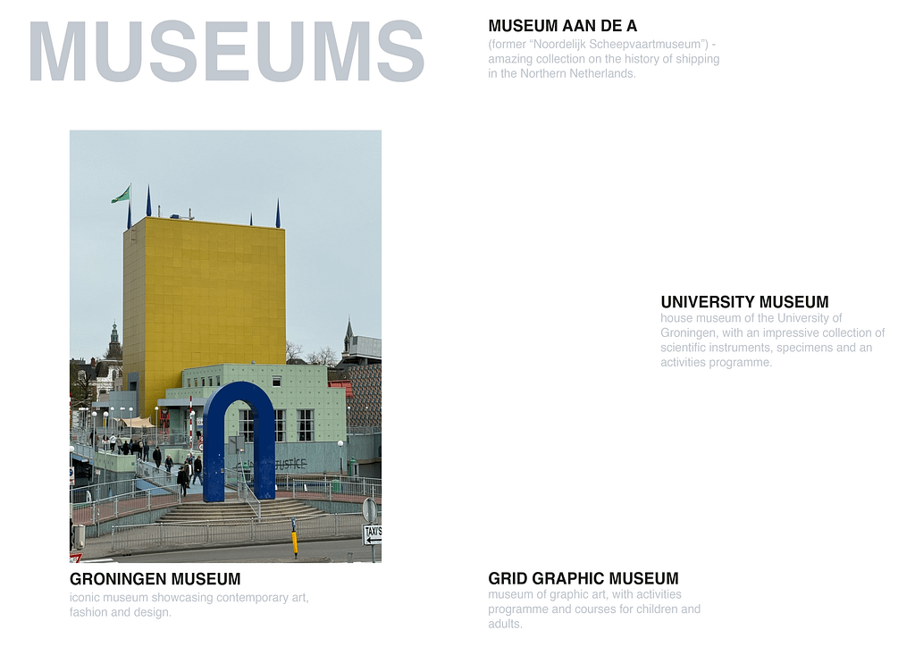
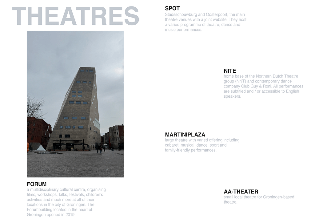
I first started off with looking at the website from International Groningen. I chose the subject “Culture and events” because this is something that I find interesting. After knowing what text I wanted to use for my proposals I went to the city to look for the buildings that are mentioned on this page, I then photographed these buildings so I could use the for my proposals and for the full magazine.
Some of the photo’s I made:


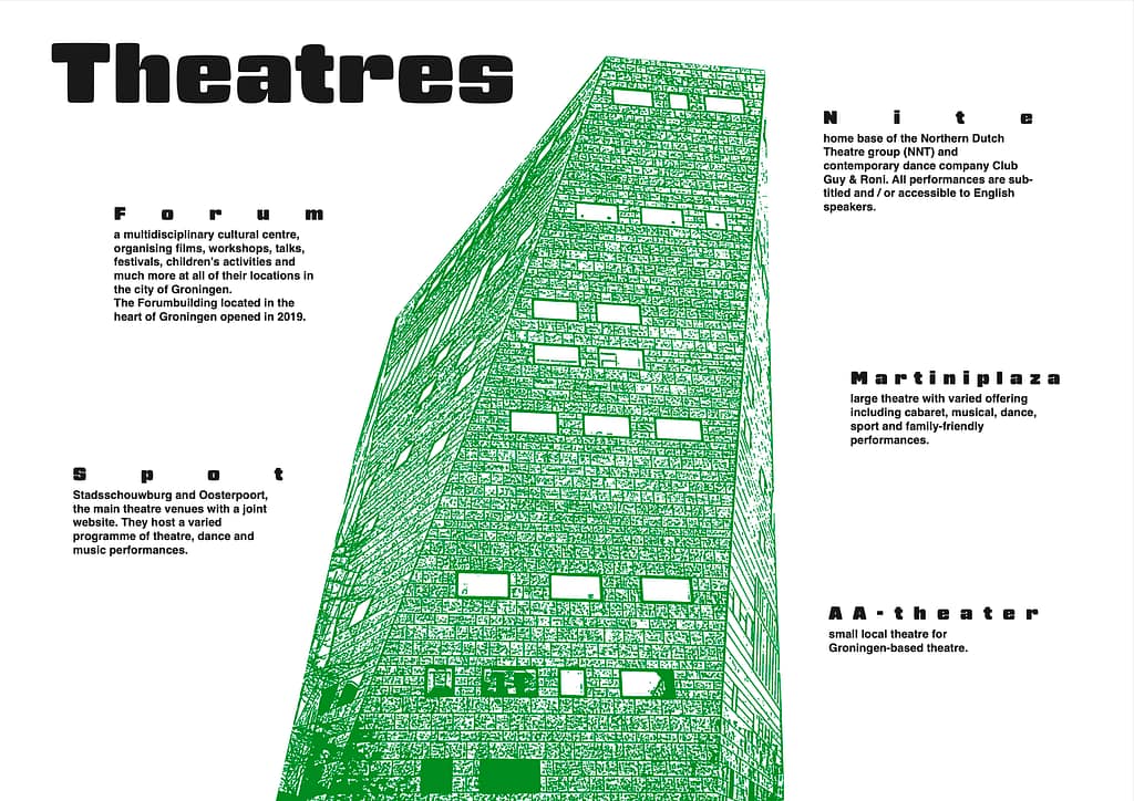
Then I made my first proposal, for this I used the photo’s that I made. For this proposal I only experimented in InDesign. For my second proposal I wanted to experiment more. I used photoshop to photoshop the pictures into looking more illustrative. I used illustrator to make the lines around the Martinitoren for the infographics. For me the second proposal was more experimental and more out of my comfort zone, which I really liked. Because of this I learned new things.

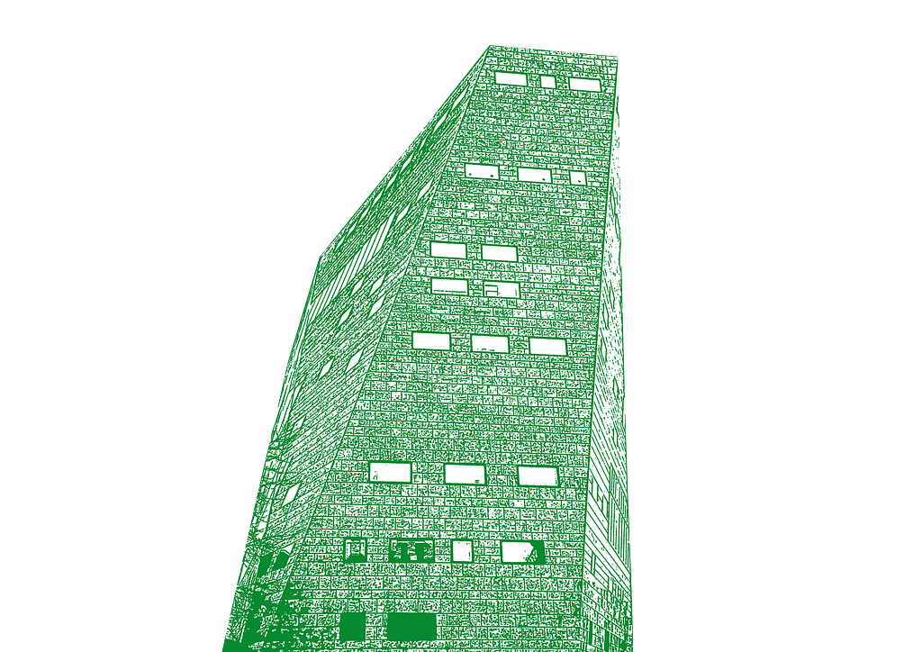
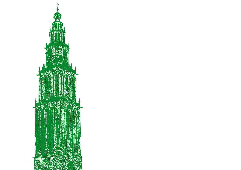

make the lines around the Martinitoren for the infographic