INSPIRATION
CONVENTIONAL DESIGN
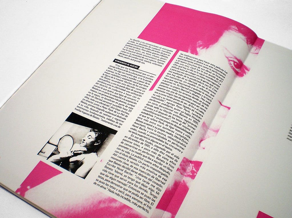
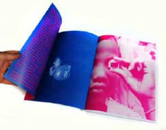
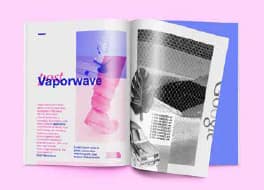
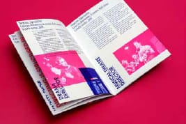
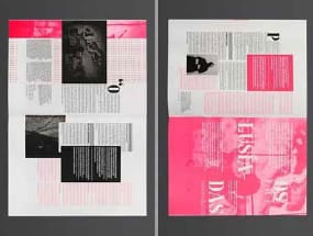
I collected multiple magazines with mono-colored pictures with a strict color palette, because I feel like I can create a harmonious design following these examples. The typeface and colors look very friendly and calming to the eye.
EXPERIMENTAL DESIGN
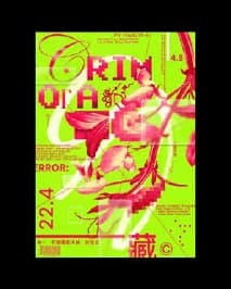
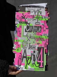
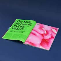
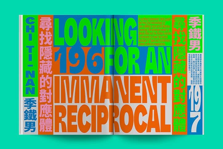
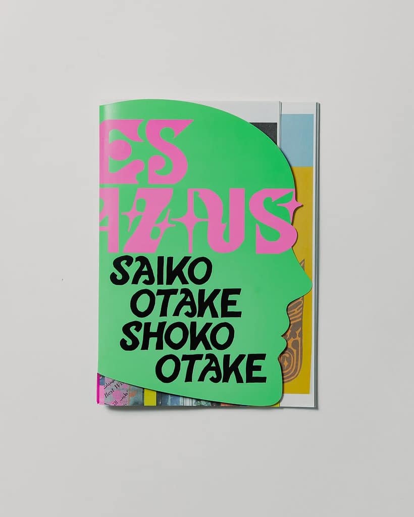
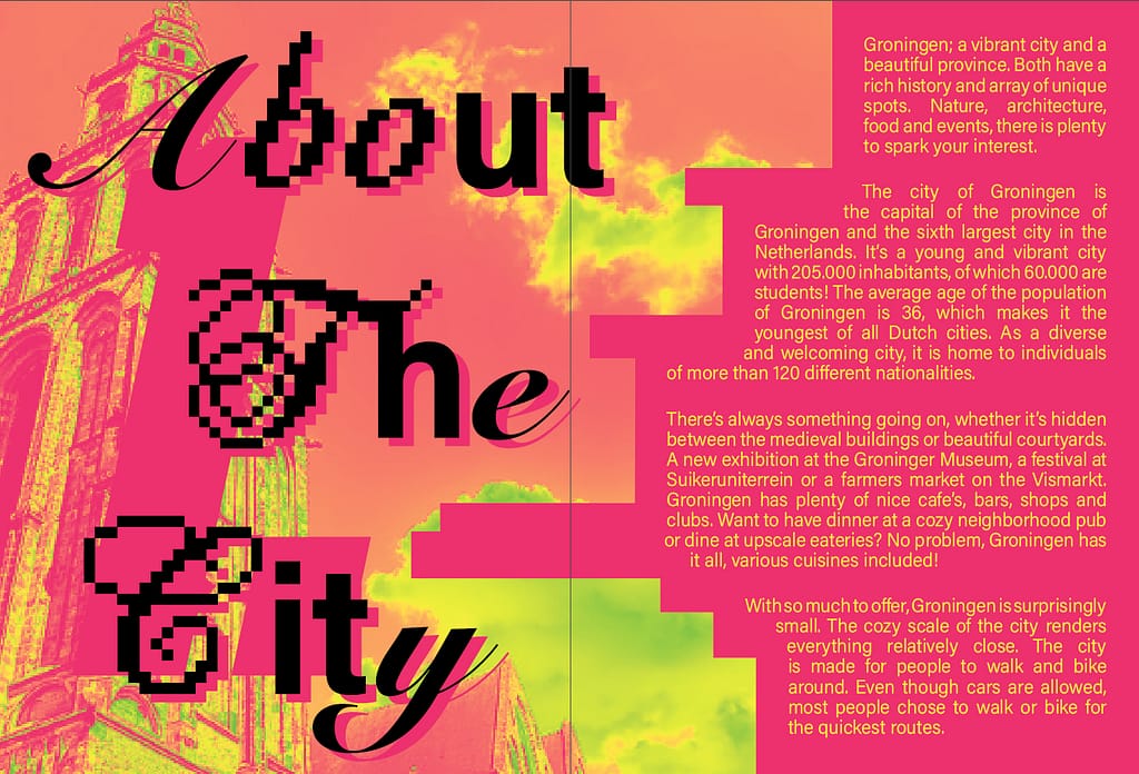
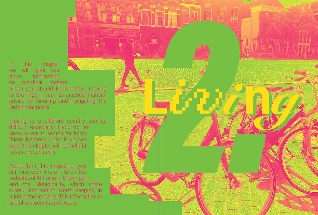
For the experimental design proporsal I want to go with really bold colors, as well as experiment with custom page cutouts throughout the magazine. My goal is not necessarily readability, I plan to focus on the aesthetics.
————————————————————————————————————————————
PROGRESS 1
For now, I decided to only focus on a couple of page layouts for my conventional design concept. Colored shapes are placeholders for images.
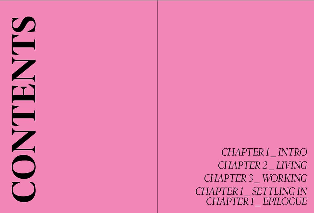
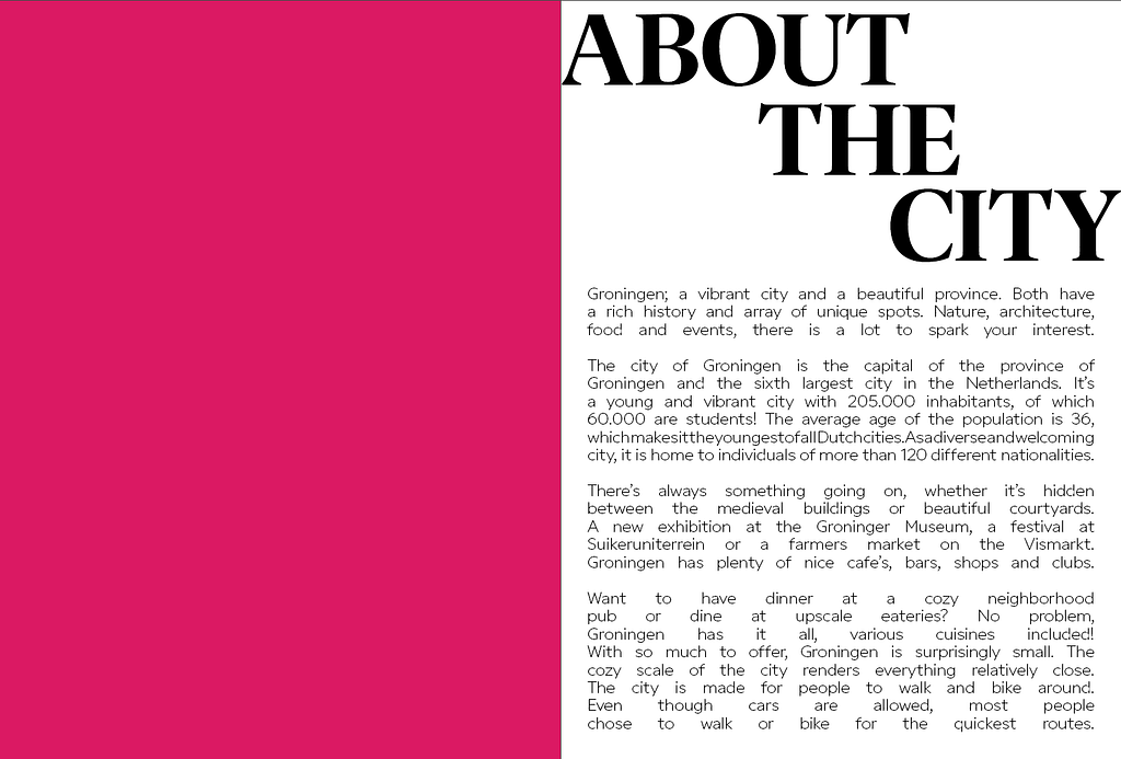
PROGRESS 2
I worked a little bit on my conventional design proposal, inserted some images and edited the text spacing. I also started working on the experimental design spreads, but I am not sure this is the direction I’m going to go with.
—————————————————————————————
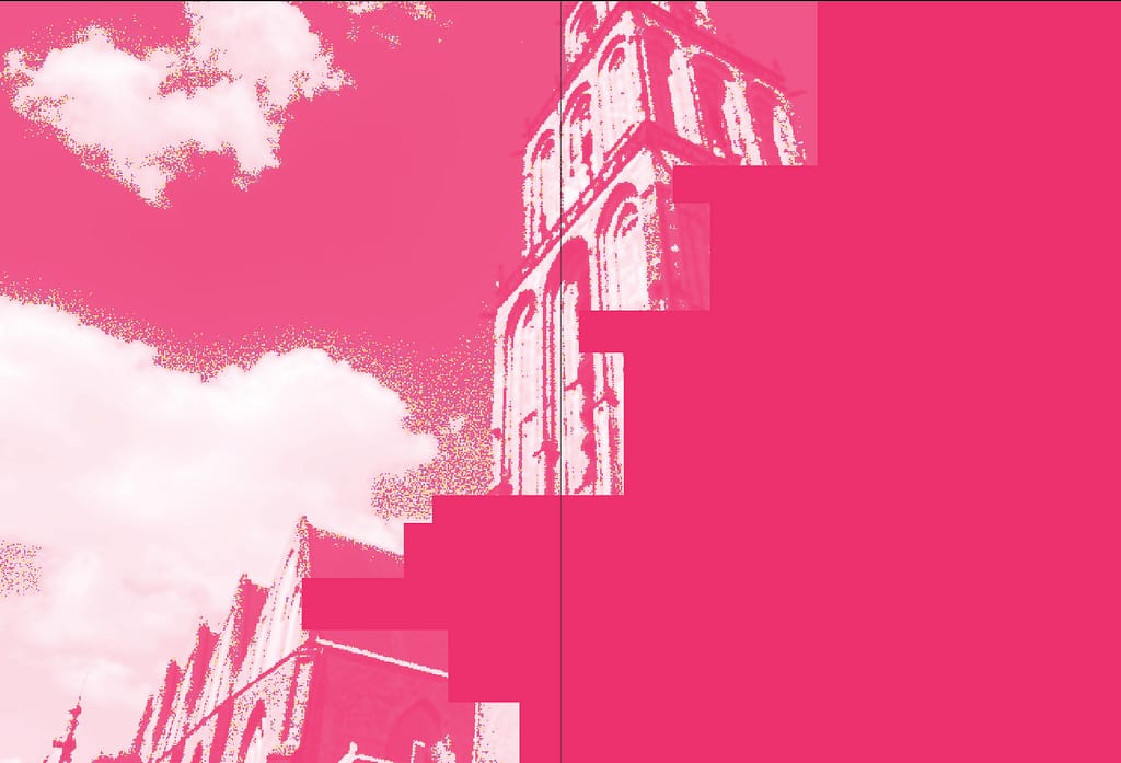
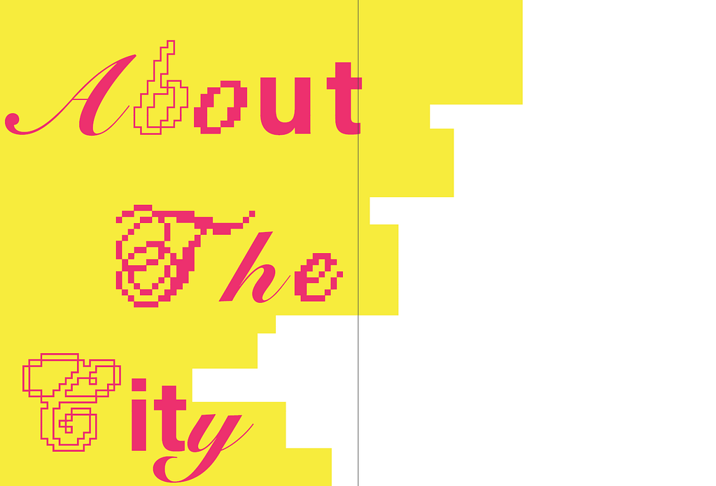
(SECOND SPREAD IS MEANT TO LAY ON TOP OF FIRST SPREAD AS A CUTOUT)
PROGRESS 3
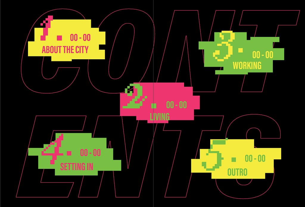
I have started to flesh out my experimental design concept more, which is the one I like more at the moment. I want to utilize custom page cutouts to create a fun and playful magazine.
PROGRESS 4
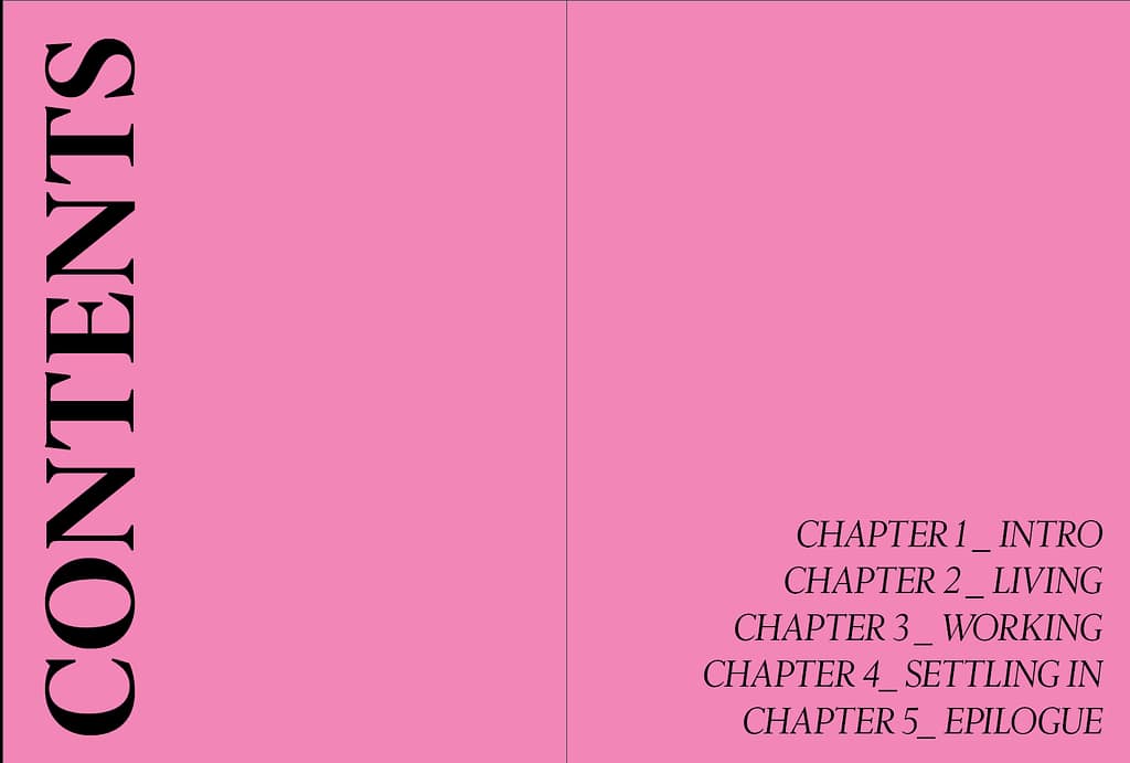
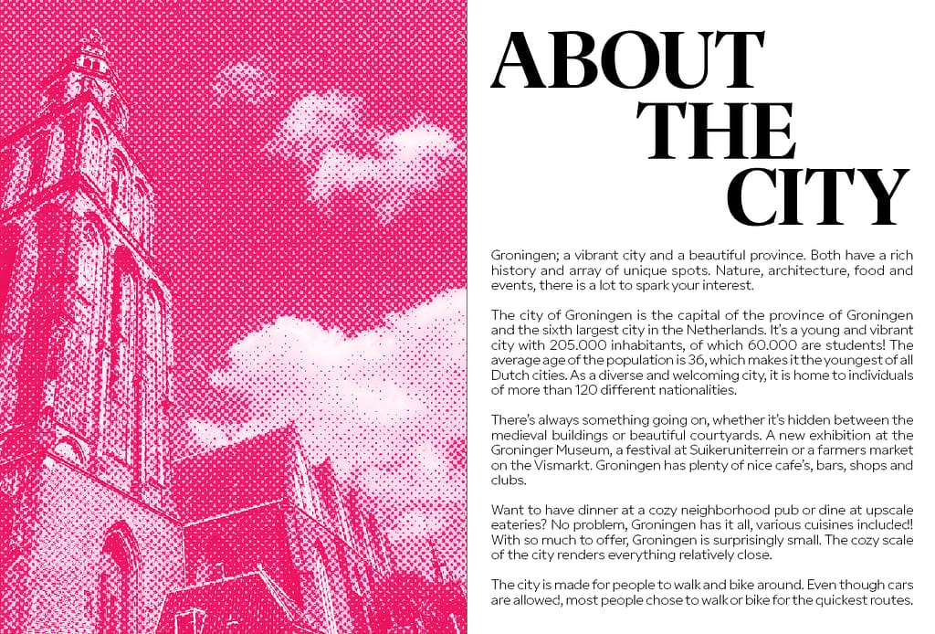
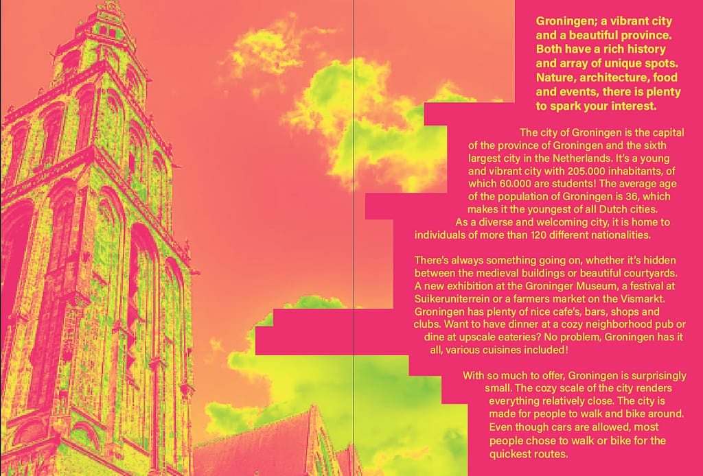
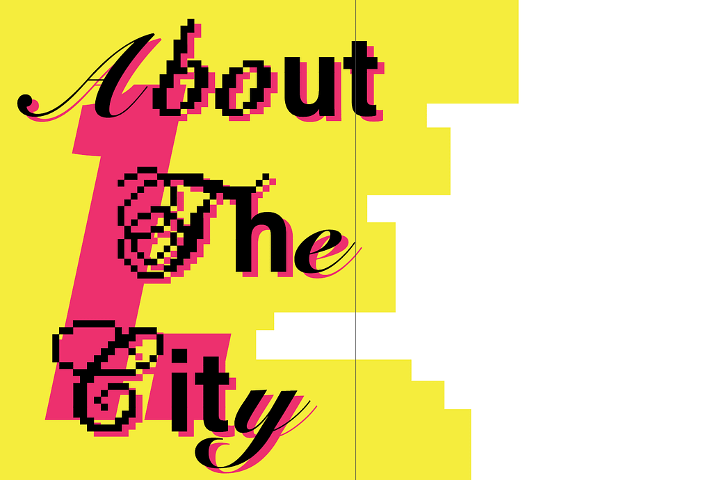
I am now fully focusing on my experimental design proposal. This is my progress so far with the first chapter complete.
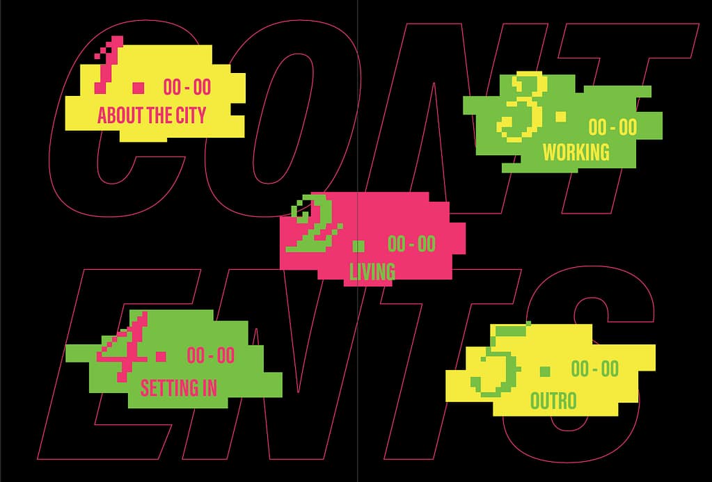
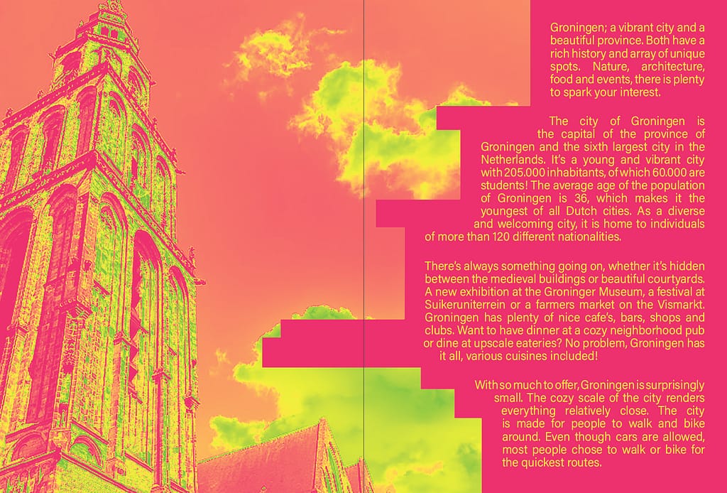
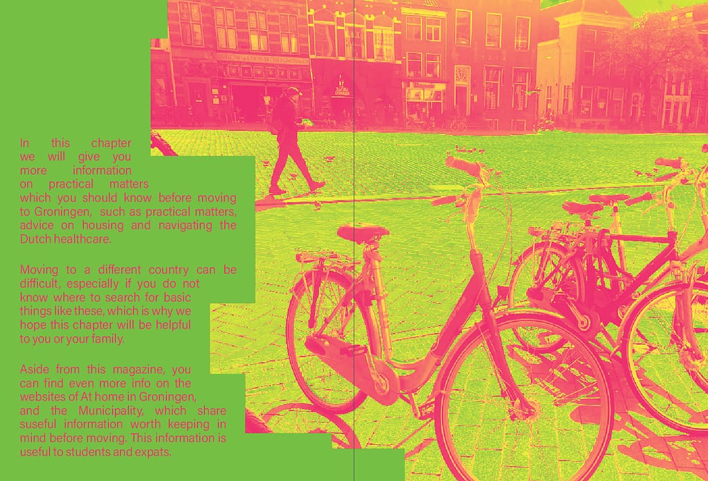
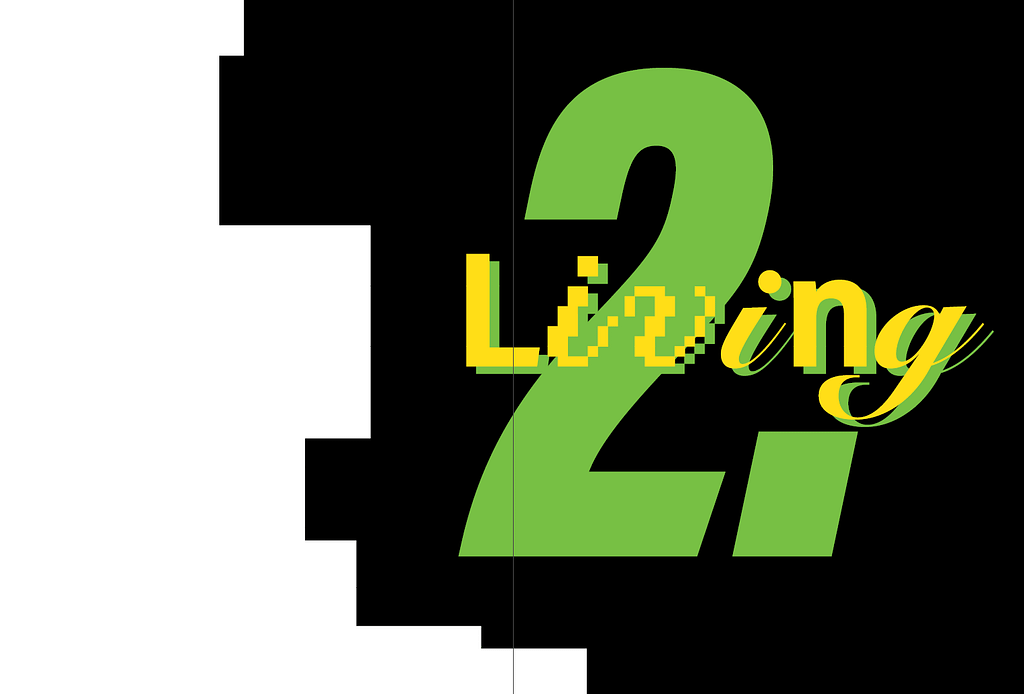
For the following spreads the translucent square indicates a new image I want to take but haven’t had the chance to.
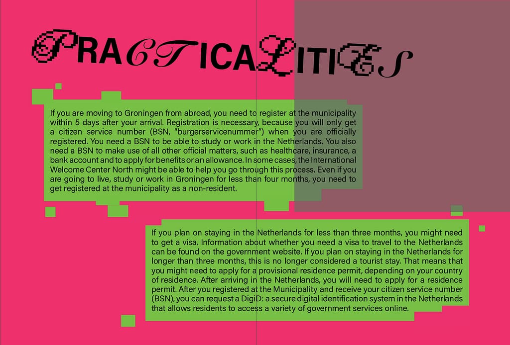
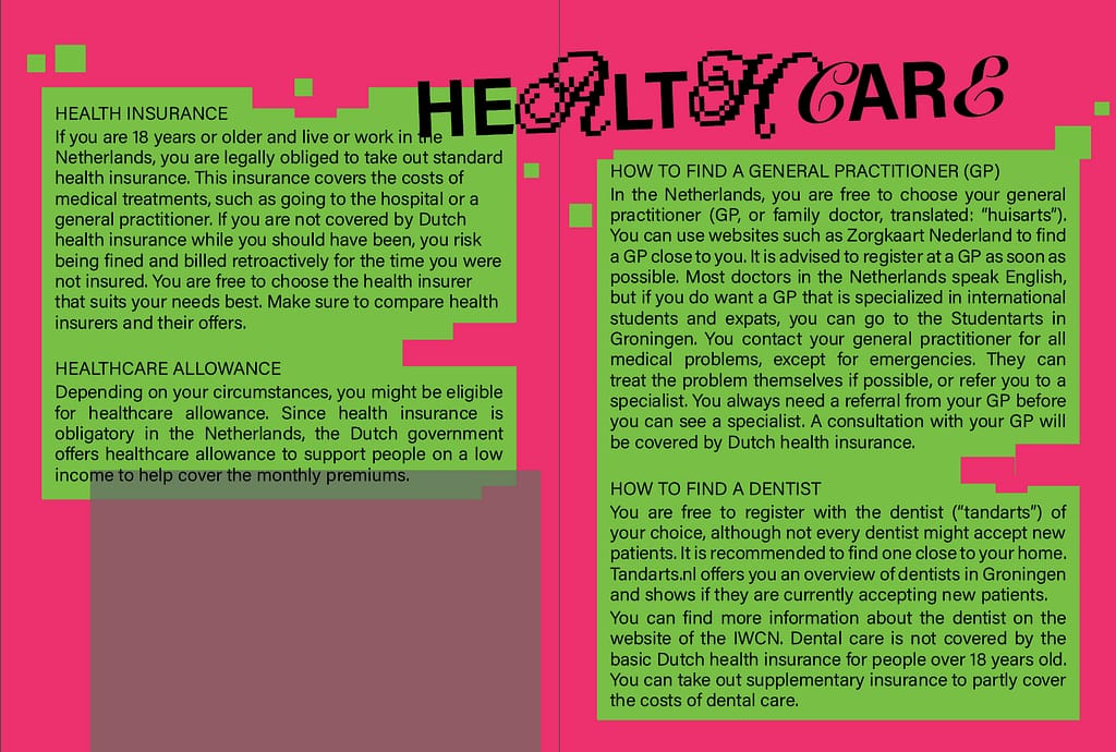
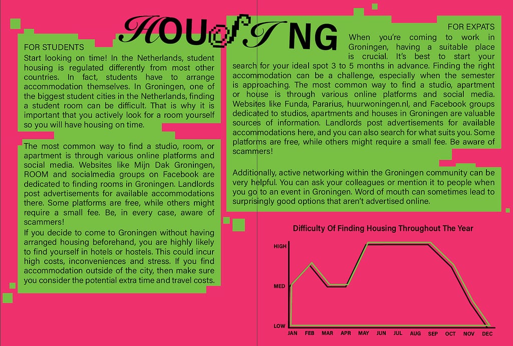
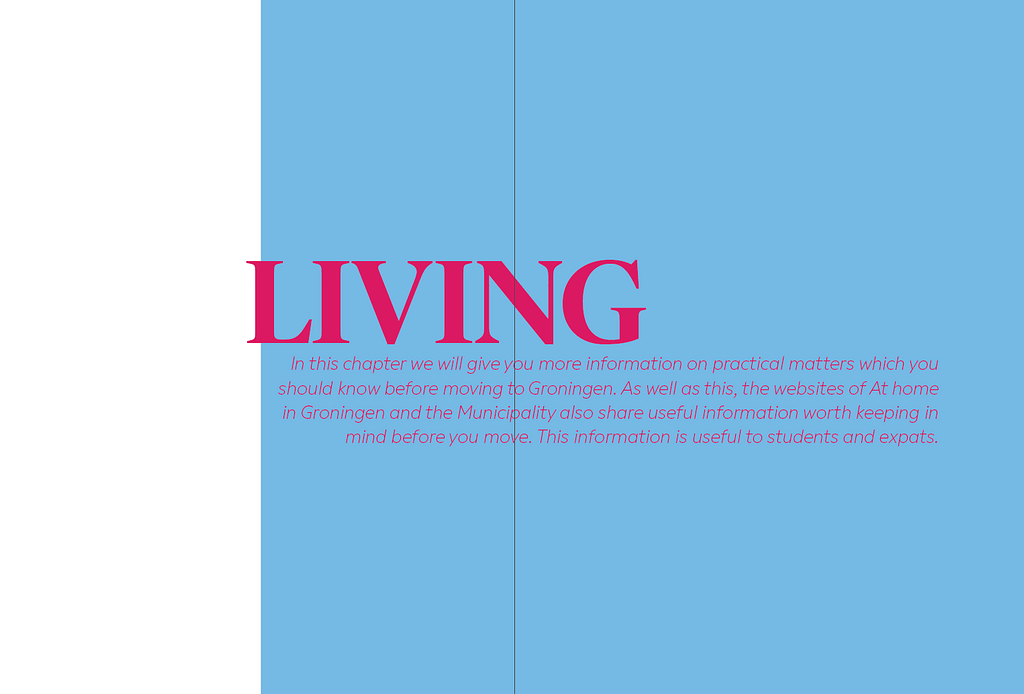
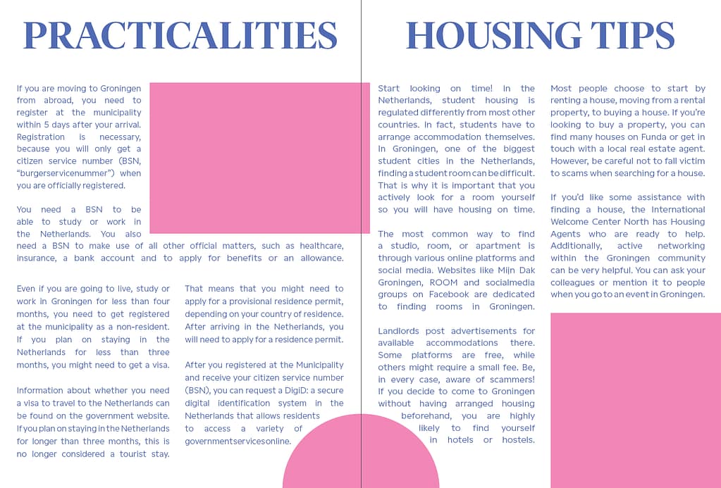
Experiments for some spreads:
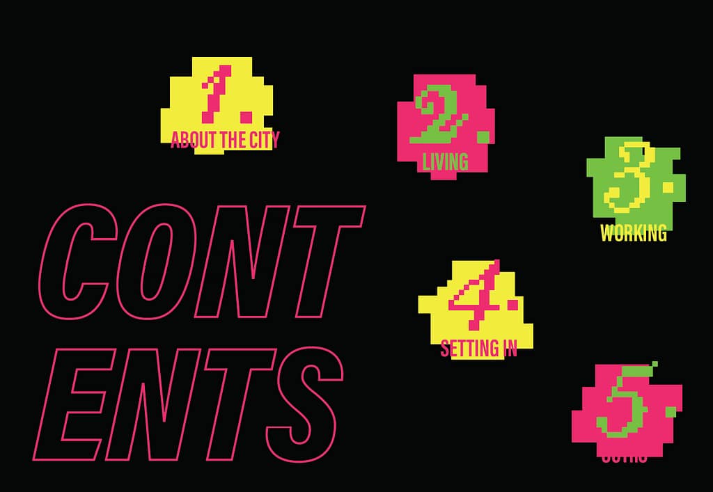
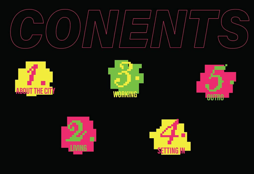
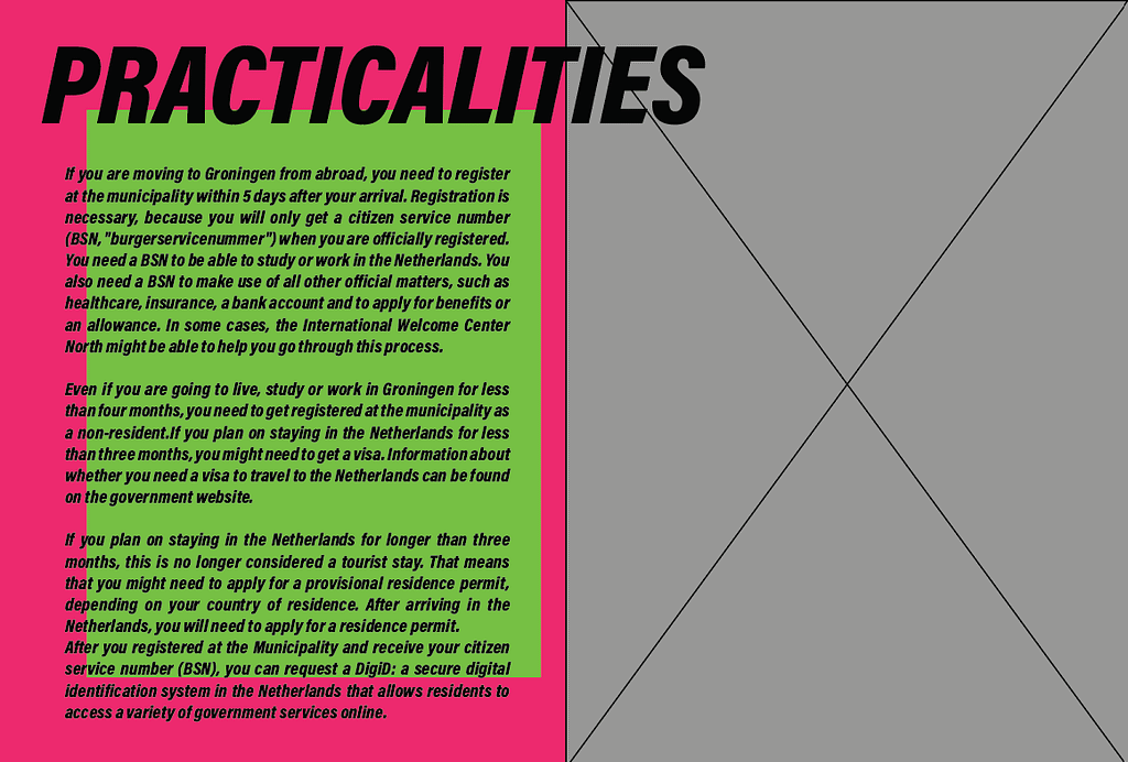
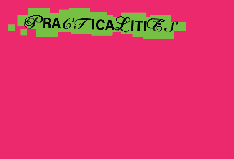
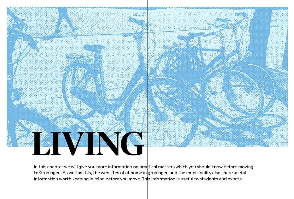
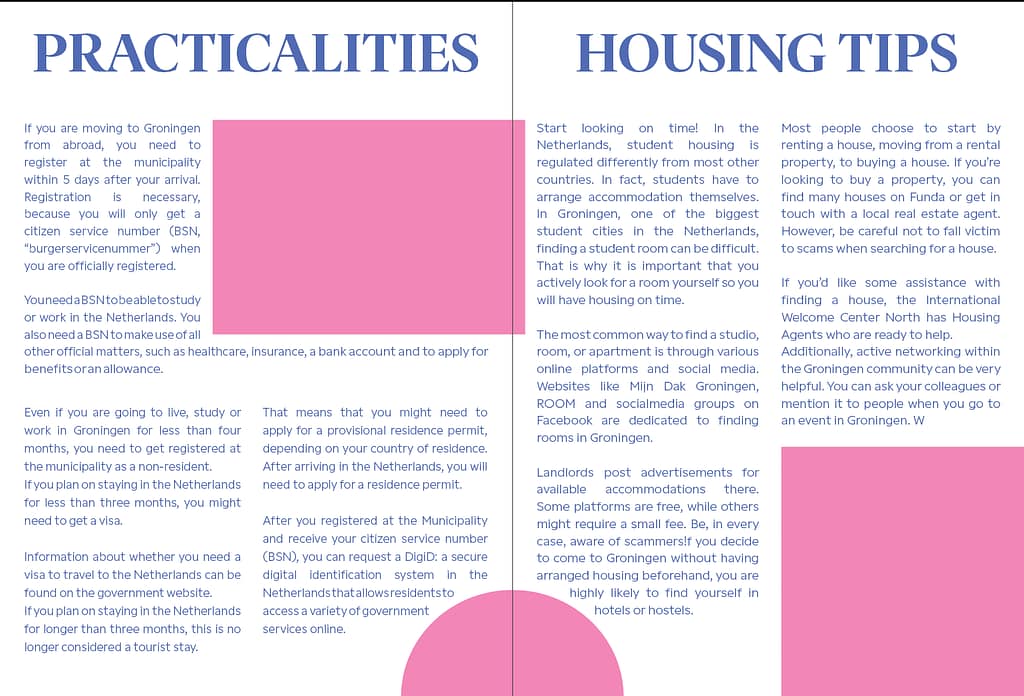
I had quite a lot of difficulty with trying to figure out the layout for spreads that aren’t title pages, but mostly text, so instead of trying to figure everything out immediately I used very rough shapes to try different things out, which I ended up using for the “Living” chapter.
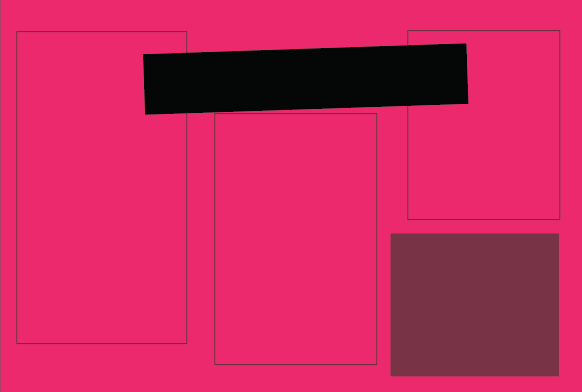
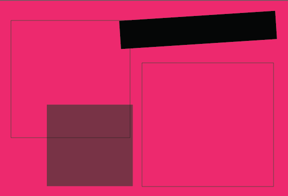
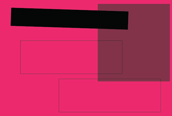
I was also asked to see what the title pages would look like if they weren’t reliant on custom shape cutouts