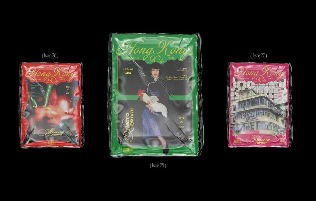
I Like the vibrancy of the colours used, as for me they reflect the vibrant city life. I like the font used on the covers as well, because even though it’s not in Mandarin, the font evokes a sense of Eastern Asia. The pictures show the rawness of the city, especially in that time and age. For example, the walled city of Kowloon (a famous slum where the streets are so narrow, and the buildings so high, that there is no natural sunlight) is pictured on one of the covers. The contents also show the “lawlessness” or at least lack of regulation in that period, since there is a full page add promoting drinking alcohol on the daily. Even though I assume it’s computer generated, I love the look of the thick plastic packaging around the magazines. It reflects the mass consumption, industry and pollution of the city in that period. The rawness and bold colours make it “tastefully tacky”. I want to show the rawer side of Groningen as well, in some way that reflects the raw edges of its culture. Since most promotional material seems pretty tame.
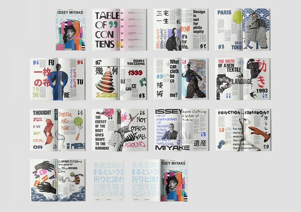
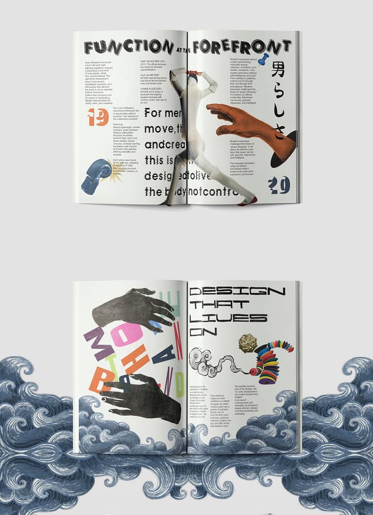
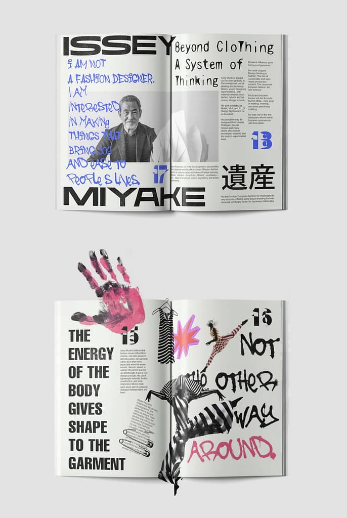
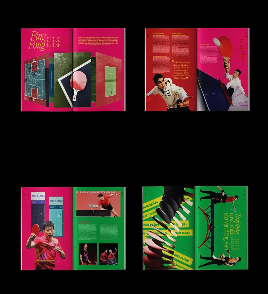
Even though it might not seem like it would work as a “functional design”, I think this magazine conveys information really quickly. The illustrations and the big, bold text synergise really well. The reader can see quickly what the main idea of the spread is. What I don’t like are the big white brackets in the justified text, especially not on the “1999” page. But in general, I would like to make something like this for Groningen, since it’s “show don’t tell” style, which I think is fitting for a young crowd, with low attention spans. Also, aesthetics are really important lately in the age of TikTok and Instagram.