Skip to content

STUDIO2 / WK6-11 by Namsom

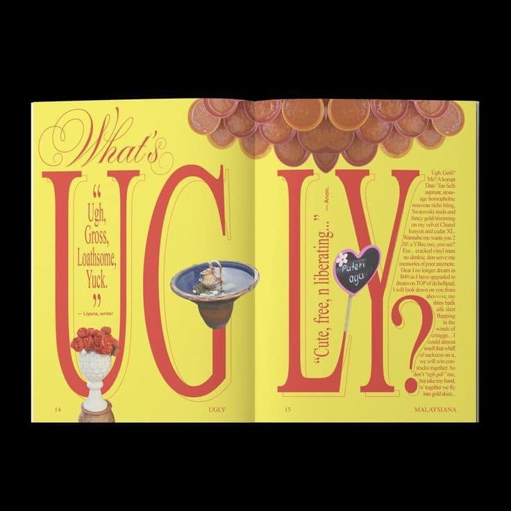
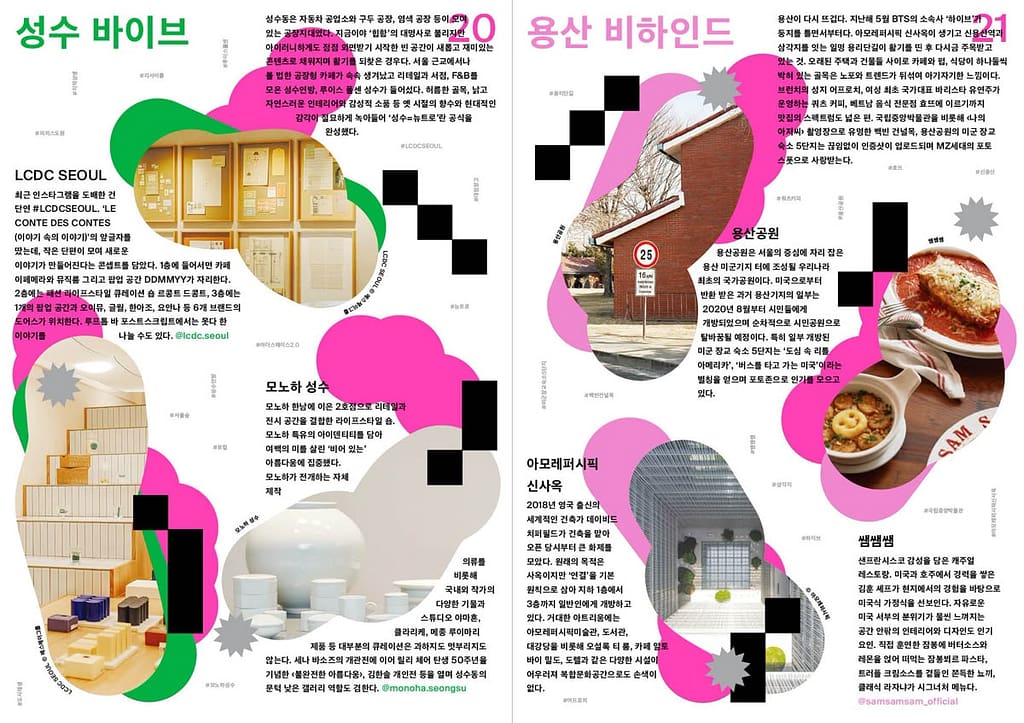
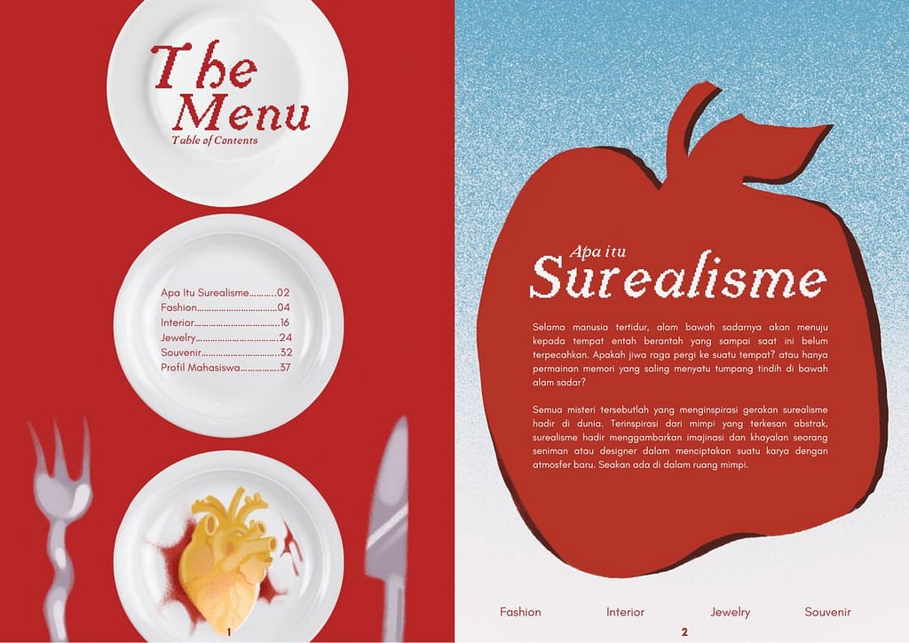
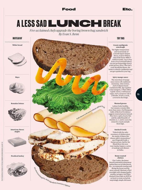
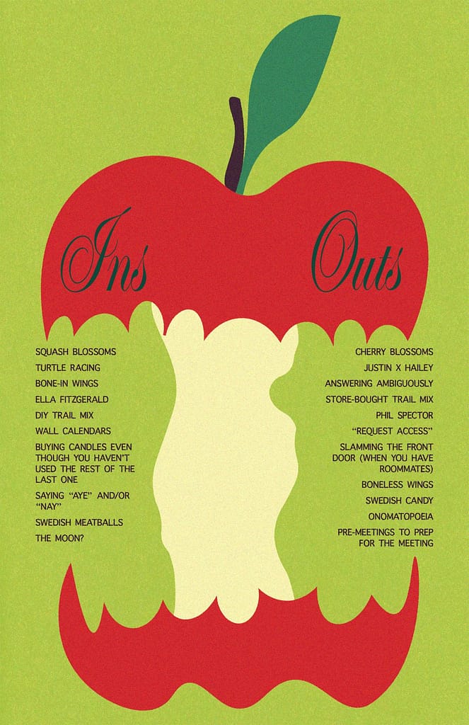
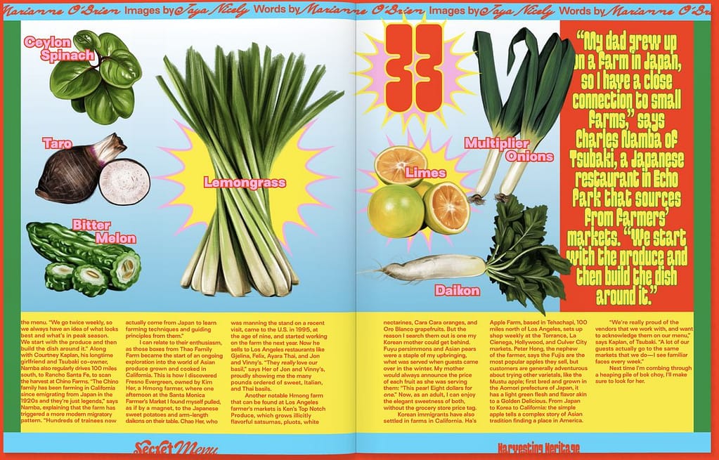
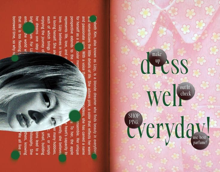
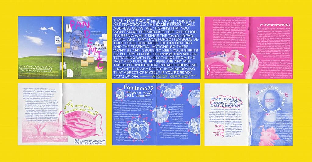
Inspirational spread

I like this design because the hierarchy of the content like how we can read it differently.
I like how they put the information align with the different shape of picture it looks fun to read.
I like this spread on how they used graphic to make the page feel not empty even with the less information.
I like the mix of color they used and the placement of the graphic and content it looks balance
I like how randomly they place the picture among the text and one looks really full and another looks more light.
I like the mix color of the spreads that they control the color really well and the mix of font that they used.

Week 10

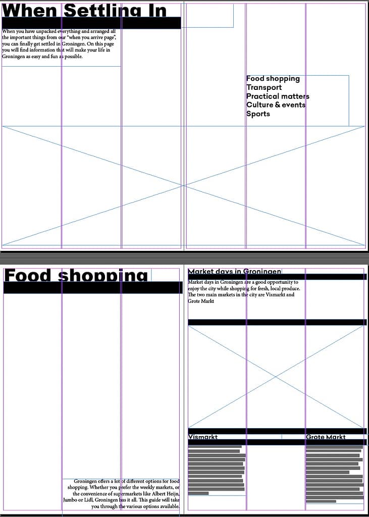
  • I did 2 purposes of design by this week, I mainly did this week is to set the setting of the 2 design, Like the grid, margin, the different font for different purpose, the size of the font for each topic and the content that I’ll put in each page.

Week 11

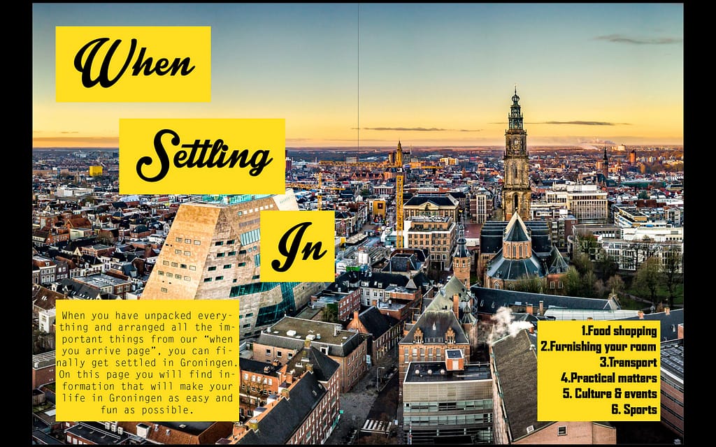
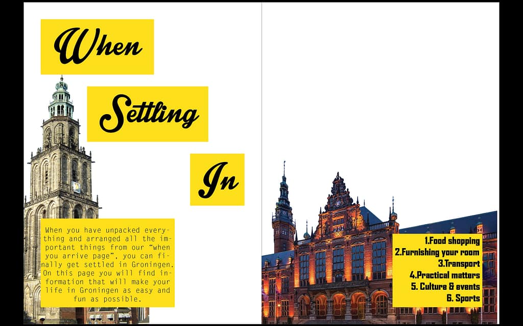
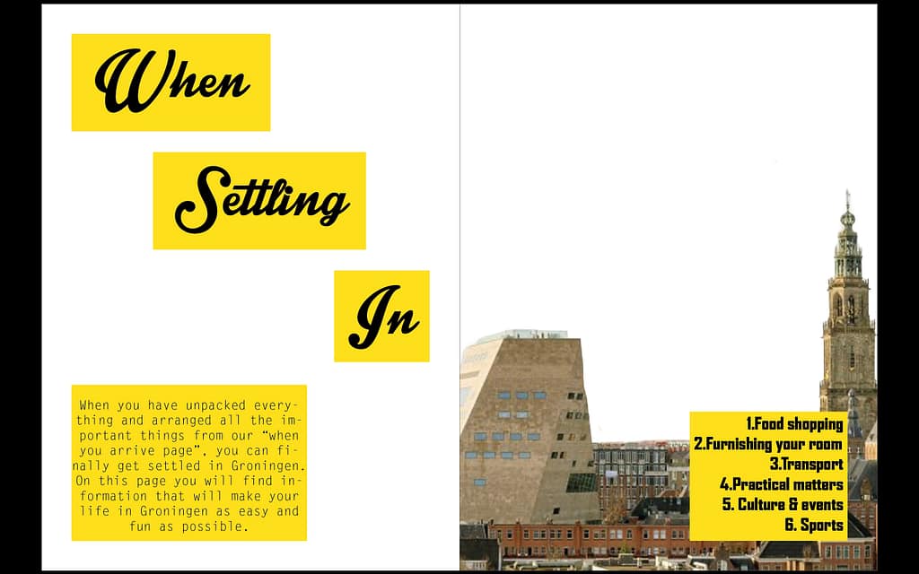
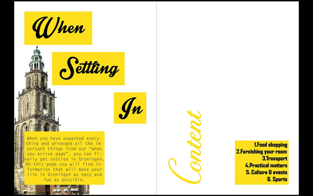
I finalize my design to 2 designs 1st one is the informative one full with photo and easy to read so the 2nd one is the one that I try to make it differently so I make it minimal because it’s experimental for me, normally my style is maximalist full with color.

Leave a Reply

Your email address will not be published. Required fields are marked *