week 6
inspiring examples of editorial designs & why i chose them
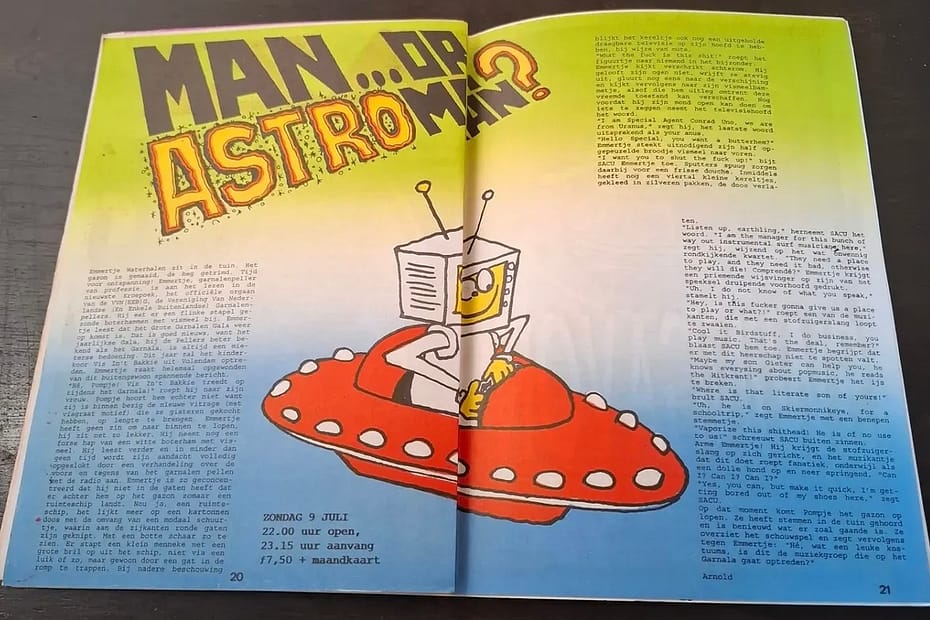
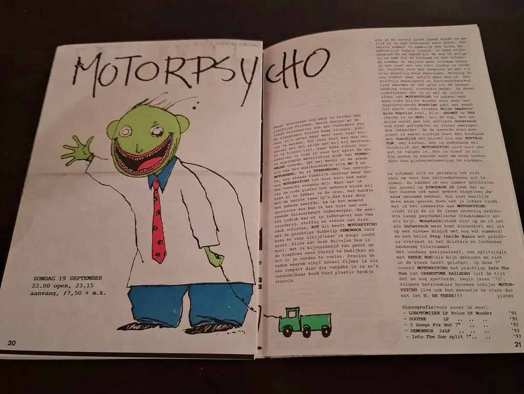
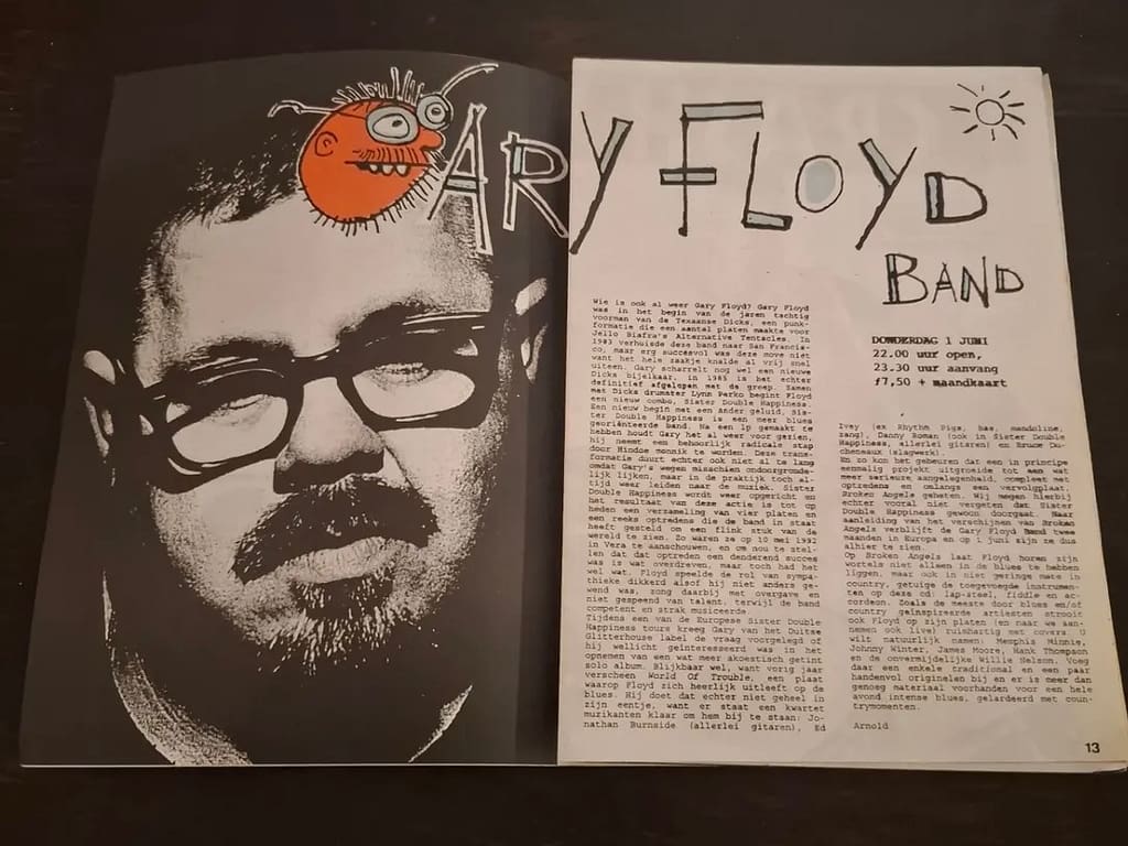
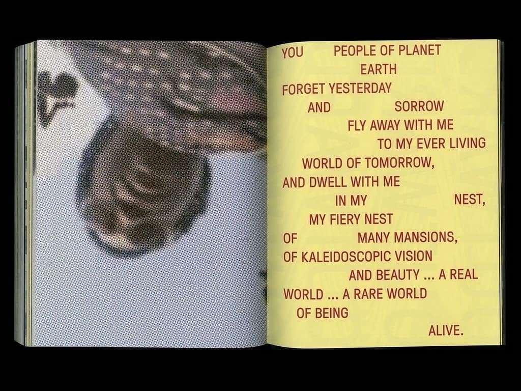
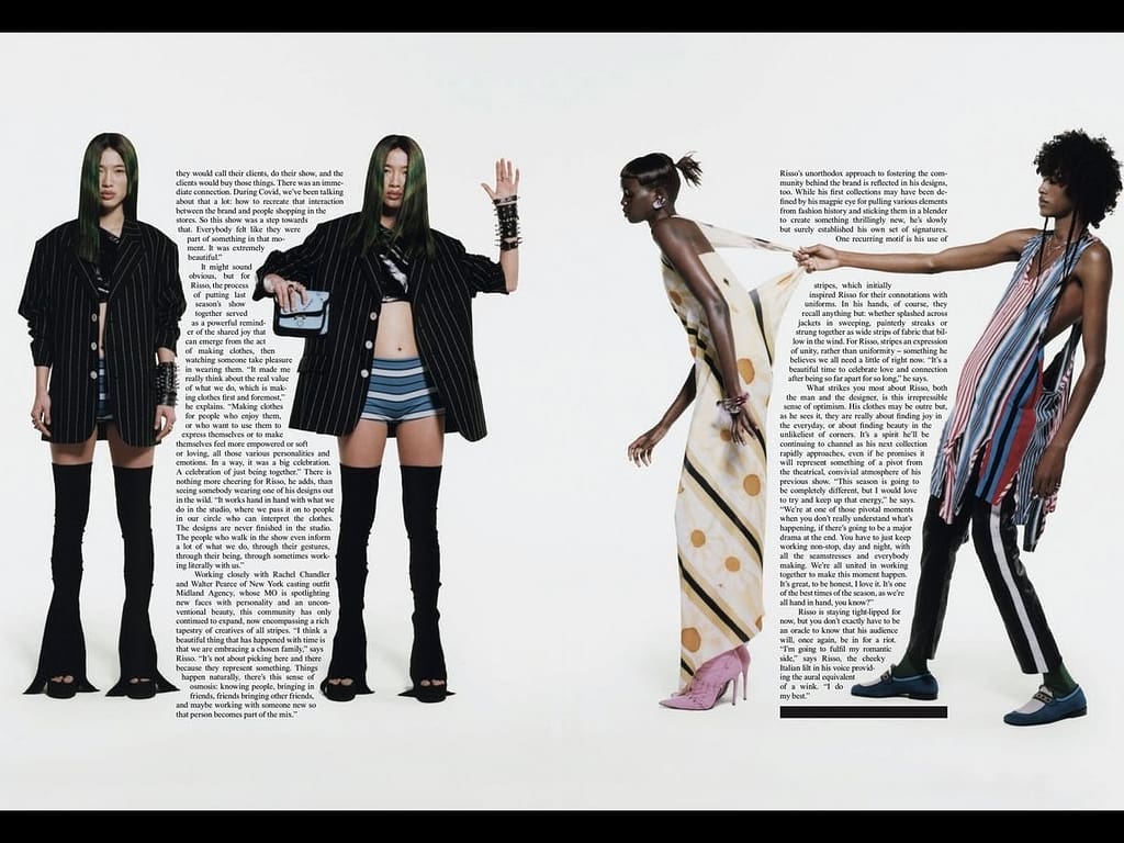
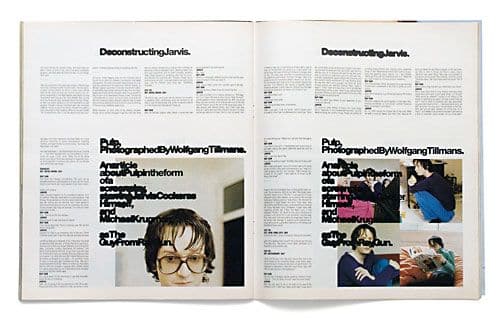
expressive layout, images flowing on both pages of the spread, fragmented and a bit chaotic text placement that makes me curious as i find it easier to read in parts, a cohesive font for the main text but off the grid handwritten titles for variety, colourful background, playful and diverse but also readable and clear
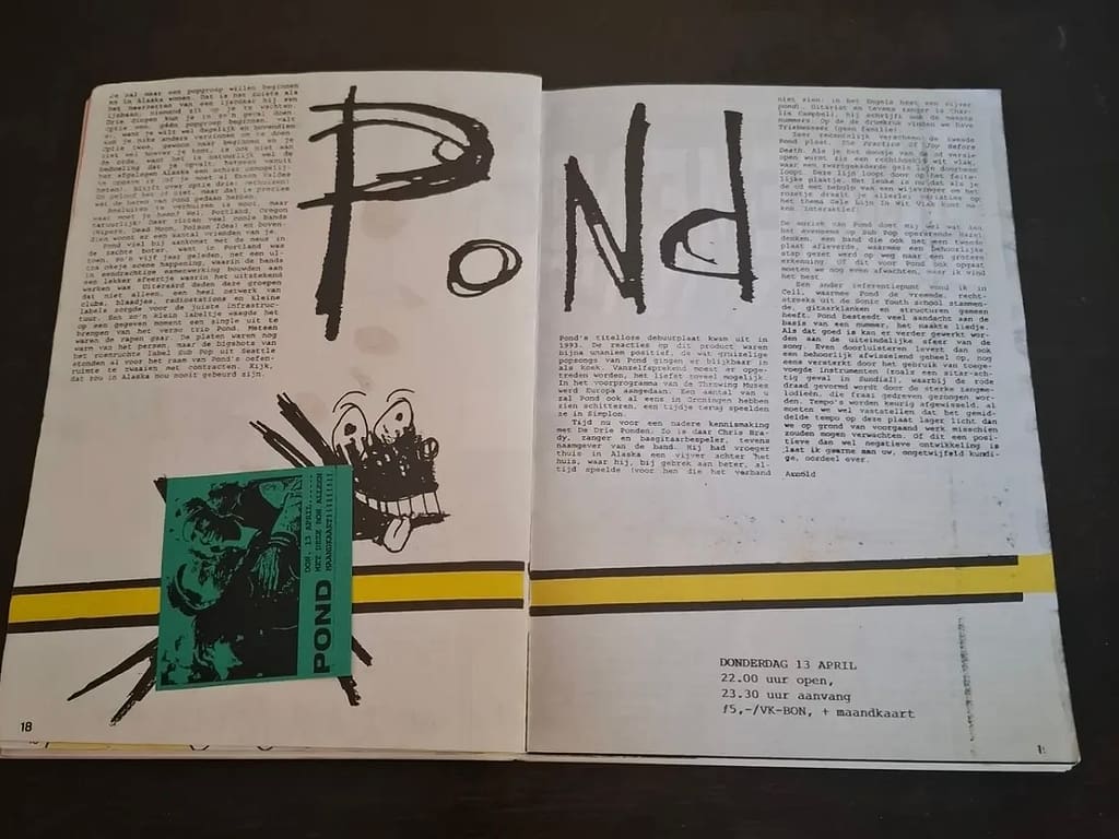
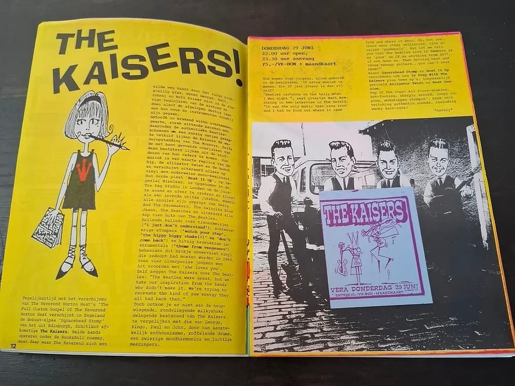
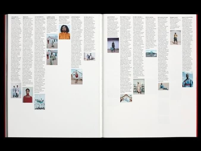
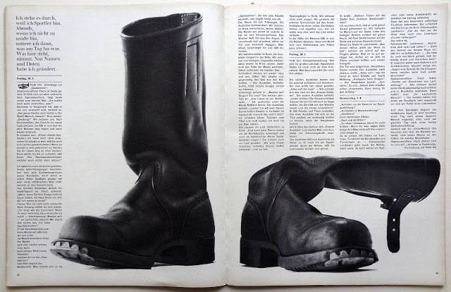
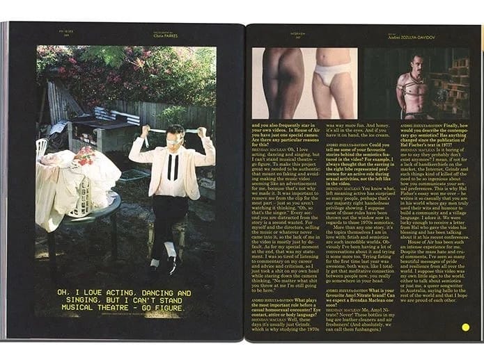
clear layout and difference between the text and the images but they still compliment each other, simple and on the grid but still interesting because of the connection between the images and the typography placement
week 7
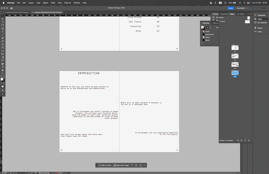
first drafts of the two proposals on the topic of going out in Groningen (not my own images yet, just examples)
proposal 1 example spreads
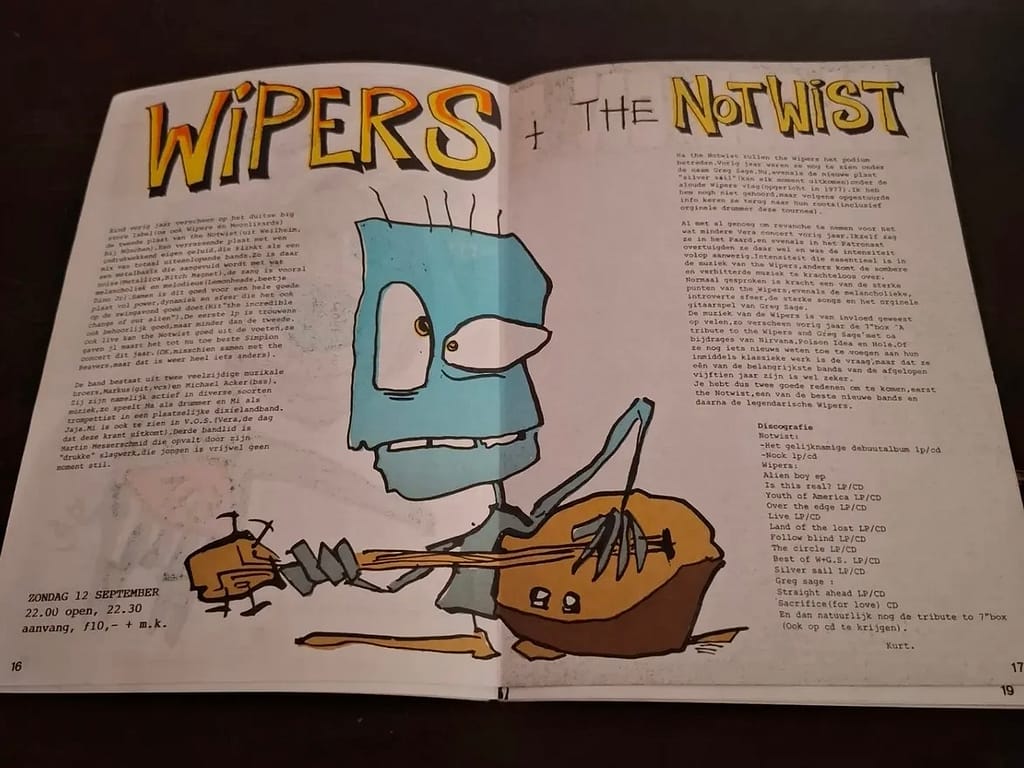
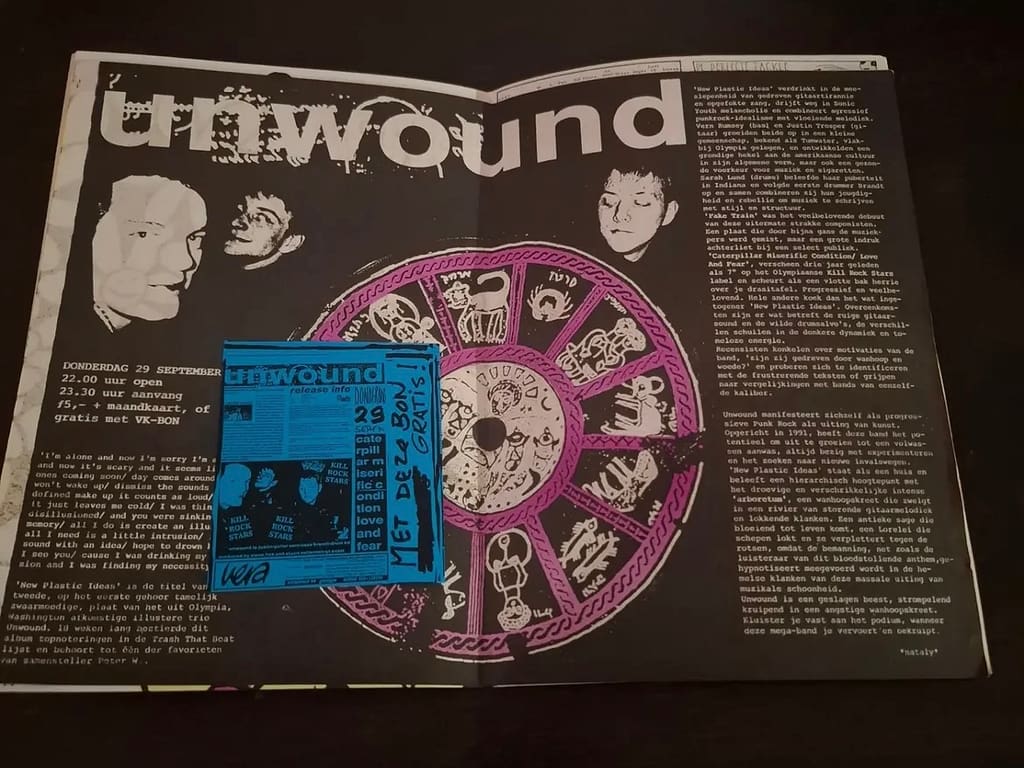
minimalist design, readable, more neutral than expressive, clear layout, old-school


proposal 2 example spreads
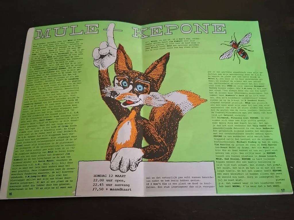
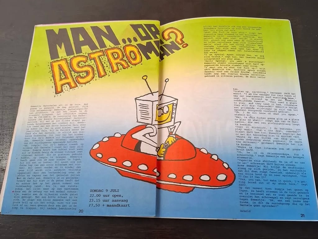
maximalist design, more expressive and colourful, bold typography, targeted at an alternative (younger?) audience


some process
first font choice

progress
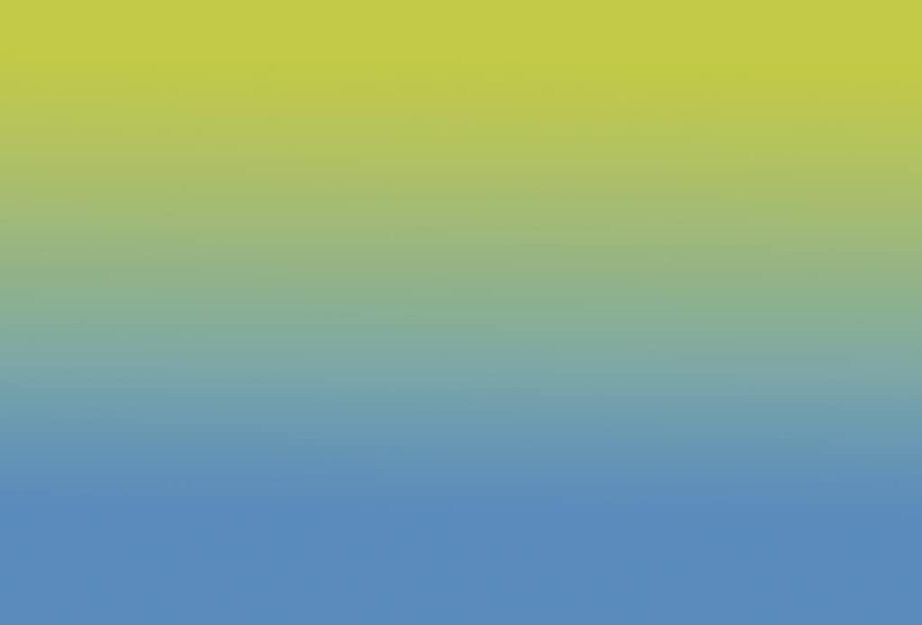
trying a gradient background for proposal 2 that i did not end up using
from now… take my own pictures and place them instead, work on infographics, maybe try making analog handwritten titles for proposal 2 instead of using different pre-made fonts?
week 8…
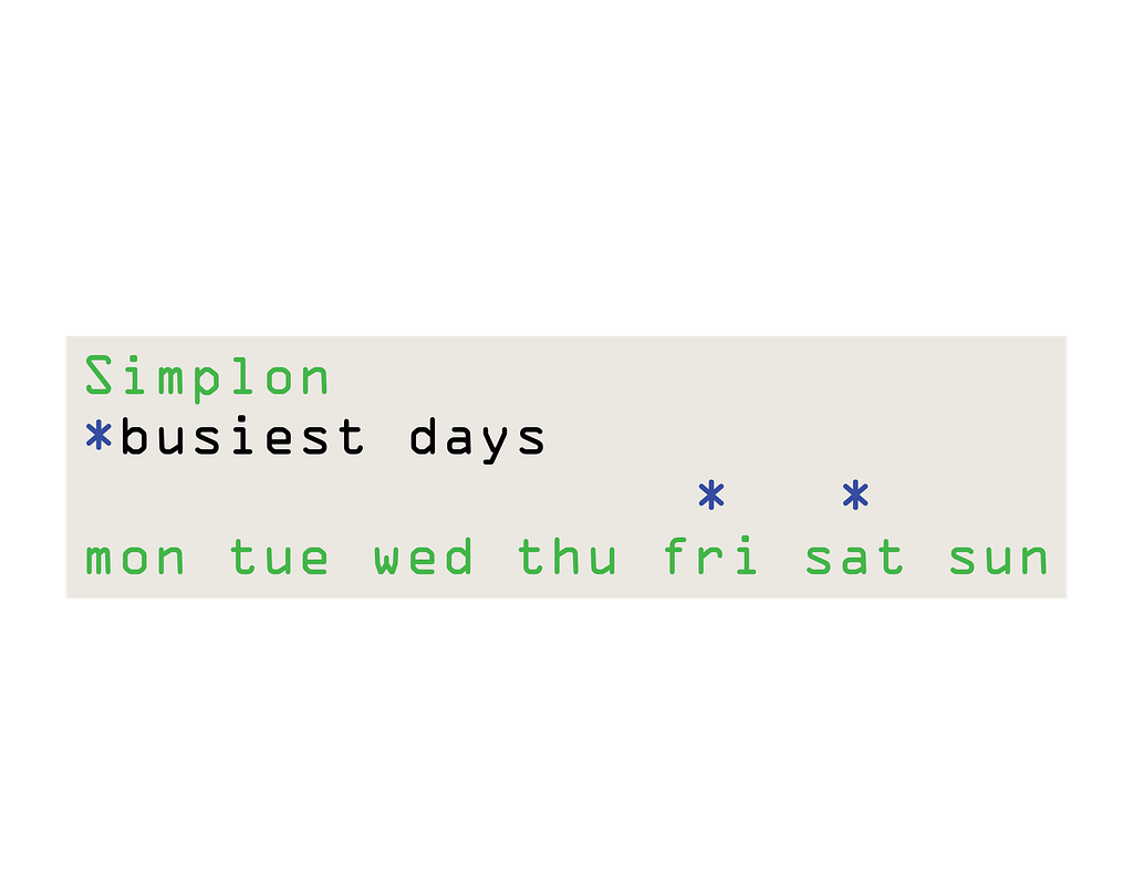
proposal 1
infographic

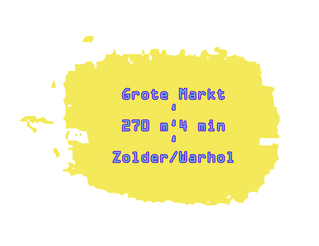
proposal 2
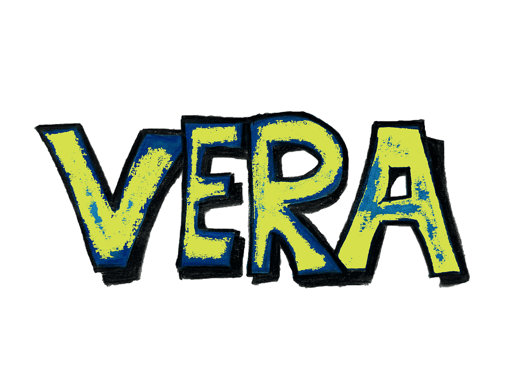
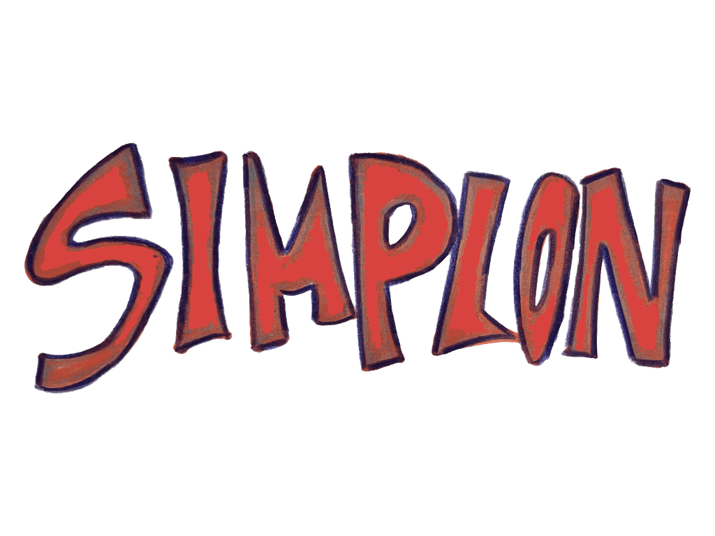
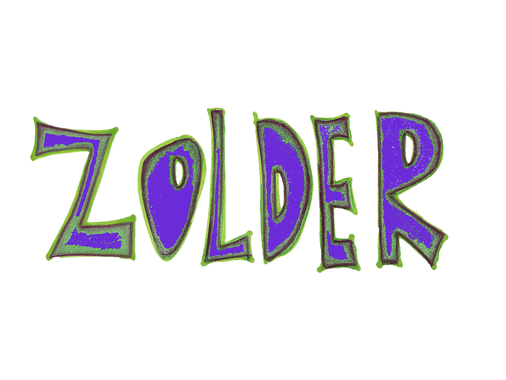
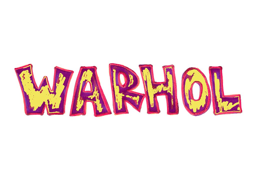
handwritten titles tryout examples

infographic


improved margins before & after examples