The Now
- Look around and record. F.e. Where are you, how many people do you see, what color clothes are they wearing, etc.
I’m in class, I see 15 people, they’re wearing all types of clothes and colors but mainly black and white.
- Determine what you see could be data (a collection of information)
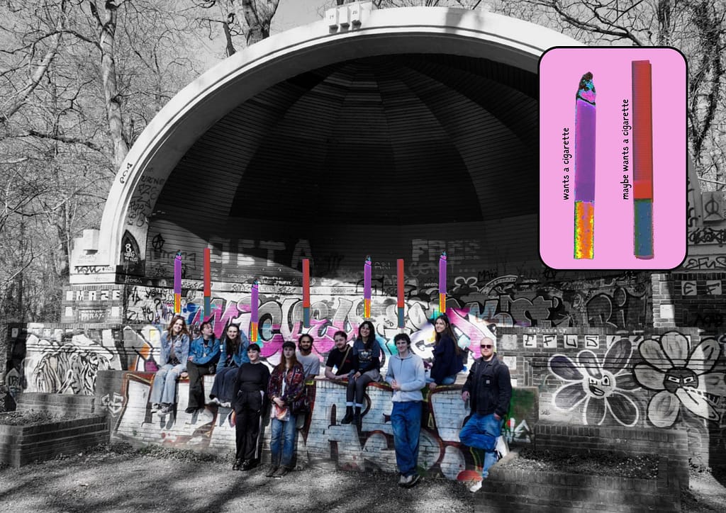
How many people need a cigarette right now.
- Choose a topic and visualize
NOTES:
Other details: Some people are slouched, some are fidgeting, one person is staring out the window. It’s quiet but starting up
People showing signs of boredom or restlessness: 6
People who look focused: 4
People who might want a cigarette (based on body language like checking the time, bouncing their leg, sighing, etc.): 3
Visualization idea
| Category | Number of People |
| Definitely craving | 3 |
| Maybe craving | 2 |
| Not craving | 10 |
How did your day start
- Write down what you did before you came to class.
I woke up, showered, got dressed, got changed twice, did my makeup, hung out with my boyfriend, then cleaned the dishes, then took the bus to school. Stopped at Albert Heijn, got pastries, and drinks and now I’m here.
- What did you have for breakfast?
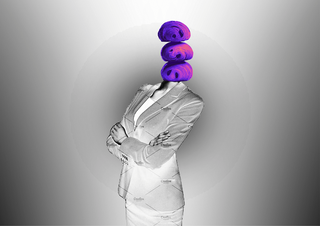
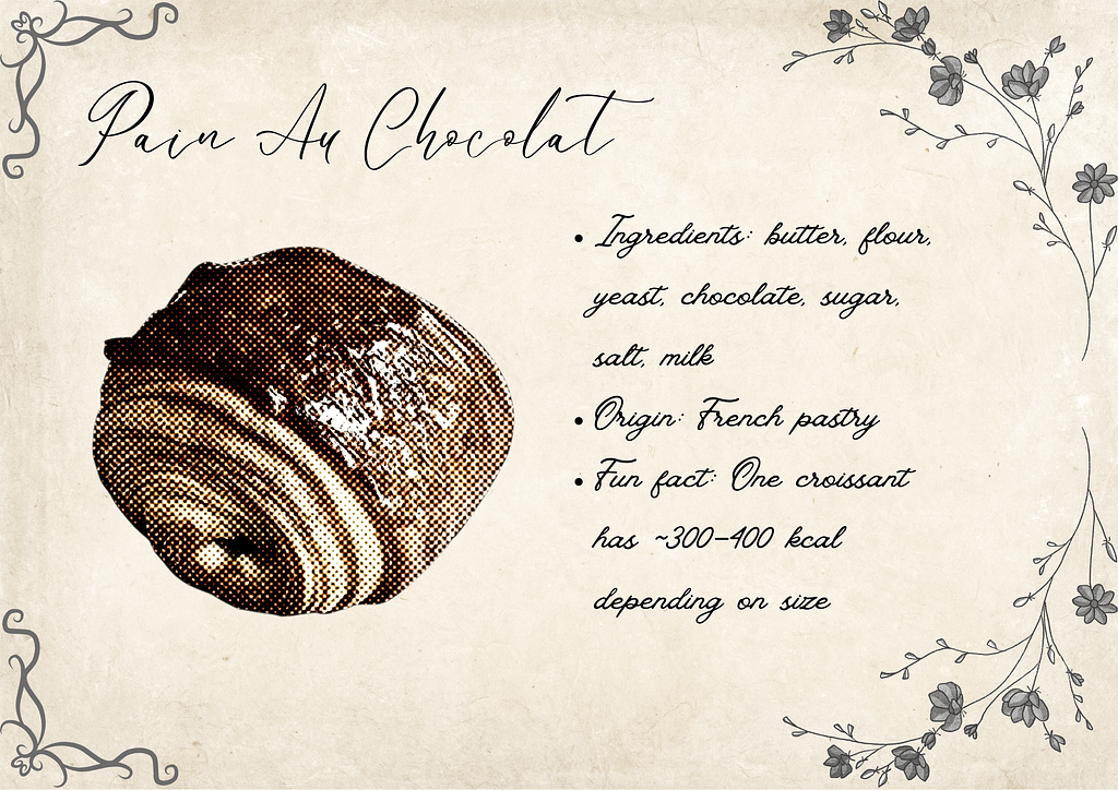
Pain au chocolat and a coca cola.
- Visualize your breakfast: I started with what I orginally ate that day which was a pain au chocolat and a cola but I was genuinely having no artistic development on it. I chose the gradient grey background to signify how groggy I am in the morning and that the broodje are colorful because they wake me up. I hate this visualization and decided to work on something else. Also, I wasnt happy with the nutrional facts and infographics about pain au chocolat. So that was the first one I made, then I thought I should try again, make it look aesthetic to the food. I made a second one but I was still so upset with the result, I felt it didn’t represent me as a designer. I then remembered that I have creative freedom and therefore I could look beyond what I actually ate.
Here, I chose a food for consumption that has a style that it up my alley, I felt comfortable designing this and the ideas came flowing verry easily.
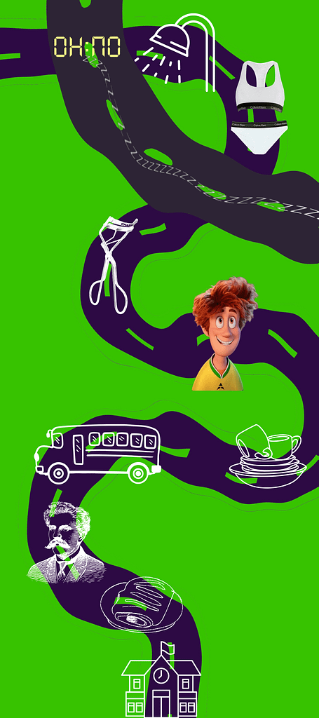
This is my morning routine. You notice there are two roads that can be taken here. The leftist road is just me snoozing my alarm and going back to sleep, but if I do wake up, this is what I do. I chose the alarm clock visualization to be yellow but it’s meant to be a new day. Yellow signifies happiness and beginning and therefore wanted to represent it like so. All the other emoticons are white because I want these actions and procedures to stay as neutral as I can. Getting up in the morning is muscle memory so I don’t associate any feeling to it. I also just thought that it looked clean. In the middle, there’s a boy and he’s colorful unlike the rest of the emoticons. He represents my boyfriend, it’s exciting to see him before I’m off to school so I made him colorful, it is one of the highlights of my day. The road are also wavy and curvy because as I said, everything is muscle memory so I get clumsy and I’m barely woken up, I feel like I’m in a dream state.
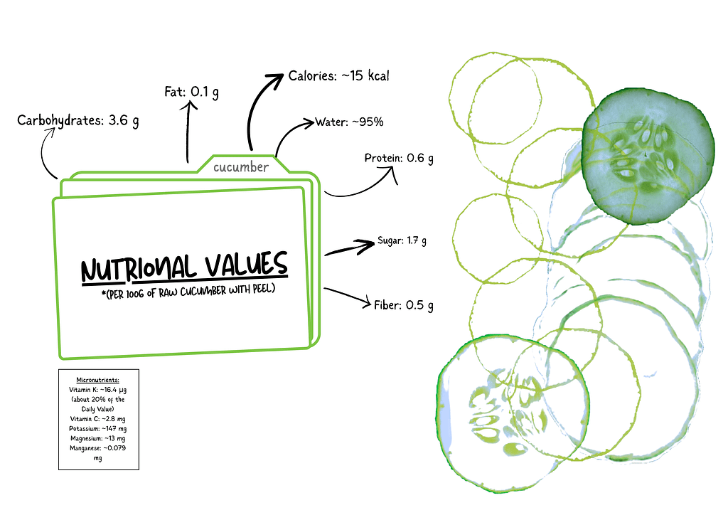
Here I thought I’d do a minimalistic healthy spin to it and chose a cucumber. I love the cross section that used, it makes me very happy and I think it looks very clean. I really tried to have a playful spin on it.
| Time | Activity |
|---|---|
| 07:30 | Alarm went off |
| 07:35–07:50 | Shower |
| 07:50–08:10 | Got dressed (changed twice) |
| 08:10–08:25 | Makeup |
| 08:25–08:40 | Hung out with boyfriend |
| 08:40–08:50 | Cleaned dishes |
| 08:50–09:15 | Bus to school |
| 09:15–09:25 | Stopped at Albert Heijn |
| 09:25–09:30 | Arrived at school |
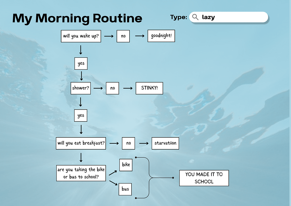
I realized I didn’t do an infographic on my morning routine with words and numbers so I wanted to do that inspired by this type of quiz.

I came up with this:
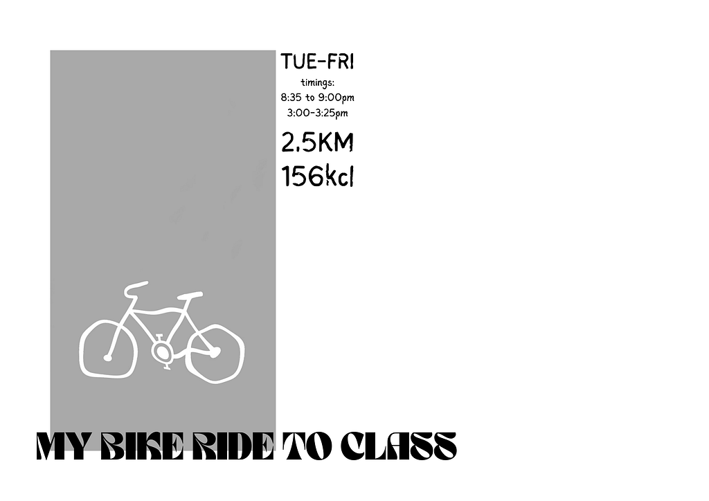
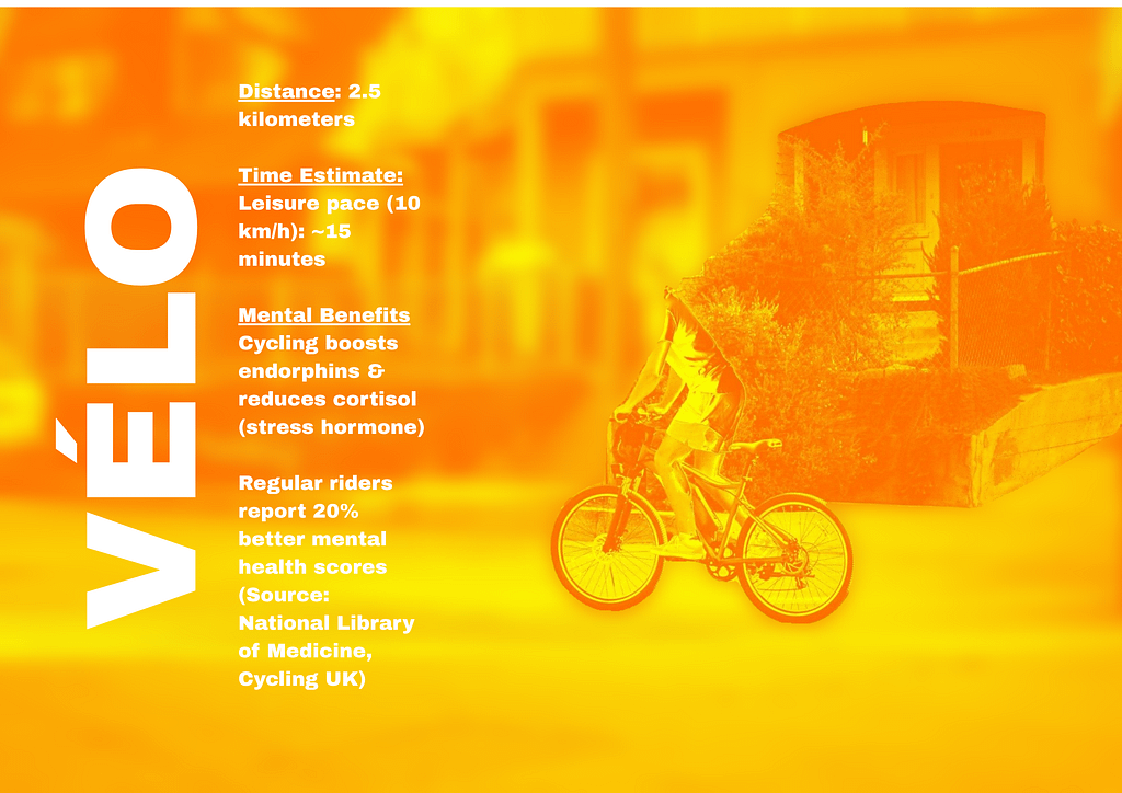
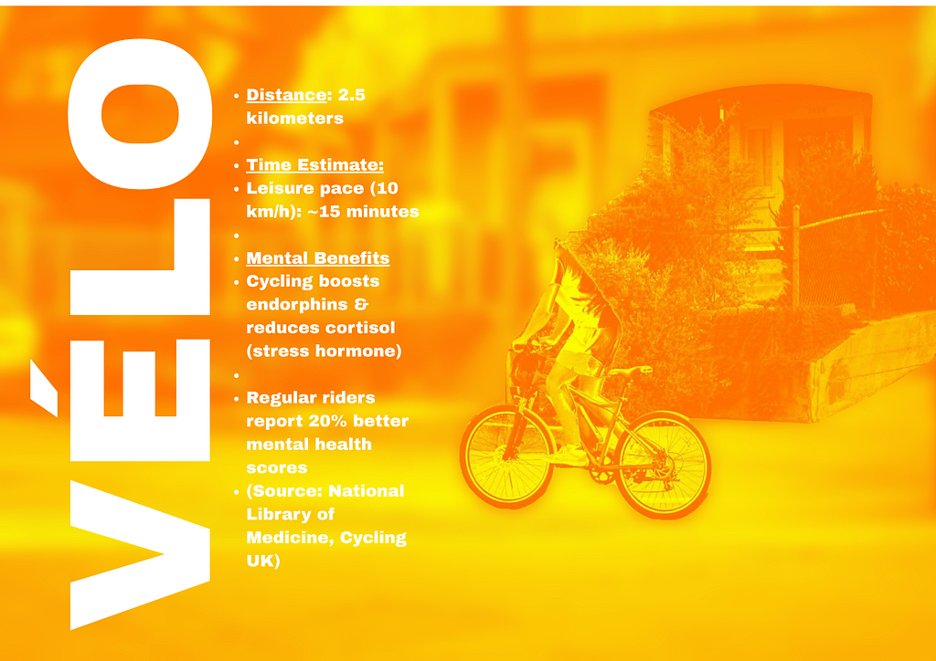
Now for the inforgraphic of my bike ride to class. I was truly stuck on that one because how can you make a bike ride interesting? I started with this to make it look like an event. I wanted to make it look fancy but the font and the structure is not good and doesn’t look like an event people want to attend. So I thought “okay how can we make this exciting? what’s a poster i’d see for a bike ride that i’d actually go to?” and then came the second idea.
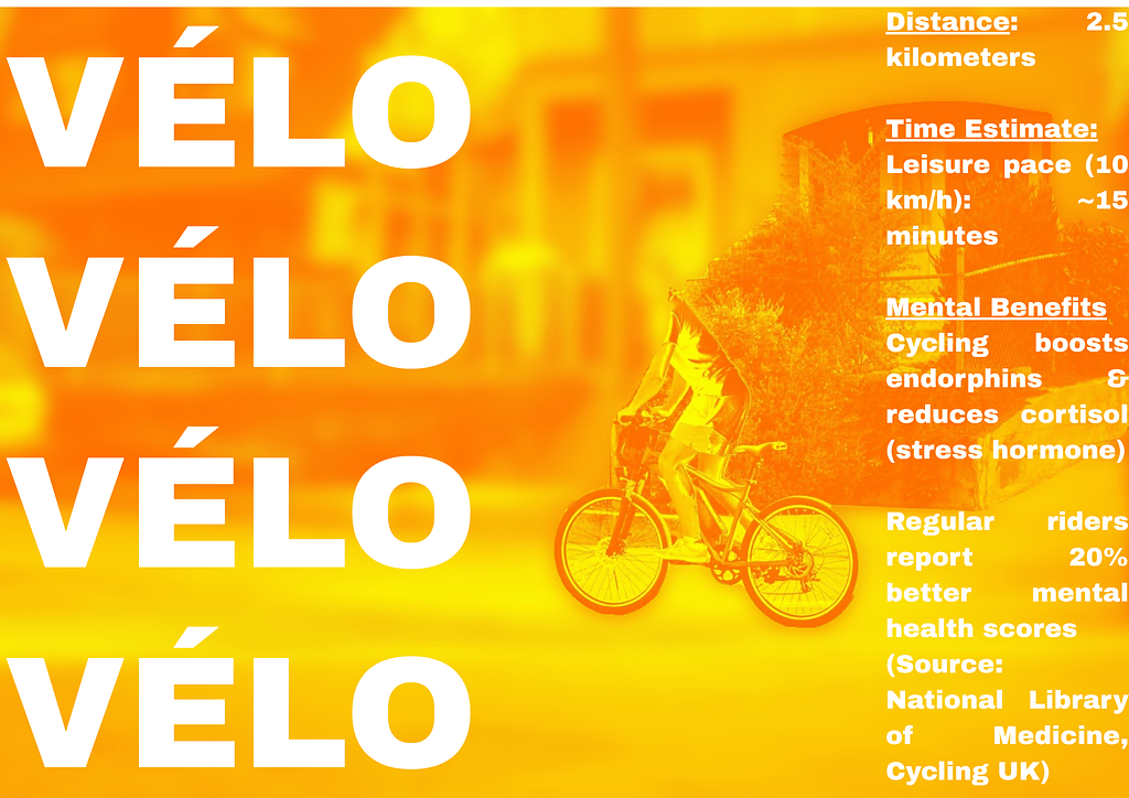
I took some feedback from teachers and tried to change the lettering and typography around.
THE STATE OF THE ART
For the visualization of data from my school. I gathered as many students as I could that do the following 5 design profiles:
- product
- spatial
- graphic & interactive
- animation & illustration
- time based
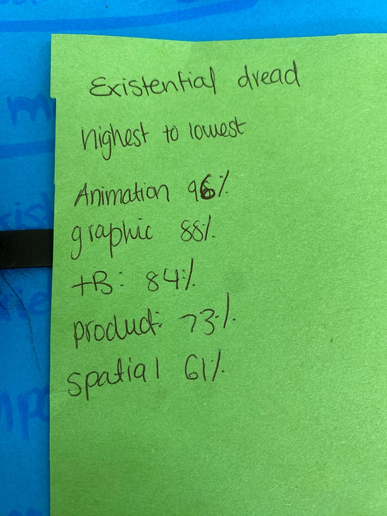
The uncontrolled variable was the following emotions they experience in a week:
- existential dread
- brief delusions of grandeur
- imposter syndrome
- creative euphoria
- desire to drop out
| Emotion | Product | Spatial | Graphic | Animation | Time Based |
|---|---|---|---|---|---|
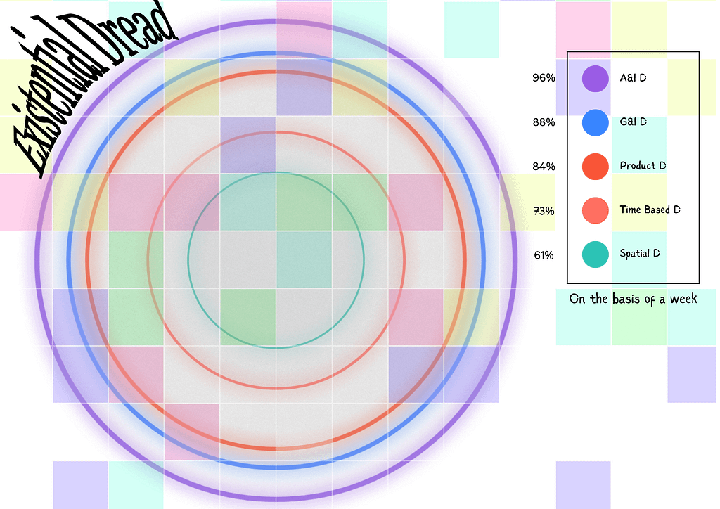
| Existential dread | 73% | 61% | 88% | 96% | 84% |
| Brief delusions of grandeur | 52% | 45% | 68% | 70% | 59% |
| Imposter syndrome | 91% | 77% | 92% | 89% | 90% |
| Creative euphoria | 21% | 39% | 33% | 28% | 42% |
| Desire to drop out | 64% | 58% | 74% | 81% | 77% |
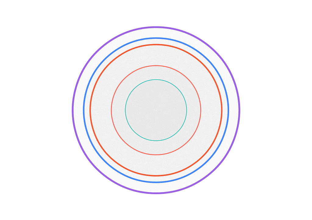
I started with making rings for the different classes.
- product design: red
- spatial design: green
- graphic and interactive design: blue
- animation and illustration design: purple
- time based design: orange
Which then this infographic is for all the design students across the five profiles that exeprience existential dread throughout a week.
It then turned into this:
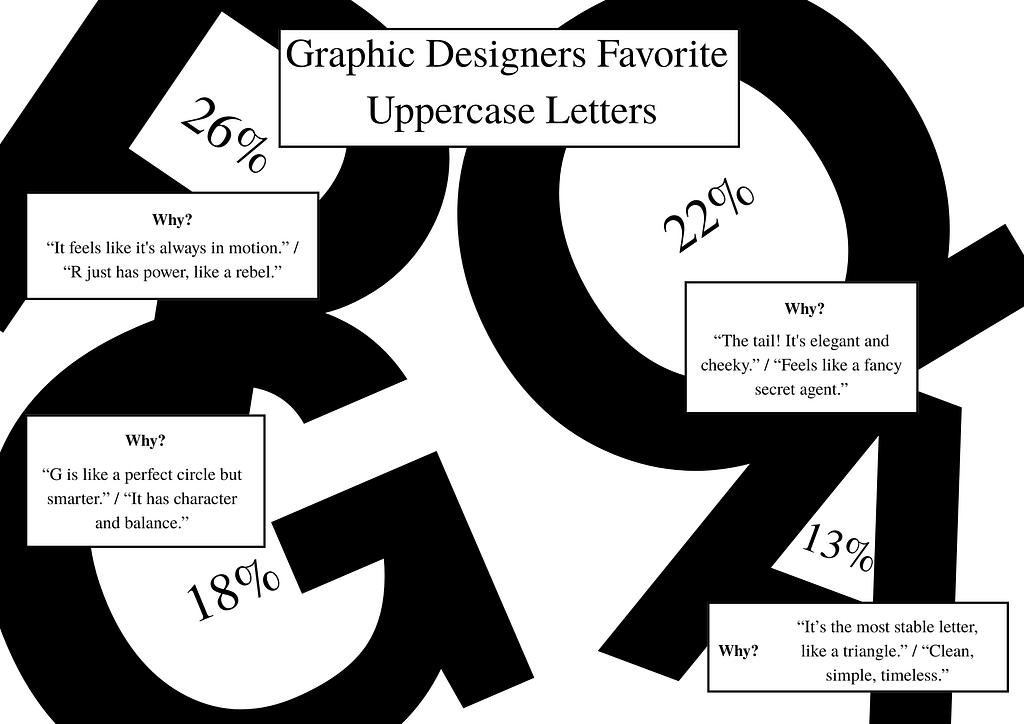
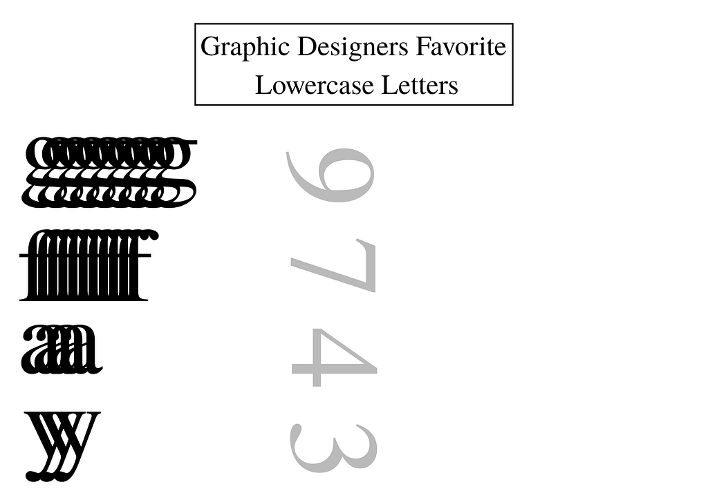
My next idea was to play with typography and implement that however I could. I wanted to ask graphic design students their favorite letter (uppercase and lowercase).
Uppercase Letters – Percent of Students Who Chose It
| Letter | % of Students | Why (general answer) |
|---|---|---|
| R | 26% | “It feels like it’s always in motion.” / “R just has power, like a rebel.” |
| A | 22% | “It’s the most stable letter, like a triangle.” / “Clean, simple, timeless.” |
| G | 18% | “G is like a perfect circle but smarter.” / “It has character and balance.” |
| Q | 13% | “The tail! It’s elegant and cheeky.” / “Feels like a fancy secret agent.” |
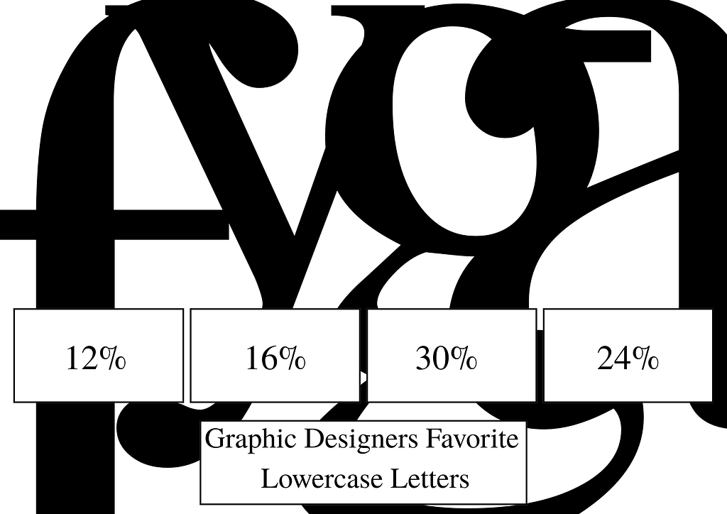
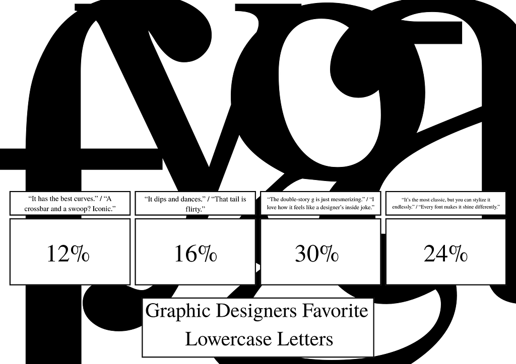
Lowercase Letters – Percent of Students Who Chose It
| Letter | % of Students | Why (general answer) |
|---|---|---|
| g | 30% | “The double-story g is just mesmerizing.” / “I love how it feels like a designer’s inside joke.” |
| a | 24% | “It’s the most classic, but you can stylize it endlessly.” / “Every font makes it shine differently.” |
| y | 16% | “It dips and dances.” / “That tail is flirty.” |
| f | 12% | “It has the best curves.” / “A crossbar and a swoop? Iconic.” |
I also decided to make one for lowercase letters and actually preferred it way more than the uppercase letters.
Then I added some quotes:
I had another idea that i could make an infographic about what the students of minerva are buying. It started with this but I got stuck.
sick!