Week 5
First tryout with the grid, but more to come.
First tryout with the grid, but more to come.
mockup 1
Mere example of personal photography in ling with the text, the bird overlays have to be switched out as I have not cleared royalties in… Read More »Week 5 // mere experiment

I tried to make the first few drafts this week and decide on a grid and how I want to use typography and images. I… Read More »WEEK 5 DRAFTS
Softsuck by Thomas Schostok, Essen (Germany), 2021 Affiche de teatro, Martin Flores Cardenas, Buenos Aires (Argentina) Stüssy, HQ in California, 2020

Dit waren mijn eerste ontwerpen. Het was heel gestructureerd en toen ben ik wat meer gaan spelen.
Volkskrant Magazine Rolling Stone Magazine Fun playing with grid Dit is niet van een specifiek magazine maar ik vind het leuk hoe ze hier de… Read More »WEEK 4

The following magazines serve as inspiration due to a strong ethic of experimentation within the design choices made behind each issue. The often out of… Read More »Week 4 // Honours Review Assignment: Editorial Design Inspo

pondered whether an asterisk is a punctuation mark or not (for longer than I’d like to admit) uppercase Q and lowercase r differences, followed by… Read More »Week 3 // Pirates and Clones

Chose photo #1 for this assignment and simplified the overly dense grid. Messed around too much with leading, kerning and tracking in task A, leading… Read More »Week 2 // DETAILED TYPOGRAPHY GRID

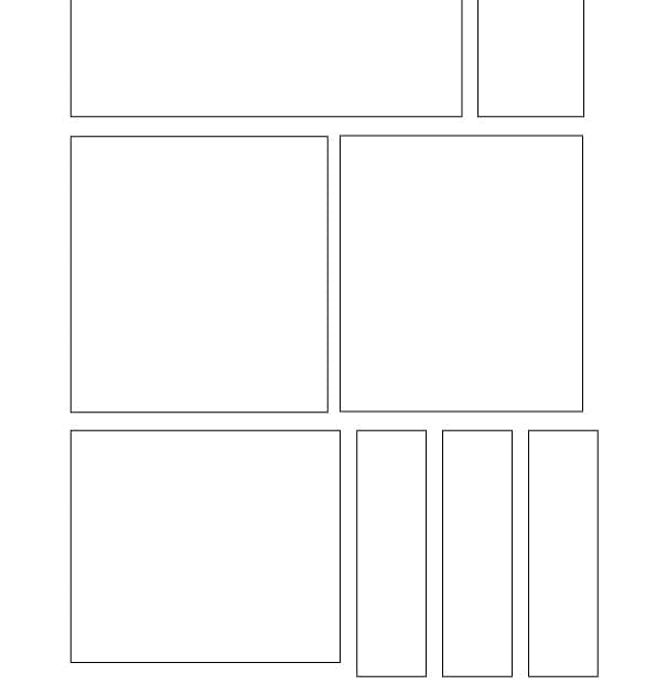
*rigged the assignment a bit and ended up using my kitchen for reference photos as well Stuck to strictly horizontal and vertical lines while creating… Read More »Week 1 // GRID
I felt as though this magazine is really relevant to this project because it is really fun to look through. Bright colours and a range… Read More »Task 4- Editorial Design

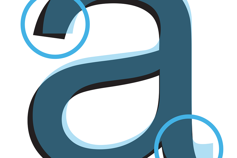
There was a lot more differences than I expected there to be, and the differences themselves weren’t what I was expecting. Arial has a lot… Read More »Task 3- Helvetica/ Arial

I really enjoyed the challenge of this task. It was important to establish hierarchy but it was hard to do this with the limitations we… Read More »Task 2- Typography Grid

These are my 3 final layouts from grids created from picture of my room. I have a lot of grid-like areas in my room that… Read More »Task 1- Bedroom Grids
Research / inspiration 2. The Gentlewoman magazineWhat I liked here is the use of different font sizes. 3. New Yorker magazineWhat I liked most about… Read More »week 4 Honours Review
Inspirations apartemento thrasher slap magazine

Inspiration/Research: Shira Inbar Shira Inbar – No Man’s Land Magazine, Issue 4 BusyBuilding – National Theatre of Greece When I think of Coming of Age… Read More »Honours Review Drafts + Cover

Assigment 3 was to layer the fonts Arial and Helvetica over eachother to see the differences. With my result I wanna show the differeces and… Read More »Douwe Week 3

The 2nd assignment was to fit the 3 part text inside one of the grids. 1st we had every text the same size, then we… Read More »Douwe Week 2

The grid from room photo’s assignment I first made grid’s of the photo’s in Illustrator, I then added the text to it in indesign

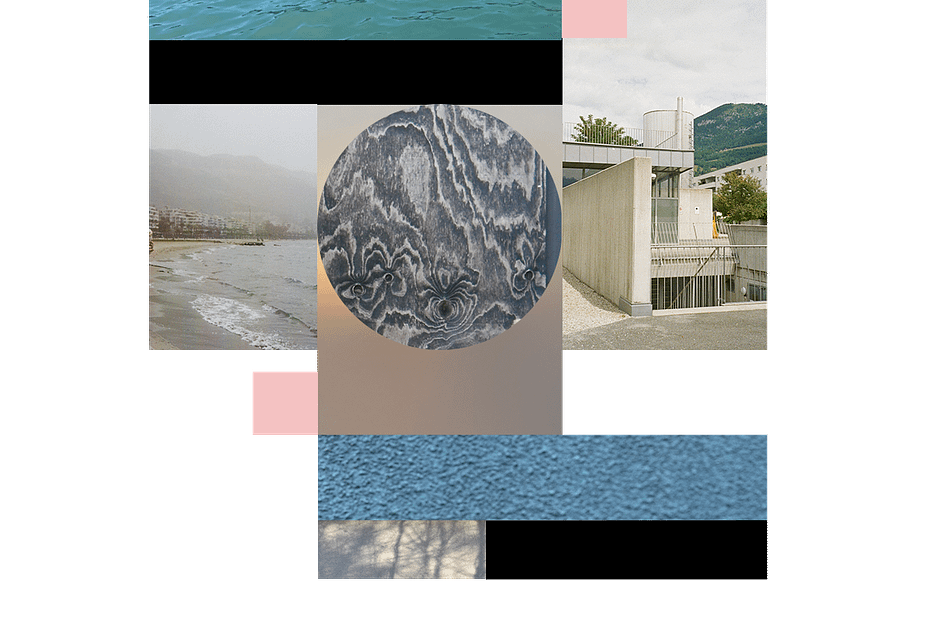
Instead of searching through existing magazines, from the first week, I stepped outside with my camera, letting the world around me inspire my vision for… Read More »Honours Magazine week 1

Inspiration/research INTRUSO magazine – by Trinidad Tamayo and Chiara Chiavazza BIURO magazine – by Karolina Pietrzyk ZOOM magazine –
This assignment was really interesting because I discovered something I liked and thought looked cool in typography. I read the article about fonts, and I… Read More »Pirates and Clones (WEEK 3)
In this assignment, I used the grids that I used for week 1, with no text, just frames of the grid I made from my… Read More »Detailed Typography Grid (WEEK 2)

Week One – Grid Exploration Week Two – Single Font Hierarchy Week Three- Helvetica Clones Week Four & Five- Honours Review Pinterest Finds Issuu.com Magazines… Read More »Anne M Design Journal (Later completion)
These were the pictures I chose of my room, I find grids everywhere I look because of the posters, furniture, etc. So it was easy… Read More »Start Assignment: Grid (WEEK 1)

For inspiration I tried finding some magazines that reflect the topic “coming of age” well in my opinion. I looked for dynamic, chaotic, bold, colorful… Read More »WEEK 4 MAGAZINE INSPO
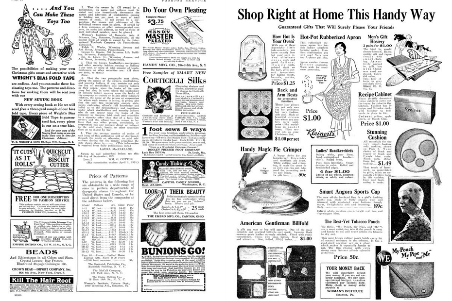
Research / inspiration In general, I chose these magazines not just for their design but mainly to observe the grid systems used in the past… Read More »WEEK 4 Editorial Design
I chose Idea magazine as it also balances a kind of minimalist communicative approach with on the other hand very interesting experiments with Type. Creating… Read More »Week 4 Magazine layouts
I chose this magazine as an inspiration because I find the way the grid is used here very visually interesting. Especially the placement of typography… Read More »4. Editorial Design
SCROLL DOWN FOR THE LATEST UPDATE ON 06.05.2025! 1. Type One – Issue 6 Why it’s interesting:Type One is a magazine dedicated to typography and… Read More »4 Designing a Magazine: Honours Review

At first glance, Helvetica and Arial may seem identical, but typography is all about details. In this assignment, we dive into the subtle yet significant… Read More »3 Helvetica vs. Arial: Spotting the Differences

For this assignment, I selected one of my previous grids as inspiration and reshaped it into a simplified version using only horizontal and vertical lines.… Read More »2 Detailed Typography Grid: Structuring Information

For this assignment, we were tasked with placing the lyrics of GRID by Public Enemy into a grid inspired by a structure in our room.… Read More »1 Visualizing Lyrics Through Structure