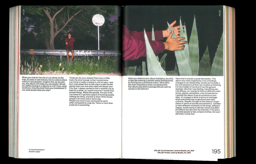
For inspiration I tried finding some magazines that reflect the topic “coming of age” well in my opinion. I looked for dynamic, chaotic, bold, colorful and emotional designs.
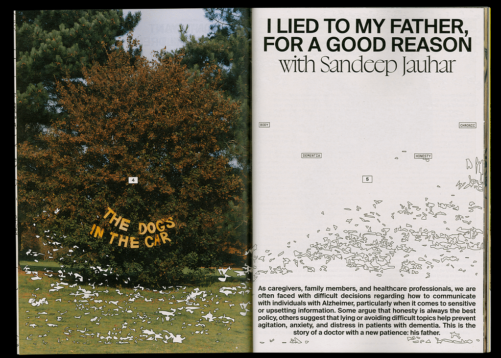
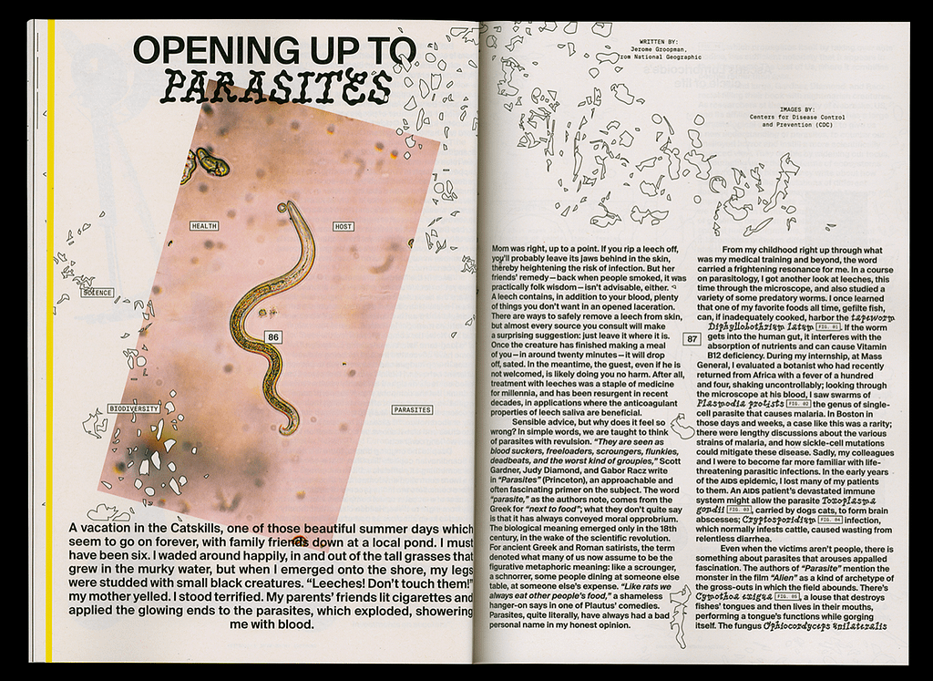
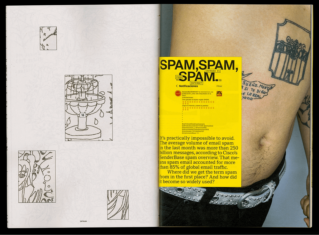
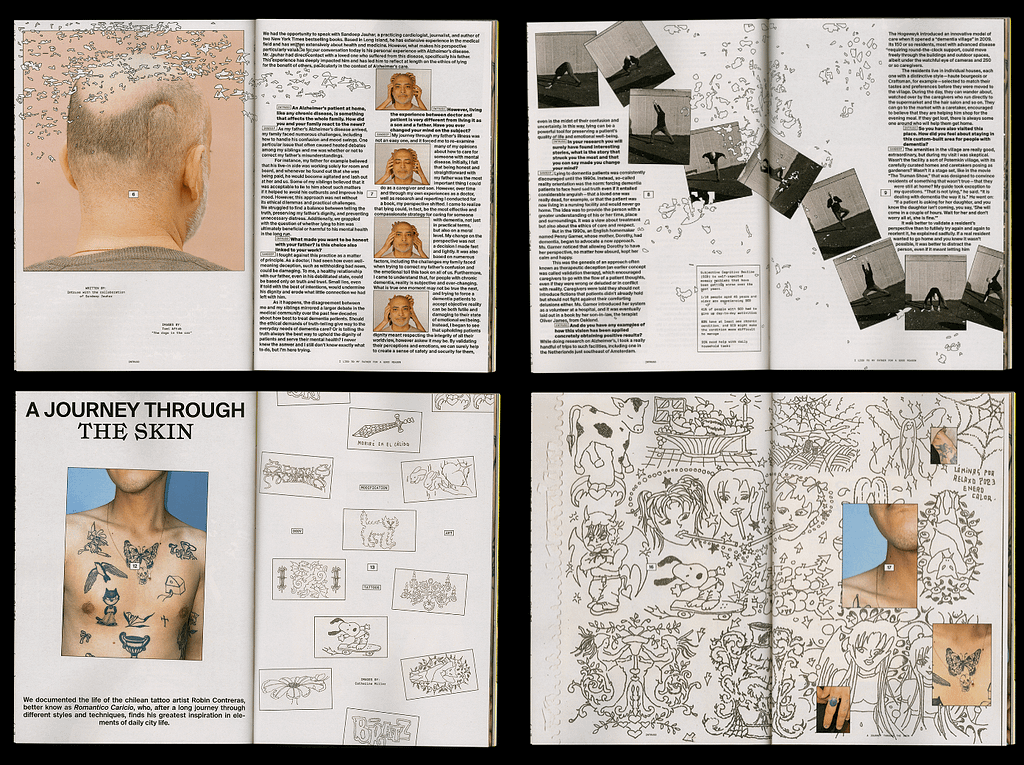
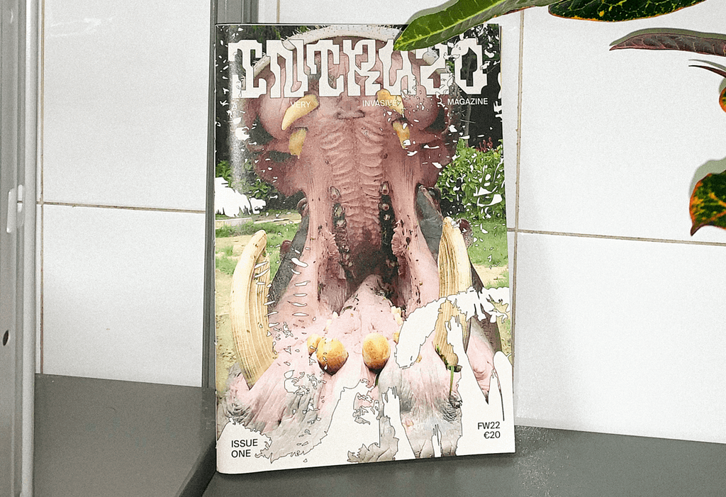
1. INTRUSO MAGAZINE
This magazine focuses on leaving the comfort zone and deals with topics all around challenging
pre-established boundaries.
The Layout I feel like represents this very well – It has a flexible free flowing key visual, that spreads
over all pages, it works with photography in a very dynamic way too and overall encapsulates a
very youthful feeling
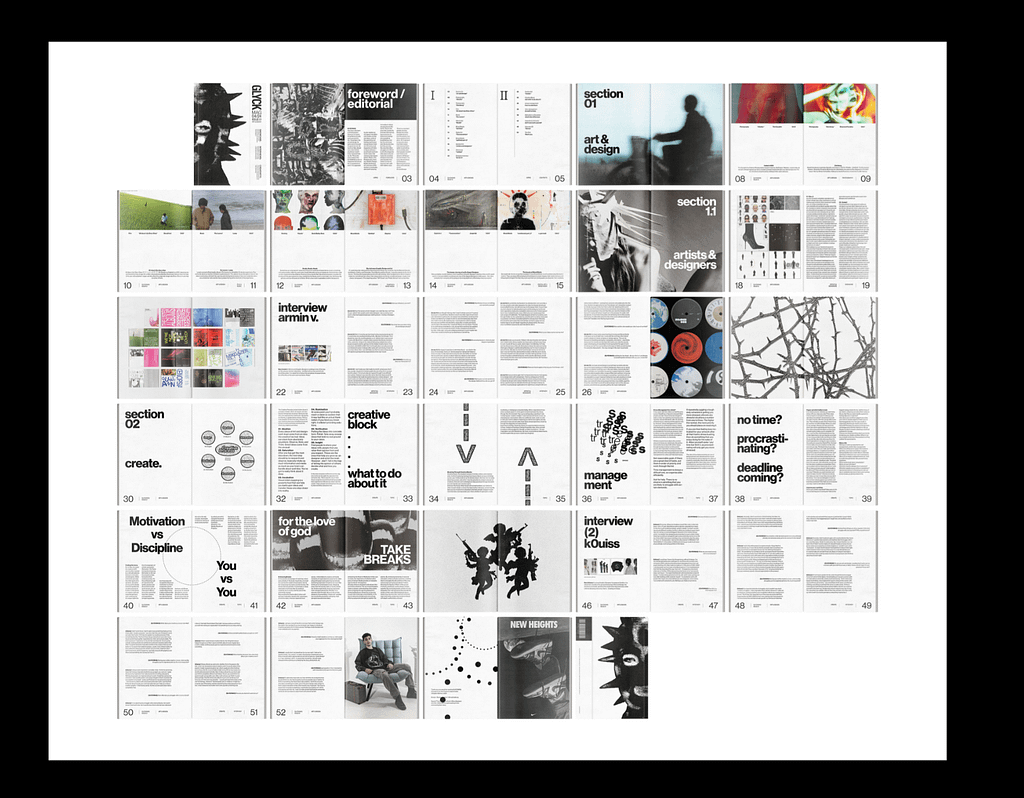
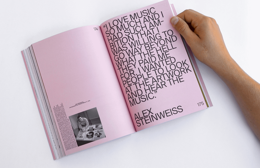
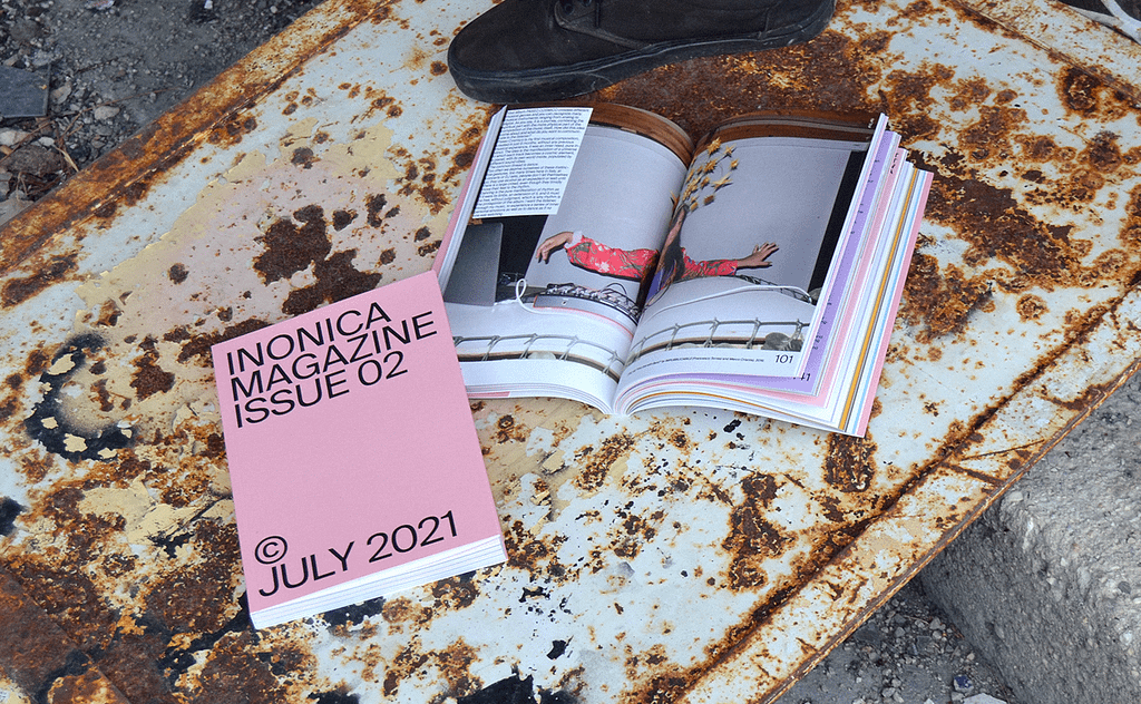
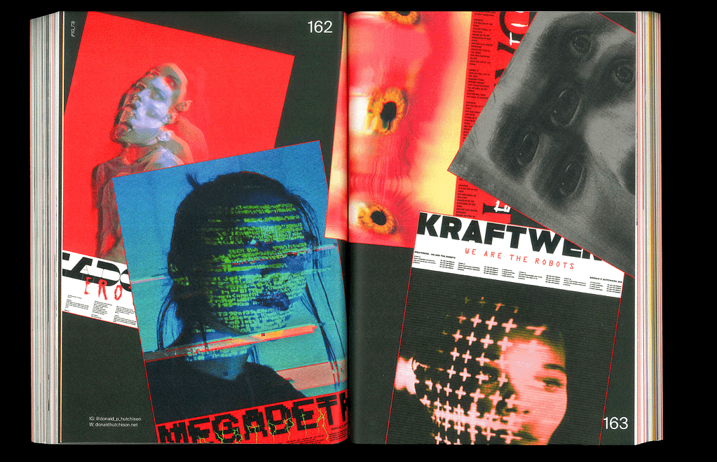
2. ICONICA MAGAZINE
I really like the use of color and typographic elements in this magazine, it is legible and structured,
but playful at the same time
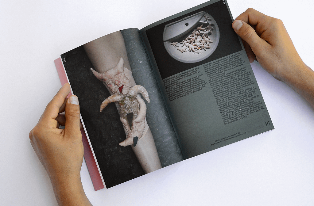
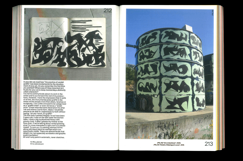
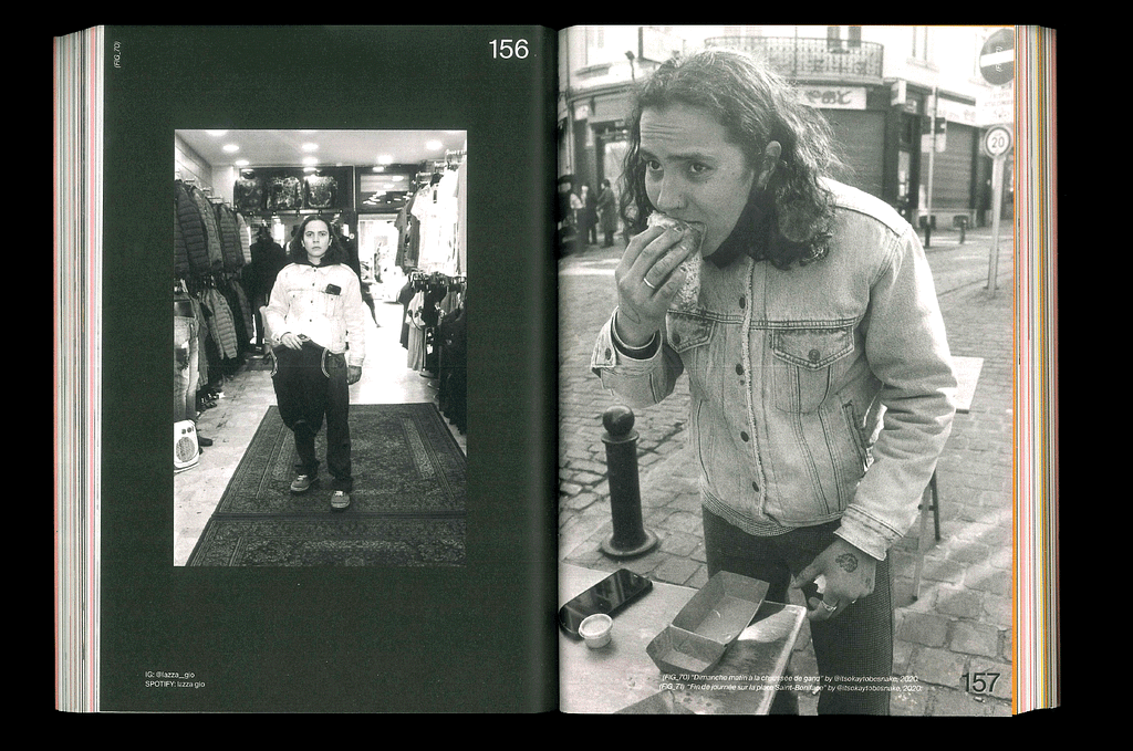
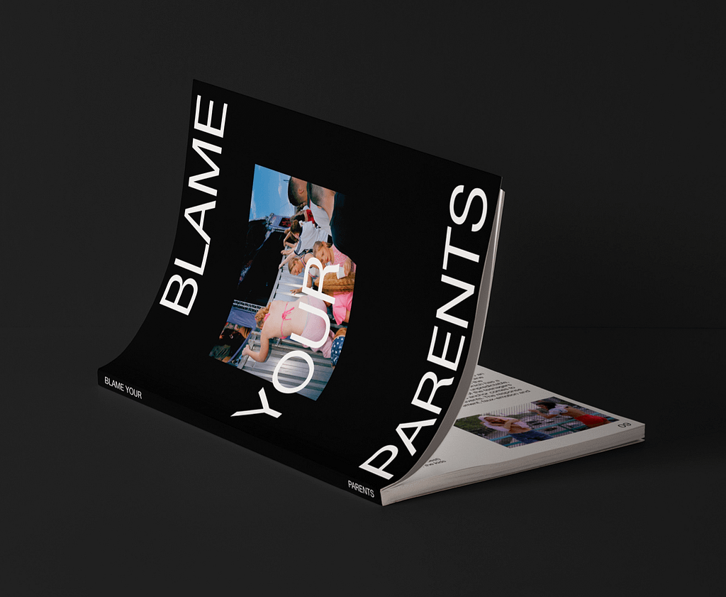
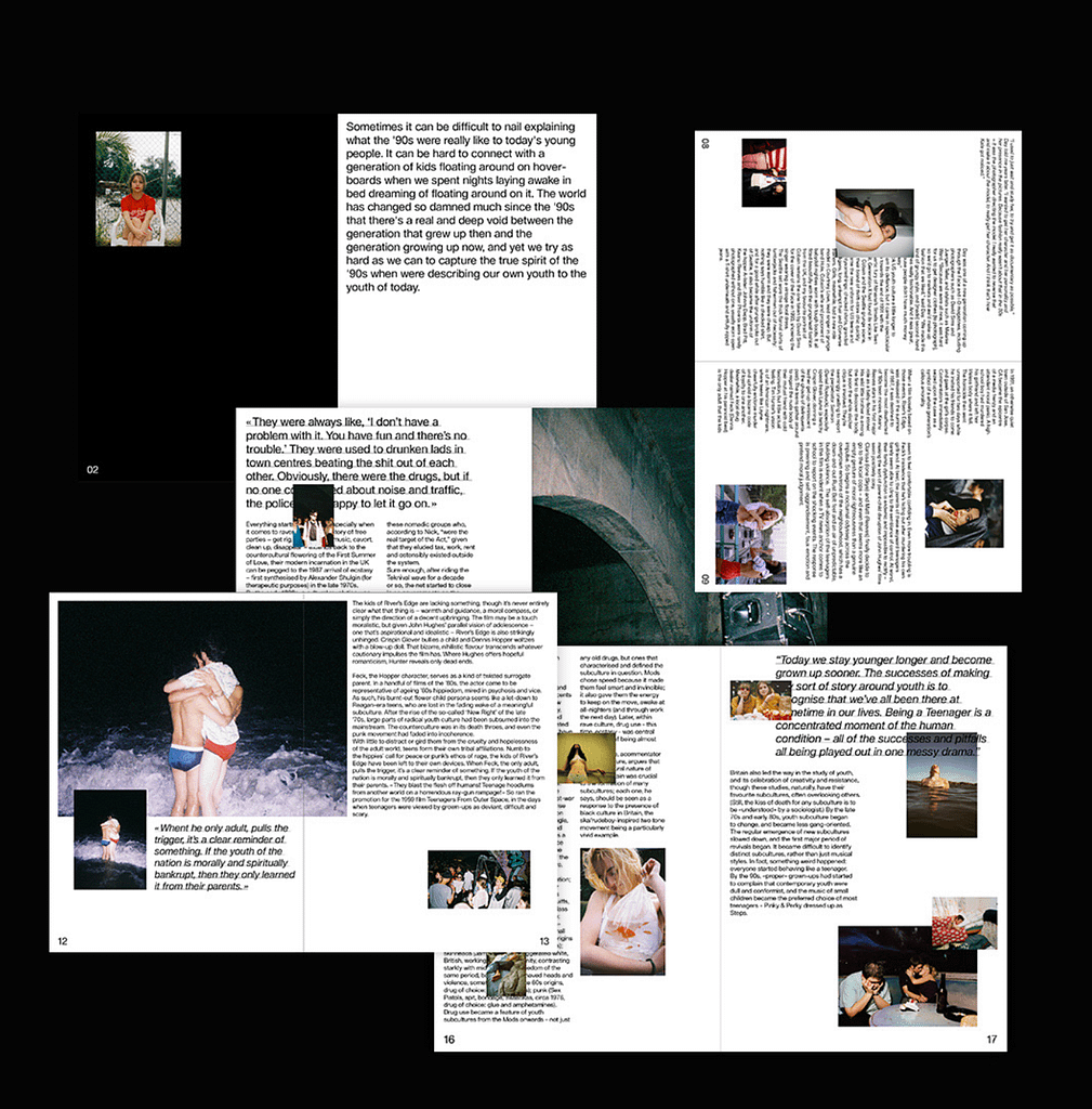
3. BLAME YOUR PARENTS
This one is technically not a magazine, but an exhibition information brochure, however I chose it,
because I like the use of photography in this one a as well as how it interacts with the typography
…and although it barely uses any color it still has dynamic to it through the layout and the loose
placement of photography