The proposal I picked:
Process:
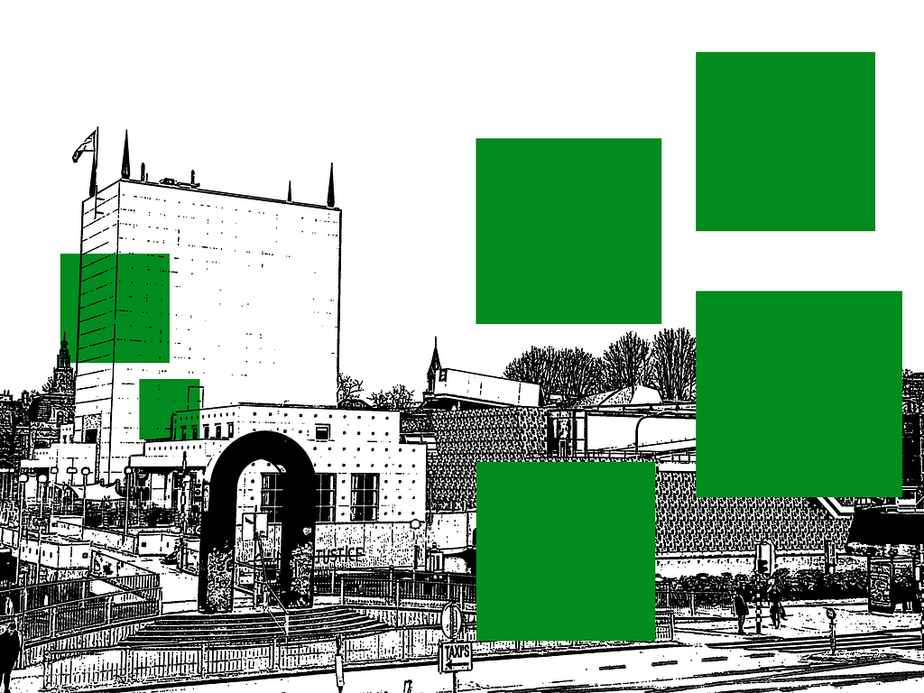
I chose my second proposal because I thought it was more fitting towards my target group. For this proposal I used colors that represent the city’s flag, green and white. I used a more expressive, readable font to make it a bit more interesting to look at. I also experimented more with the photography, I used a filter that makes the photo look more like an illustration. This design is more targeted to the people that live in Groningen and has a more playful and fun look.
The final magazine:
Process:
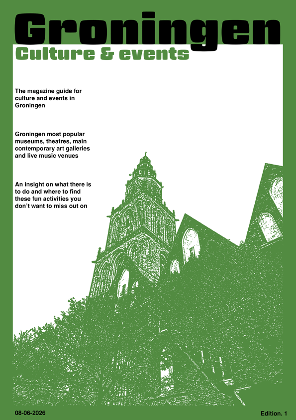
For the cover, I used a photograph I took of the Martinitoren. I added a title, subtitle, and several short text elements to give readers an idea of what the magazine is about. These elements are intended to attract attention, spark interest, and encourage people to read the magazine.
I also included the publication date and edition number. This makes it easier to distinguish between different issues and allows for future editions to be clearly organised and identified.
For the visual design, I applied a green and white filter to the photograph and used a green background. These colours I chose because they are in the Groninger flag, creating a stronger connection to Groningen and its residents. This filter and colors can be seen throughout the whole magazine.
Process:
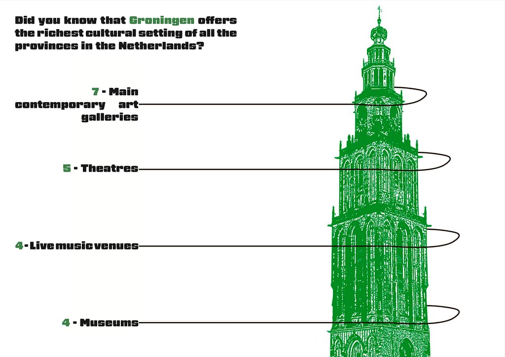
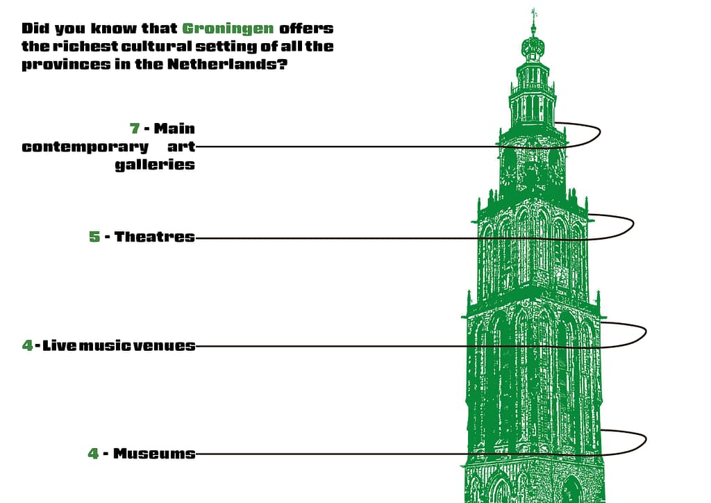
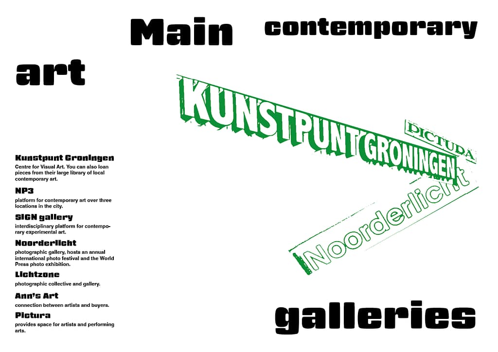
For my first spread, I created an infographic that also serves as an introduction to the magazine. It provides readers with a quick and accessible overview of the content. For this spread, I used a photograph I took of the Martinitoren and applied a green and white filter to match the visual style of the magazine. I then imported the image into Illustrator, where I added the lines for the infographic.
Process spread 3 and 4:
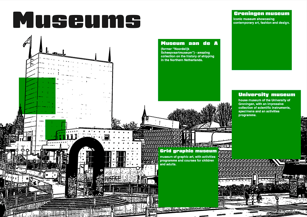
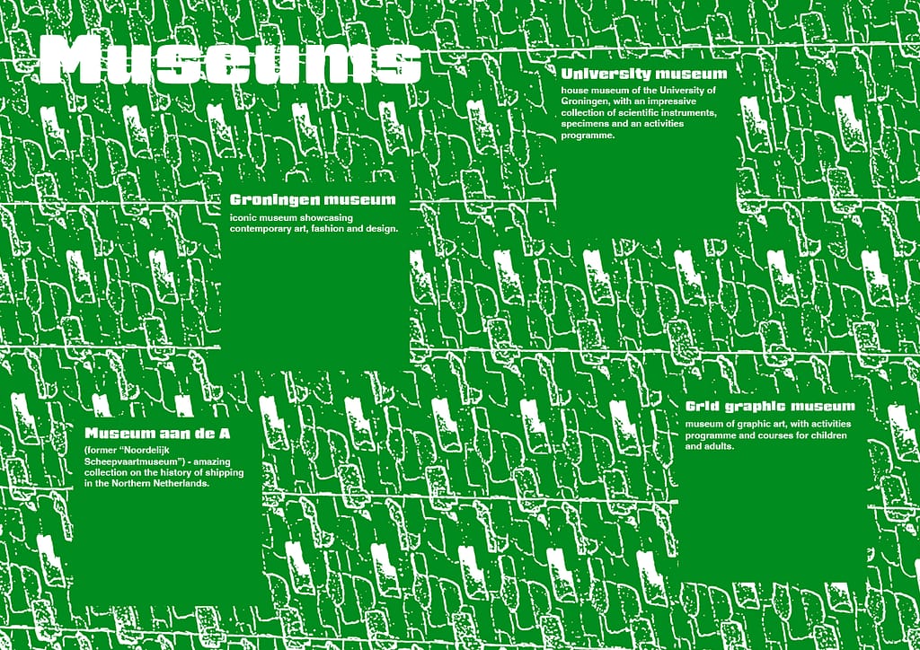
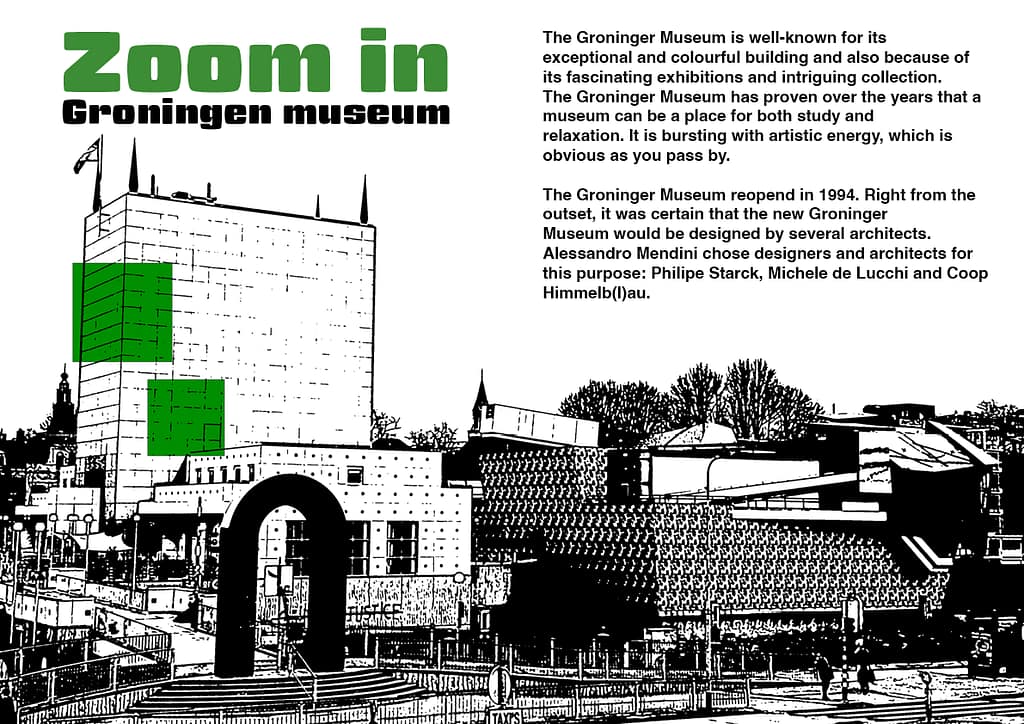
I swapped the images between these two spreads (after I made the version of the proposals) because I felt that the photo of the Groningen Museum suited the spread about the Groningen Museum better. I also think the green background image works better on the first spread, as it has a more neutral look, which fits well with the broader range of topics covered there rather than focusing on a single subject. I also adjusted the lay out to match better with the background. In these spreads I also used photo’s that I took of the Groningen Museum and edited them in photoshop.
Process:
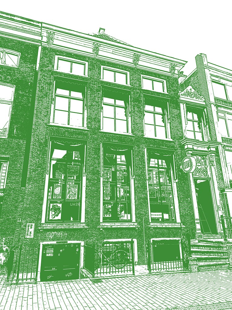
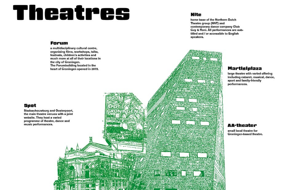
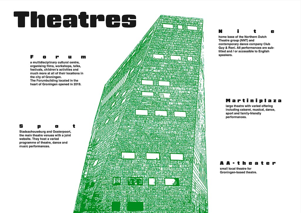
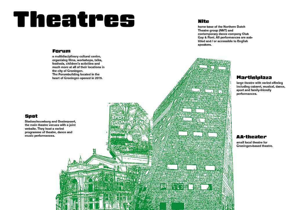
With this spread, I added more of the photos I took myself. These images show other theatres in Groningen, so the focus is not only on the Forum and readers also get a visual impression of the other locations. I also adjusted the text alignment so that all the text now starts from the left. In the previous version (proposal version), the headers were more spread out, but I felt this made the layout look too messy and visually not nice. That is why I decided to change it. I also changed the text layout to match the photos better. The photo’s I used are photo’s I took myself.
Process:
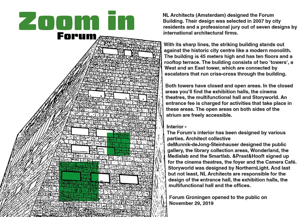
For this spread I used a photo I took of the building and edited it in Photoshop to give it a more illustrated look. I also slightly warped the text so that it follows the angle of the Forum’s right wall. I did this to reflect the building’s distinctive crooked lines, which helps create a more cohesive feel across the entire page.
Process:
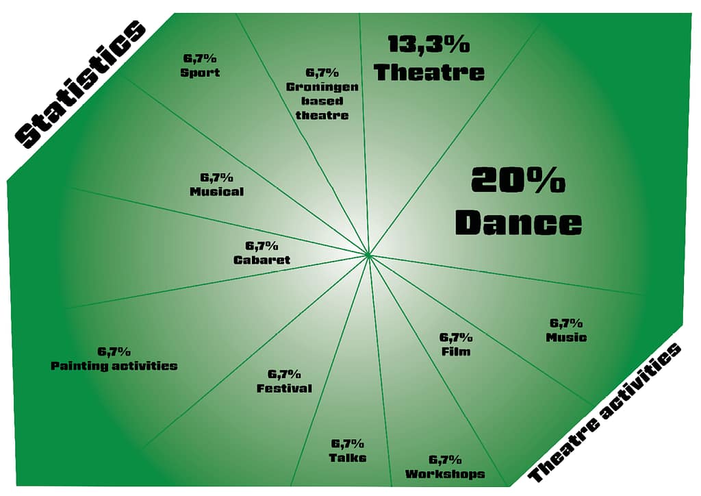
This is an infographic I created about the activities offered at the theatres, giving people a clear overview of what there is to do most often. The green shape is based on the logo of Spot, one of the theatres. I thought it would be a nice detail to incorporate an element from one of the theatres into the infographic design.
Process:
In this spread, I experimented more with the placement of text and photographs to create a visually engaging layout. The main body text is arranged in a clear vertical structure, which improves readability and helps guide the reader through the content in an organised way.
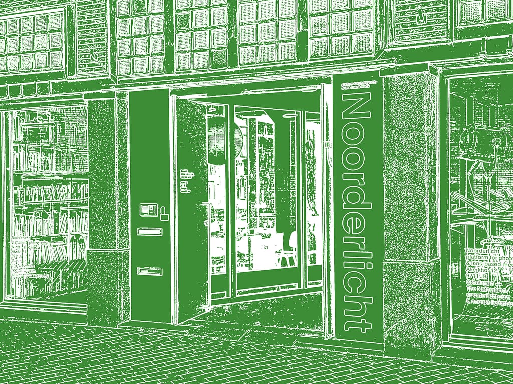
Process:
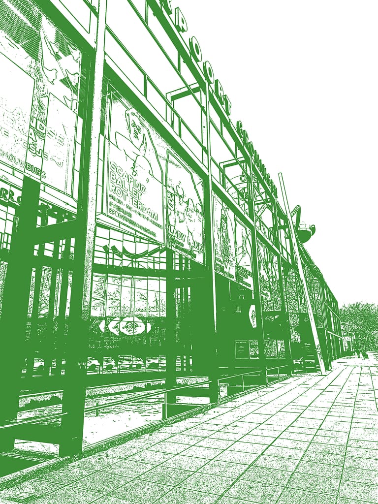
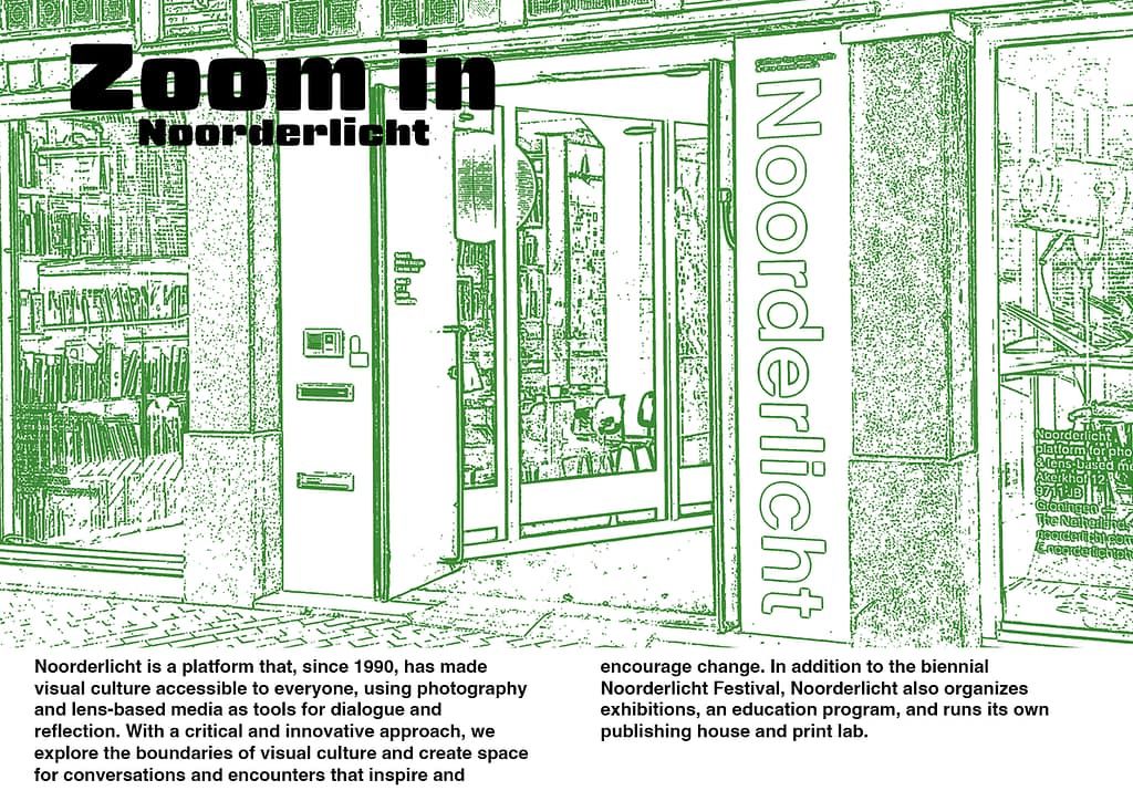
I used a photograph of the Noorderlicht building as the background, making it the main focus point of the spread. To improve readability, I placed the text on a white diagonal shape, ensuring the content remains clear and easy to read.
Process:
On the left side of the spread, I experimented more with the arrangement of text and photographs. Instead of using large images or cropped sections, I chose to display the full photographs in smaller blocks. This creates a more playful layout and helps reduce repetition throughout the magazine.
On the right side, I arranged the main body text in a clear vertical structure to maintain readability. This layout also creates visual consistency with the previous spreads, helping to still establish a cohesive design throughout the magazine.
Process:
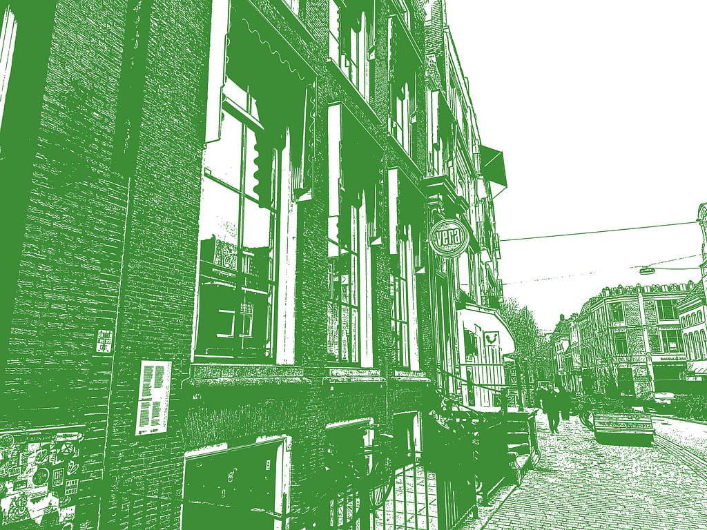
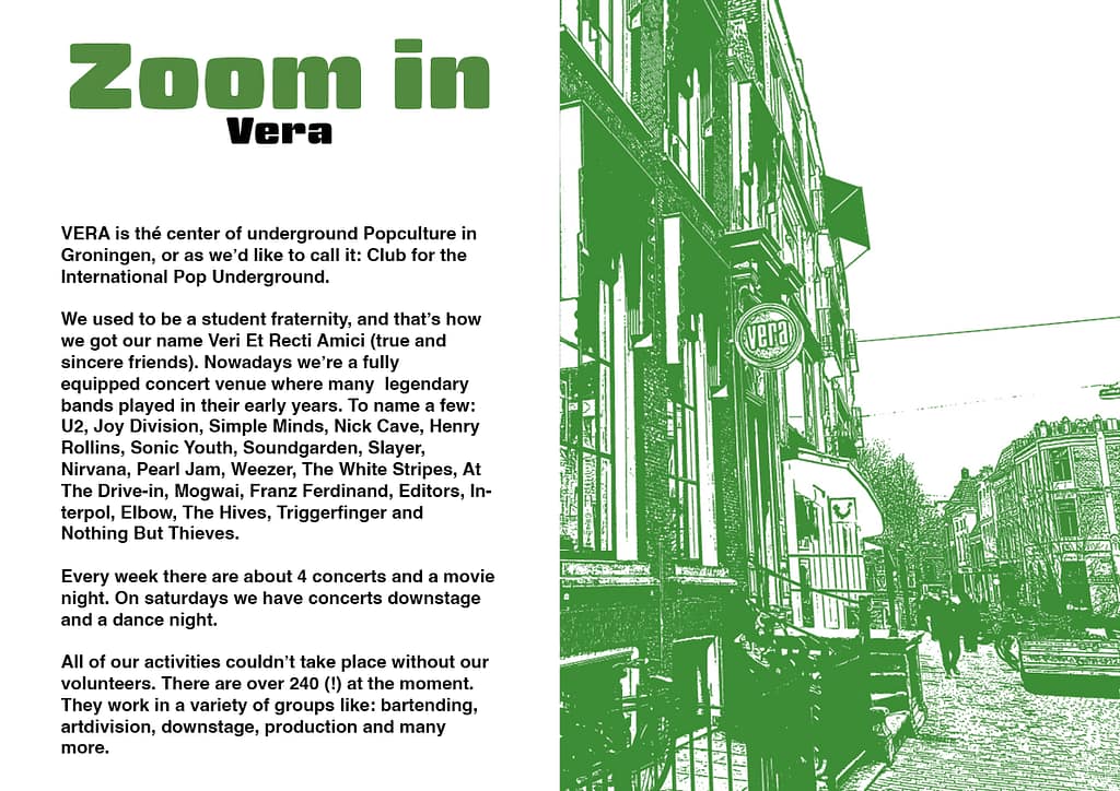
This spread focuses on Vera and provides a closer look at its building. I placed the text on the left page to keep all the information together in a clear and organised way. On the right page, I included a large photograph of the Vera building, giving readers a visual impression of the location and helping to complement the written content.
Process:
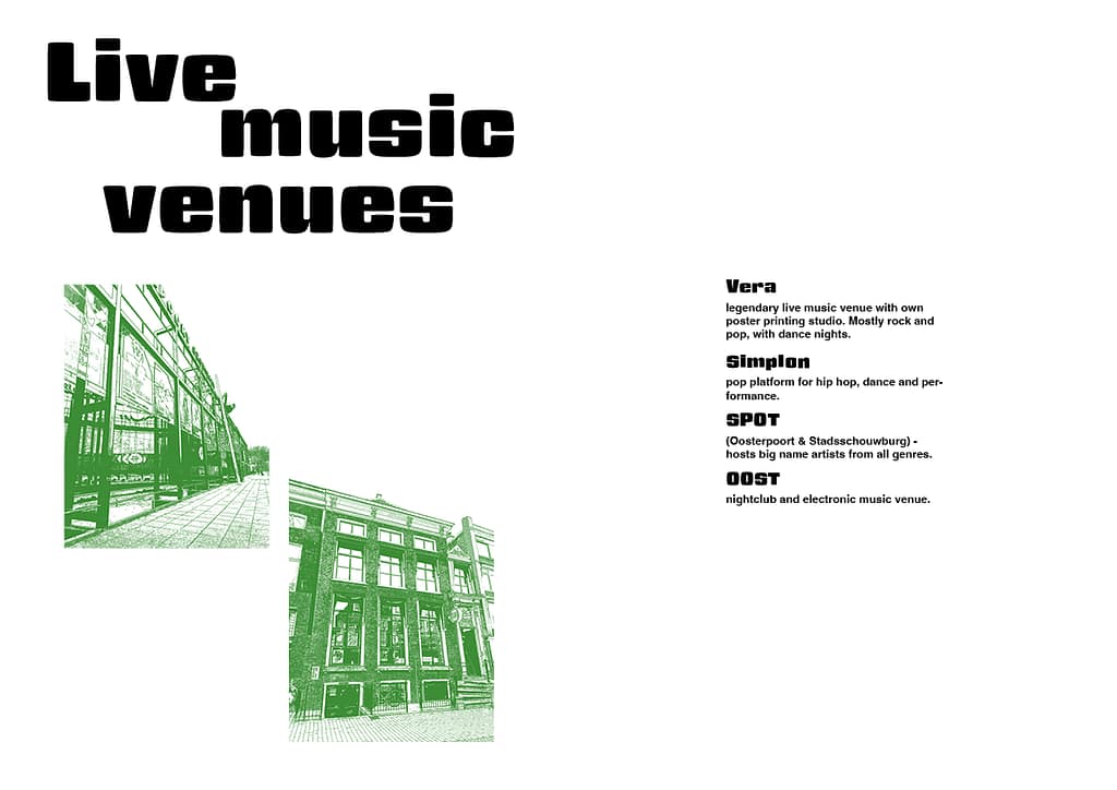
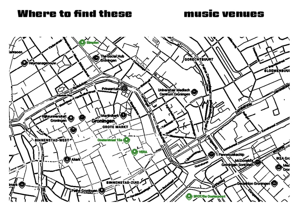
For this infographic, I used a map showing the locations mentioned in the “Live Music Venues” spread. This provides readers with a clear overview of where these venues are located and helps them find these places.
To keep the focus on the featured locations, I made the street lines black so they are less prominent. The music venues are highlighted, making them stand out clearly from the rest of the map. This approach also reinforces the magazine’s green and white colour scheme while ensuring that readers can quickly identify the most important information.
Process:
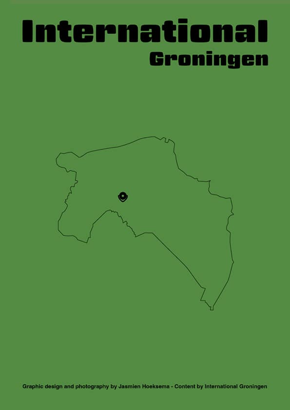
For the back cover, I used a green background to maintain consistency with the magazine’s visual identity. I created an illustration of the province of Groningen and added a location pin to indicate the position of the city, as the magazine focuses on culture and events taking place there.
I also included the name of International Groningen, as it was the primary source of information used for the magazine’s content. At the bottom of the page, I added credits to clearly distinguish between the work I created myself and the information obtained from International Groningen.
Process text size:
I chose to make the text bigger than the standard size, in my opinion this is better readable for everyone with makes sure the magazine can reach everyone in the target group.
Photography (some of the photo’s I made for this assignment):


Edited versions of the photo’s and illustration (edited in photoshop and illustrator):

One aspect of the design that I spent a lot of time experimenting with was the layout and also the image layout. I realized that using only a photograph of the Forum was not enough and that the spread would look more visually appealing if it also included images related to the other topics mentioned in the text.
I explored several ways of arranging these images within the layout. After creating different versions, I first developed the second option and eventually decided to use the third version, as it provided the most balanced and visually engaging composition.
For these spreads, I also experimented with different background images to determine which ones best suited the content and overall design. By comparing several options, I was able to choose backgrounds that complemented each spread more effectively and enhanced the visual connection between the images and the subject matter.
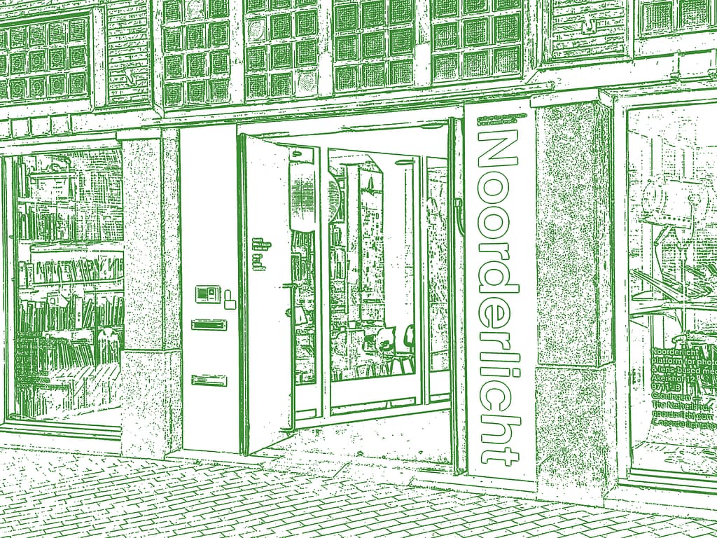
In this spread I played around with the filter to see what color I want to be more noticeable. I chose for white because it looks calmer.
Other edited photo’s and illustrations: