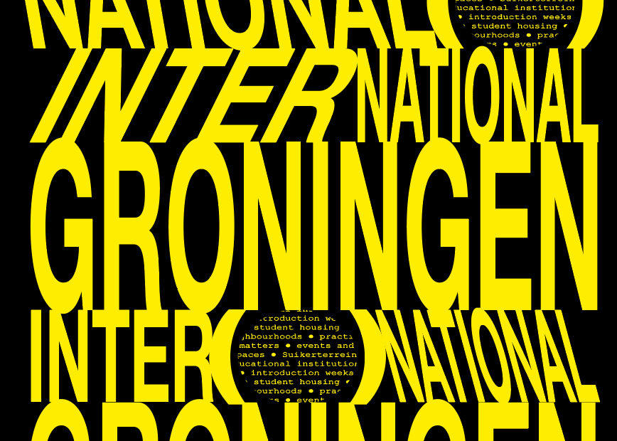
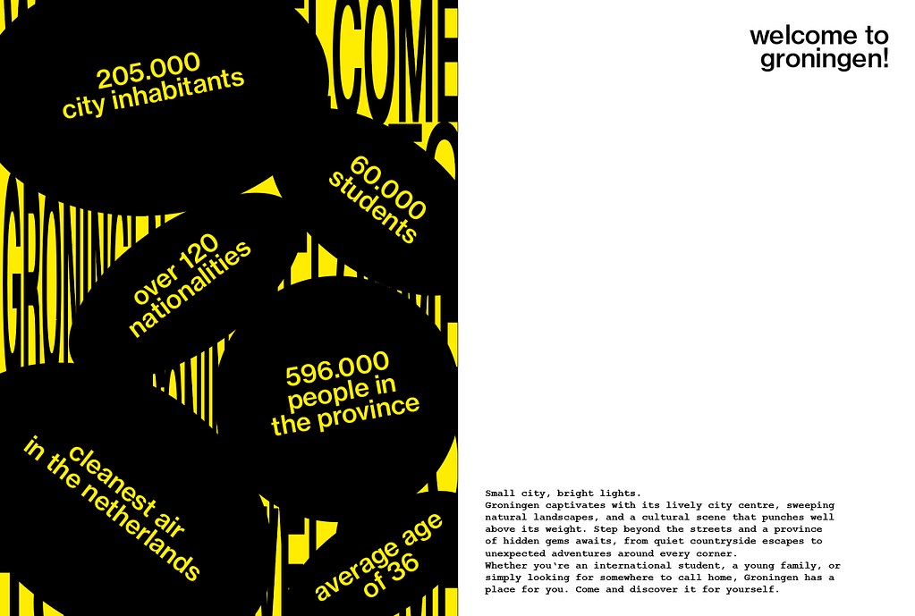
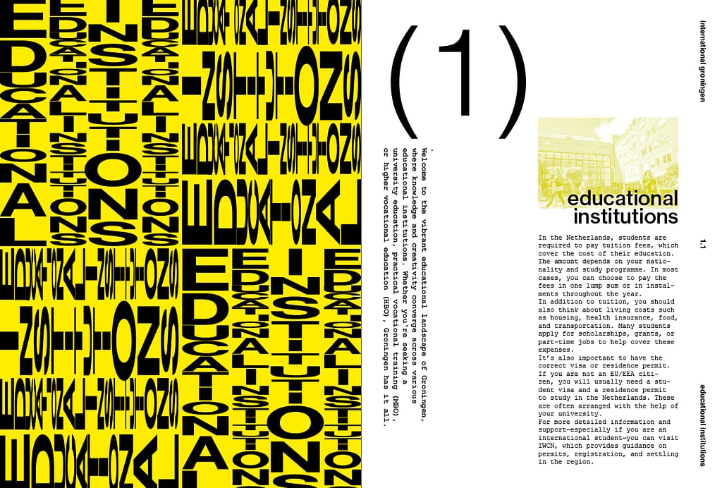
For the final design I decided to combine my two designs: experimental chapter opener pages and more minimal content pages. I went with the yellow from my experimental design as accent color, to convey energy, optimism and youth. It also supports the modern and bold typographic experiments.
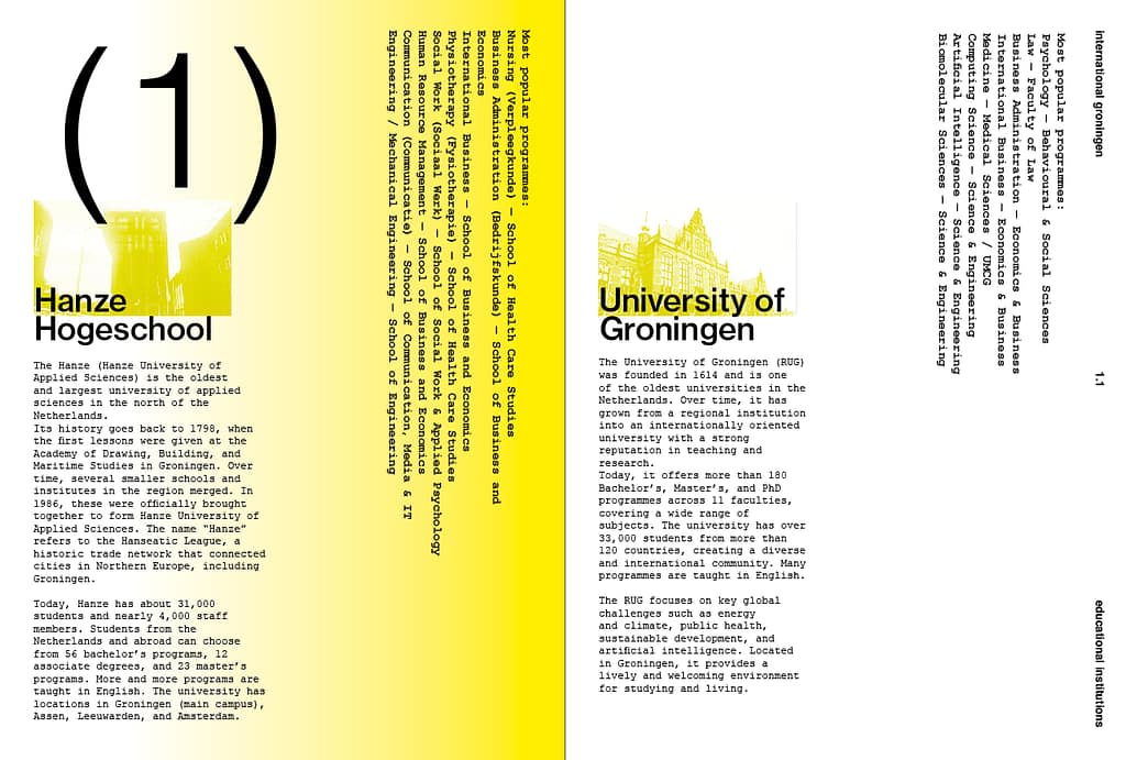
For the subheaders I chose Neue Haas Grotesk, a modern sans-serif that connects to the bold yellow. For the body text I went with Courier New, a serif typeface that contrasts the subheaders and connects to Groningen as a student city. Courier was originally designed for typewriters, which suits the university context.
Spreads:
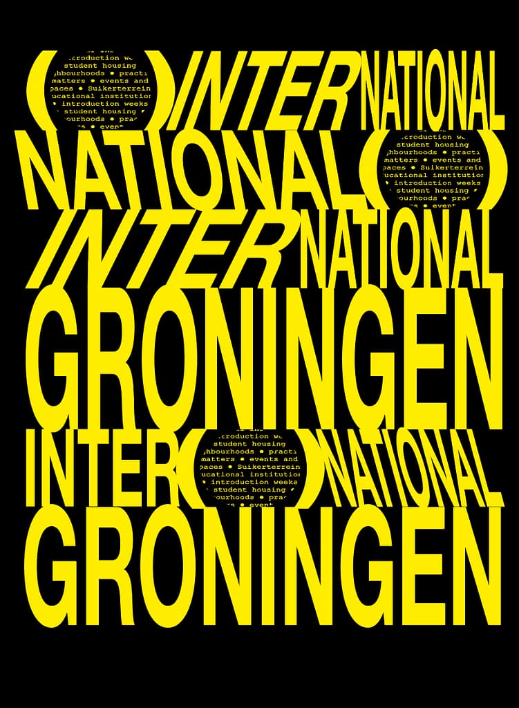
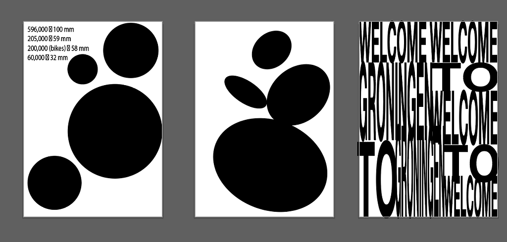
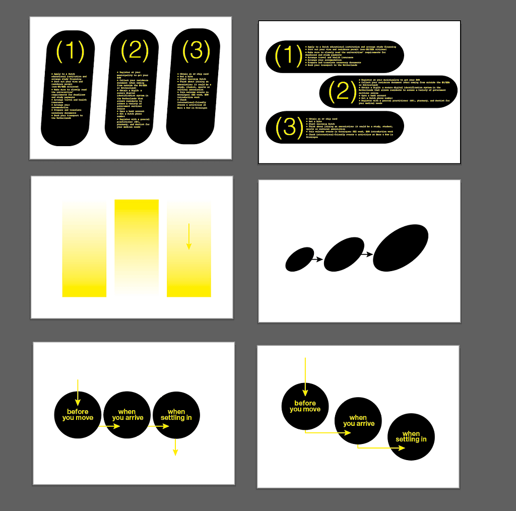
Infographic in progress:
Cover Design Progress:
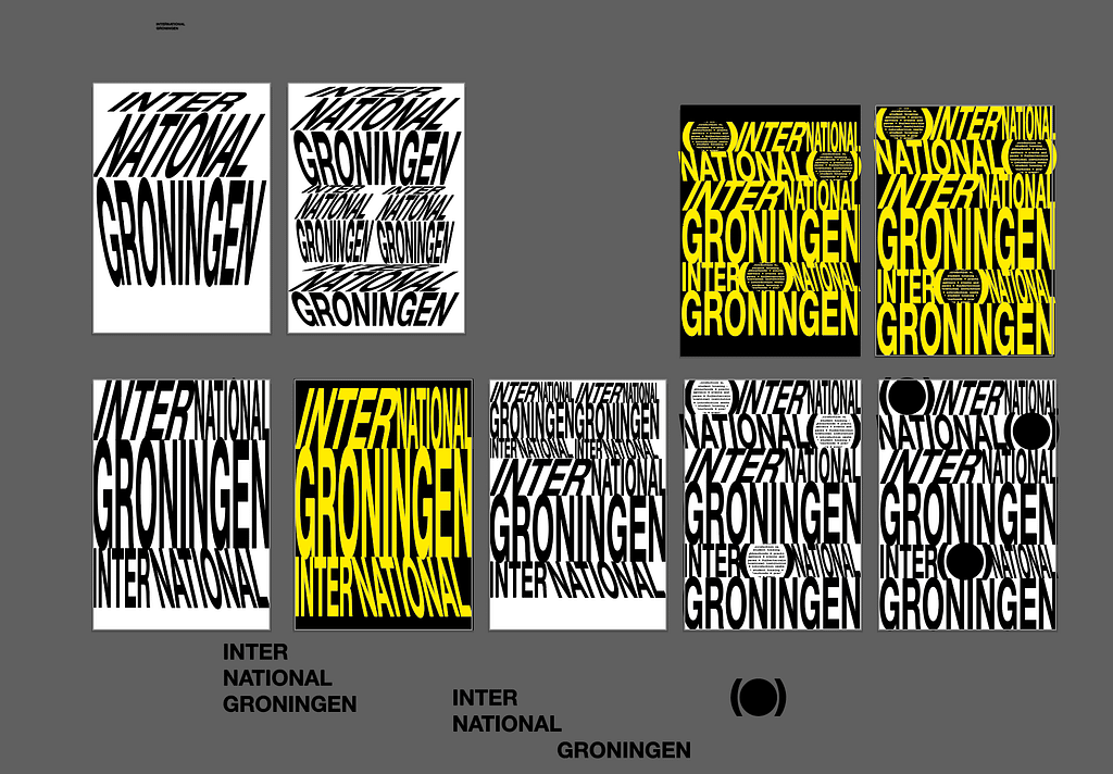
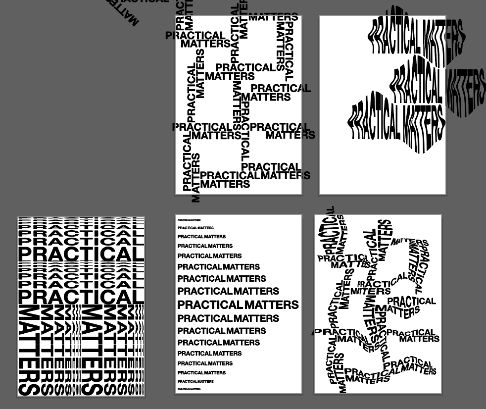
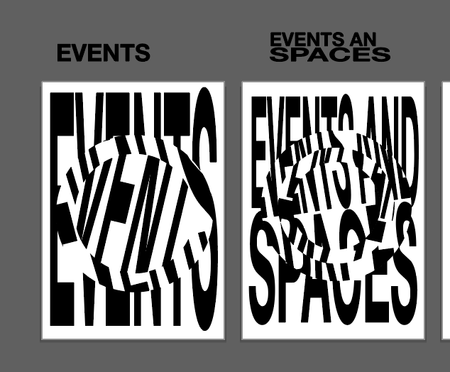
Process:
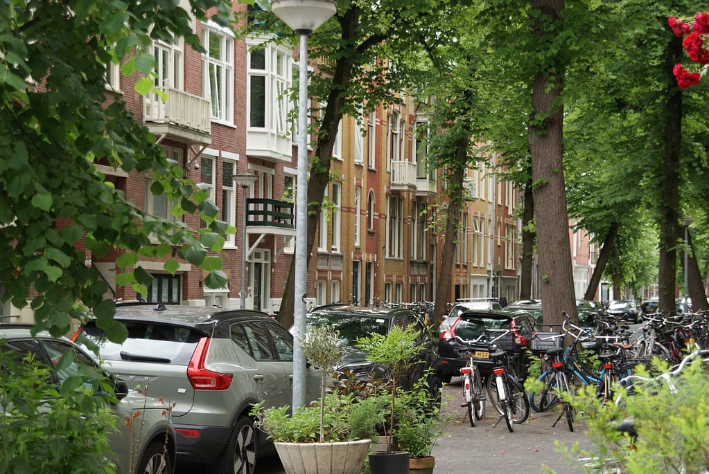
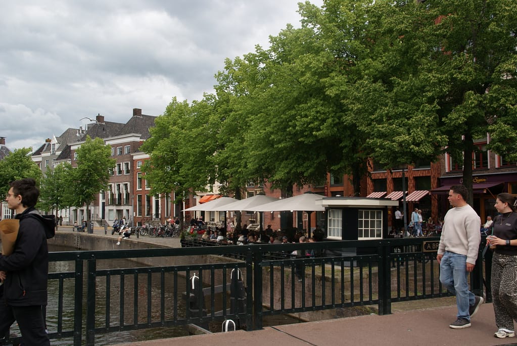
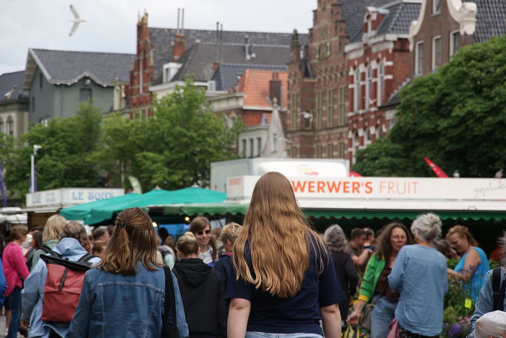
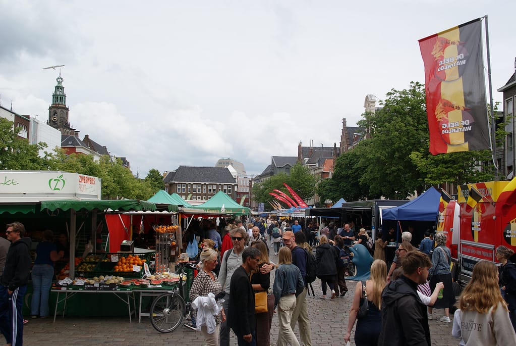
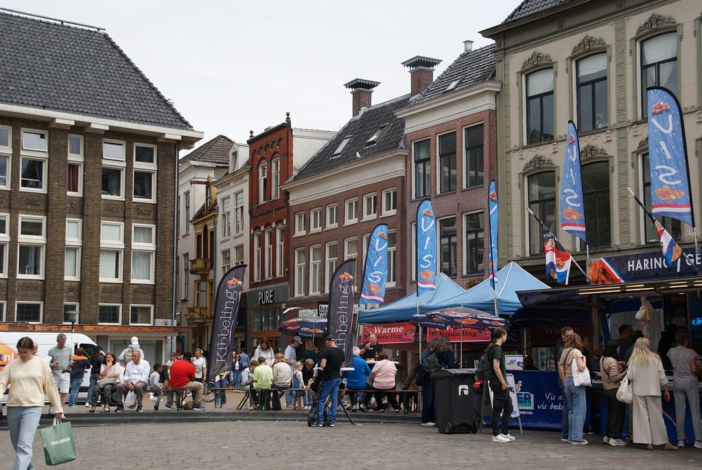
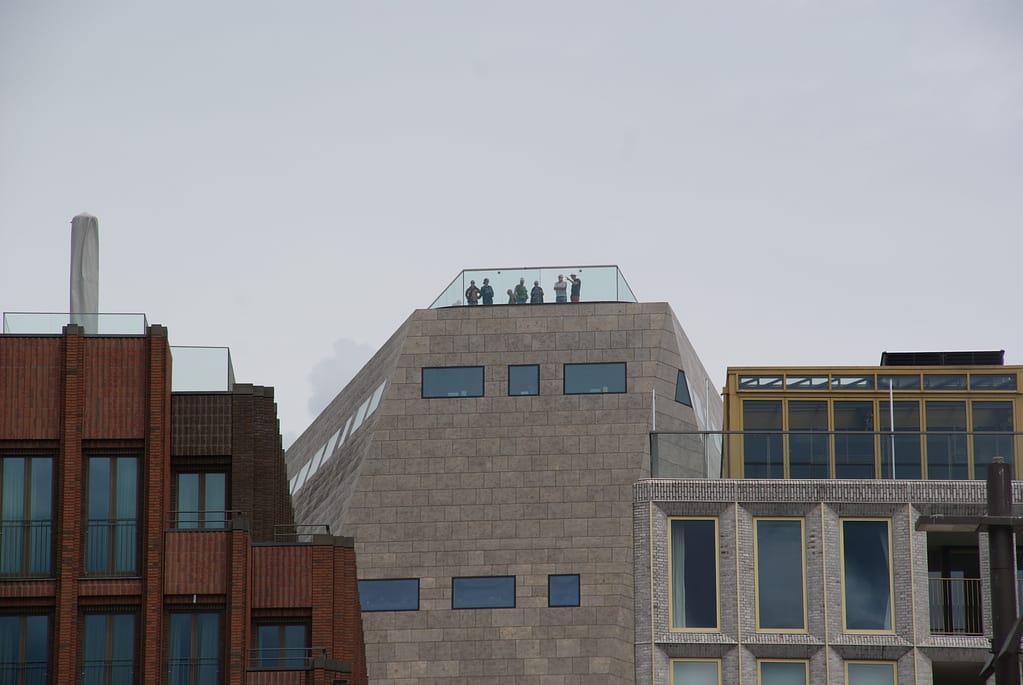
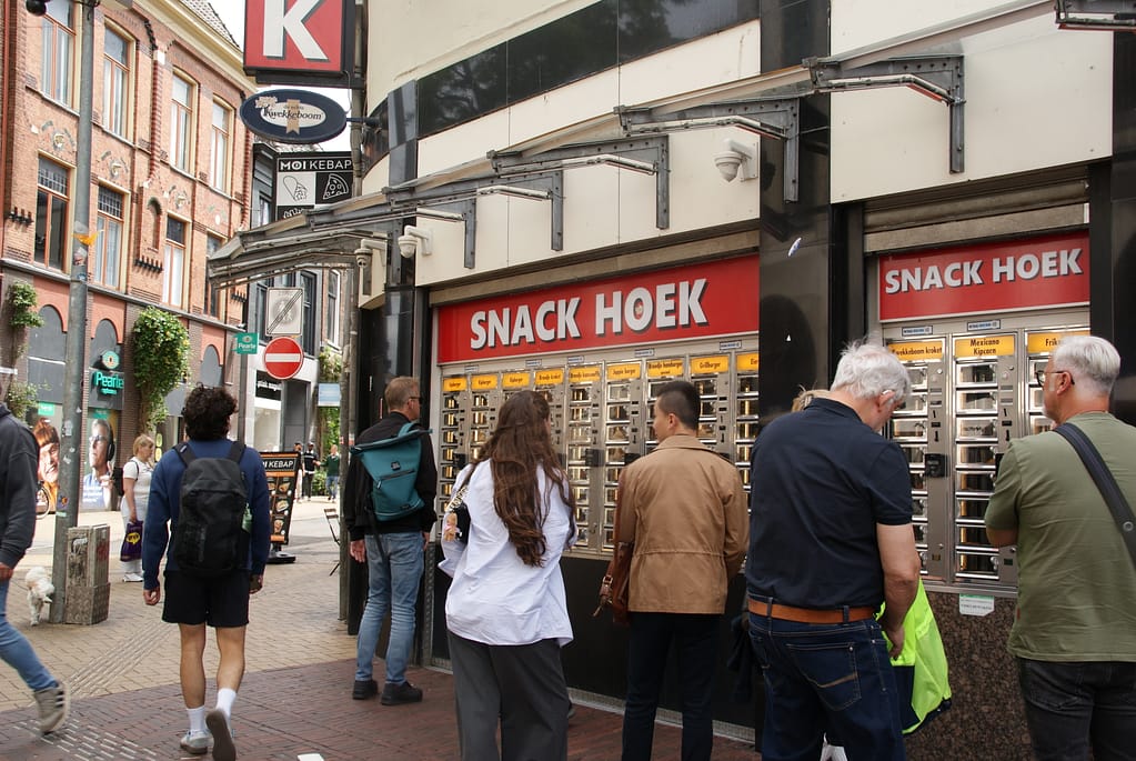
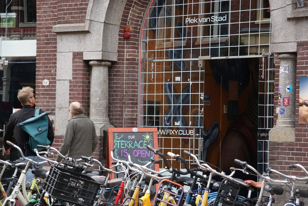
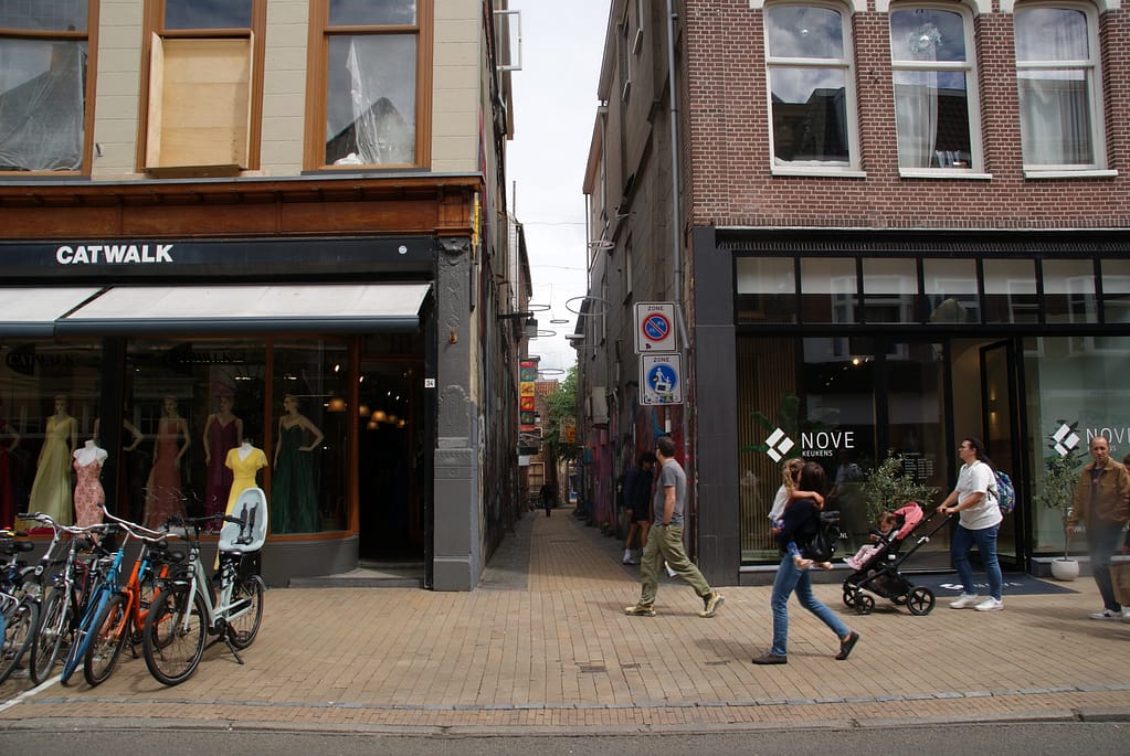
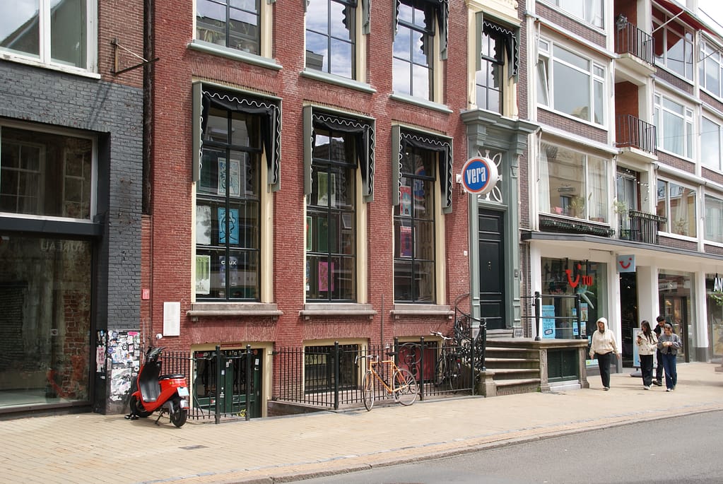
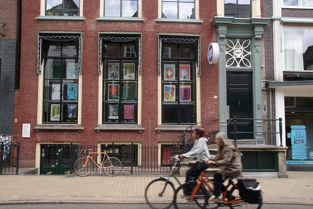
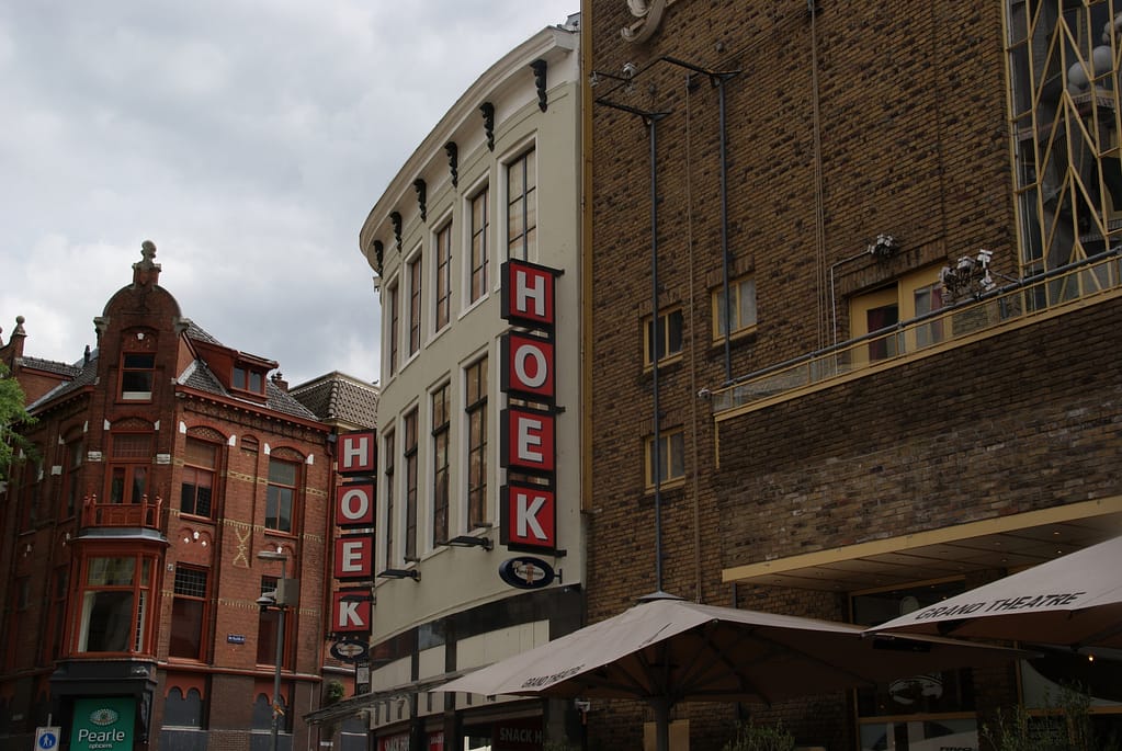
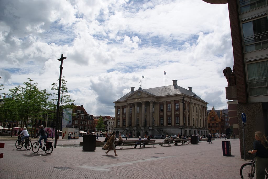
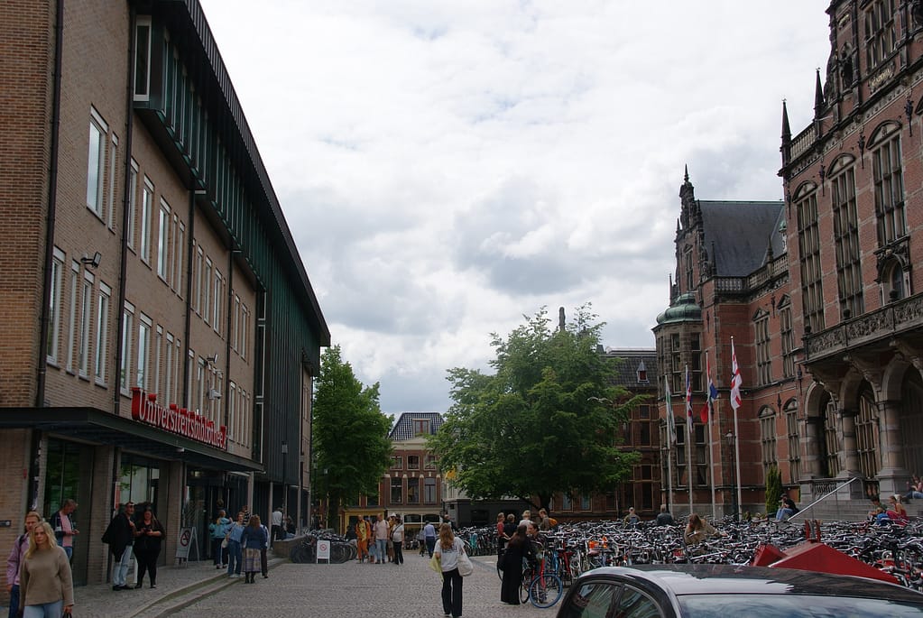
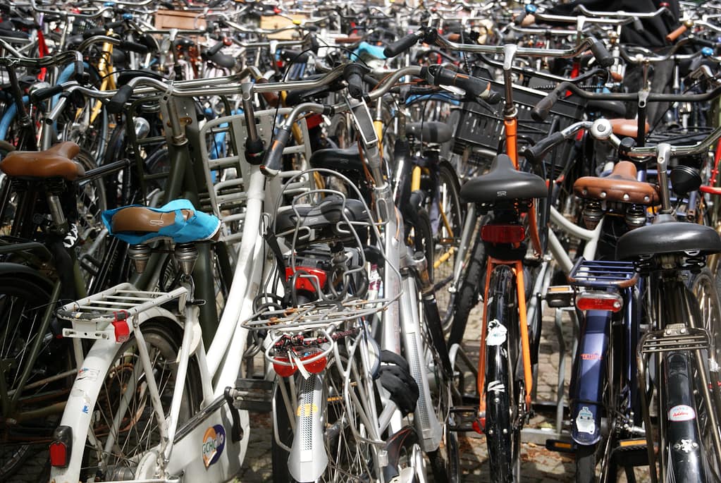
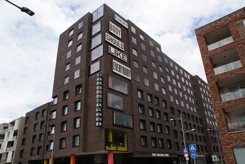
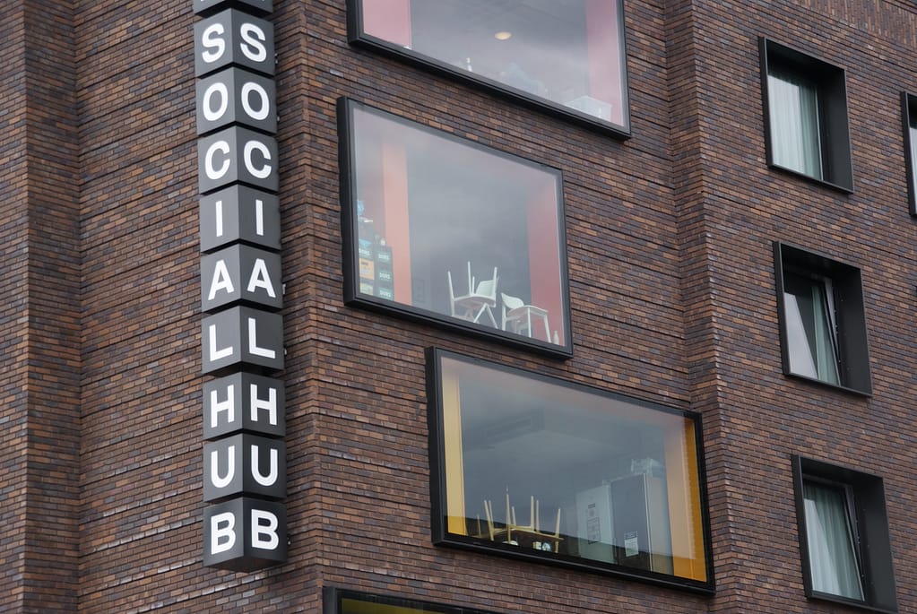
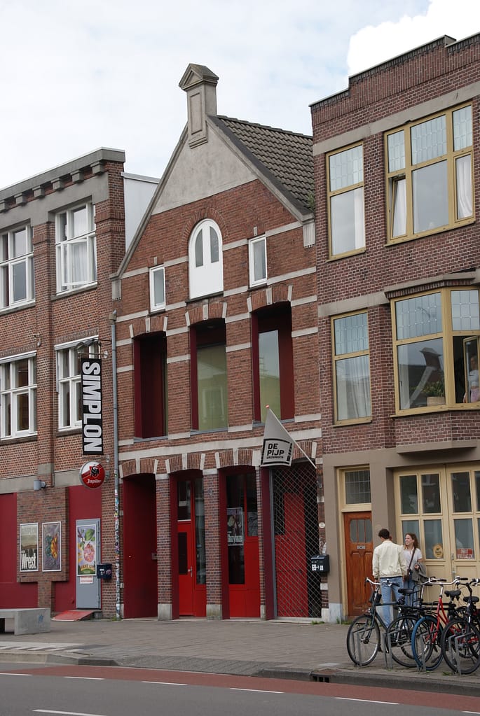
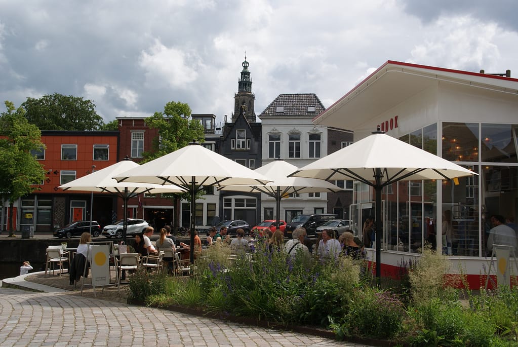
Photos: