Homework:
Minimum of 5 spreads
In which we can see multiple elements having a place
at least one of these:
– an opener of a chapter
– a spread which is a continuation of a chapter (without opening)
– an infographic
At least two
– images created by you (photography) with or without illustration
And of course we have insight in your process,
in which you show (for instance) the different experiments in type, image, lay-out etc.
5 spreads


Process:
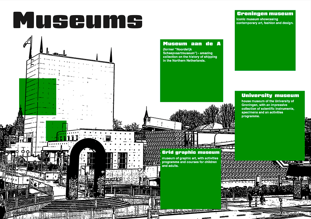
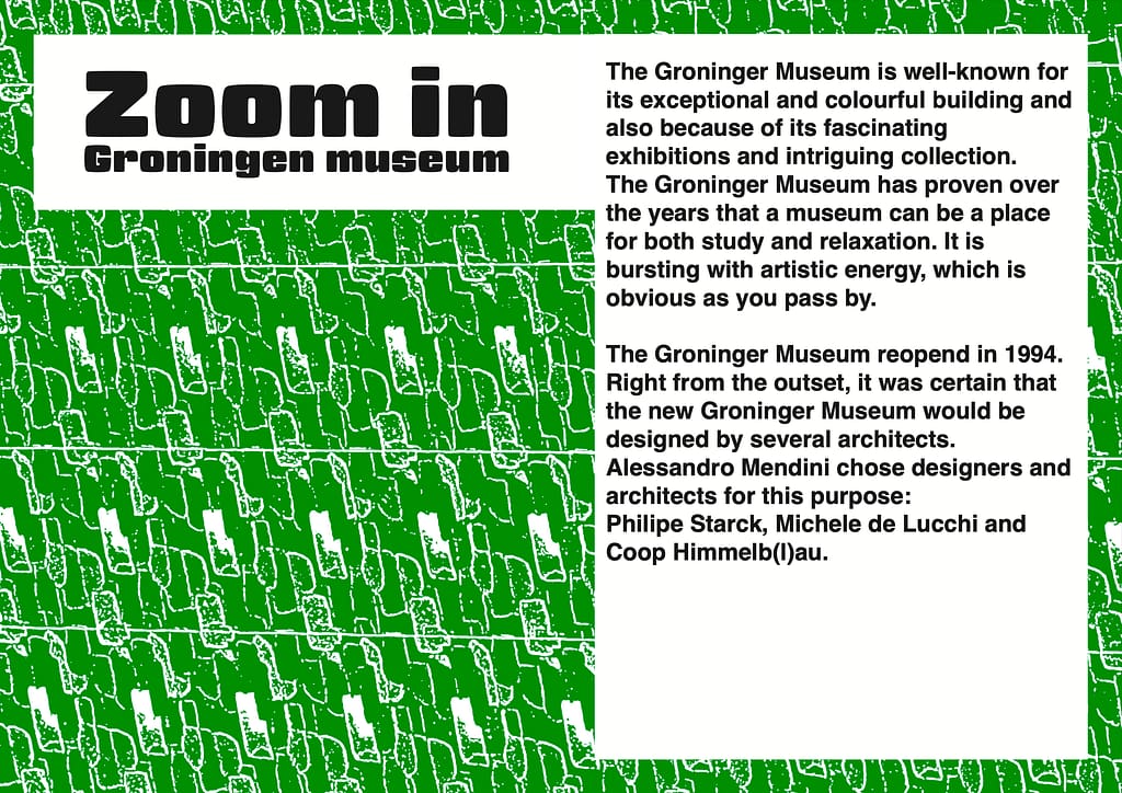
I swapped the images between these two spreads because I felt that the photo of the Groningen Museum suited the spread about the Groningen Museum better. I also think the green background image works better on the first spread, as it has a more neutral look, which fits well with the broader range of topics covered there rather than focusing on a single subject. I also adjusted the lay out to match better with the background.
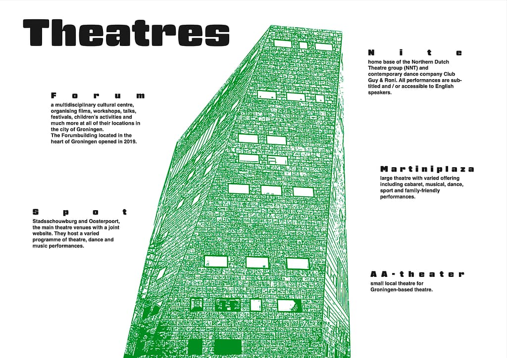
With this spread, I added more of the photos I took myself. These images show other theatres in Groningen, so the focus is not only on the Forum and readers also get a visual impression of the other locations. I also adjusted the text alignment so that all the text now starts from the left. In the previous version, the headers were more spread out, but I felt this made the layout look too messy and visually not nice. That is why I decided to change it. I also changed the text layout to match the photos better.
One of the new spreads I created is a zoom in spread focused on the Forum. I used a photo I took of the building and edited it in Photoshop to give it a more illustrated look. I also slightly warped the text so that it follows the angle of the Forum’s right wall. I did this to reflect the building’s distinctive crooked lines, which helps create a more cohesive feel across the entire page.
This is an infographic I created about the activities offered at the theatres, giving people a clear overview of what there is to do most often. The green shape is based on the logo of Spot, one of the theatres. I thought it would be a nice detail to incorporate an element from one of the theatres into the infographic design.

Some of the photo’s I took:


