EDITORIAL INSPIRATION EXAMPLES
In all the designs I have chosen I like how image and text are interacting. In this particular one I also really like typography of the name. I like how the letters are different, but still similar and I also like how cohesive the smaller text looks with the title. The design feels well balanced.
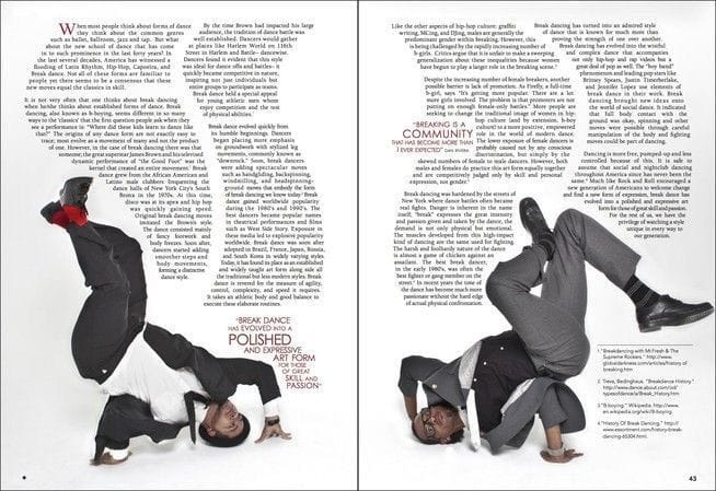
I really love how text is shaped in this spread. It suits the topic very well and you can feel the movement of dance even through text.
For both of the designs I really like how they used empty space to represent their idea in a simple but effective way.
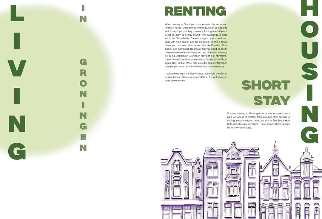
NEUTRAL, INFORMATIVE DESIGN
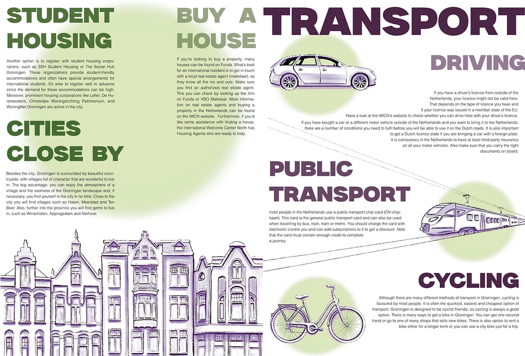
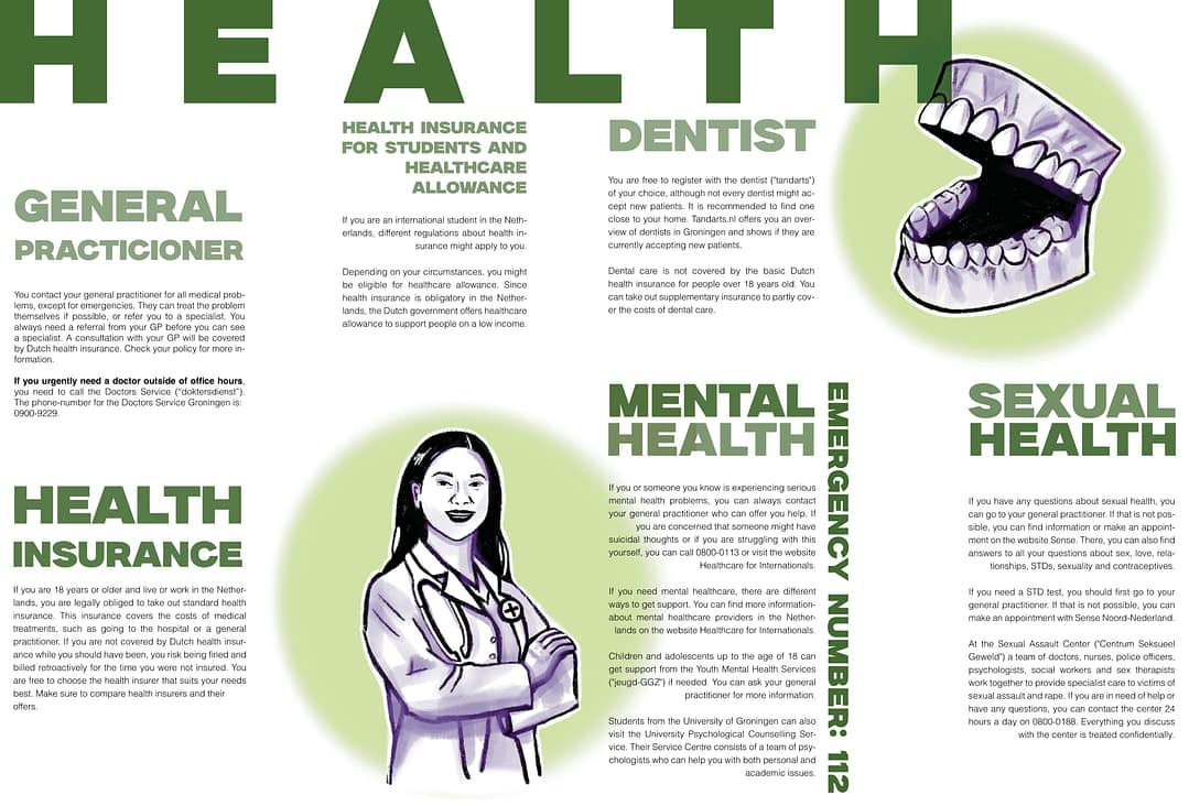
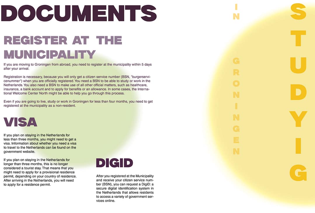
When designing my proposals this is the version that I started with. The target age group that I had in mind was 18-30 years old internationals, students and workers. It has a simple design complemented by illustration. The magazine is clearly divided into chapters like living, studying, work and more. Every chapter has a leading color that dominates both illustrations and text. Purple is a color that is being used consistently thought every chapter and illustration to make the design cohesive. The magazine is filled with useful and practical information about everything you need to know to successfully start your life in the Netherlands and Groningen specifically.
TARGET AUDIENCE, EXPERIMENTAL DESIGN
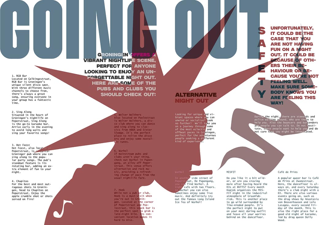
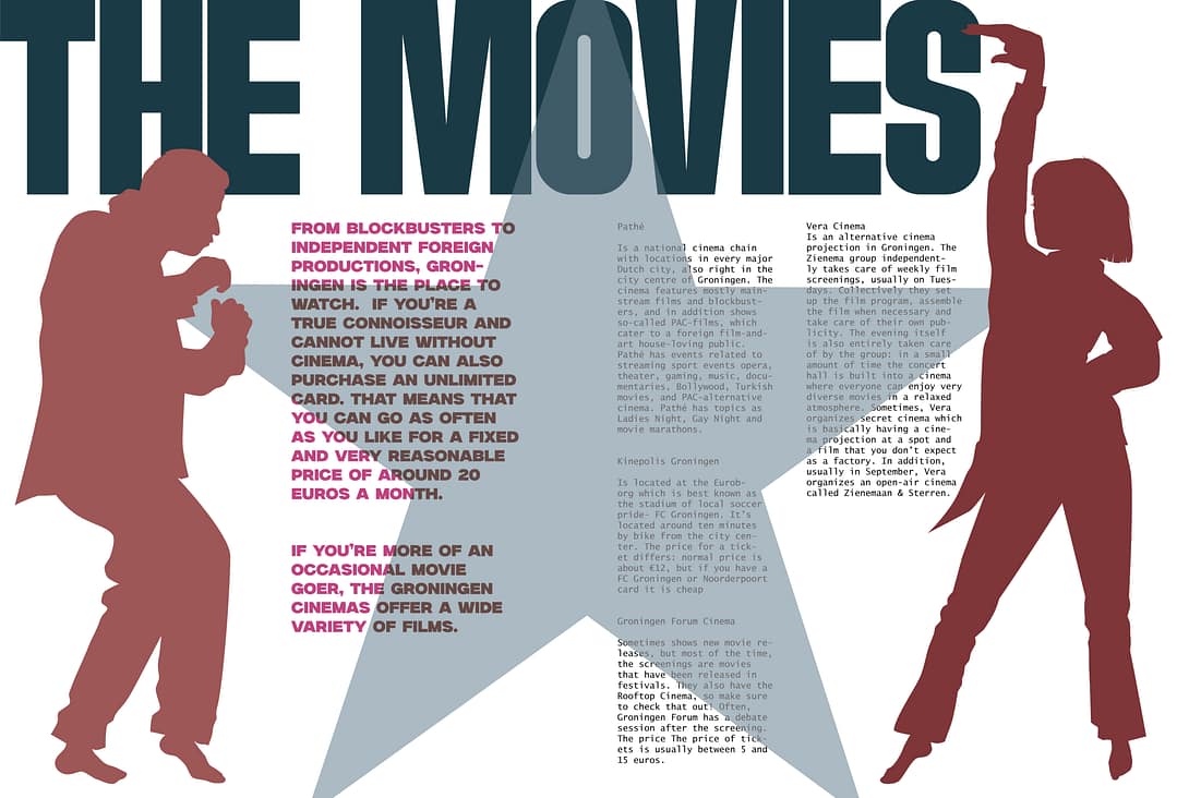
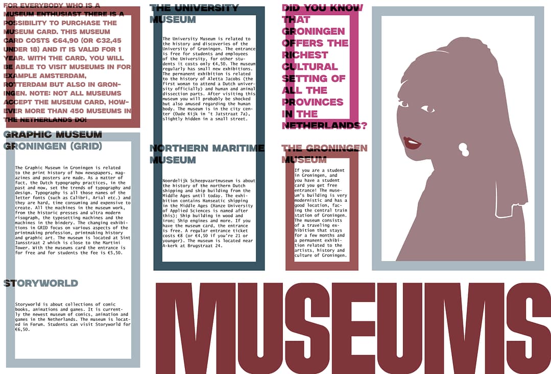
After making the first version, I realized I wanted the text to be interacting much more with the graphic part of the design. That is why for the second version I decided to use Adobe Illustrator instead of traditional illustration, that I am so used to doing. The target demographic for this magazine is mainly young people from even before 18 to 30, but not only. The focus of the magazine is entertainment in Groningen. It includes topics like cultural events, local pubs, galleries and cinemas. The color theme is muted shades of red and blue with accents of hot pink. During creating this version I was playing a lot with different kinds of opacity settings to make the text and images interact with each other. The font I decided to use for the small text reminded me of receipts in stores, so I decided to lean more into that aesthetics by making my columns long and narrow. I was going for a scrapbook a bit chaotic energetic kind of design. The graphic parts are only outlines of my subjects in most cases which makes it simple enough for me to be able to layer text over it in a way that it remains readable. All the text used I found on the recommended website or links from that website. For the museum page I created my own graphic version of a “Girl with a pearl earring” to represent Dutch cultural heritage. I am still considering making background color beige, but I am also considering to use colored paper as a base for printing. I had a lot more fun creating this version than I expected. I would definitely prefer to continue expanding this version going forward, because it makes me excited to see how it unravels and how the finished version is going to turn out.