Design Proposal 1
Inspiration, Minimalistic but chique. Curvy but readable typography, small “risky” details such as tilted or cut off text. Combined with big clear photography.
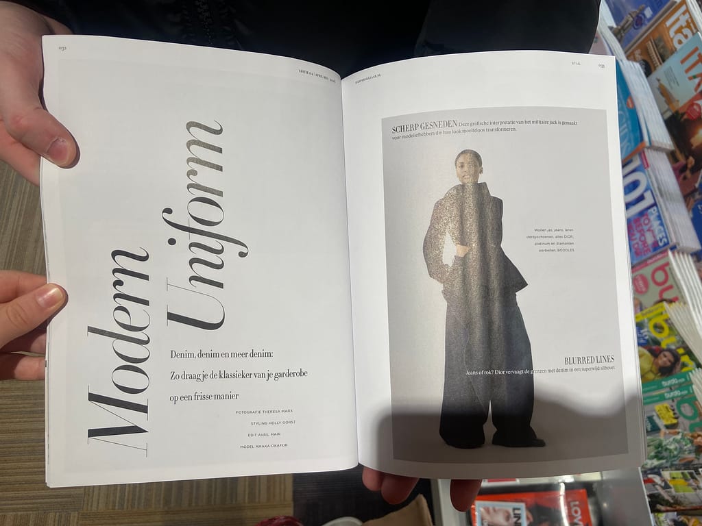
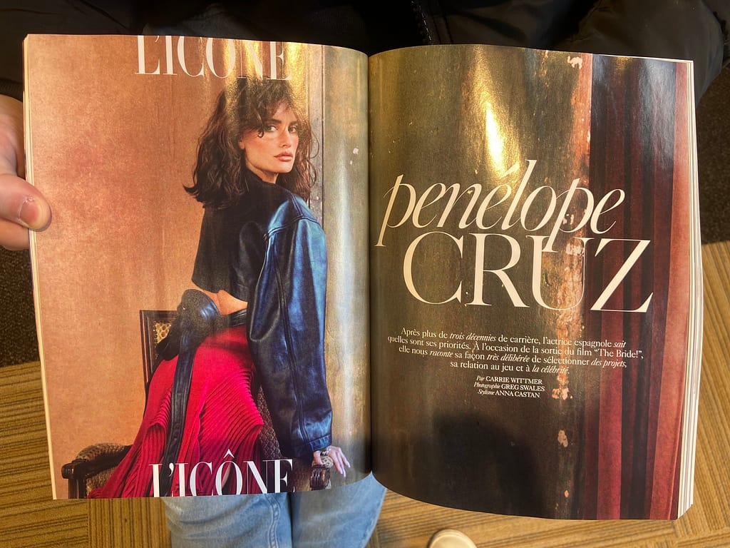
Design proposal 1, first 4 spreads, including table of contents and the first chapter of the magazine:


Design proposal 2
Inspiration, photography cut in triangular shapes covering the page creating playful layouts. Combined with bold and big typography grabbing the attention on the page.
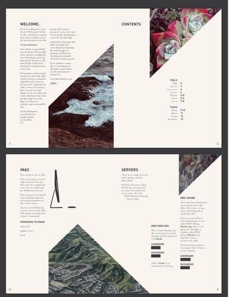

Design proposal 2, first 4 spreads, including table of contents and the first chapter of the magazine:


Conclusion and choice
Im going to search for a balanced version combining both of the designs in a strong design. Working with the chique typography combined with a few big bold accents. Where the photography wil be clear and big with a few cut off accents to keep the triangle shapes in a softer way. I think this balanced version works the strongest with the context and the target group. As the bolder accents grab the attention but the softer layouts keep a calm reading flow, with a chique accent to capture a bit of city charm.
