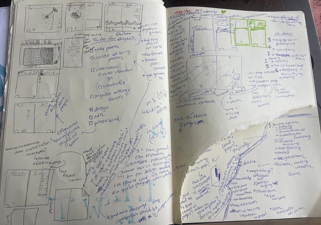
For my two target groups I want to make 2 different catalogs on housing in groningen and advice/ recomendations.
The more adult magazine will have more of an emphasis on living in the accomodation + gardening culture and neighbors and of course advice on where to find cheap housing.
The younger audience will have a more emphasis on student housing and what to look out for, who to ask where to buy the cheapest furniture. + unexpected culture shocks
Editorial Design Ongoing Inspiration:
Anything by eye magazine
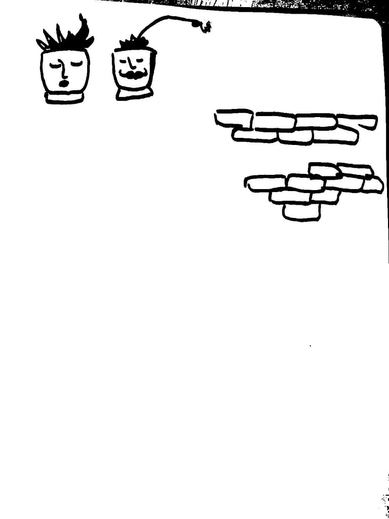
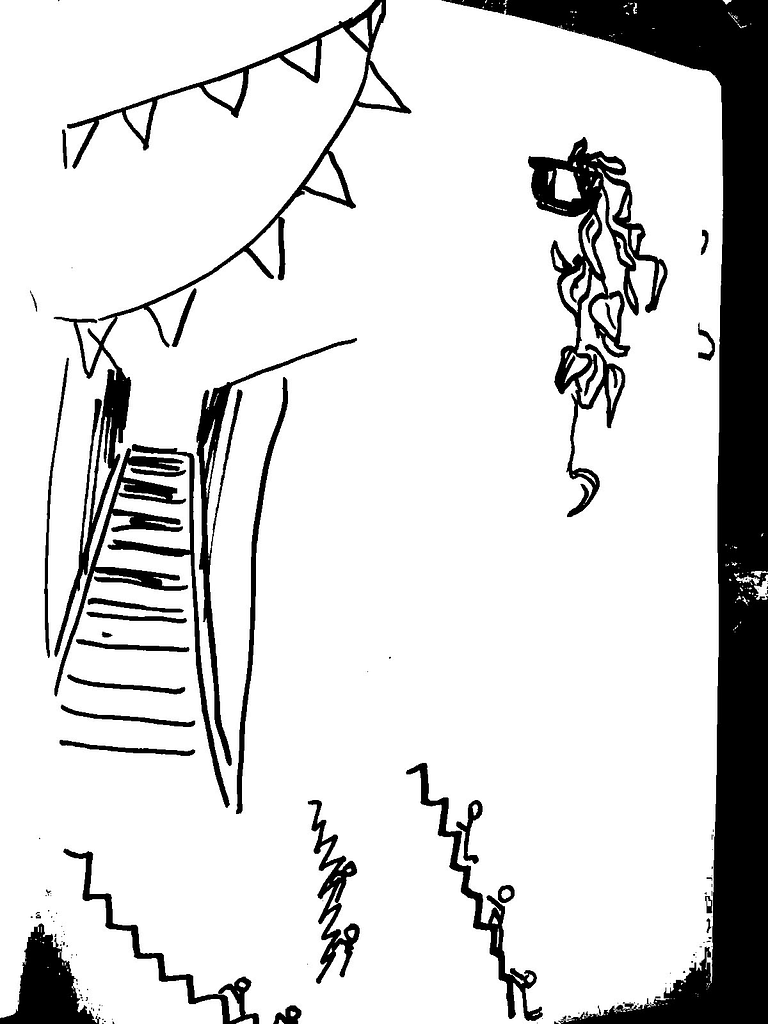
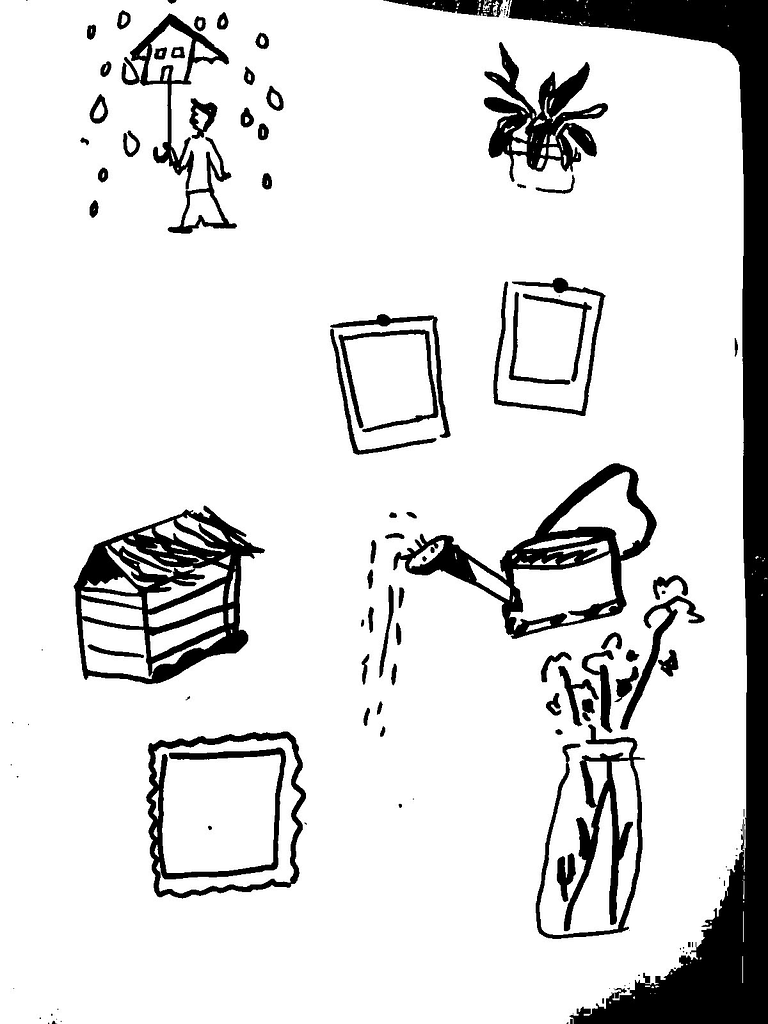
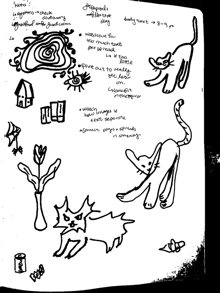
Sketches and ideation:
2 Proposals:
proposal 1 : I am not going with this direction because for me the “rebel” aesthetic feels forced. I would prefer the second proposal because I think it fits more with my audiences experience of groningen.


Proposal 2:
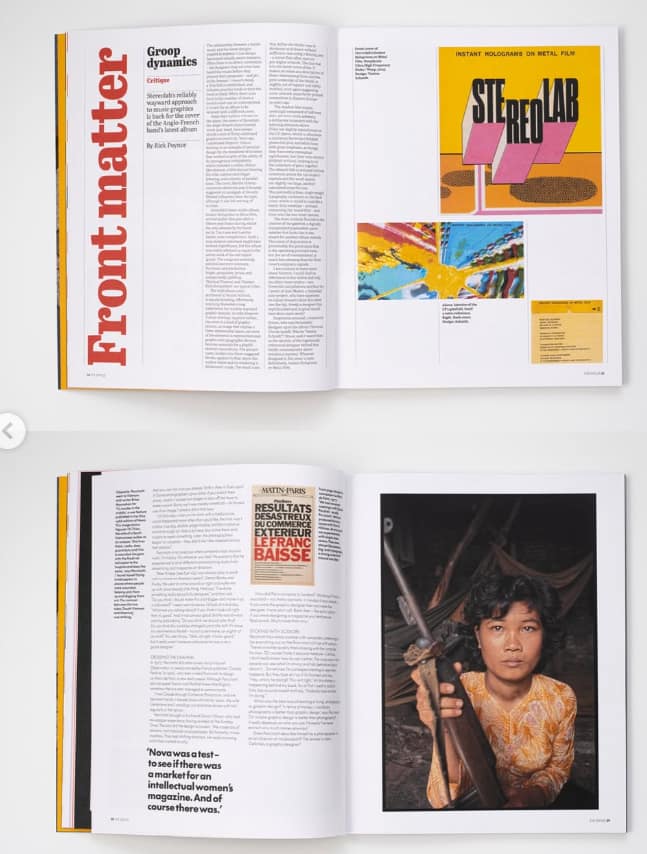
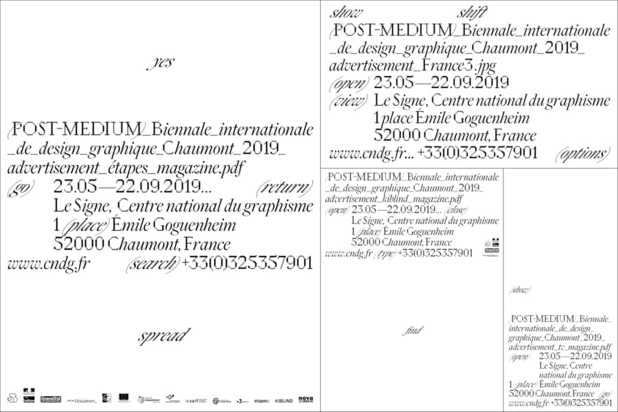
I am most inspired by this reference photo. The typography design caught my eye in the way it is so intricately handled and the small intentional use of mirrored layout. Its a genius design honestly.
I was pushed in class to find a similar font. which I have now found and I am eager to play around with the typography in my captions and titles with this image in mind 🙂
this proposal I like better so this is the direction I am leading!


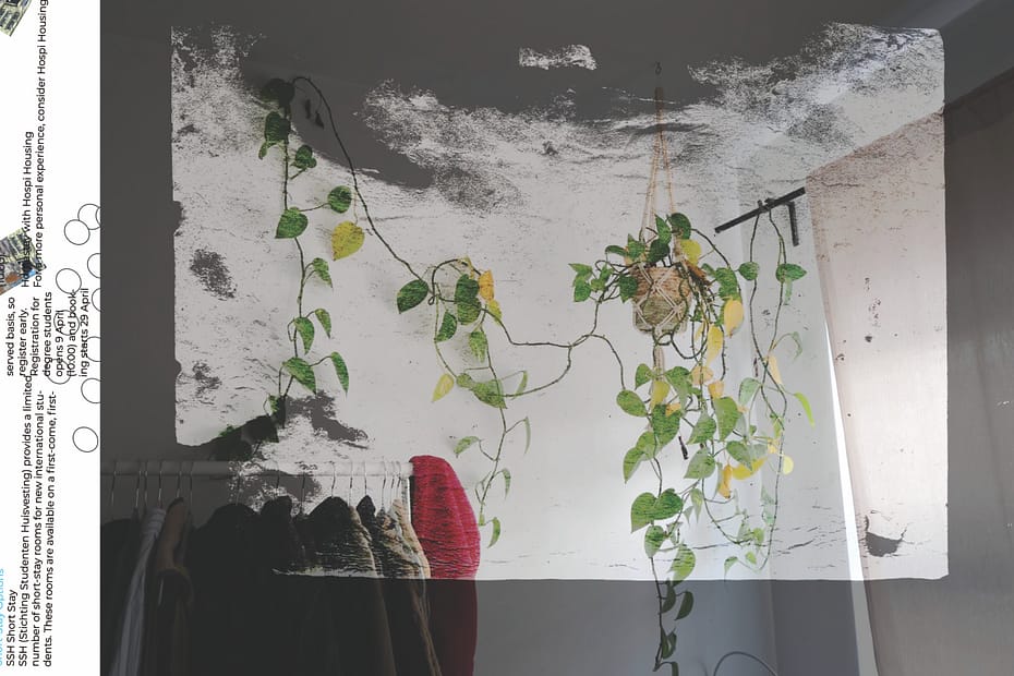
This spread (underneath) from my proposal phase is my favorite so far. I really felt playful moving around the elements 🙂

In these spreads I am using photos I took myself + illustrations i made myself: