I started by writing down the first words and thought that come to mind for the magazine.
For this first proposal I decided to try do other things that I usually do. During the midterm, while I was hanging up my work I noticed everything was very brightly coloured, bold and round. I wanted to try something different for my magazine. So I tried using a darker colour, black and white images. I also tried a thinner, serif font, and sketch like illustrations. But I really do not like how this looked and got very demotivated so I tried something that makes me enthusiastic.
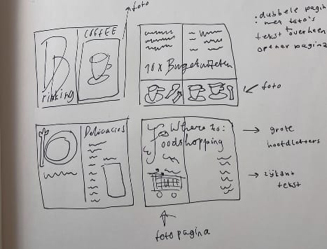
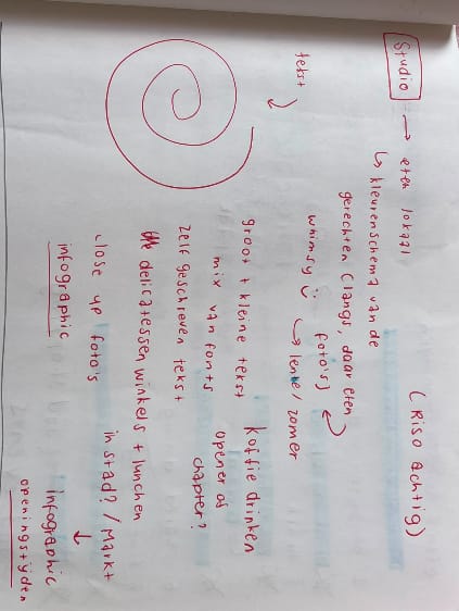
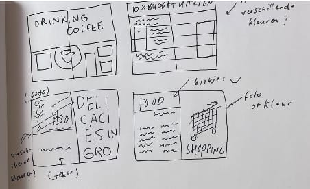
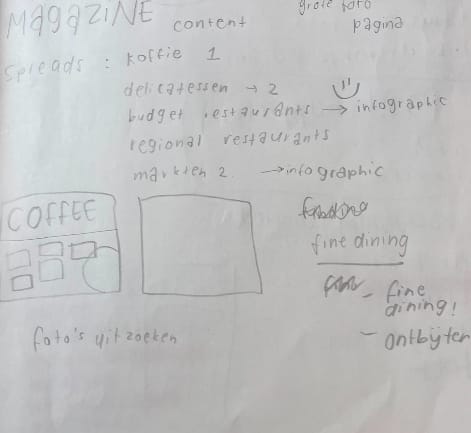
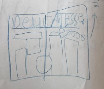
These are the first small sketches I did before going to indesign. Just so I could sketch some layouts
Version 2 (favourite)
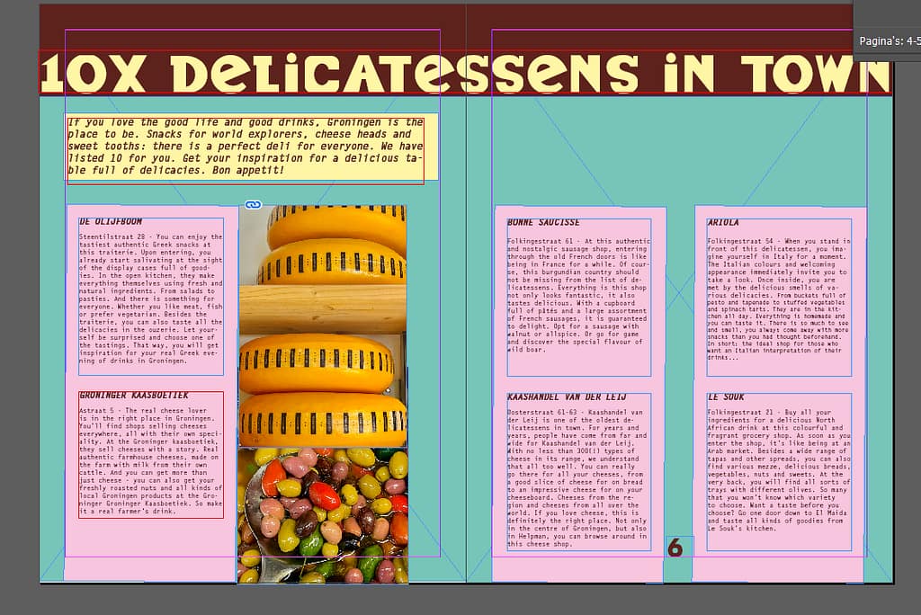
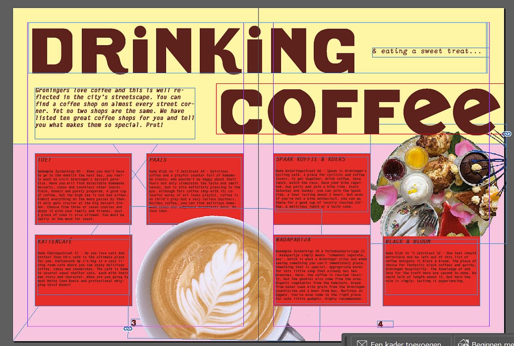
For this version I decided to use more and brighter colours, a bold font with a typewriter font for the body text. And this immediately got me more excited and was more the vibe was going for with my magazine. I want my magazine to feel happy, bubbly, fresh and inviting. Less serious then what I tried with the first version.
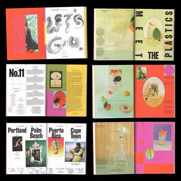
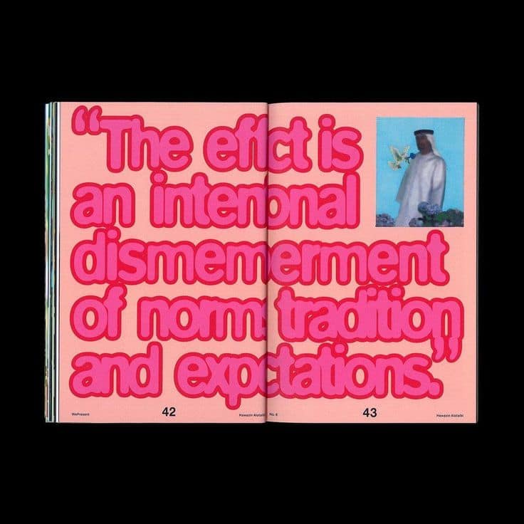
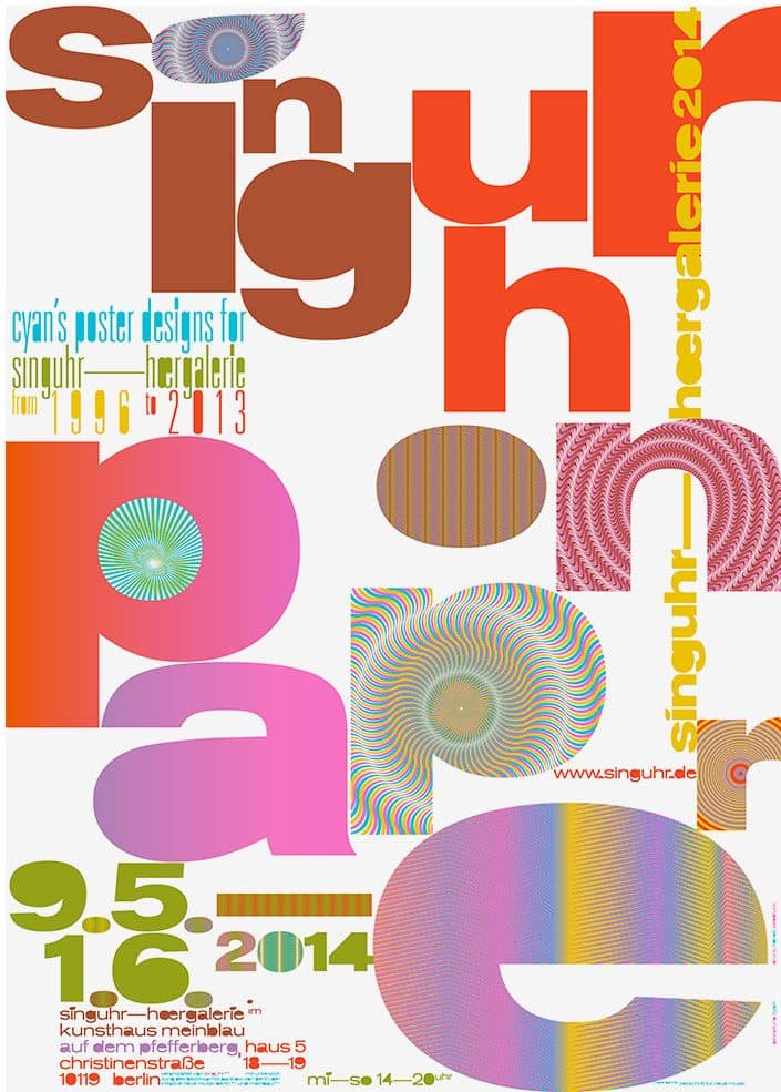
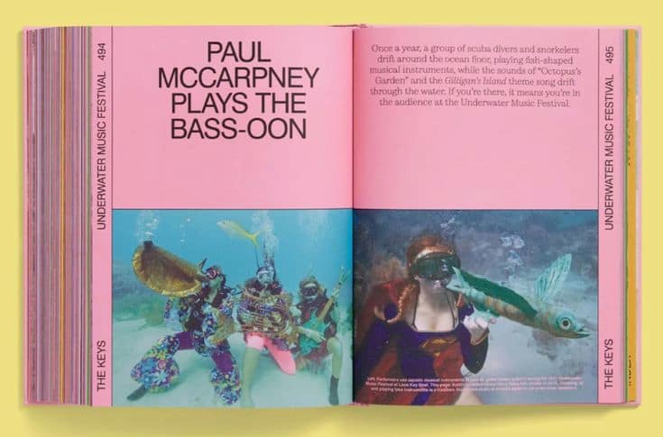
some more inspo: