personal magazine 2.
experimenting with putting photos in shapes
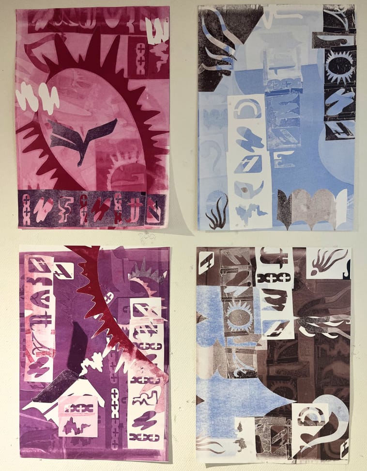
I decided to remove the brown entirely and focus on the purple and blue & to follow the shapes of the posters.
I made the posters that were completely brown, purple in Photoshop.
----------------------------------------------------------------------------------
plan: not only using brown and blue for text/pictures and purple for sides, I want more diversity in colors, it feels repetitive. So maybe changing them per chapter.
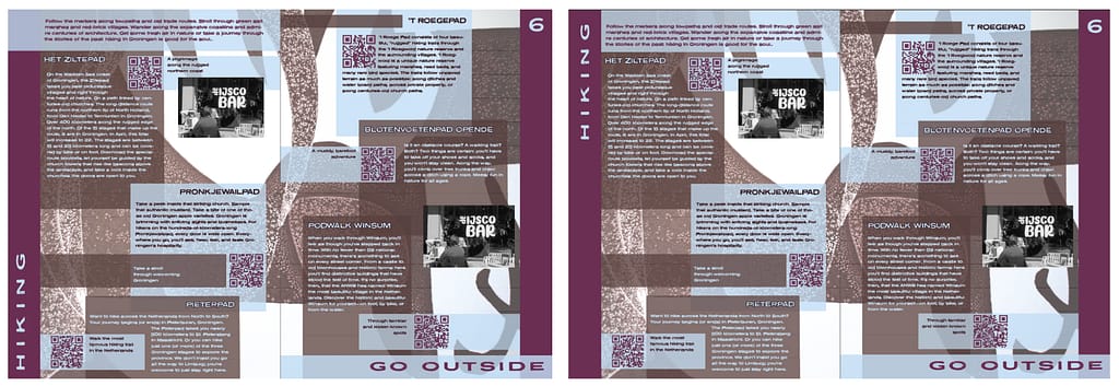
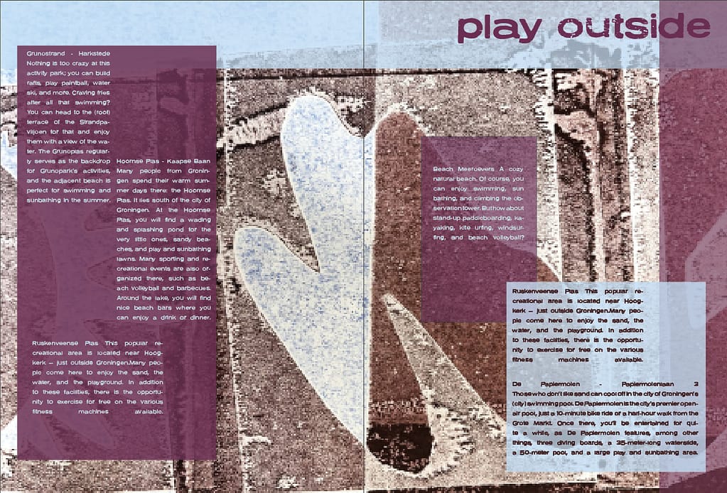
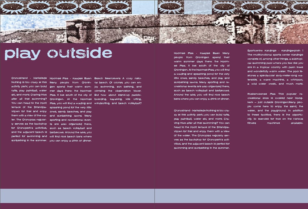
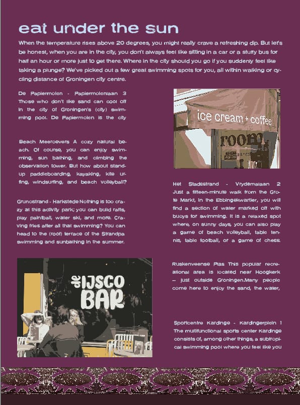
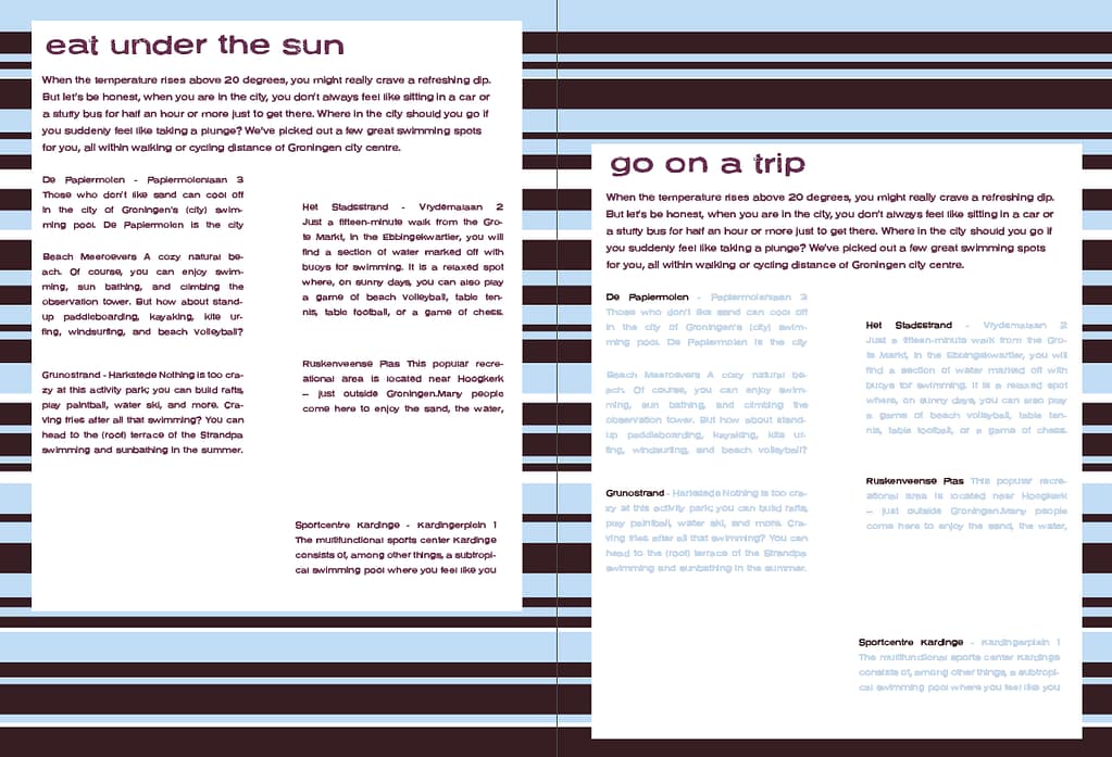
spreads (without final pictures)
design choices
subtitles
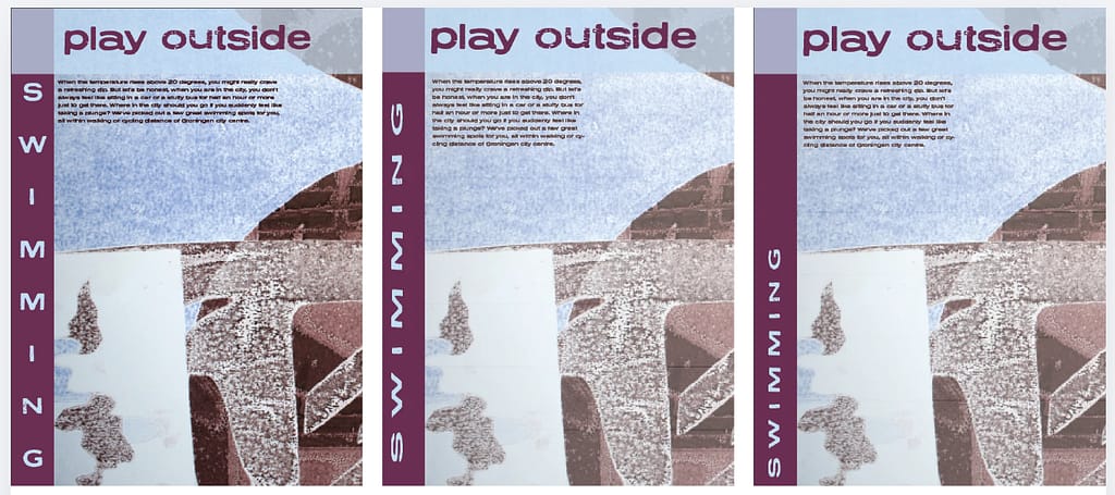
editing of the pictures (normal pictures (left bottom) is too busy, 6 tone (right bottom) blends too much into the background, and top right has less contrast then normal picture turned black and white)
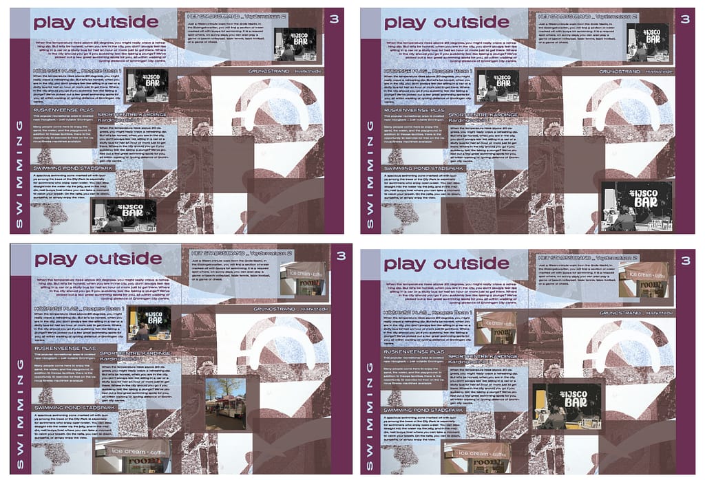
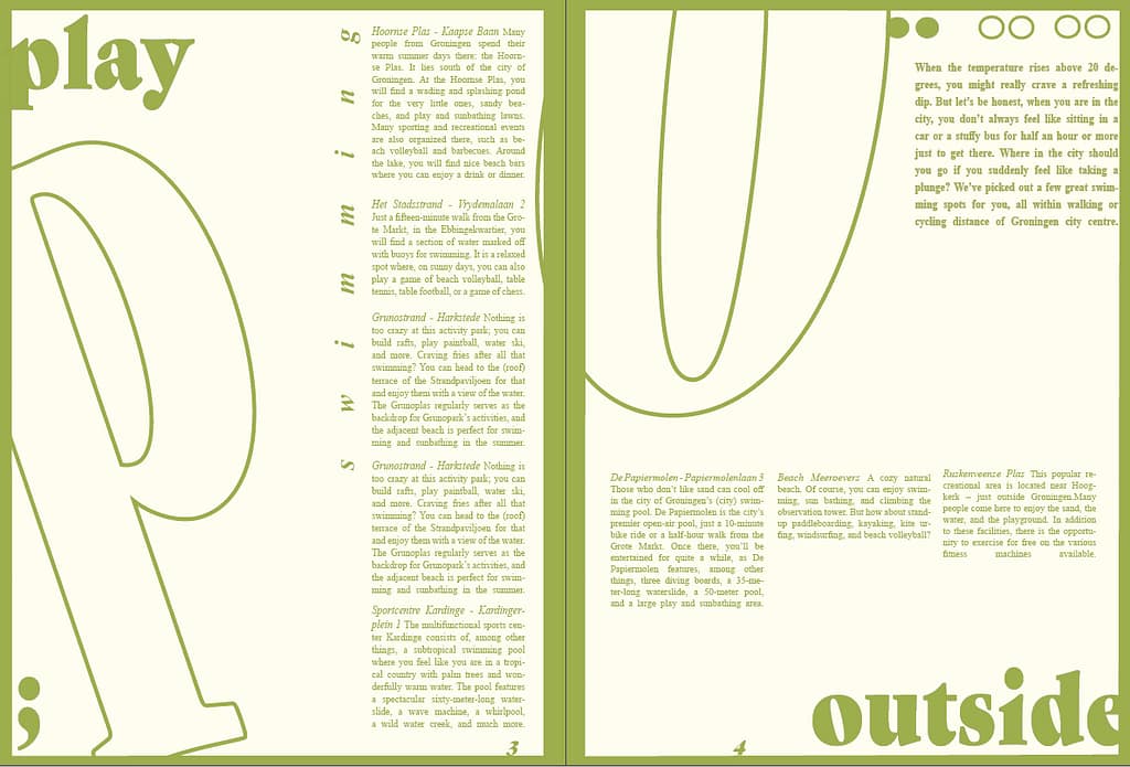
placement of subtitle (with the first one I feel like the viewer will be searching for what the spread is about, so I decided it needed to be more towards the top)
pictures with camera
sketches to get an idea of the concept (i haven't scanned the posters in, so colors and quality is not where it will be)

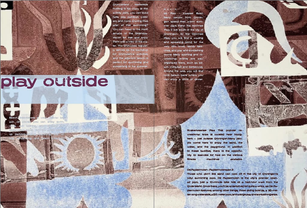
When there is no text I will add parts of my posters.
experimenting with adjusting the lay out to the poster + legability
textboxes
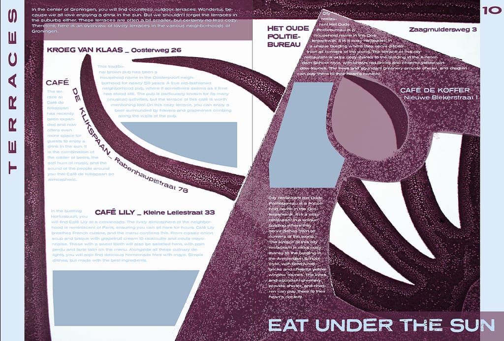
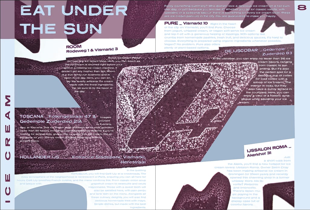
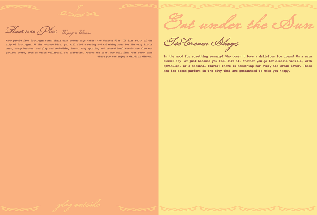
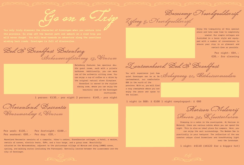
For the spreads with pictures I don't want to have a full print visible, so I will add small parts of the posters by themselves.
i could also make new patterns with the line elements, but i don't know how this will work for the cohesion of the magazine,
color pallet

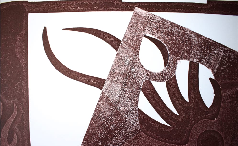
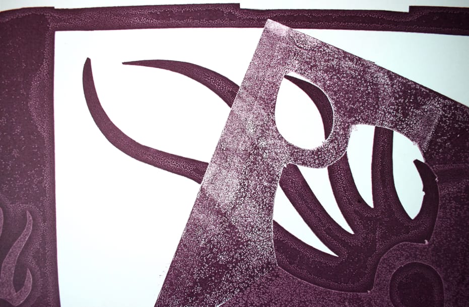
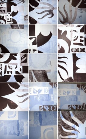
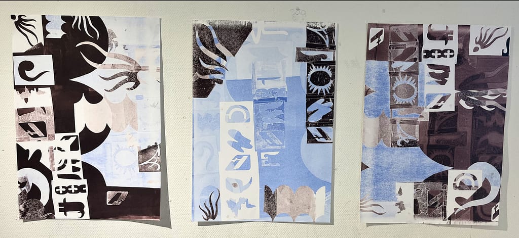
For my repair in the first semester I made monoprints in the lithography workshops. I would like to work more with this method. If I choose to work out this concept I would create new patterns and shapes, connected to the places I mention in my magazine. Below are the posters I've already made.
If I were to make it really experimental, I would make mono's on the paper and print over it. But then the ink for the text would be hard to see probably.
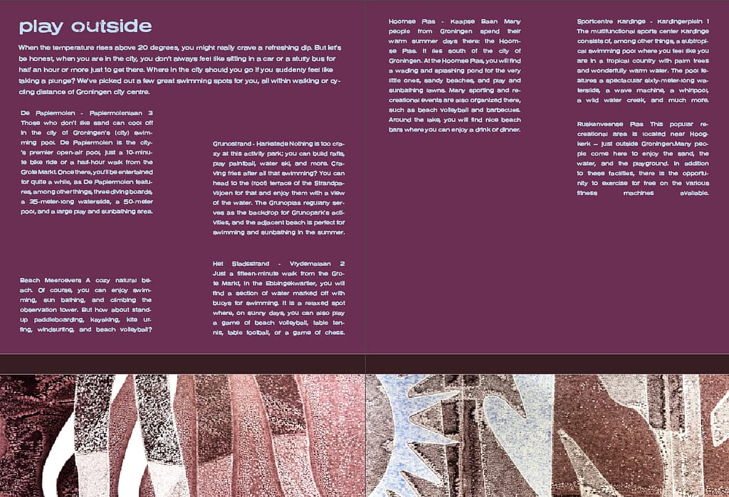
informative magazine. _
concept for informative turned into experimental.
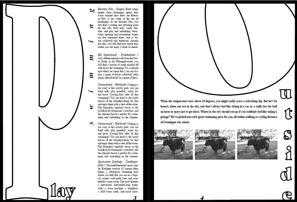
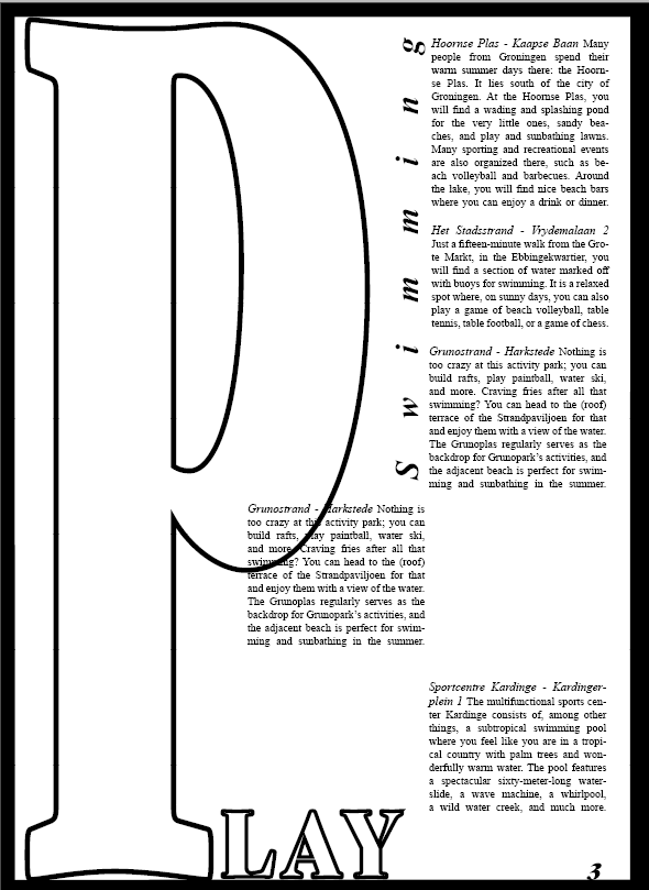
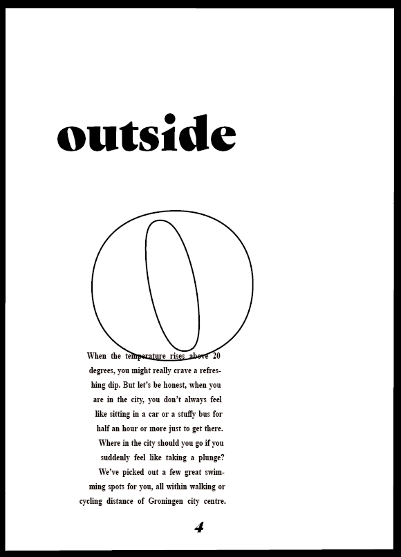
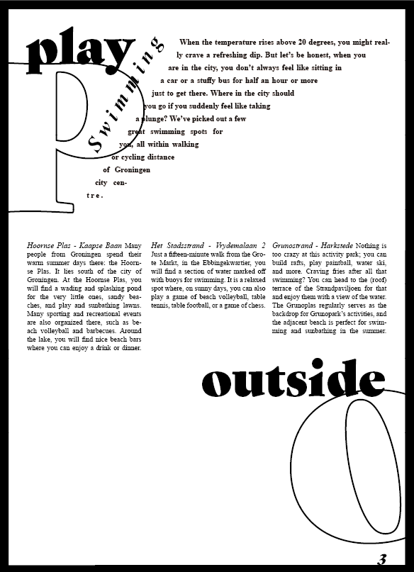
concept now: playing on every spread with the text, titles, page numbers, etc. No set lay out or way of filling a page. Using letters and characters as I would in the letterpress workshop. Would still riso print this (in color) (on newspaper-paper).
I do think it looks better without photos...
I think I would risoprint this in a color on newspaper-paper. I would like to elevate it a bit more by adding some more playful elements, like maybe tearing the edges of the paper once it's printed, but also graphic elements in the design, but I'm not sure how to.
I think two spreads was enough to show the concept. I would've just continued the same way of working on the other spreads.

inspiration
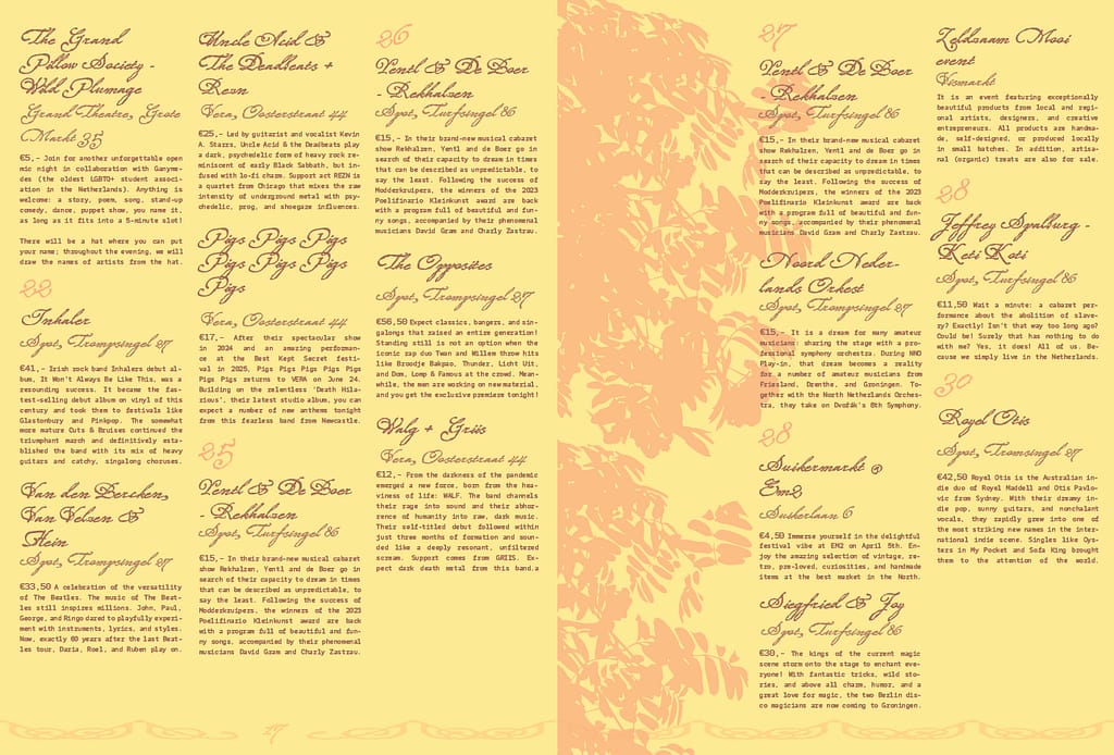
personal magazine 1. _
I will continue this design on my own for the zine for the Minerva Market & work out a new experimental proposal for this assignment.
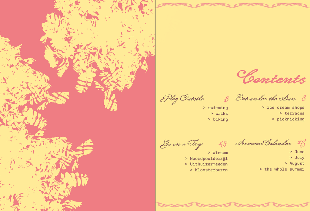
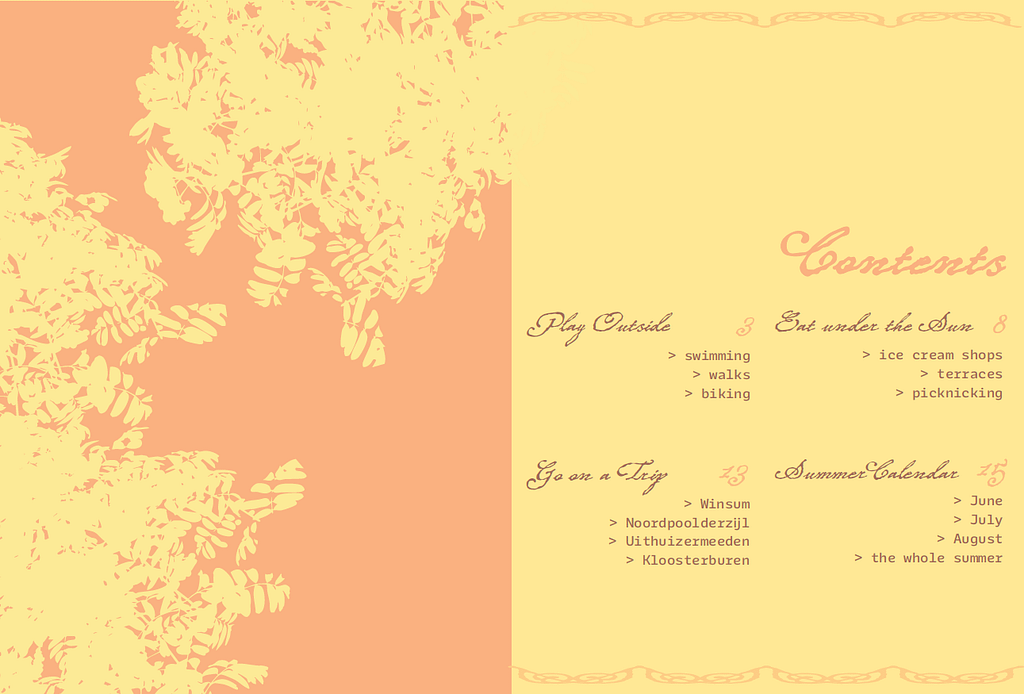
color adjustments: yellow paler & brown darker and more purple

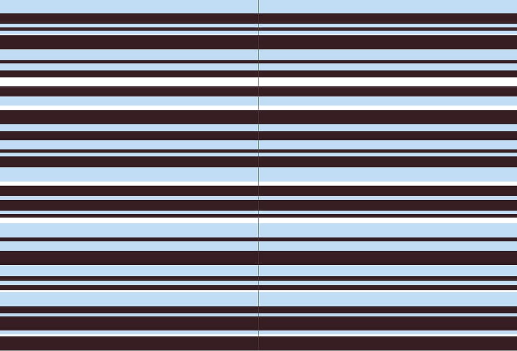
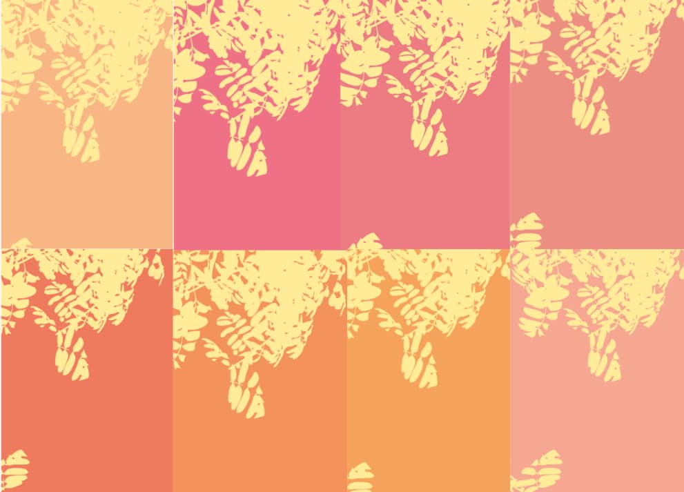
different colors:
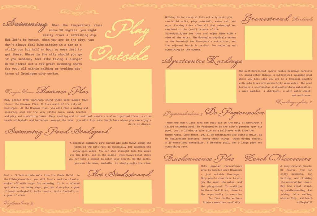
to me: summery, whimsical, soft but structured
feedback: more spring than summer
inspiration
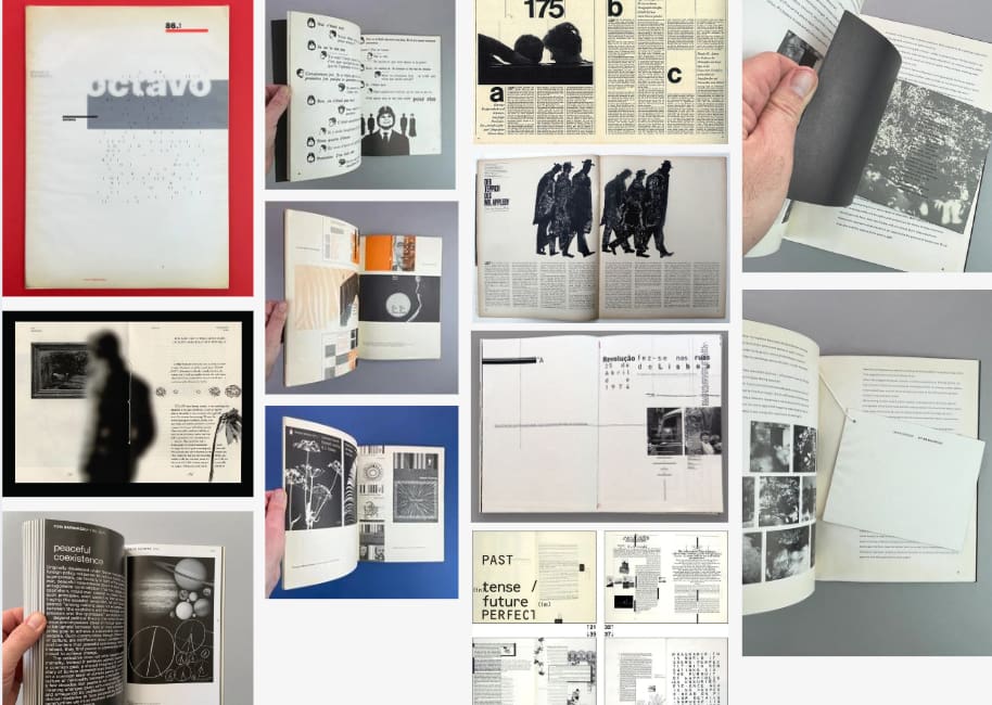
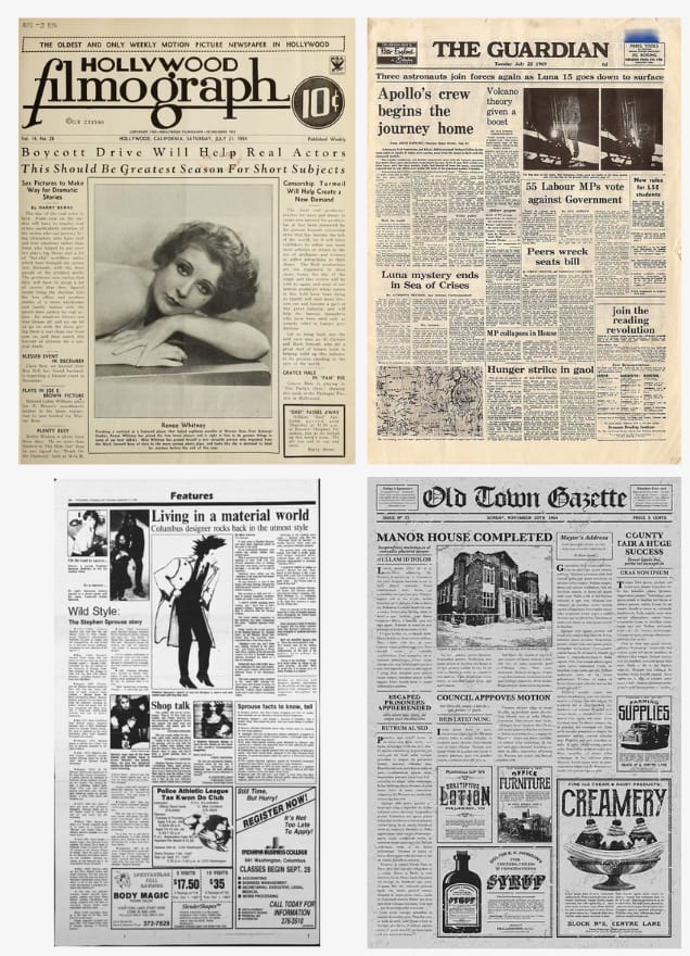
informative inspiration: vintage, black & white, typewriter
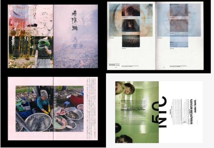
personal/experimental inspiration: I had trouble finding inspiration for this one. There is not one particual style that I find really inspiring. For these magazines, I liked the colors of the photographs and the vertical text and overlapping photos.