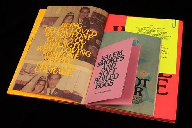
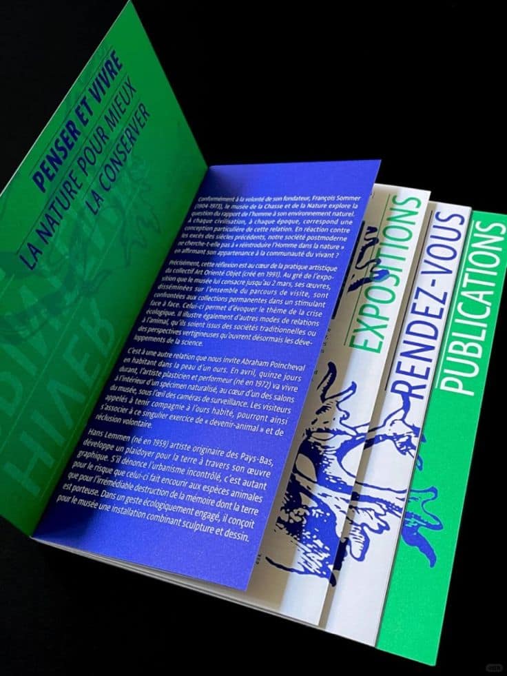
Inspiring examples
Minimal
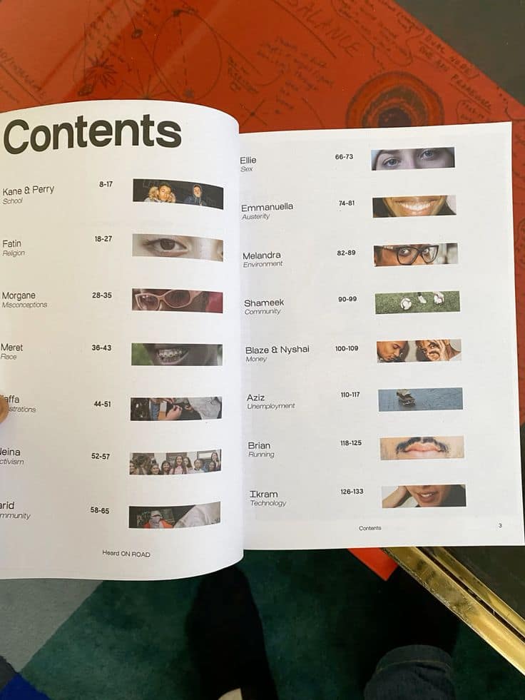
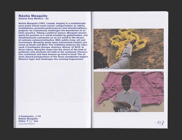
What I like about these examples is how clearly they convey the contents of the magazines. The way some stretch the design across two pages is interesting. I also like the minimal use of colour.
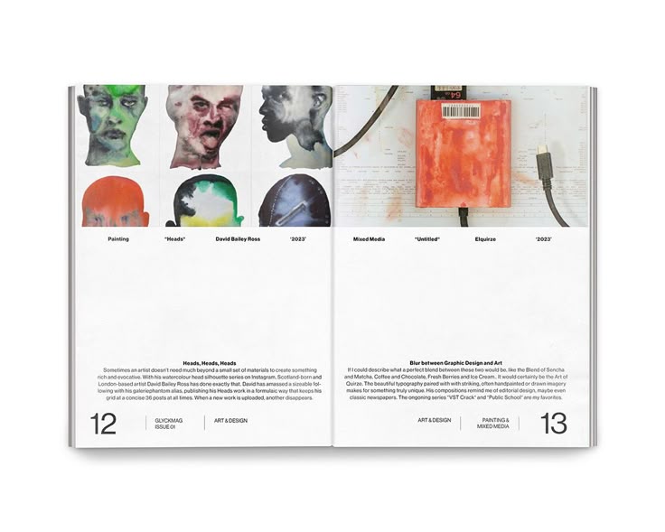
More bold examples (for the targeted proposal)
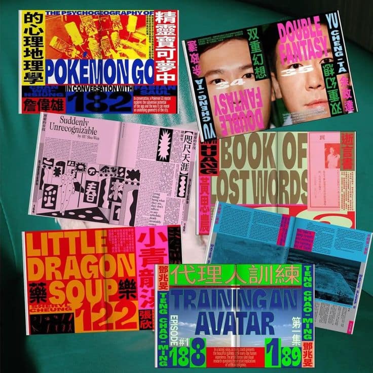
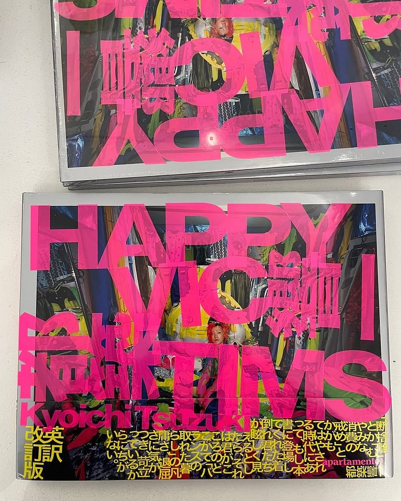
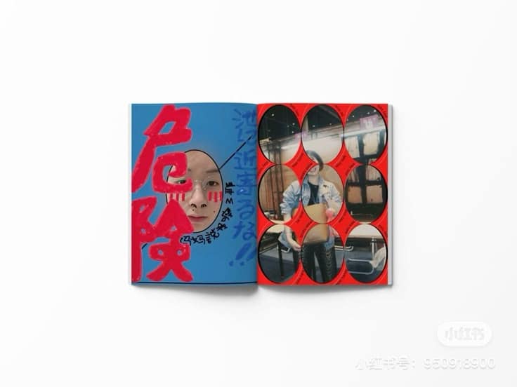
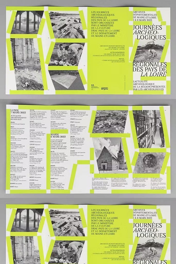
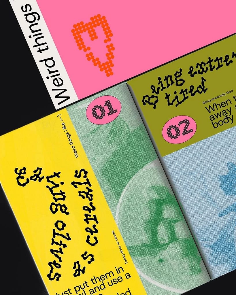
I collected these designs because their bold use of colours, bold typography and unique layouts was very inspiring for me. These designs have a lot of radical design decisions but still end up being legible, nice to read magazines. I want to see how I can also balance these two things. As I don’t want to sacrifice legibility for aesthetics.
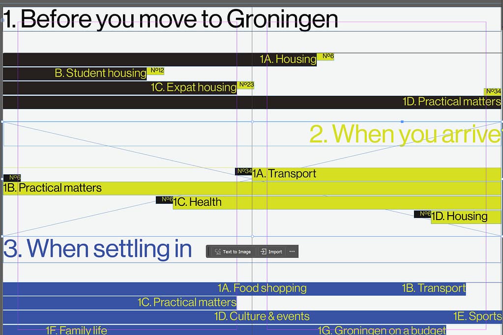
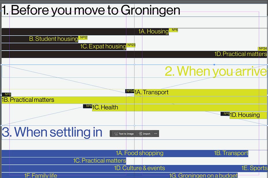
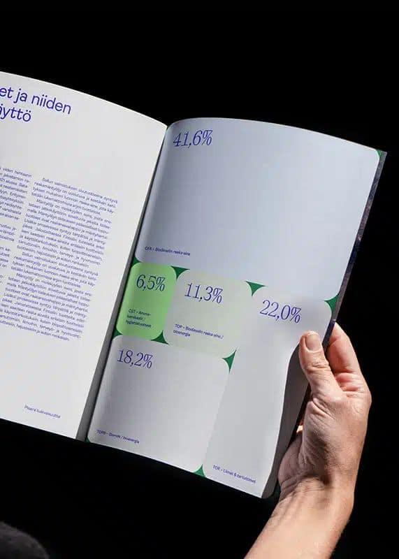
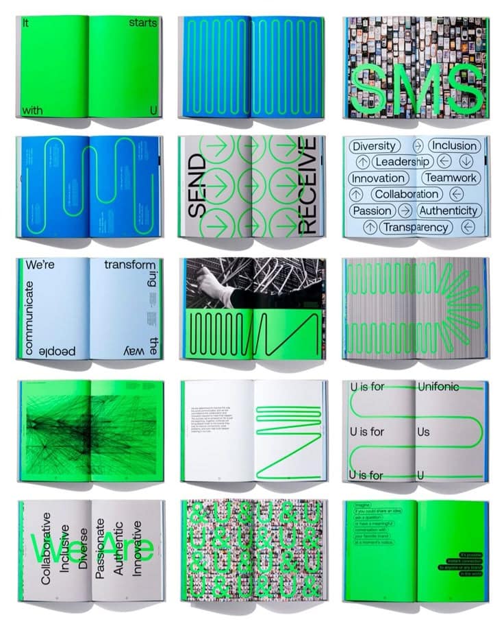
Some early concepts
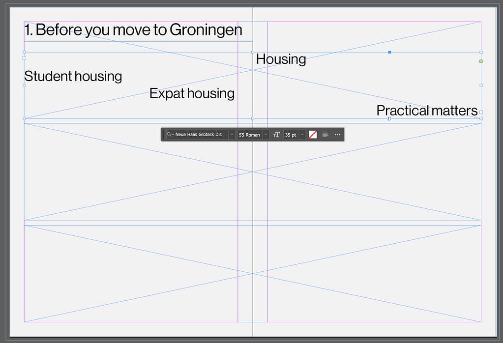
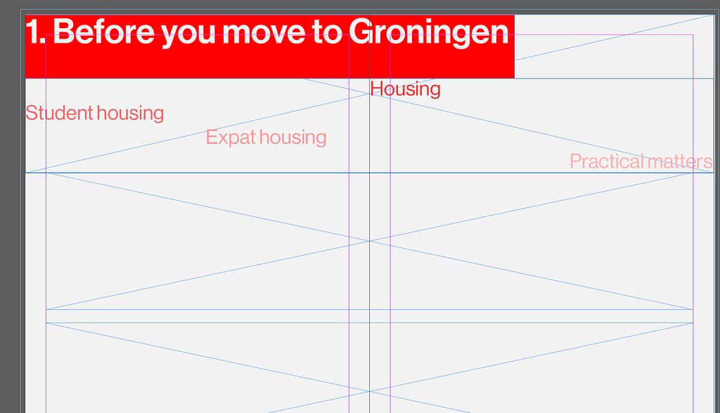
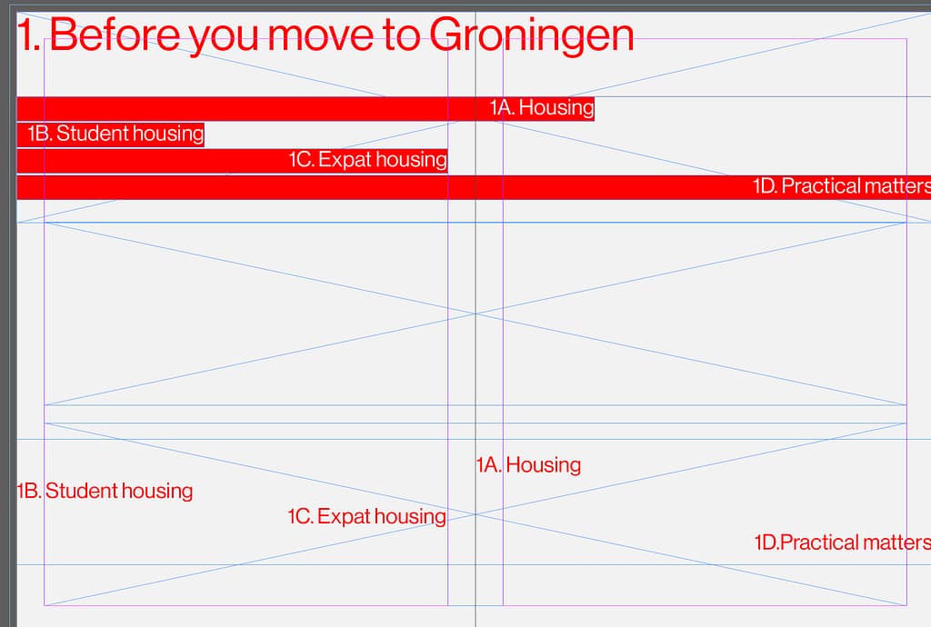
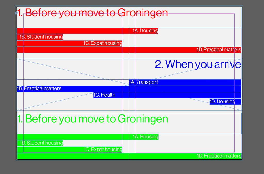
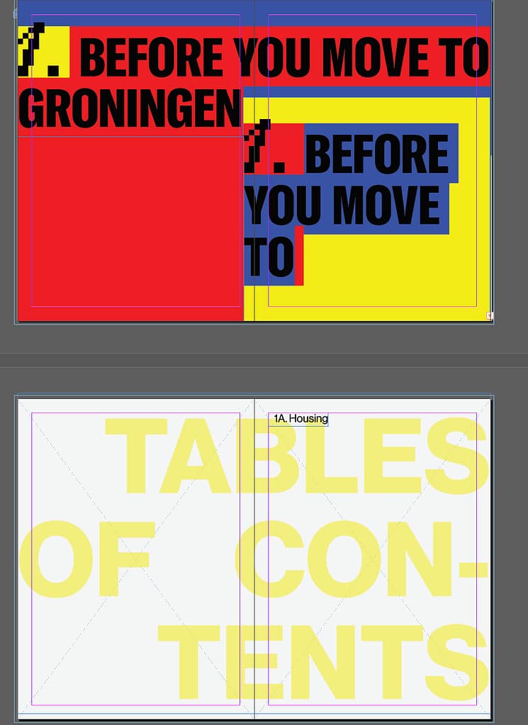
Here I am trying to work on the tables of contents first and create a general feel for the magazine.
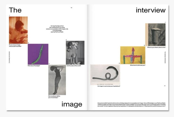
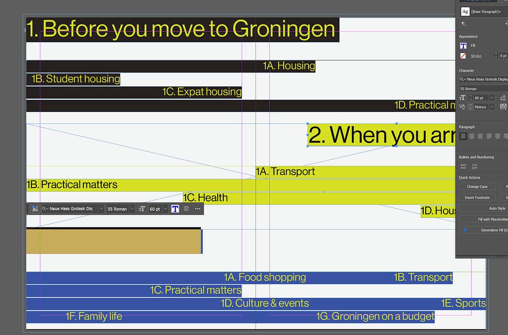
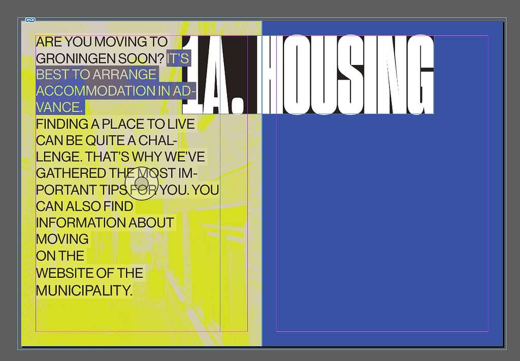
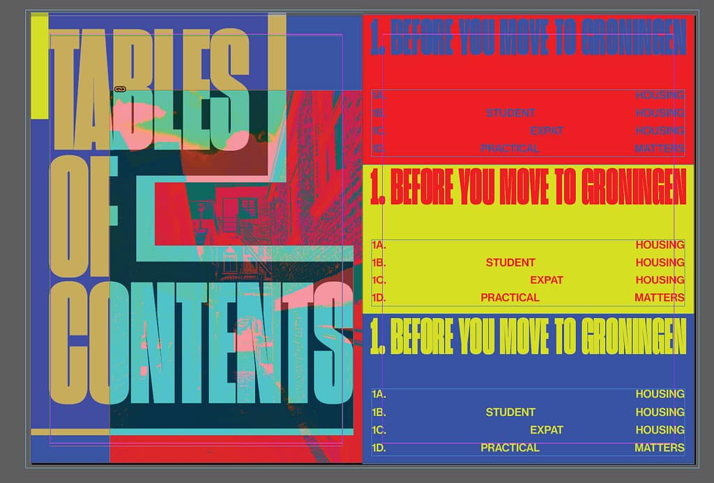
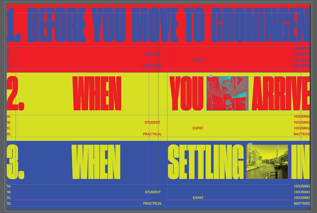
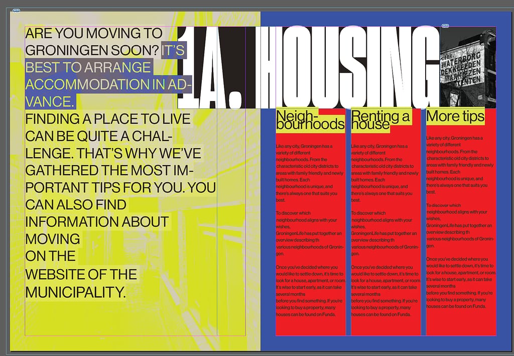
First concepts proposal 2 (targeted)
First concepts proposal 1 (neutral)