I. Inspiration
Magazines (sort of) owned by me
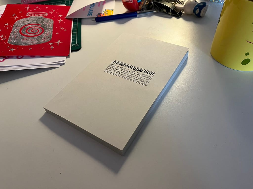
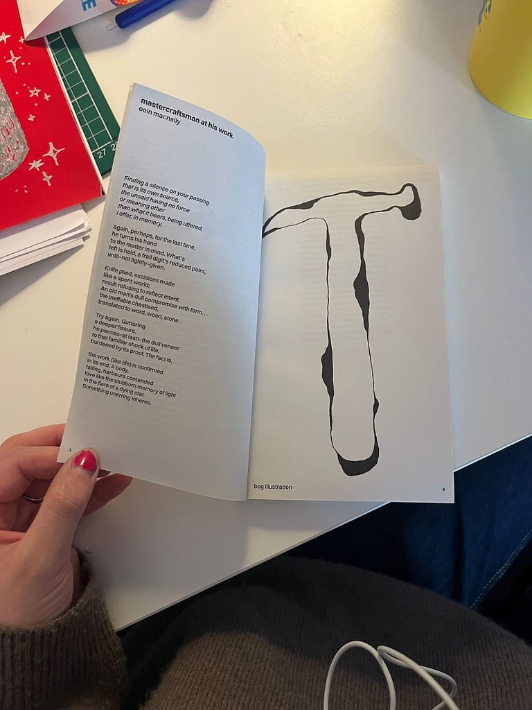
mnemotope
bogbodiespress
edited and designed by réiltín ní aodhagáin & lilou angelrath
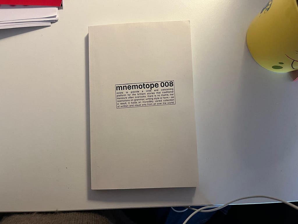
“exists to provide a wide and welcoming platform for the brilliant stoeries that traditional literature often overlooks. there is no theme, nor restrictions on grammar, writing style or form- as a result, it holds an indredibly varied collection of written and visual arts from all over the world.”
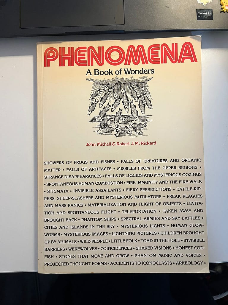
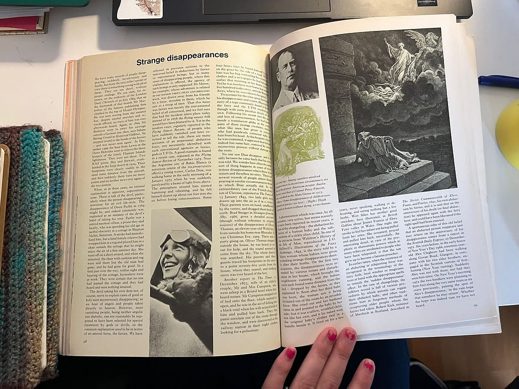
PHENOMENA A Book of Wonders
Design by Carl Wilson

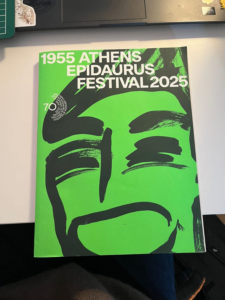
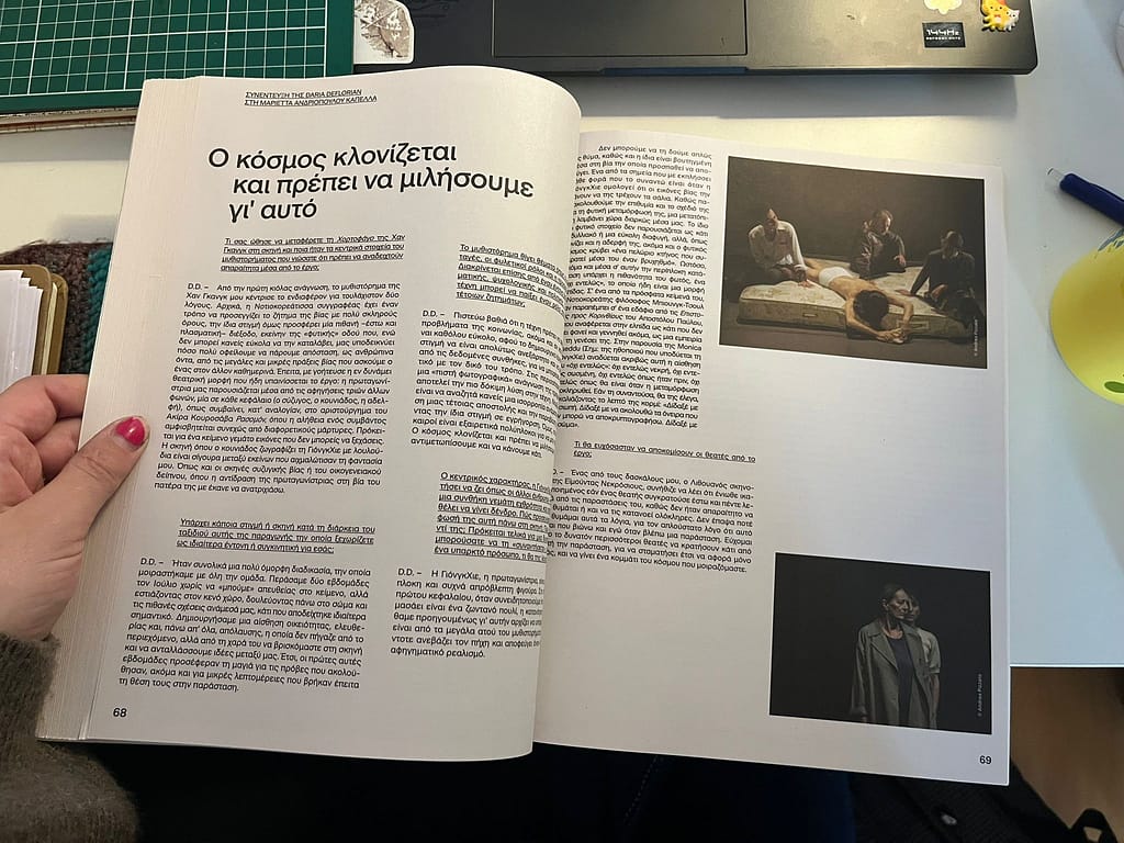
1955 EPIDAURUS FESTIVAL 2025
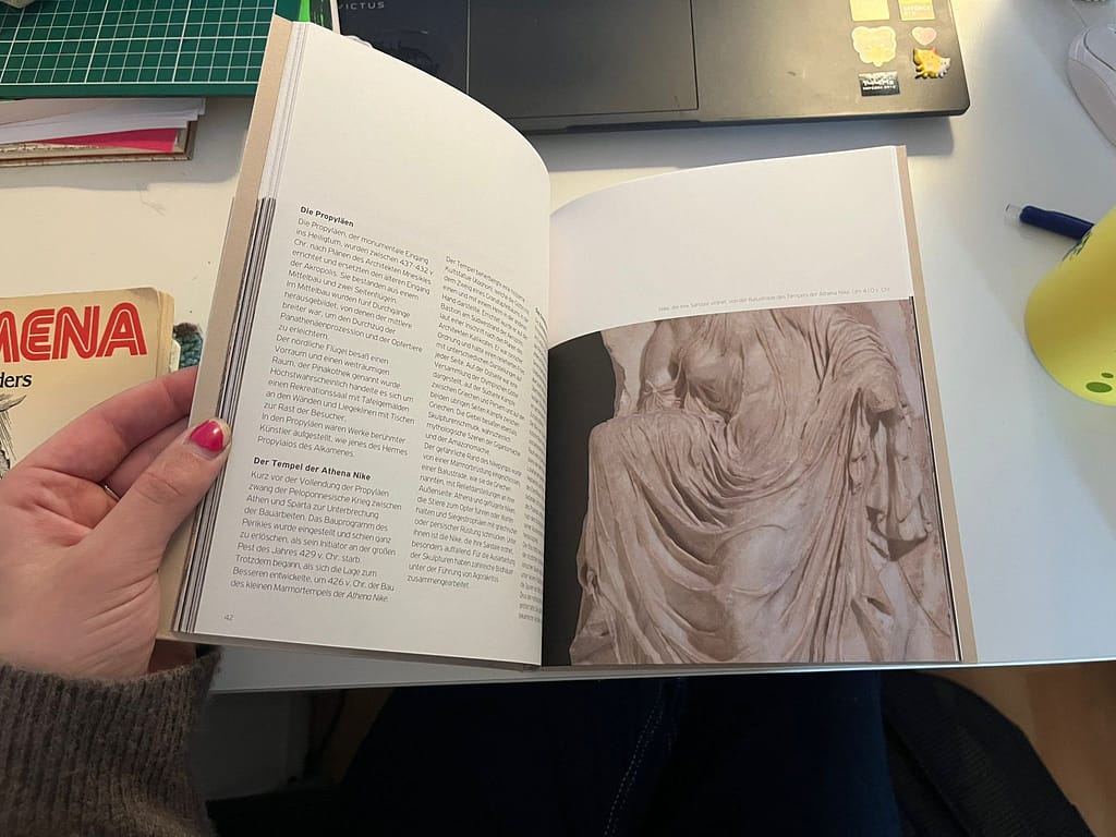
Information is in Greek- so I can’t read it
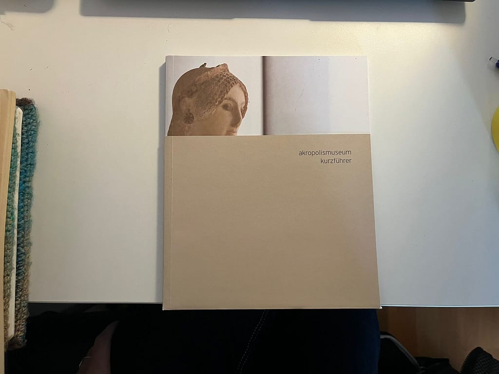
Akropolismuseum kurzführer
Inspiration from the library
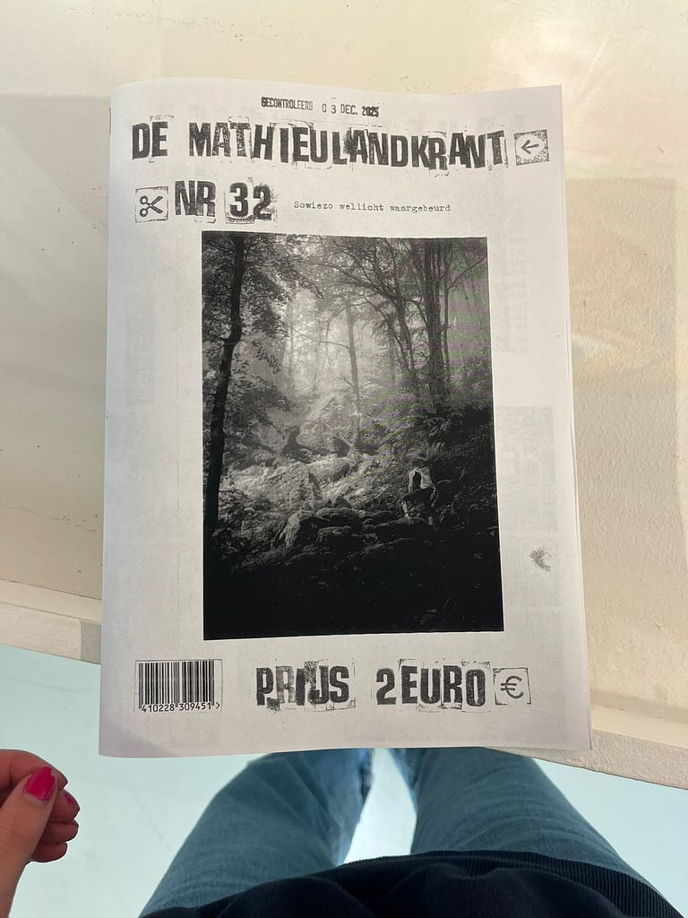
De Mathieulandkrant
★I like the low budget production that creates a higher accessibility.
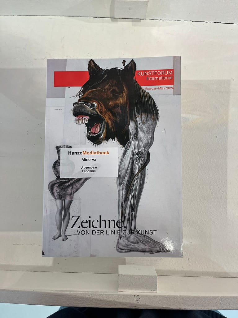
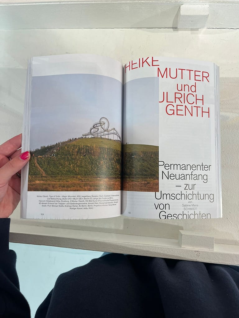
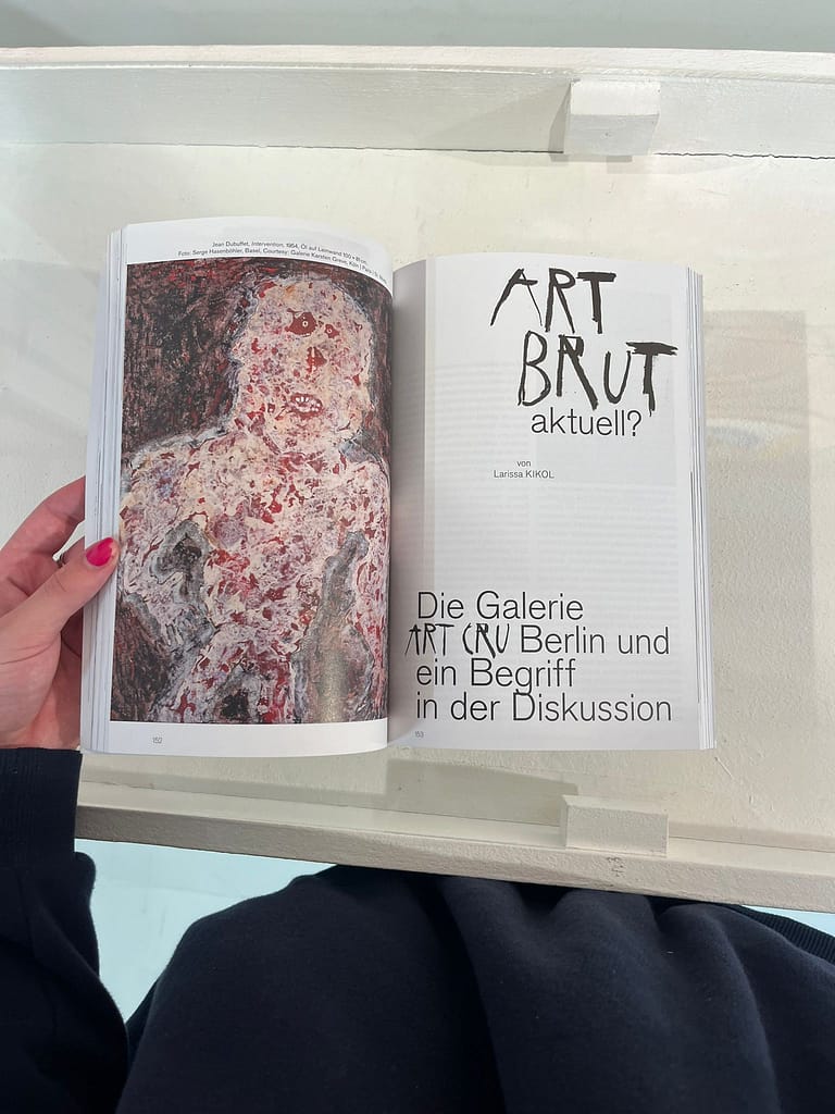
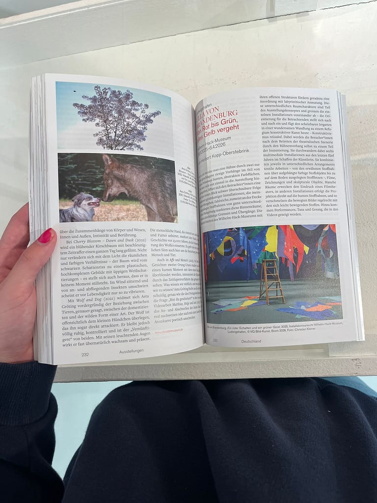
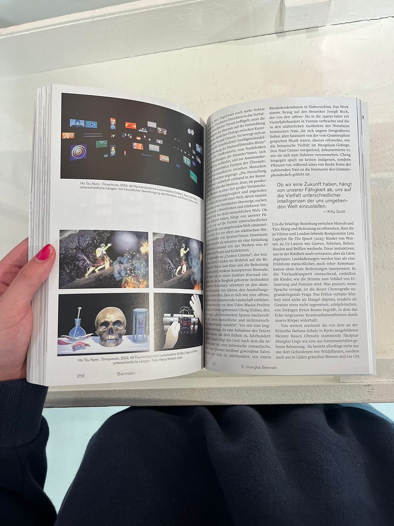
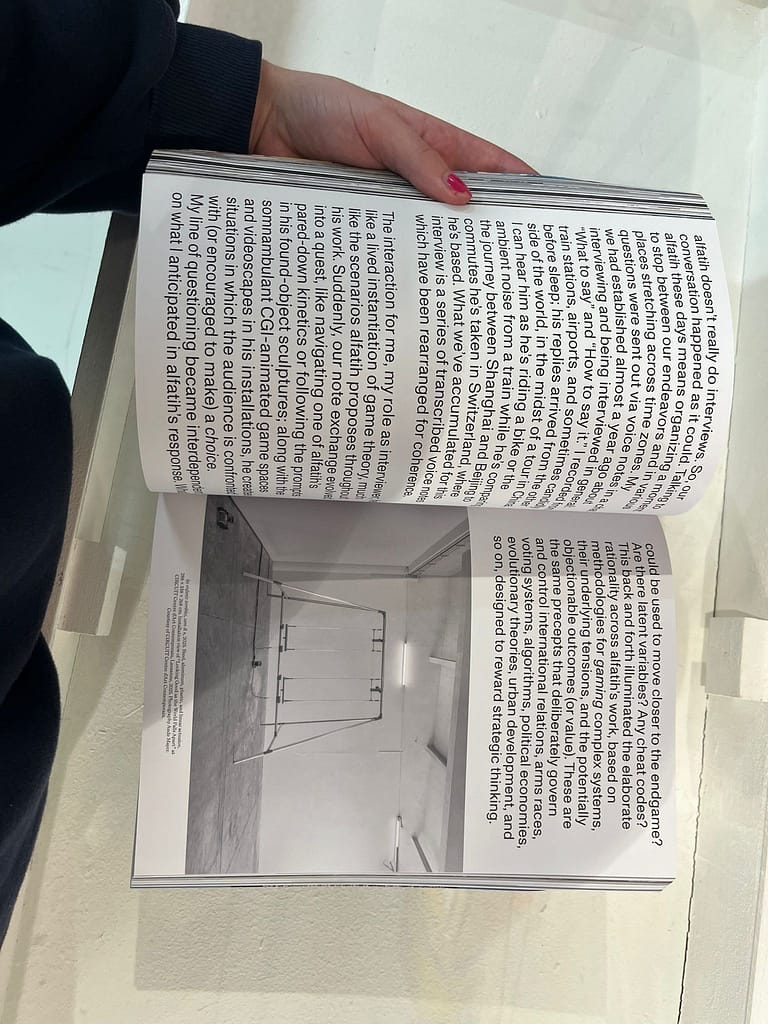
Kunstforum international
★Layout overlap two pages
★Text till edges of pages
★Use of different fonts and colors (interesting)
★Use of large type
★Use combination handwritten typeface & computer typeface
★One page used for one full picture
★Layout (placement of text and pictures, width), typeface
★Starting new article close to end other article makes it dynamic
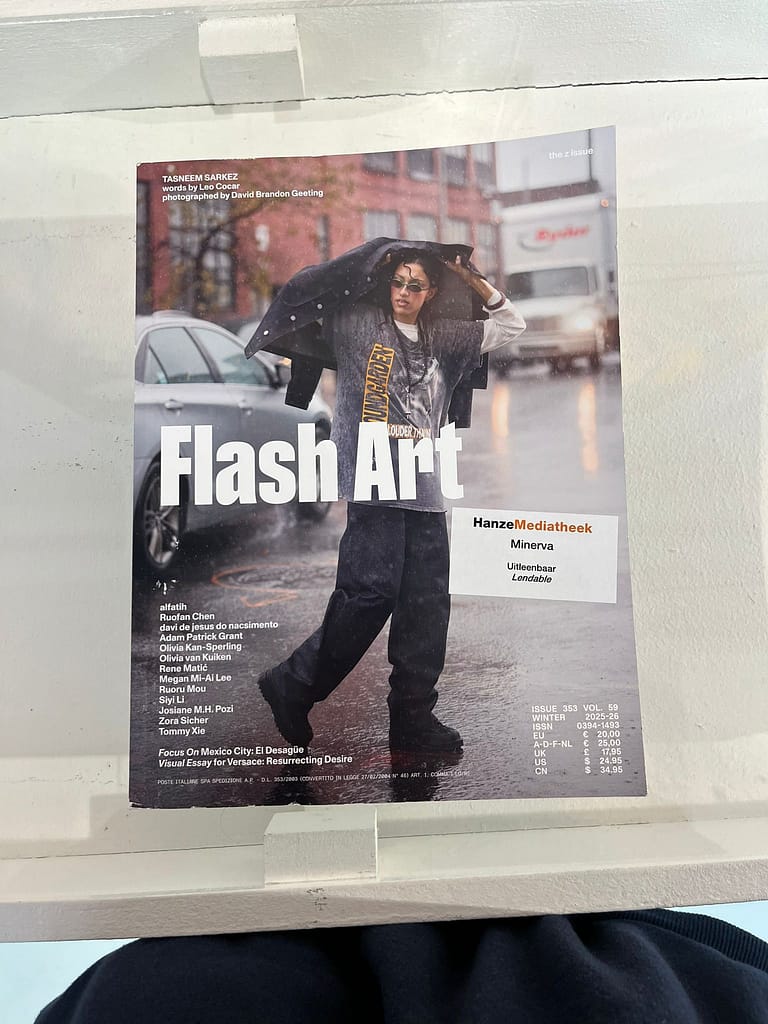
Flash Art
This cover made me not interested in this magazine at all, I think it looks boring and as something I would not be really interested in. I think the cover is not representative for the content inside, because that was on the contrary way more interesting, playful, artistic and experimental. This was my favourite magazine in the Minerva library.
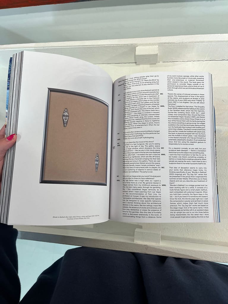
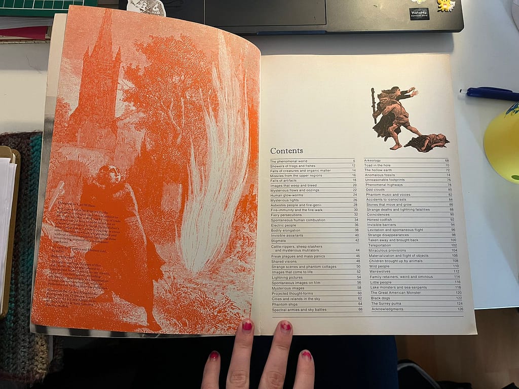
★I like the layout: one page for one picture on the left and clear devision of paragraphs on the other page
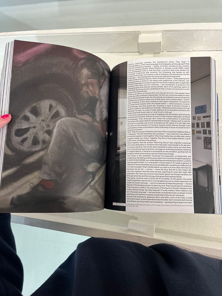
★Again, playfulness by making a (readable) column on a page originally filled by one whole picture.
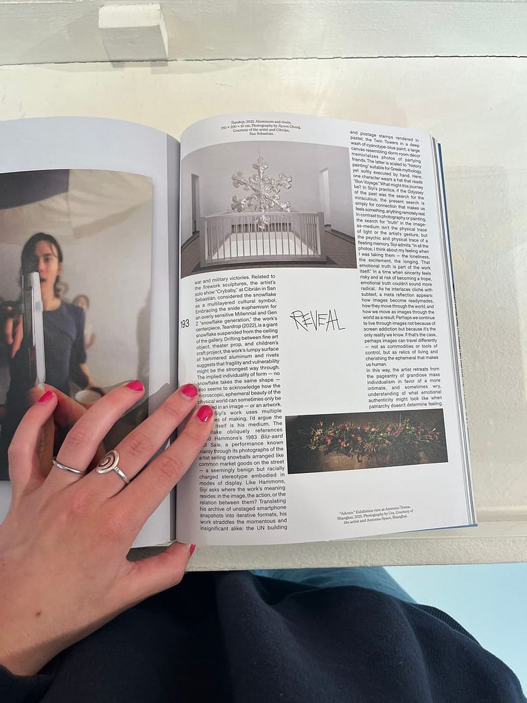
★The experimental layout of the colums together with two pictures. As lines directed in different ways it feels like they build the page together as bricks. The written text in the middle (not exact middle which I think is cool) makes it more playful, it breaks something.
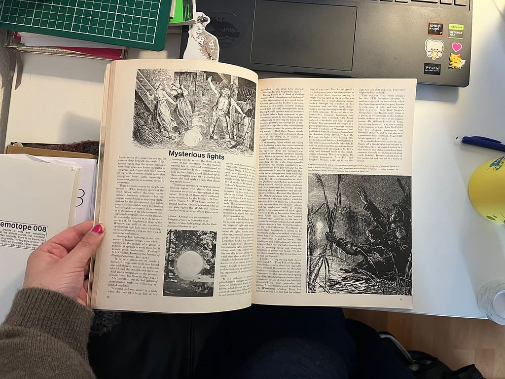
★I like the use of the large typography all over the page in a visual aspect. But readability- wise I wonder if this is the best size to read a article in a serious way.
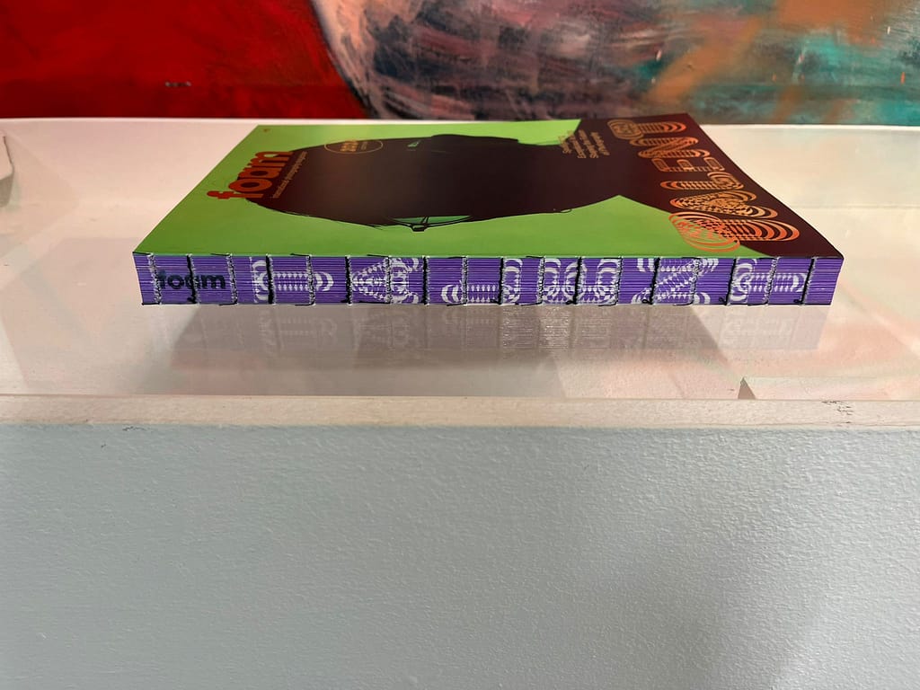
Foam
★Table of contents, colors and binding of Foam
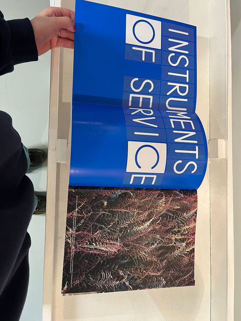
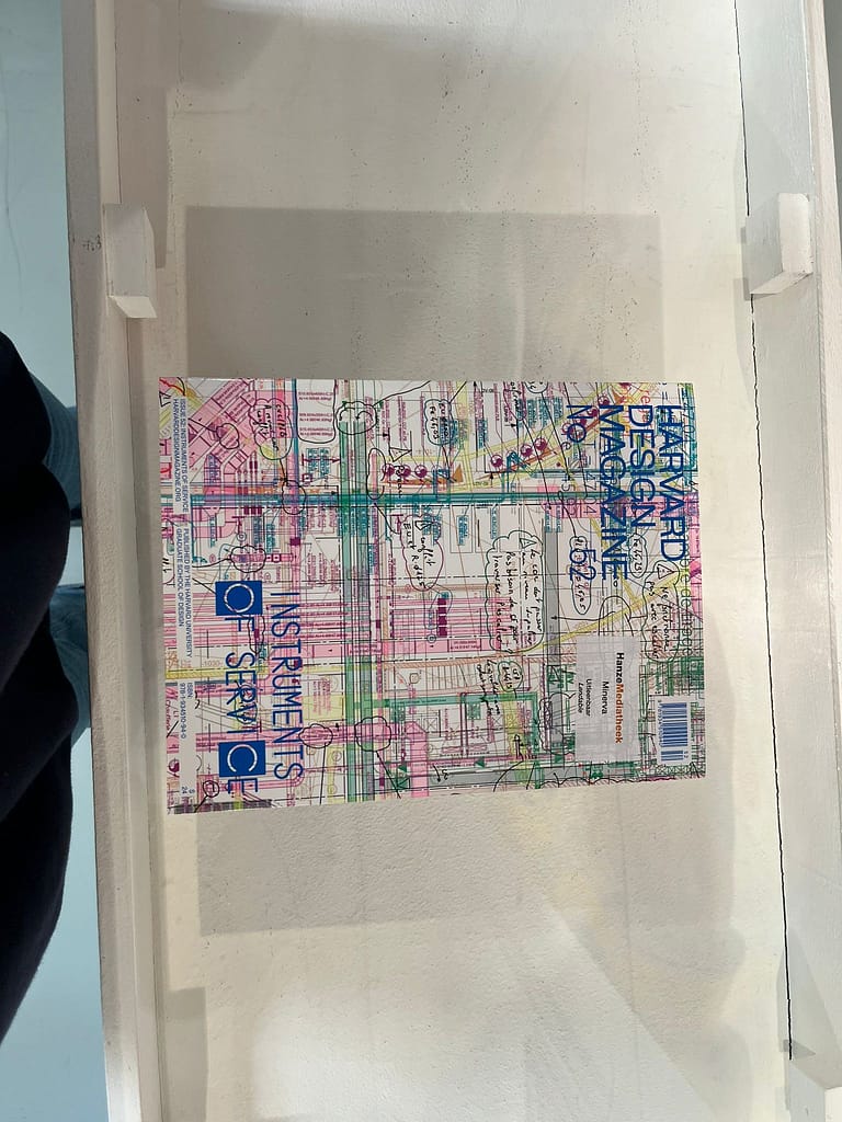
Harvard Design Magazine
★Cover and ‘flip’ page:
Playful, colorful and interesting
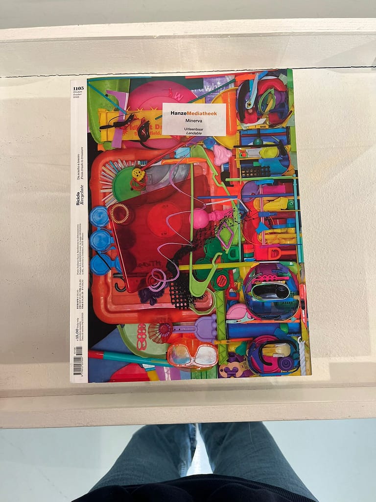
Riciclo Recyclate
★Cover: Very colorful, and only text on the white binding stripe, very small. I think this is interesting because its unconventional.
As I’m flipping through all the magazines in the library, I notice that I (again) don’t like the usual magazine lay-out and I’m searchinf for new and different ways of laying out text and making things interesting.
★Placement of text & image
★Color of text
★Colors
★Playful layout
★Difference in typesize
★Playfull
★Illustration
★Off the grid
★Hand made
★Layout
★Image and text
★Playfulness
★Dynamic
★Colorful
★Not too much going on (good)
★Typeface and layout
★Color (all one color)
★A lot
★Playful
★Fun
★Funny and playful
★Not that serious
★Color combination
★Paper material
★Images
★Connection between both pages
★Visual information
★Spikes attention
★Image underneath text
★Colors
★Puzzle engaging…..