DIFFERENT SIZE
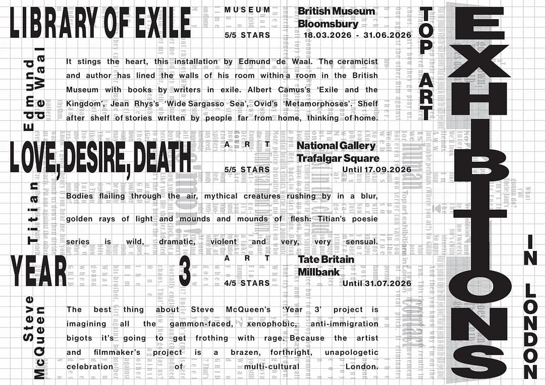
I included a version with the background, because I thought it looked good, as well as to show my process. First, I took my assignment from the week before with the grid and turned the opacity down. On top of that I made the assignment from the week 2.
ONE SIZE space only
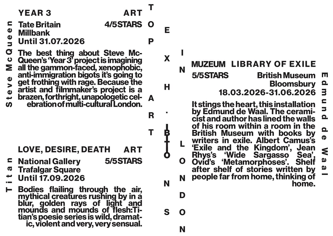
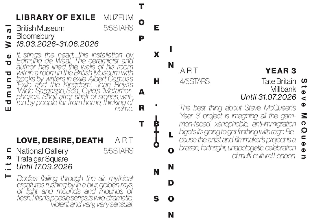
I got bit confused with instructions: “one font, not the typeface” and assumed that it is one font, but not only one typeface. That is why I made 2 versions. I used bold typeface in the universal one, since the assignment was about spacing and I feel like boldness of the letters really bring the shape the grid out of this design.
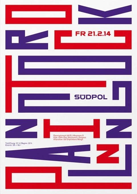
COLOR
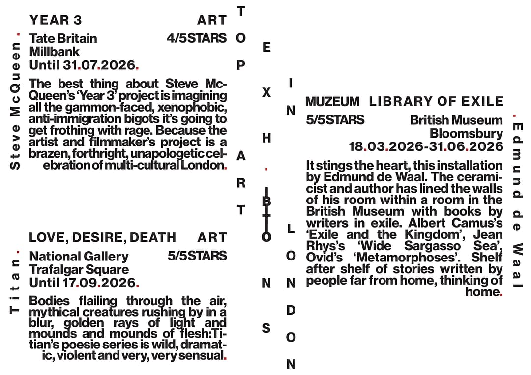
I decided to be minimalistic with color and only used it as an accent.
MINIMALIST TO MAXIMALIST TYPOGRAPHY EXAMPLES: