for this infographic I made I decision to make it about the free smoking area in Minerva. Since it’s a space I visit a lot during the times I’m in Minerva. Then on the 9th of march when it was the busiest day I recorded data visuals and since cutting was not smart I decided to show the info roughly by percentage.
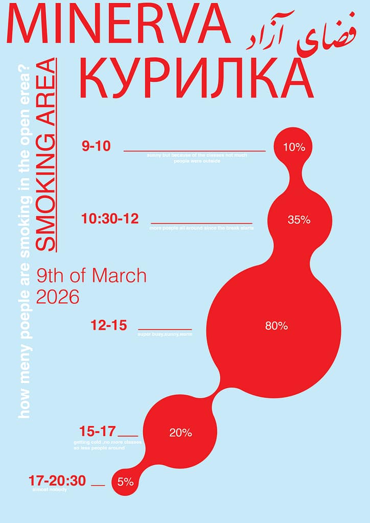
The reason behind the language I selected was to experiment visually and attract more attention to the data more maybe…
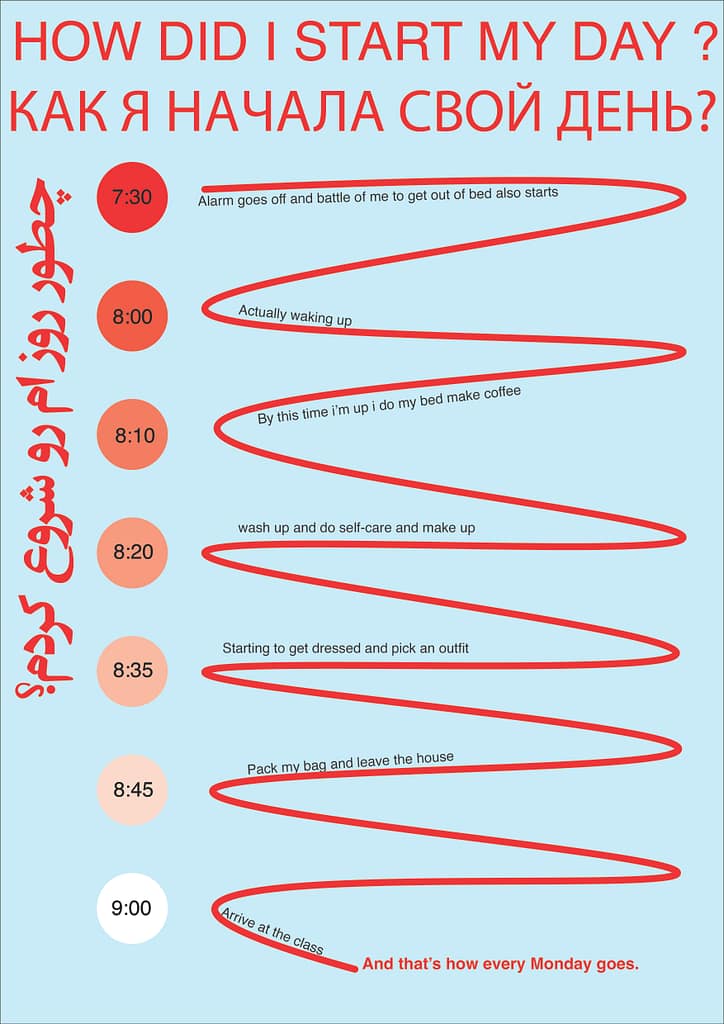
How did your day starts?

also I decided to add my sketch that includes short planning and the information I want to add .
and so that became my final result.
for my time line first!
and also I decided to keep teh same theme for all the infographics related t this assignment
What I had for breakfast