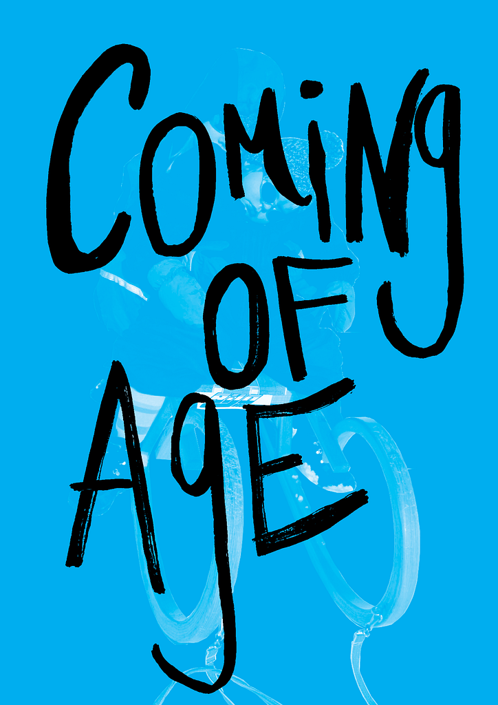
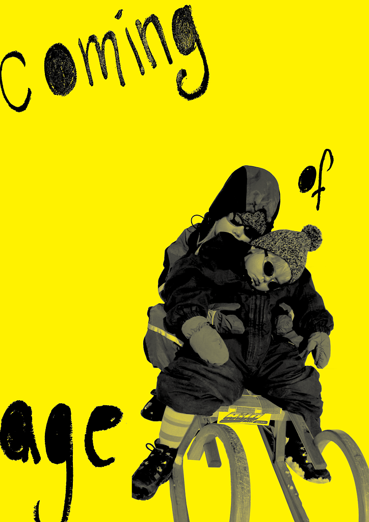
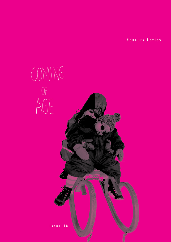
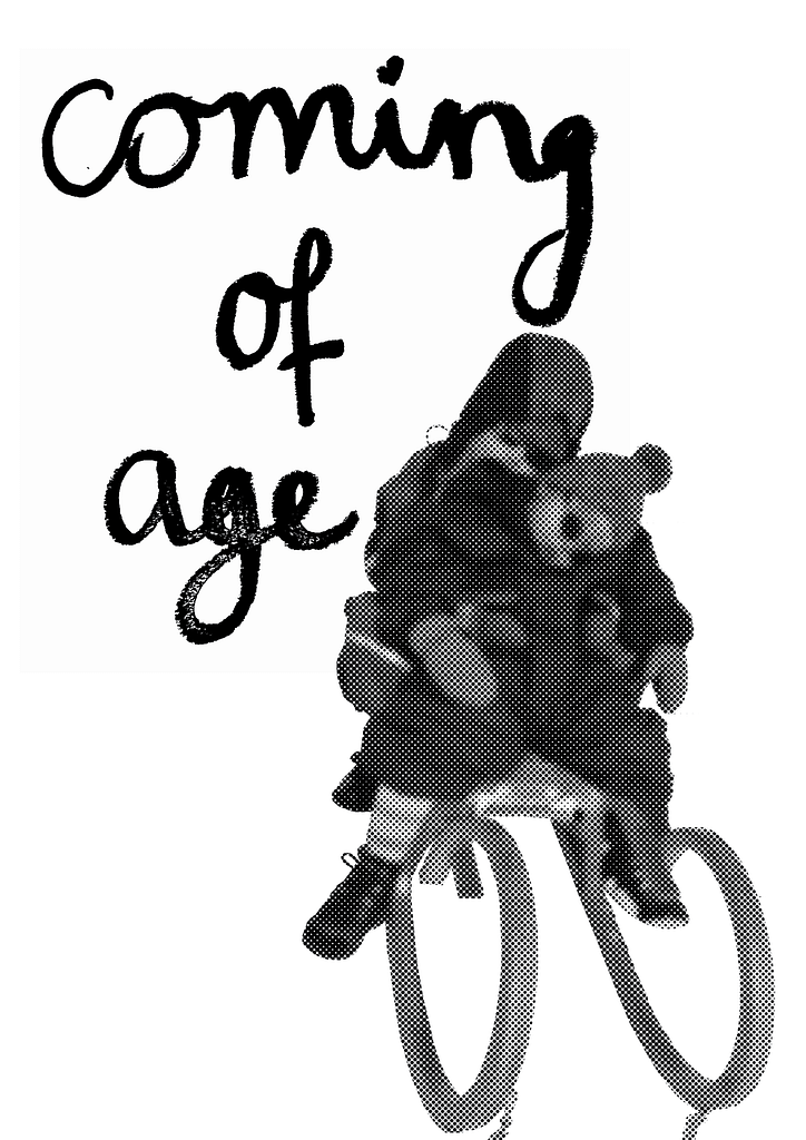
For the cover of the magazine, I tried to stay true to what i did for my spreads as well. I wanted it to feel personal and scrap bookish. I like a photo album you would get as a present for your 18th birthday. I also wanted to keep that kind of “punk-ish” element I had in the mood board as well, so I choose bold colors and handwritten fonds. Like someone just glued the cover together with an old photo they found and quickly wrote on top of it.