@here.mag Issue 11
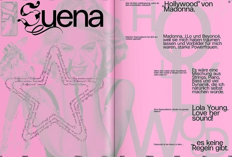
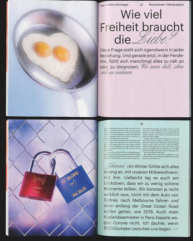
I like how it is bold and expressive. The large typography stands out and becomes part of the layout, not just text. I like how the pages mix simple areas with bright colors and interesting images, which makes them more engaging.
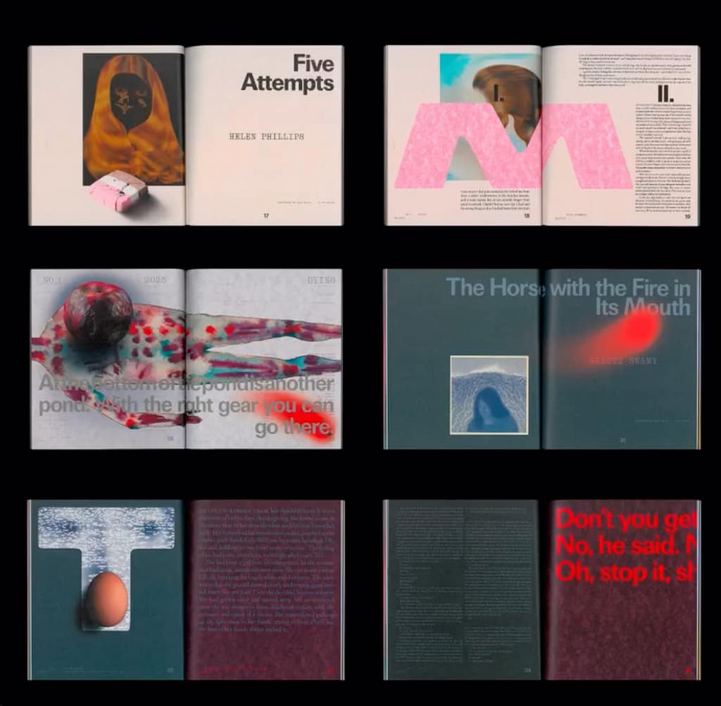
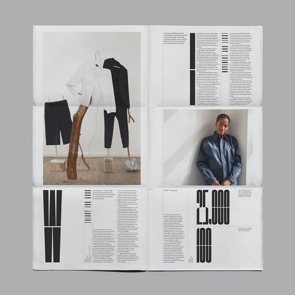
Spreads from POLYTON Magazine
I like how this one is more experimental while still using simple colors. The limited color palette makes everything feel clean, but the images and graphic elements stand out more.
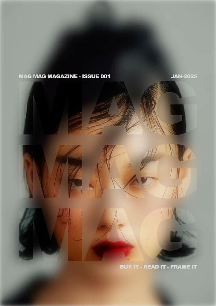
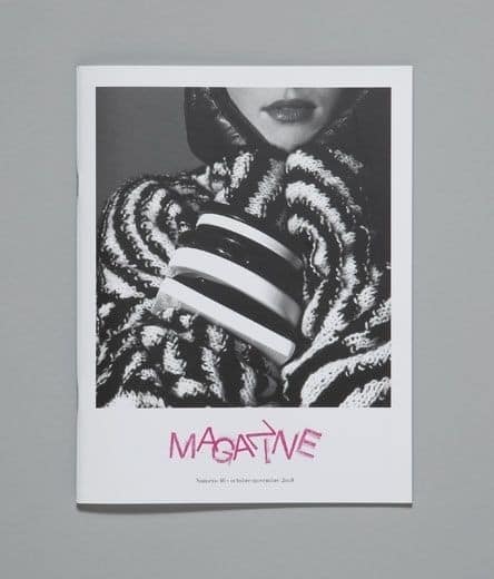
Mag Mag Magazine cover – issue 001
The big typography is placed over the image, blending them together in a creative way. I like how the text and image work as one, making the design feel modern and clean.
Magazine cover n°16, published by the Centre d’art contemporain de Genève
Arranged feels clean and balanced, and it shows how a simple structure can still be visually interesting.
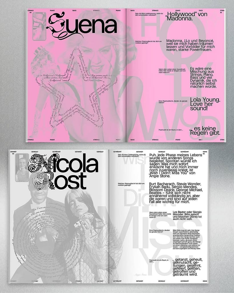
expressive but still very clear. The layout separates the image and the text, making one side more visual and the other more informative. I like how both parts are still well designed and balanced, which makes the layout feel clean and easy to follow.
I chose this design because it is more informative and very simple. I like how clean it looks, and how only a few elements are used to create something readable and well designed.