Inspirational editorial design: COLORS magazine 1991 – 2014
COLORS was a quarterly published magazine about ‘the rest of the world’. Each issue would pick a topic, and covered the theme from an international standpoint.
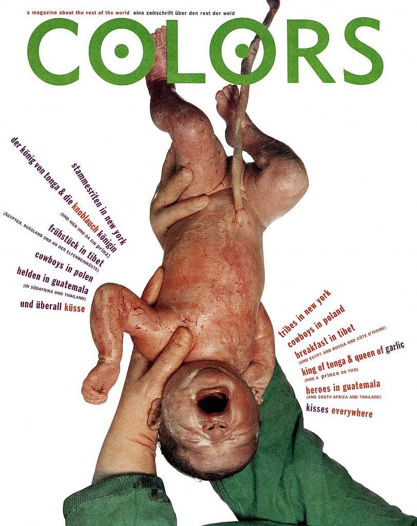
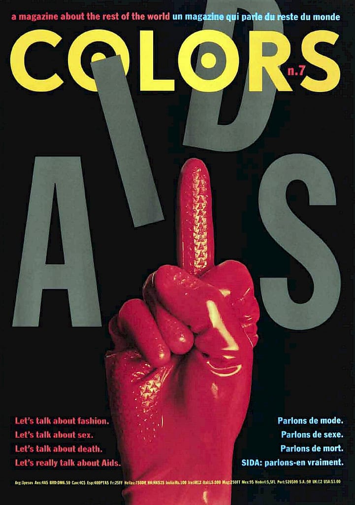
The covers often used photography. The subject of the photographs was often the opposite of mundane to the average western person. It wasn’t always clear that the issue of the magazine was about. This evokes a sense of curiosity in the viewer.
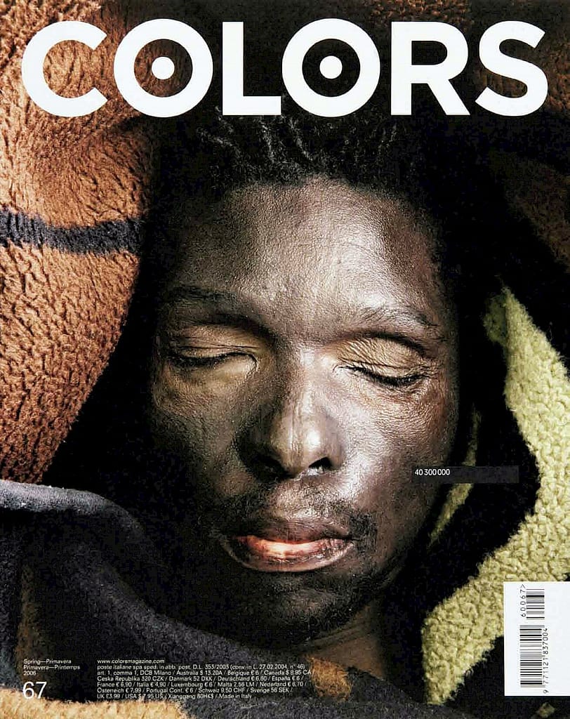
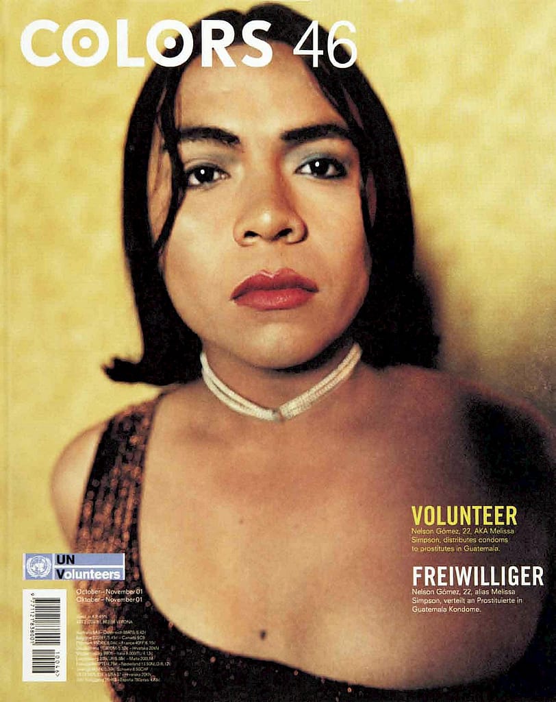
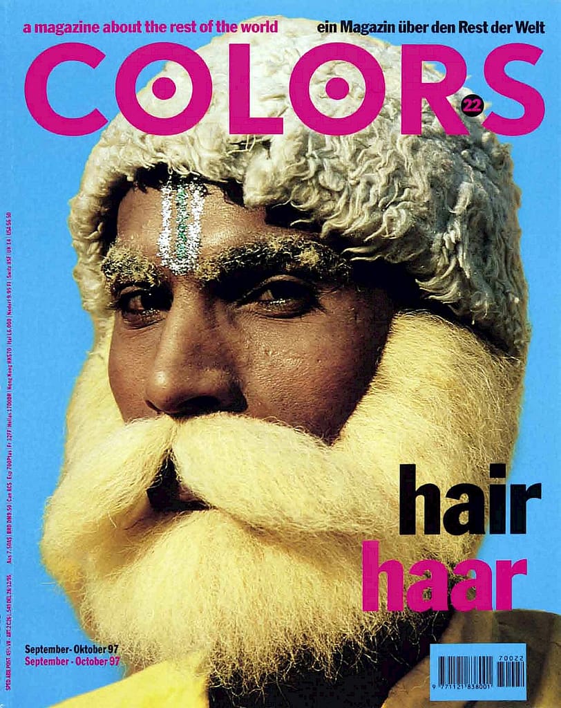
Sometimes the covers showed portraits of people from different parts of the world.
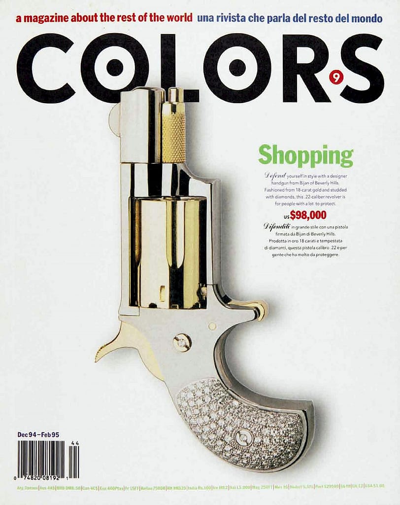
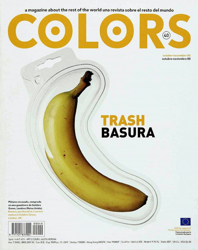
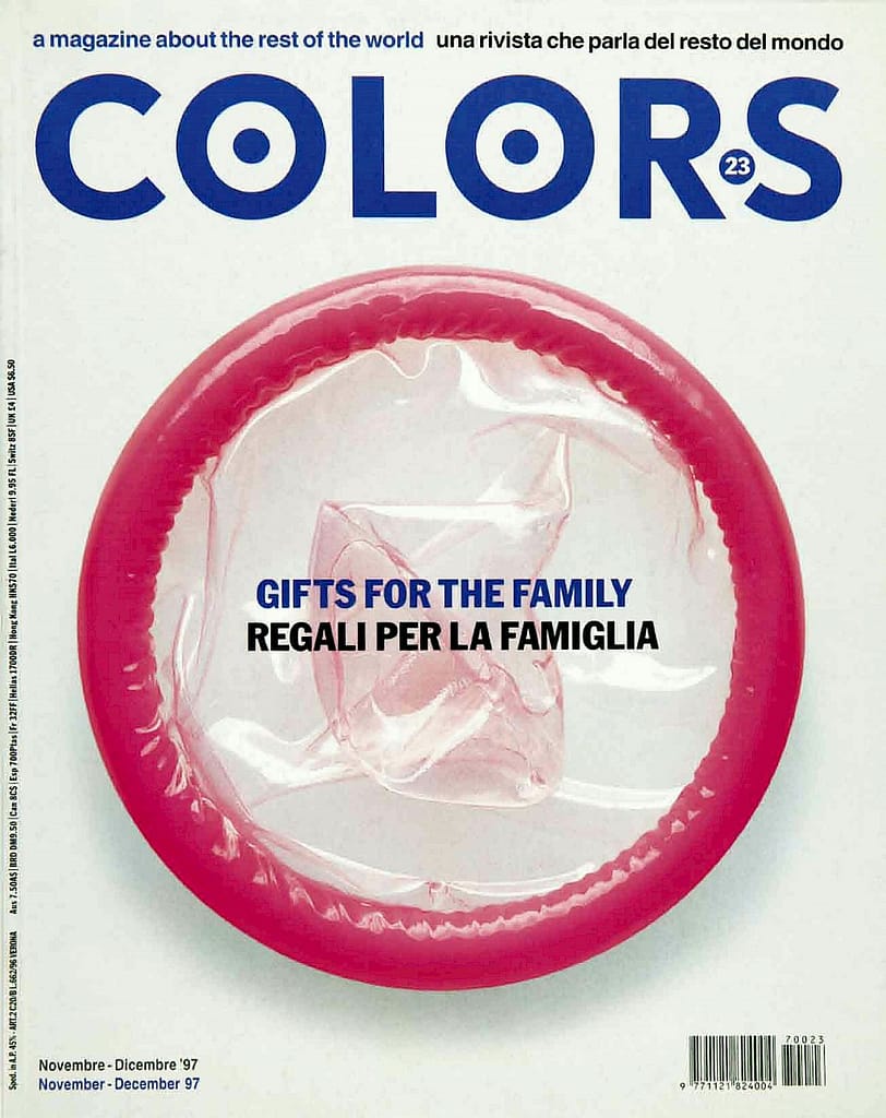
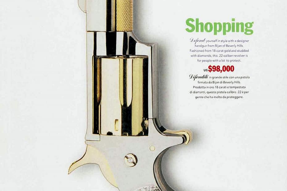
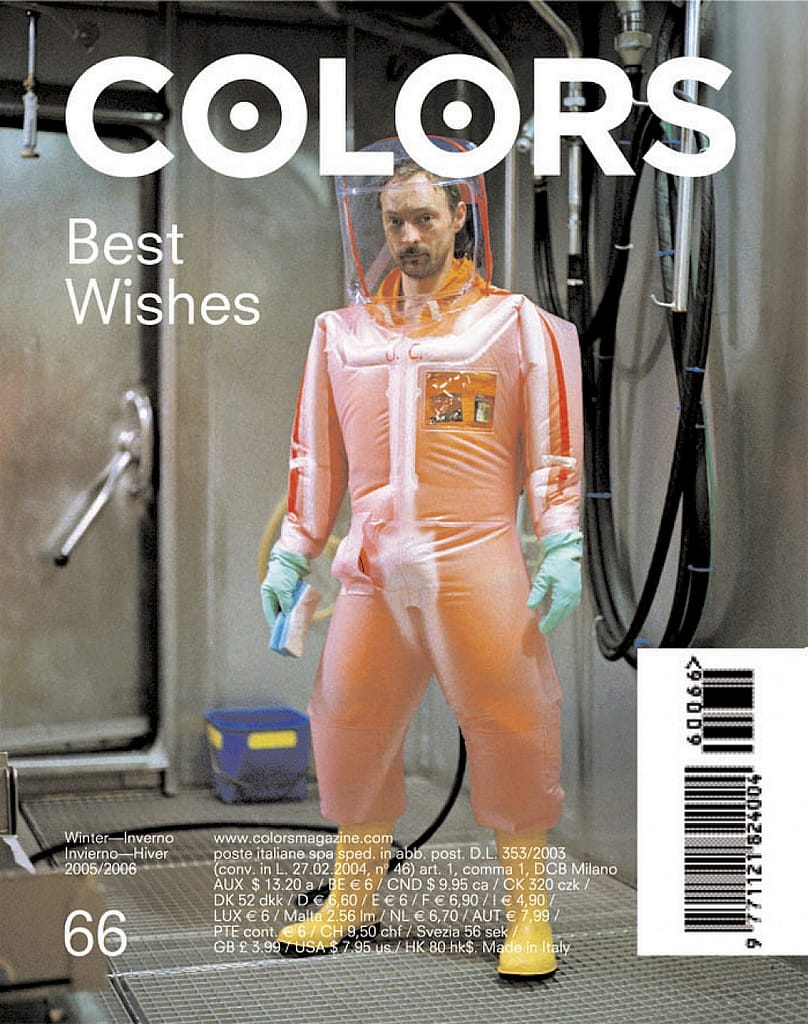
At other times the covers showed single objects on a white background. I find the singularity of these covers amusing – they usually display a single person or object – showing a single perspective in the chosen topic. The subjects are chosen to spark curiosity – sometimes it is a graphic, even gory image. Sometimes it is a person in traditional clothing from a country you haven’t heard about. other times it’s an unusual object. The covers had a consistent graphical style and theme.

The contents of the magazine differed greatly between issues. But there were some similarities – all issues were bilingual. (in this example in Chinese)

Both imagery and info graphical illustration was extremely important. The content of the magazine centers around everything. In this issue called “What makes you happy” there is a page dedicated to learning to smile. These informational pages were interrupted with whole page photograph spreads such as bellow. These pages were no labelled or captioned, allowing the viewer to deduce the meaning themselves.

A section of the magazine titles “the yellow pages” catalogued random products, articles and stories. This is similar to “The Whole Earth Catalog” by Steward Brant.


The magazine often told stories through a collection of items.