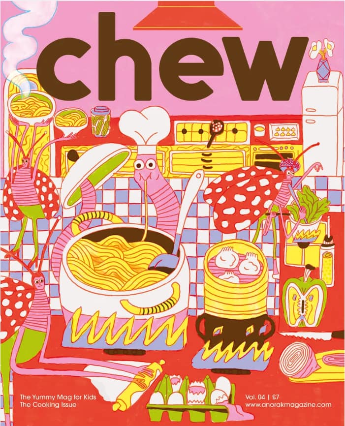
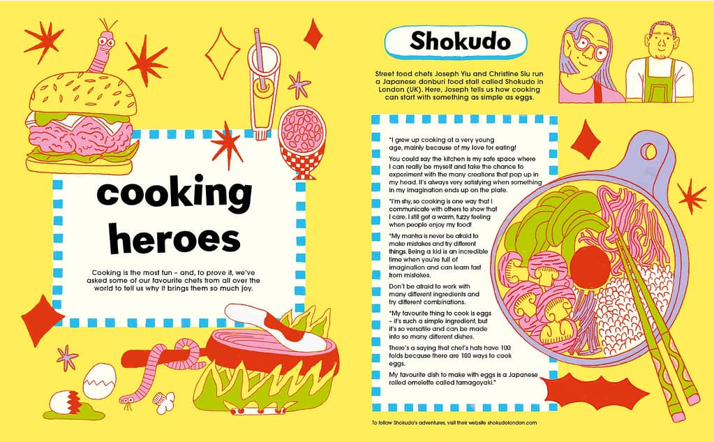
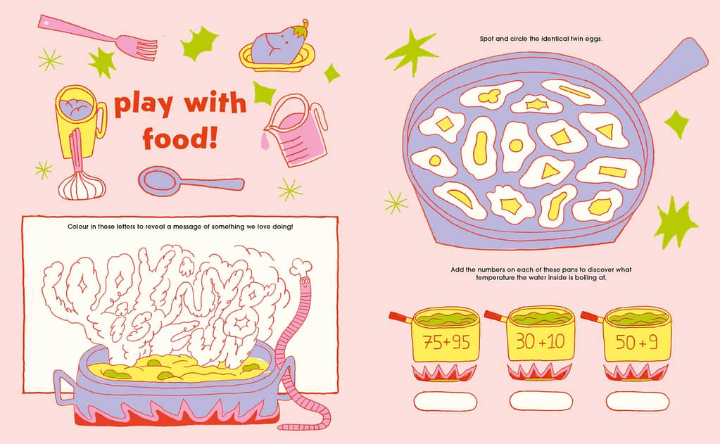
This is a magazine I find very inspirational. It’s called Chew and it’s by a British studio called Anorak that puts it’s focus on making magazines for children. Chew is a series specifically about food. It is very illustration based, but the colours, playfulness and creativity really pull me in. It’s also a little different from ‘regular’ magazines since it’s a magazine made for children. I find this very interesting. A different demographic than I usually consider, even though my style would fit this younger demographic. So I think that is nice to think about.
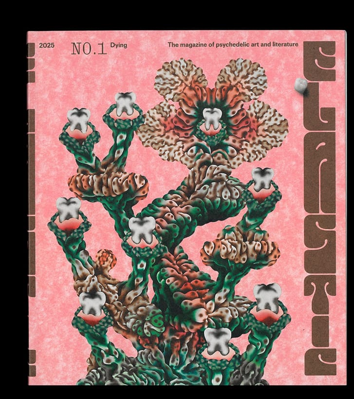
This is a magazine of psychedelic art and literature, a topic I don’t see magazines about. What I find inspiring is again the use of colour and the different media used in the book. Also the repetitive type and other elements make the magazine nice to look at. I get very inspired and excited by big typography which is used a lot in here, and also by simplicity and calm pages.
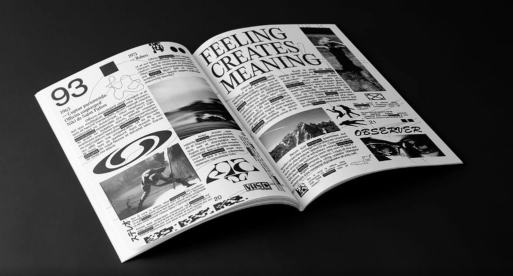
Last inspo. This is an experimental magazine by Gross Robert-Paul, a Romanian graphic designer. What i find inspiring in this design is how he is able to create a very interesting page with just black and white. I often use a lot of colour so this is good to see. He uses illustrations, lines, shapes, photographs, experimental fonts, different sizes typography. Very cool to see how this is all combined into a cohesive, fresh and balanced magazine.