- IGTimes
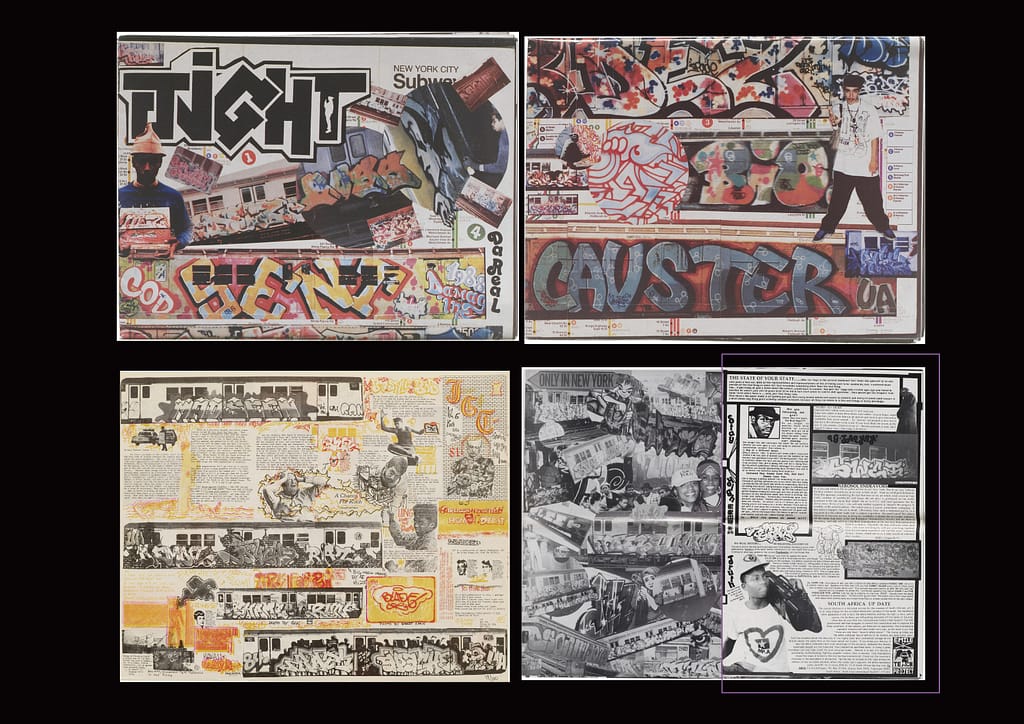
This is a collection of graffiti images.
The contrast between the clean, organized grid and the graffiti-like elements inserted throughout the text is particularly striking. ( purple rectangle )
Additionally, color is applied only to the images, which enhances the contrast even further.
Although the composition is visually complex, this approach helps separate text and image, making it easier to read.
2. Redaction
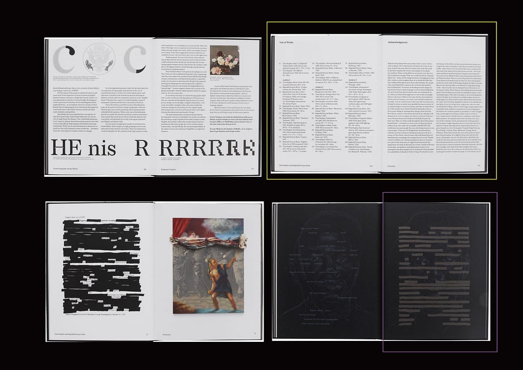
This book creates new texts by erasing words from existing legal documents.
Overall, the text follows a structured grid system. When the content changes, the grid also shifts, creating a consistent pattern that makes it easier to follow.
( yellow rectangle )
However, when the artist wants to emphasize a message more strongly, they use unique methods such as removing parts of the text to leave only certain words, or combining images with empty space.
This creates a good balance between readability and creativity. ( purple rectangle )
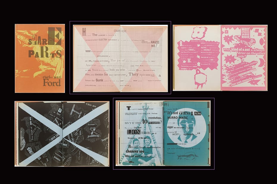
3. Spare Parts
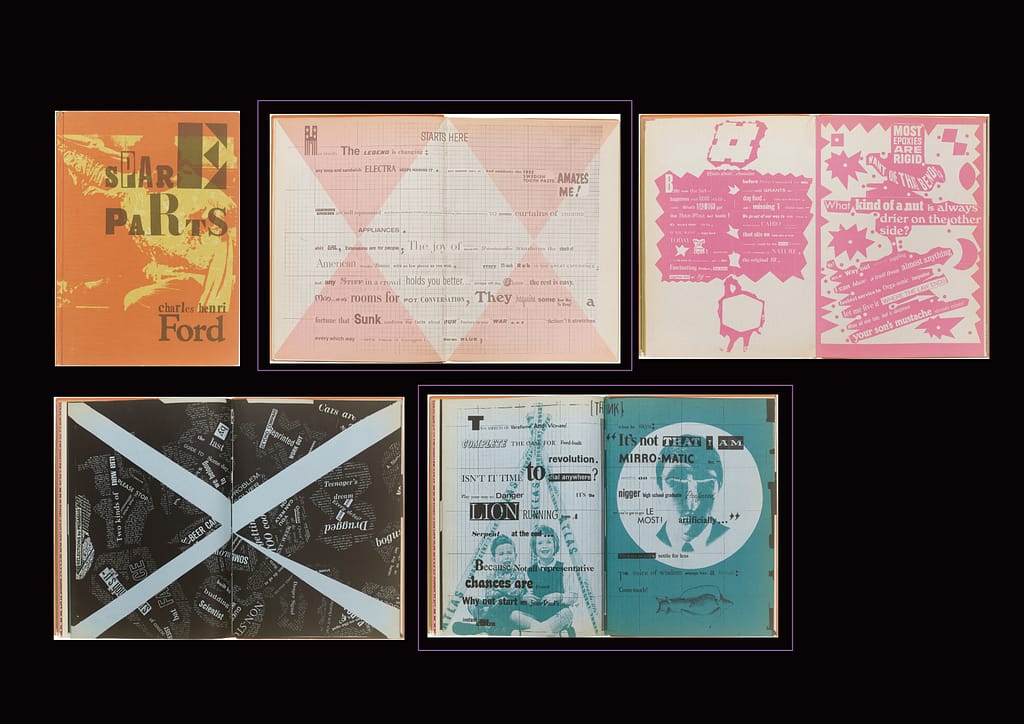
This book presents disconnected words taken from different sentences.
The variation in fonts, tones, and sizes makes the composition visually engaging.
Although it is not meant to be read in a conventional way, the overall mood and nuance can still be sensed, allowing the reader to experience the book more intuitively. ( purple rectangle )
It is also interesting that each page experiments with different visual approaches, making it a useful reference