Collect inspiring examples of editorial design along with a short description
A) Covers
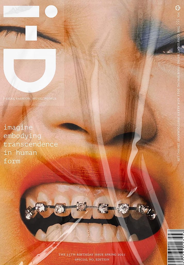
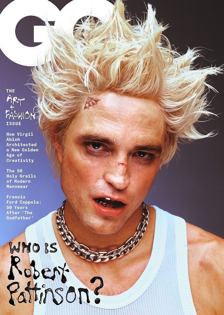
Interesting and bold photography with nice color grading is always a great concept for covers in my opinion. In this I-D example, I love the usage of textures in combination with the close up on the face of the model. The cover feels “perfect” but also rough and edgy at the same time. The same goes for the GQ cover. The image looks flawless, but somehow at the same time still rough, which I find super intriguing, especially with the additional experimental typography.
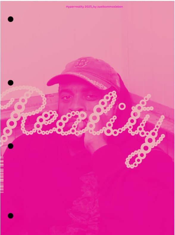
Like said, I enjoy interesting and experimental typography, especially in magazine covers. It immediately draws in your attention and makes the magazine stand out. In the example on the right, I especially enjoy the image peeking through through the text.
B) Text/Grids
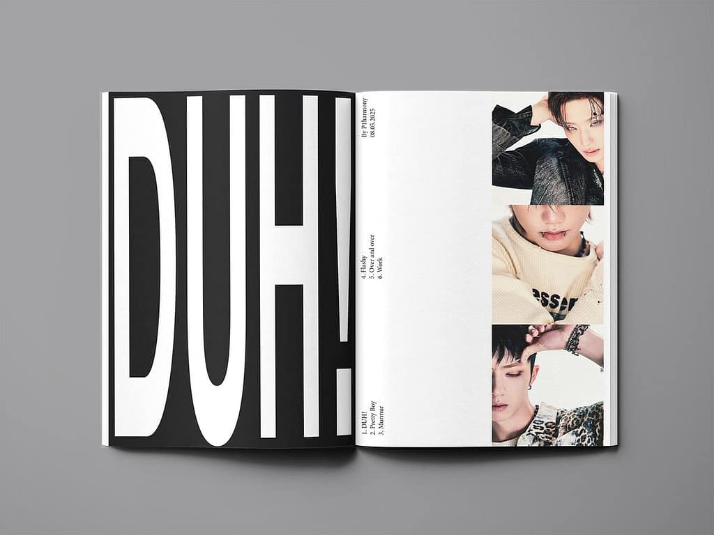
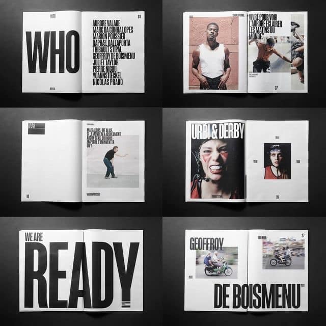
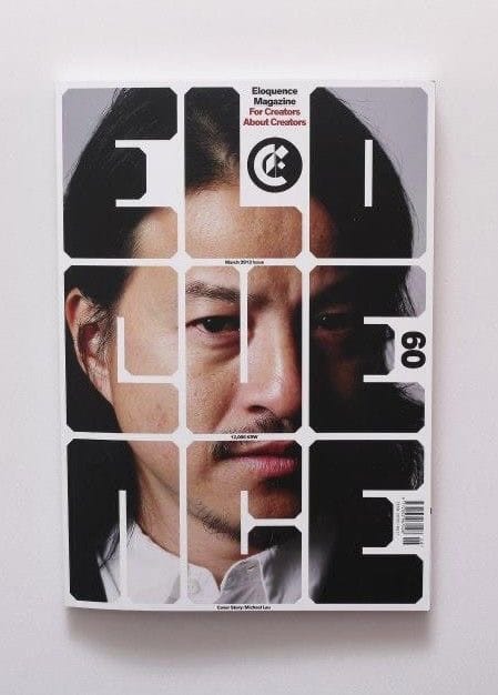
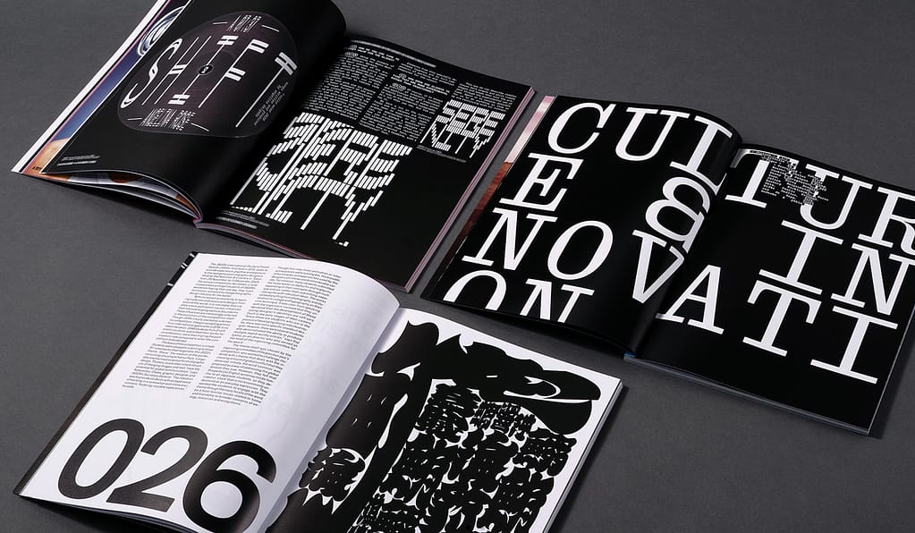
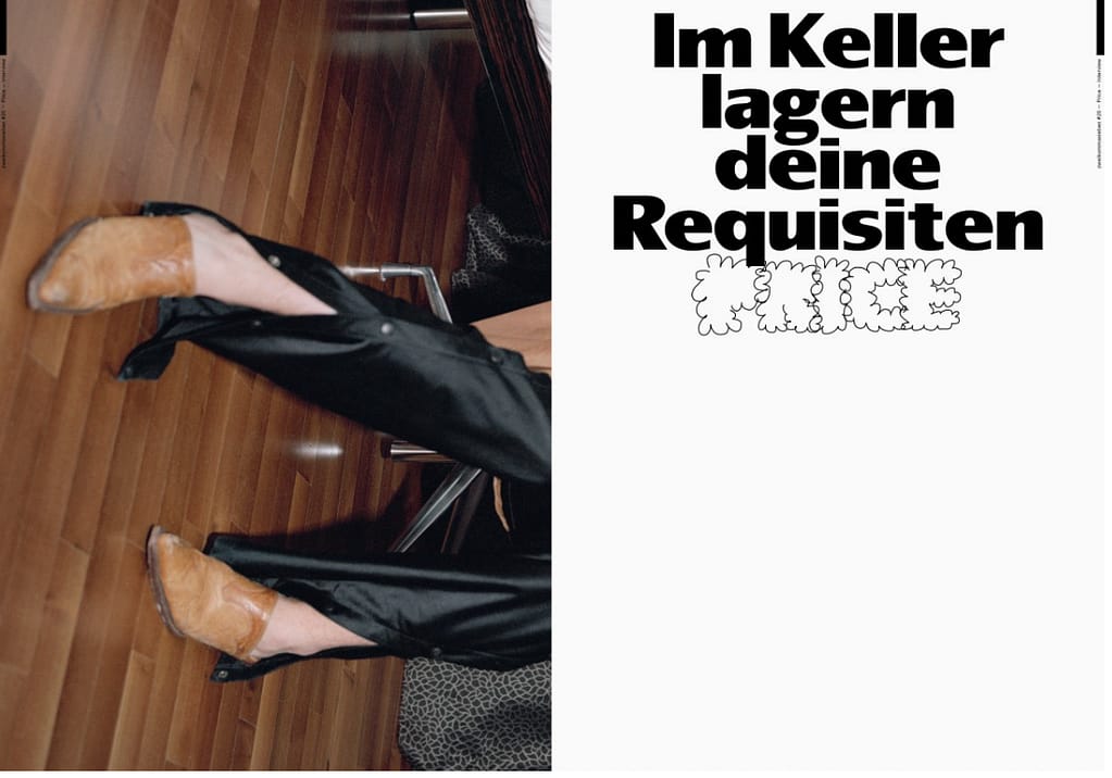
What I find really interesting in these two examples, is the play with bold typography, taking over the whole page or spread. Here, certain words or maybe titles are by far the most important role in the page hierarchy. They’re bold and are almost screaming in your face, jumping in your eye immediately.
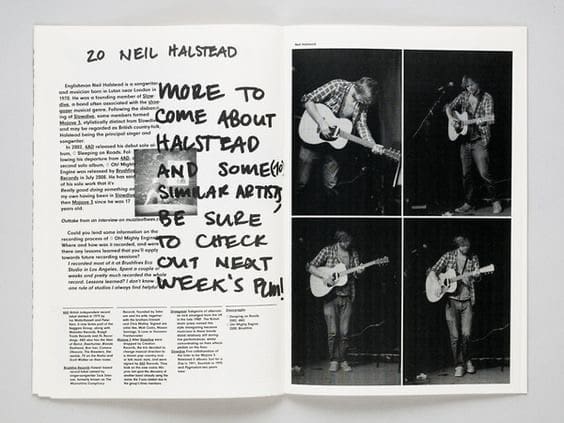
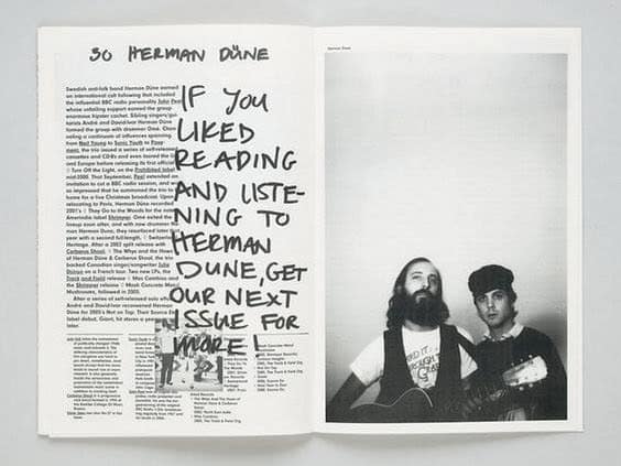
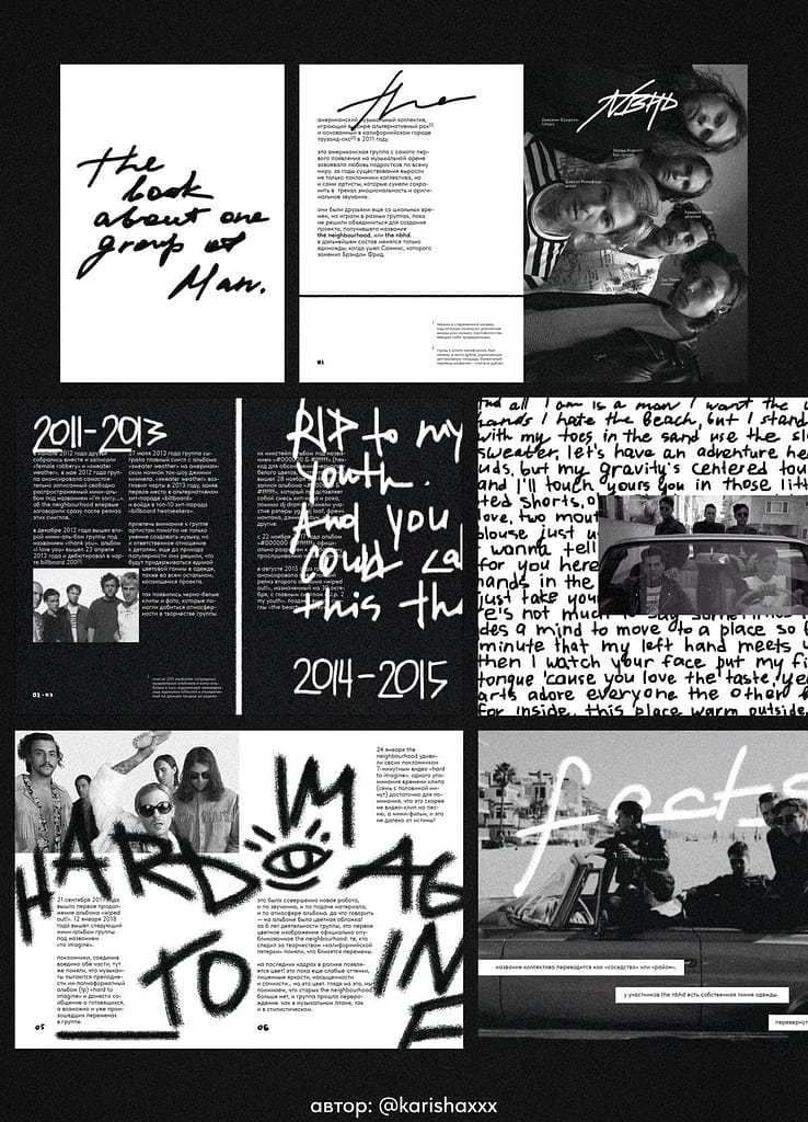
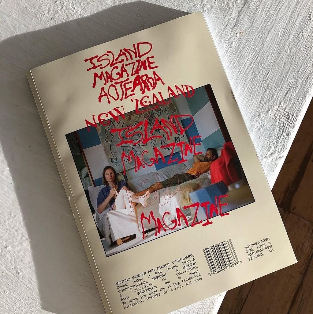
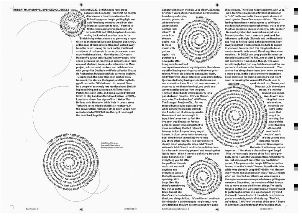
Handwritten details in the layout give works an intimate feeling in my opinion. It feels like I’m reading something personal, maybe even secret, just like reading a letter or a diary would feel like. I think it really takes away the “seriousness” of a magazine and makes the reader relate on a personal level from the start.
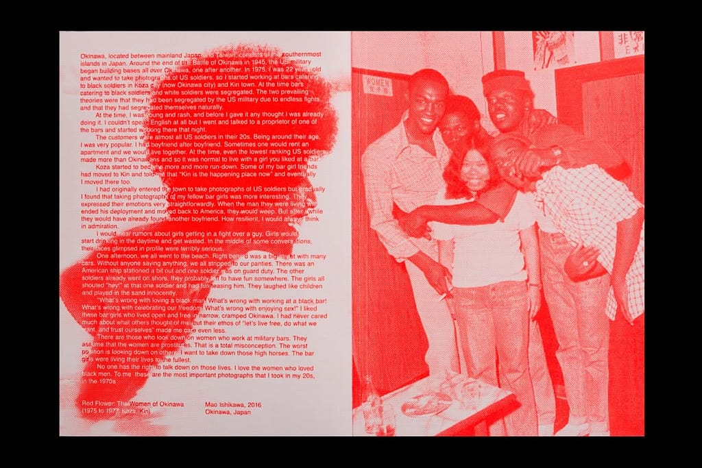
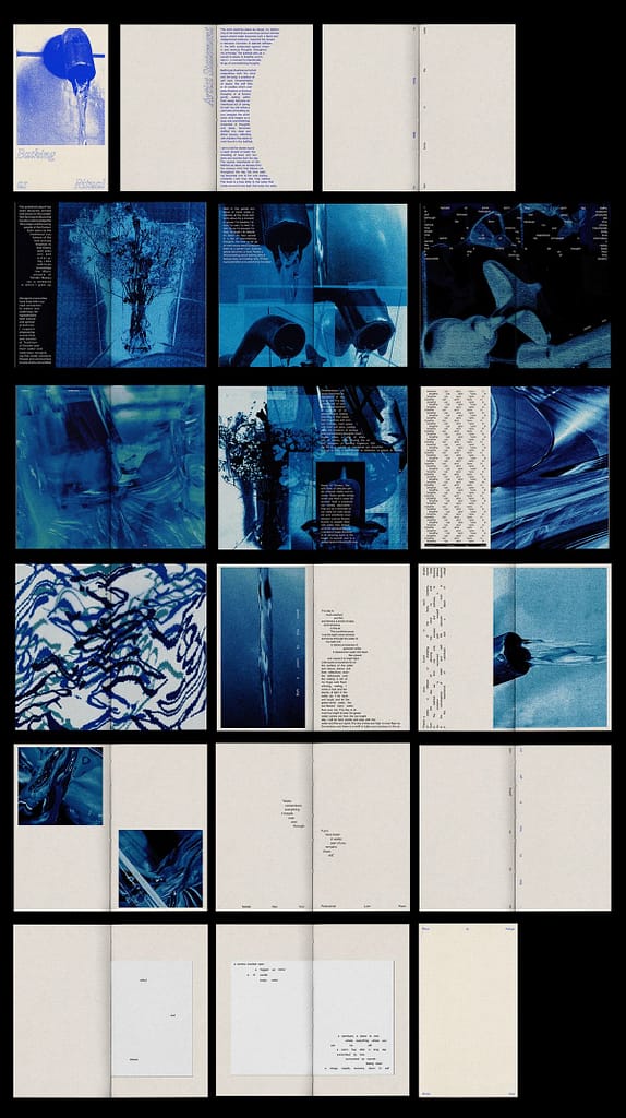
I really like magazines that focus on only using one color throughout the whole work. It creates the feeling of a riso print, but also makes the imagery really interesting. The magazine immediately feels like a whole work of art instead of separate pieces, puzzled together.
C) Photographs
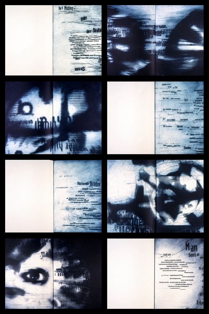
In magazines, I love rougher and edgy photography. Ones where you maybe have to take a second look, to actually understand what you’re looking at. Blurry photos, grainy photos and simply imperfect ones.
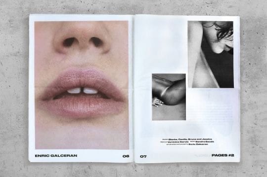
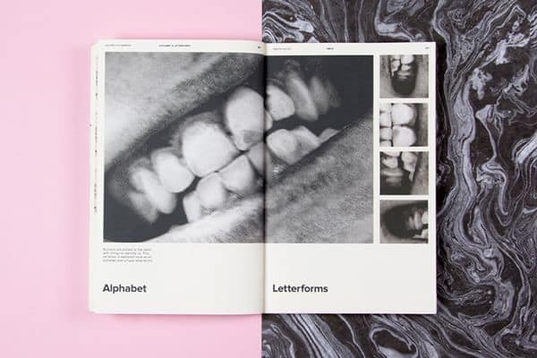
Close up photos of people are really interesting to me. They reveal imperfections but also find the beauty in them. Its creates a really intimate feeling.
D) Collages
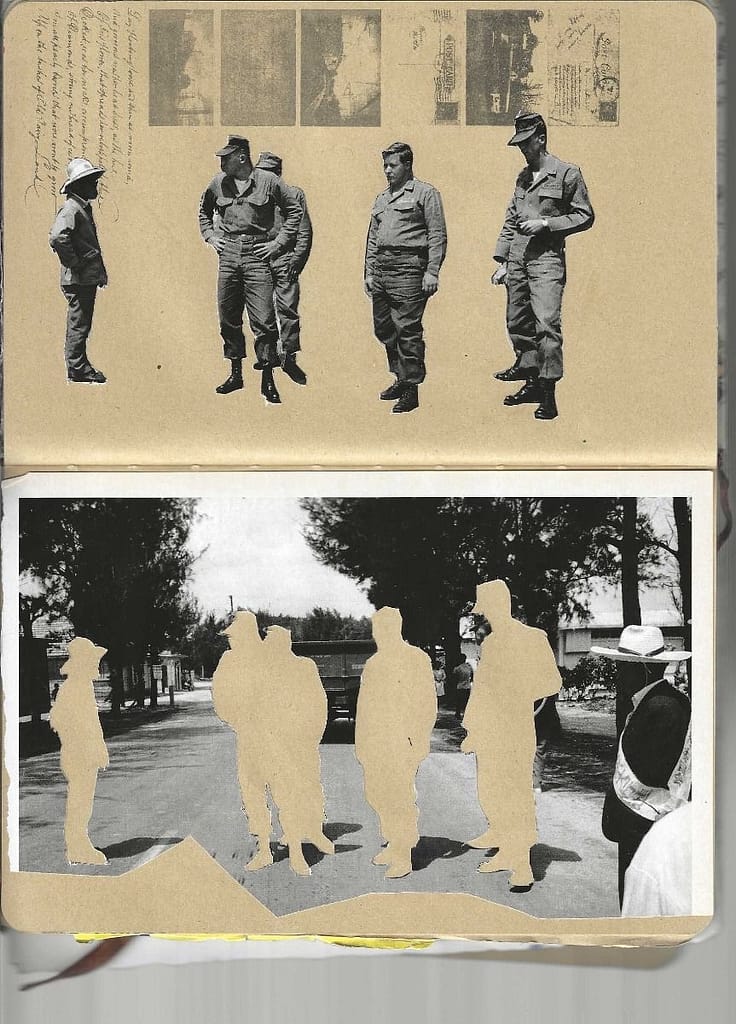
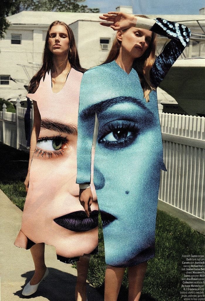
I love it when magazines play with cutting up photos, mixing and combining them and with that, creating new and dynamic compositions.
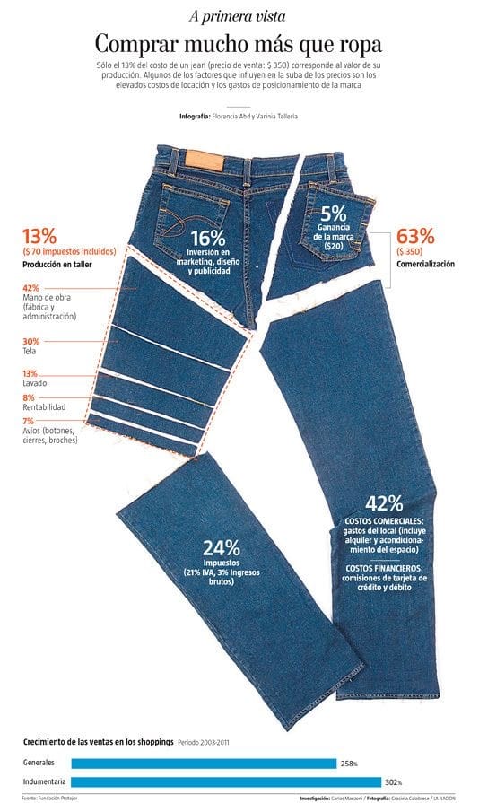
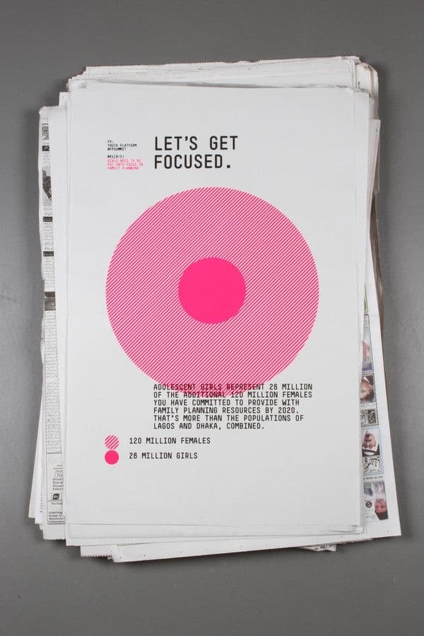
E) Infographics
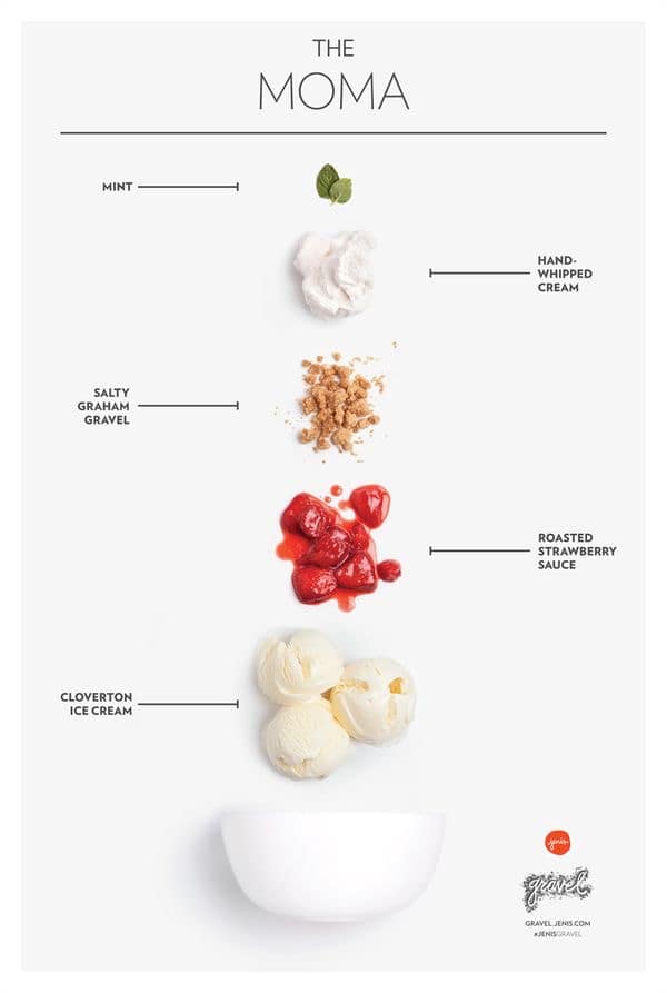
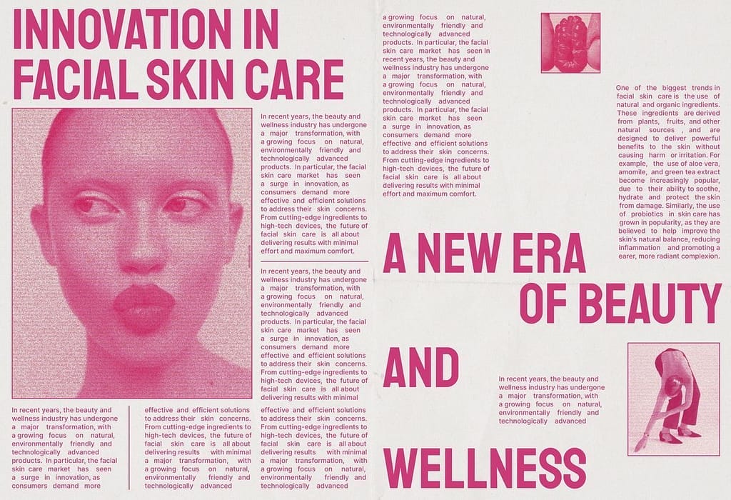
I like very “clean” looking infographics, where the images tell the biggest story. The viewer immediately understands, what the topic of the infographic is without having to read too much into it, and it’s visually very pleasing.
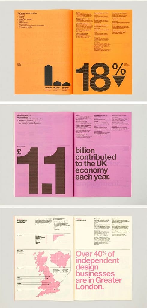
In contrast, I also do enjoy bold infographics, that work with textures, bright colors, and big typography.
F) Magazine examples
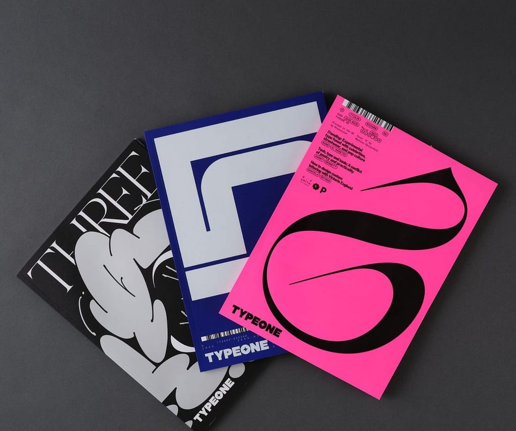
Type01: A magazine focusing on experimental typography
zweikommasieben: Working with unusual and “selfmade” typography as well as interesting layouting
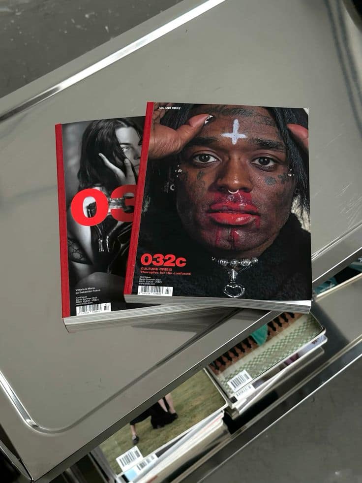
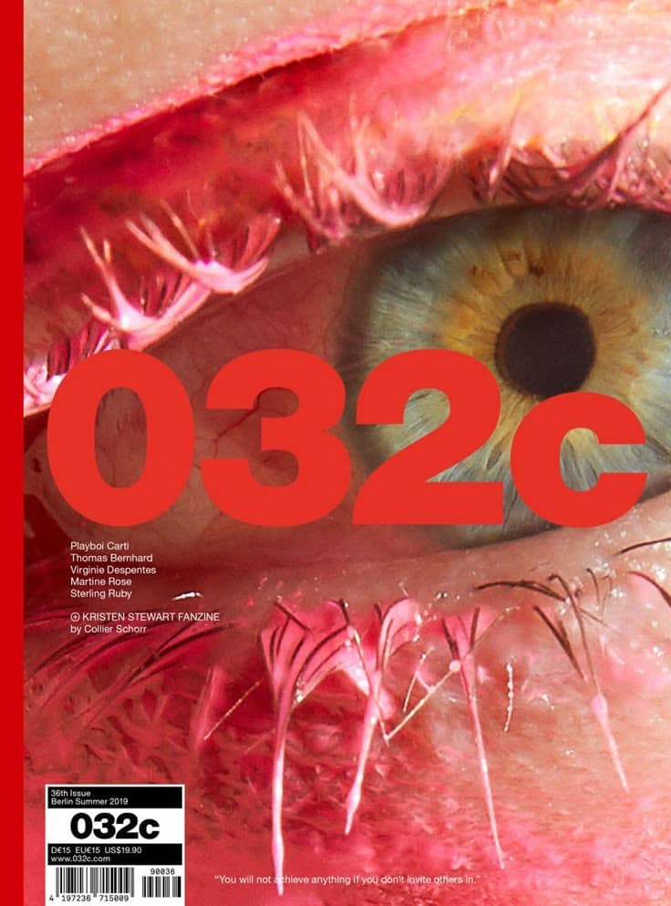
032c: Working with bold and striking photography, creating uneasiness but interest at the same time
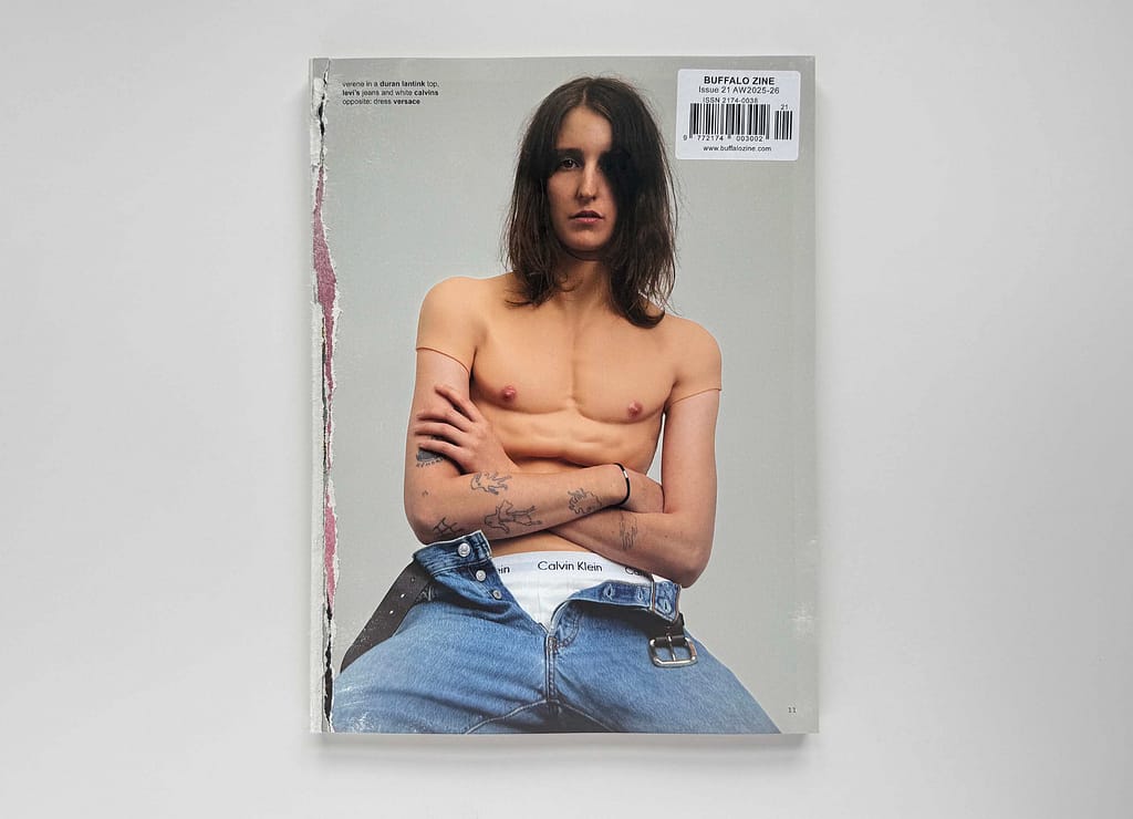
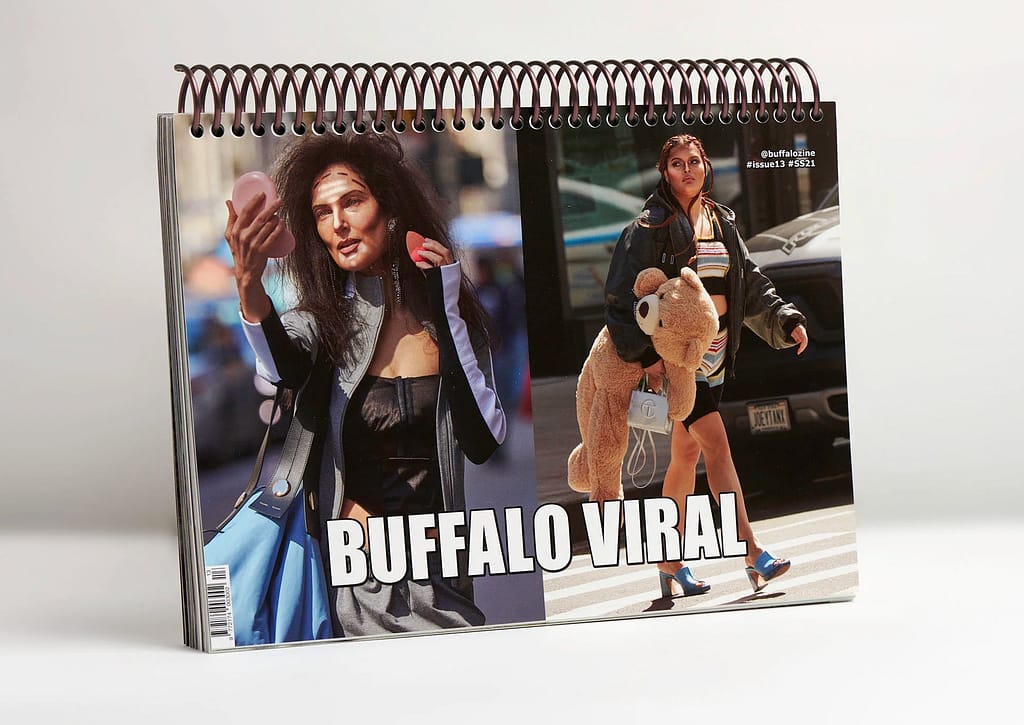
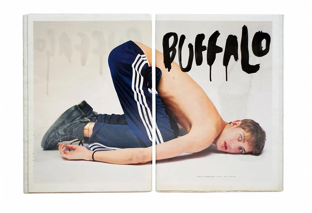
Buffalo Zine: Experimenting with different types of binding as well as with provocative photography