Magazine Inspiration:
Concept 1:
For this spread I was really inspired by the free layout of the images and how they are arranged with the text. It’s a simple design that still feels interesting.
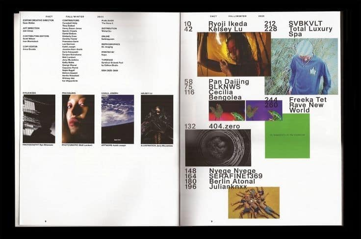
Here I was really intrigued by how the same images are used next to each other in different sizes and with different crops.
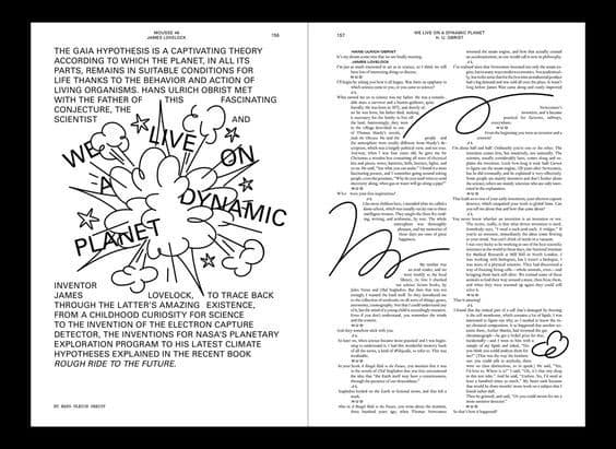
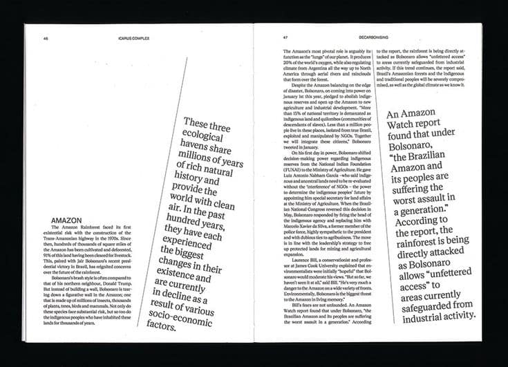
A spread that shows an interesting interaction between illustration and text layout. I like how the sketch illustration reaches into the text and separates it.
Again a quite simple design but I liked how the header is stretched over both pages and shows how a layout can make a simple page more engaging.
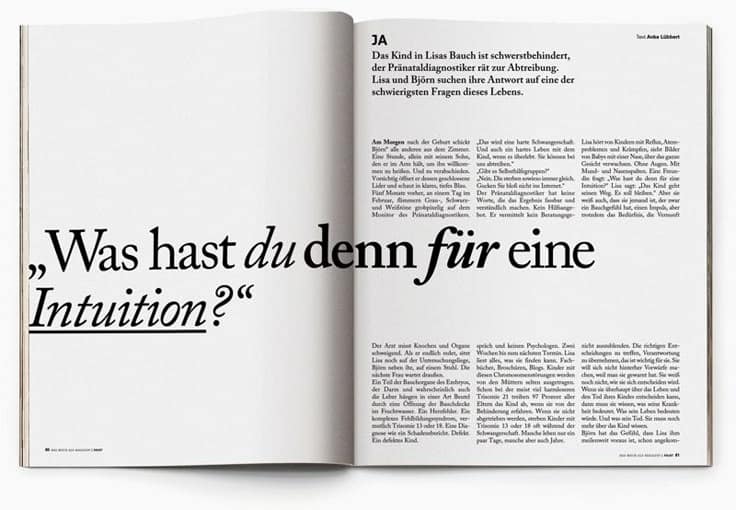
Really nice way of highlighting something more important as your eye catches the bigger slanted text first.
Concept 2:
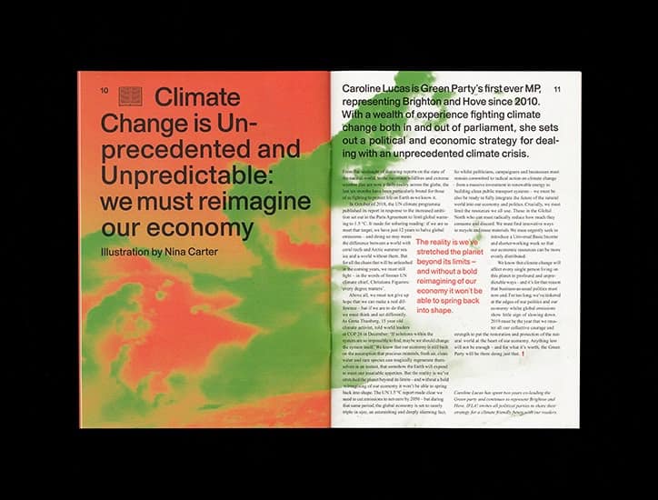
For this spread the bright colours immediately caught my eye and I like how the image on the left side is integrated into the background of the text on the right page.
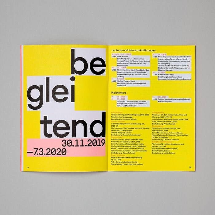
This magazine uses a really bright yellow colour which makes it stand out straight away. The layout stays quite simple and only the more important texts are highlighted with white text boxes, which helps to guide your attention a bit.
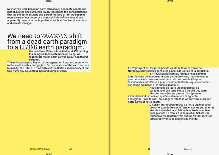
This spread has a really similar approach to the one before and caught my eye for the same reason. For this one especially I like how simple it is and how most of the page is just filled with yellow.
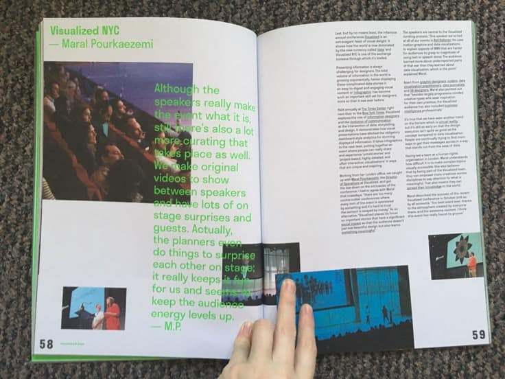
A magazine spread that shows a more free layout of image and text. The placement of the images feels almost random, but I like how they extend all the way to the edge of the page. I found the green text that runs over the images especially intriguing.

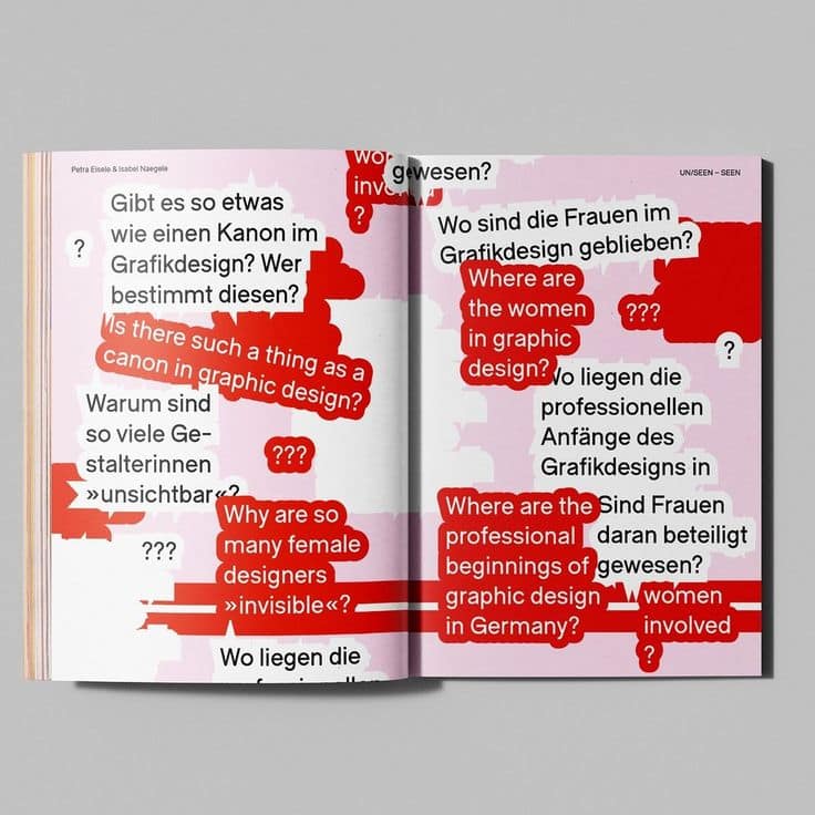
A design with really bold colors and a creative layout for introducing questions. I also liked how they used two languages in the magazine and separated German and English with color.