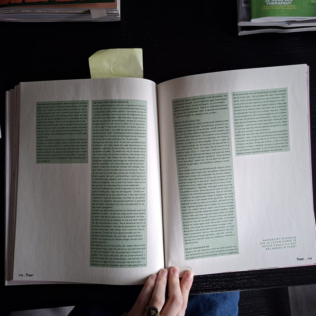
Editorial Inspo
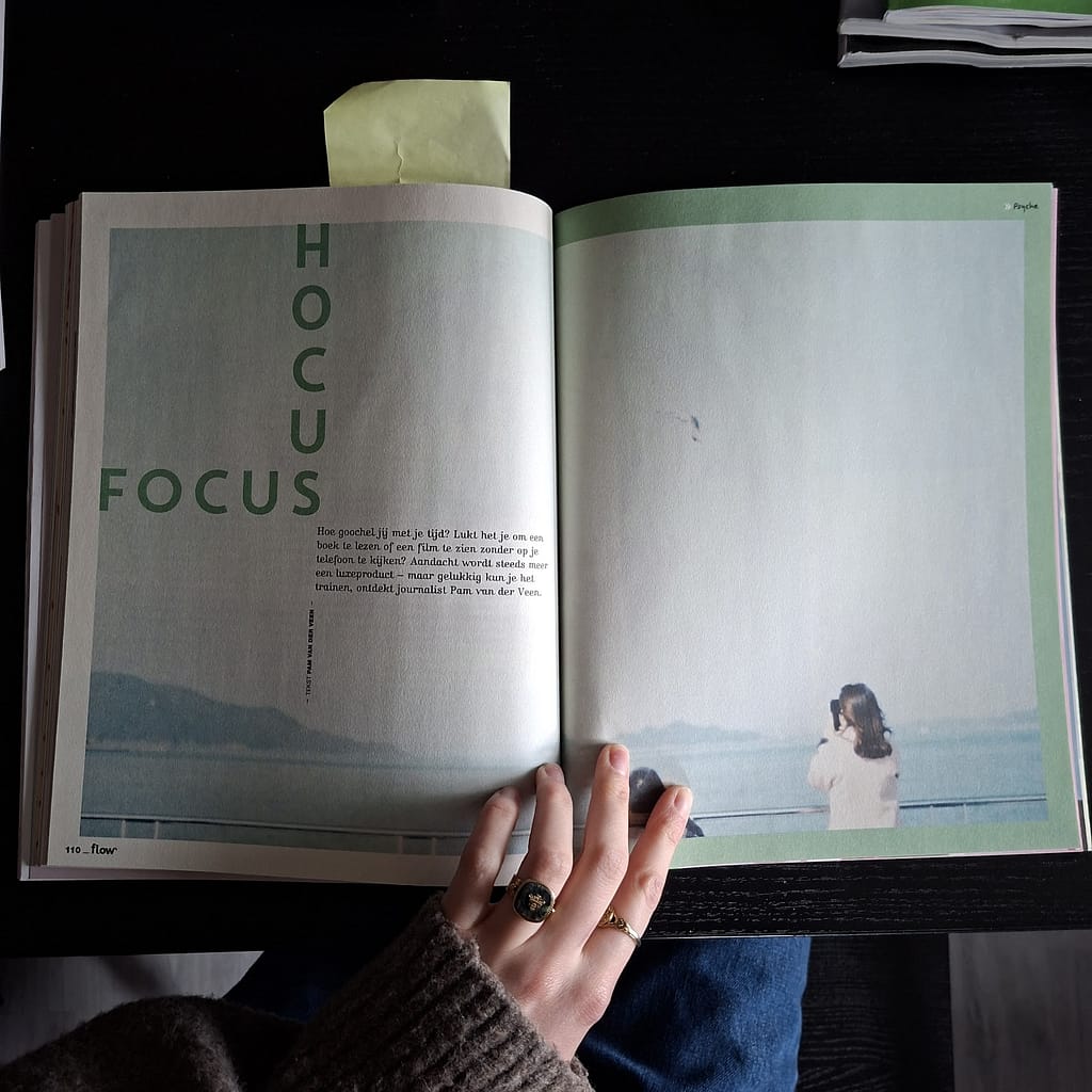
This spread was interesting to me because of the way the designer played with the direction of the text.
The green background behind the text is an example of how something very simple can add a lot of interest to a spread.
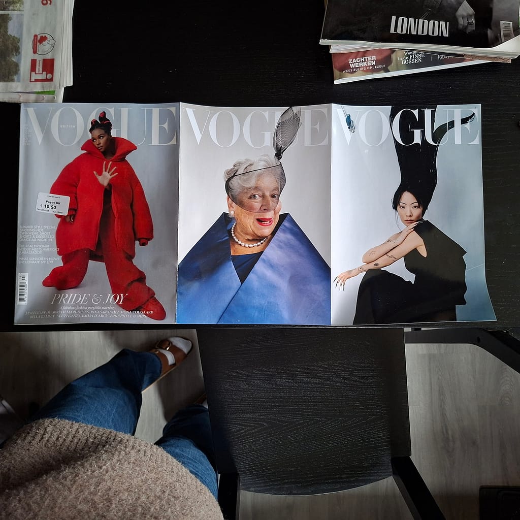
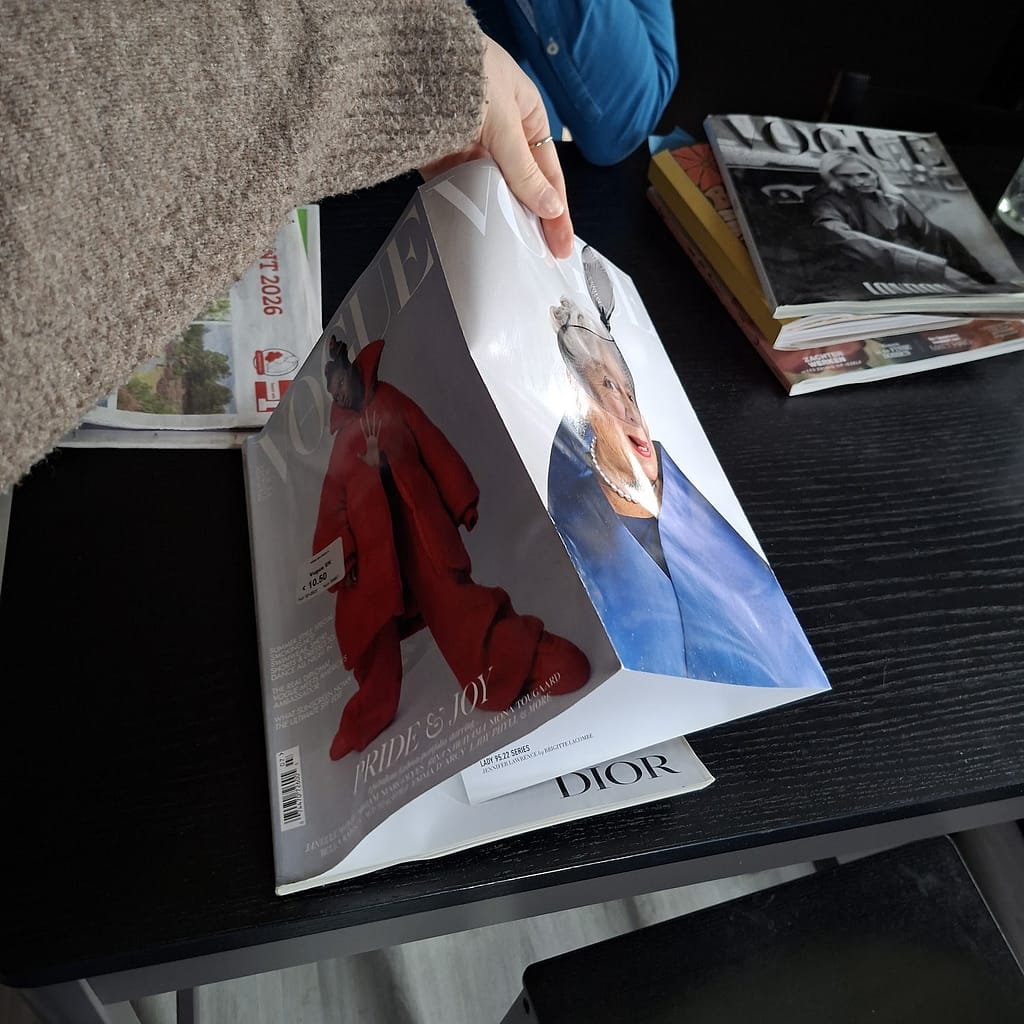
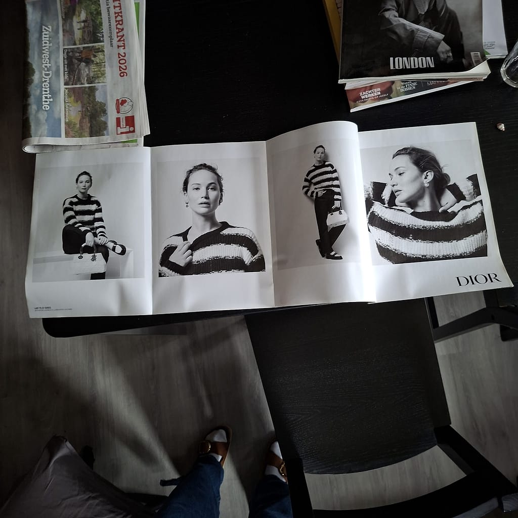
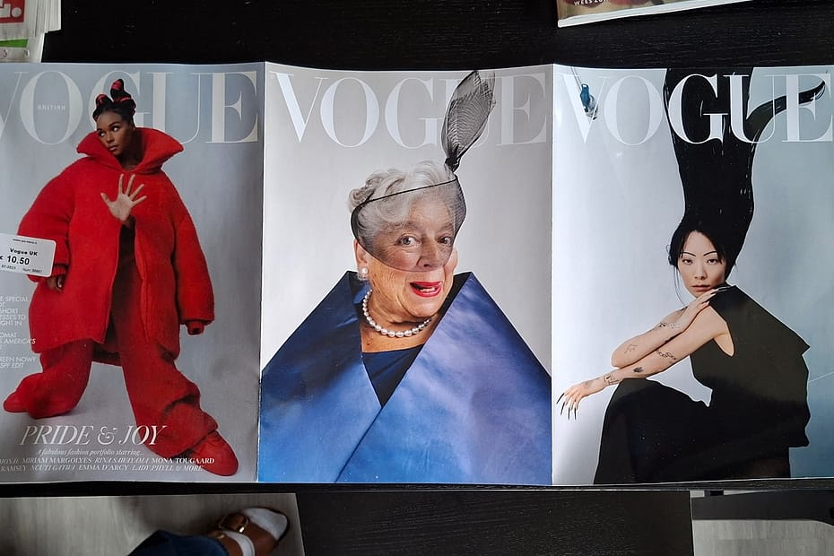
This is the cover of British vogue’s july 2023 issue, I thought it was interesting because it is interactive, you have to fold it open to reveal what’s inside.
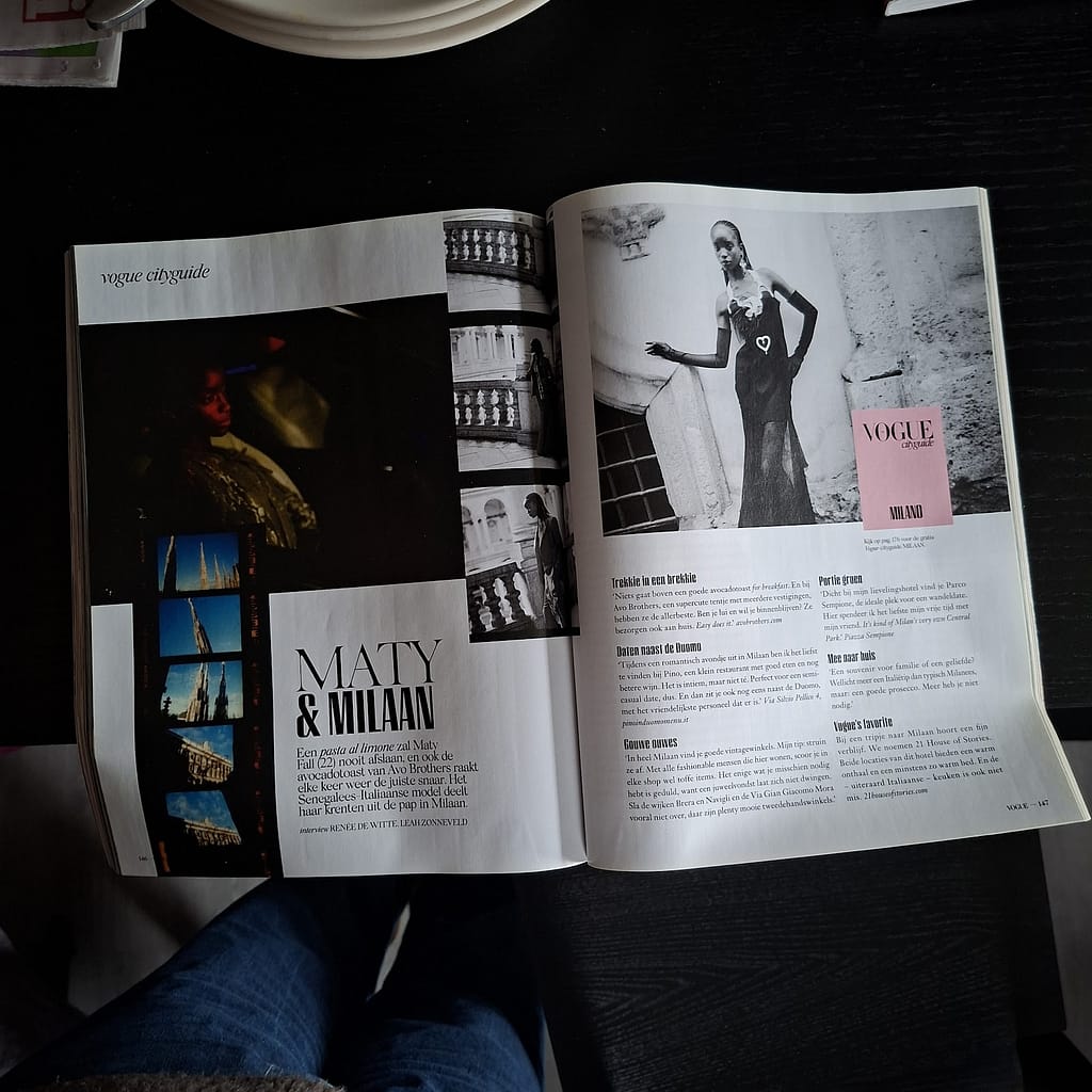
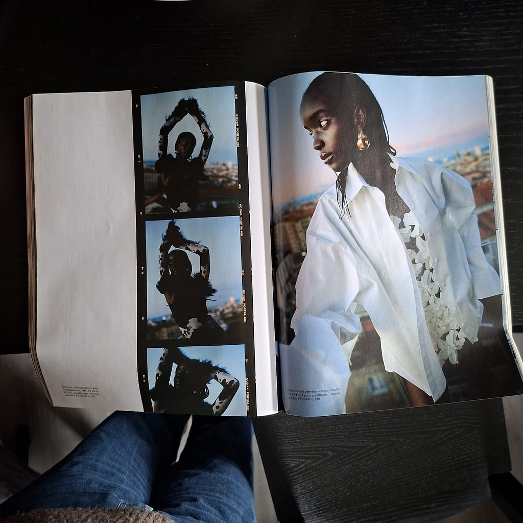
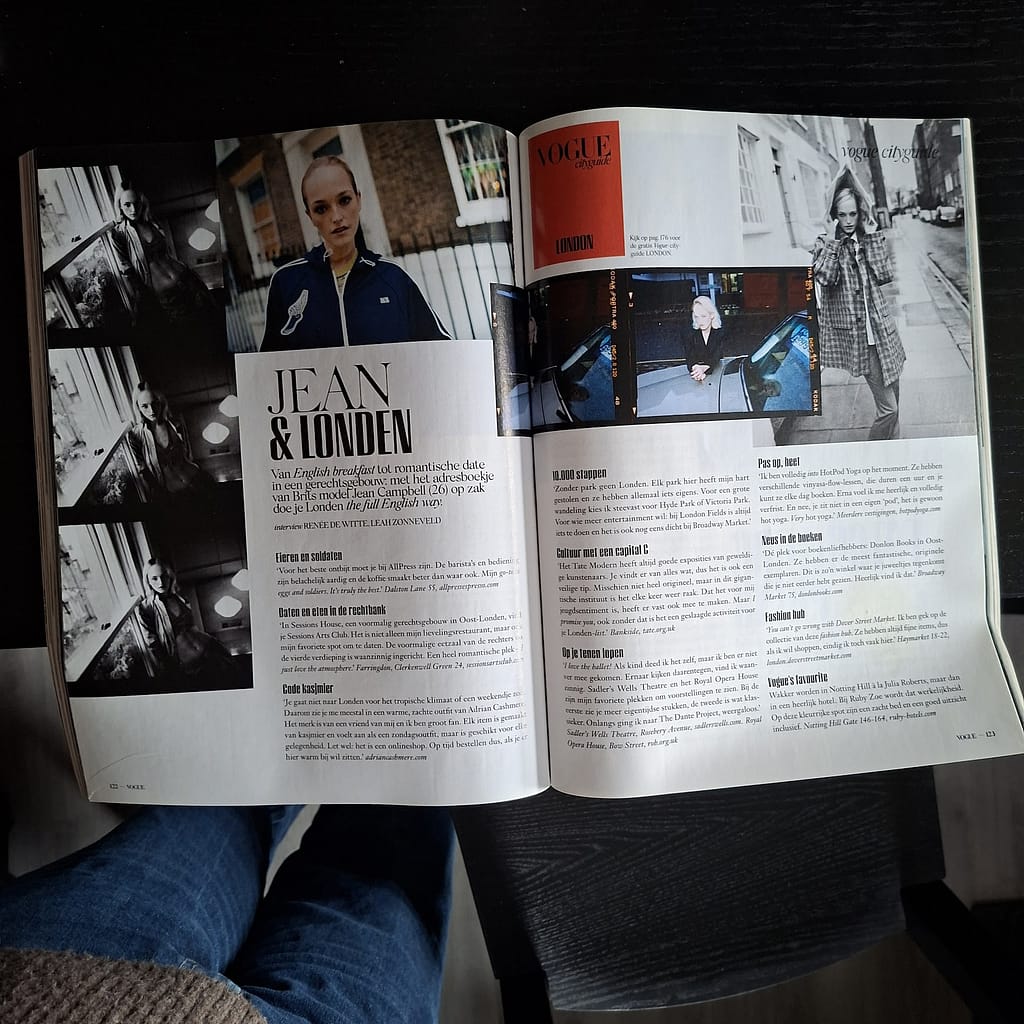
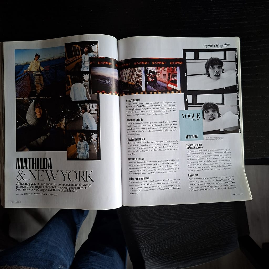
These four examples come from vogue NL’s 2024 ode to the fashion month, February. Their use of mixed fonts and images of film rolls made for very dynamic spreads.