Inspiration
In my inspiration i wanted to mainly focus on combination of photography, typography and maybe some analogue media
Cover
Cover 1
in the first cover what i liked the most was the experimentation between photography and symbols. both media connect very well with eachother as the photograph has this analogue feel which helps it connect with the sketches and symbols on top of it
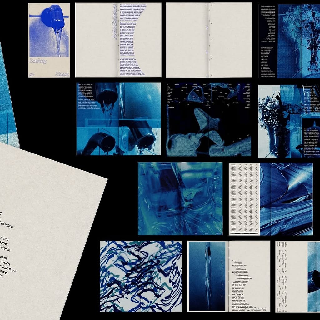
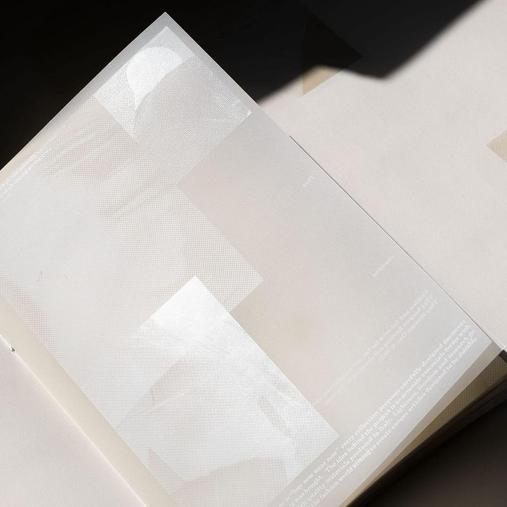
Cover 2
for the second cover i liked how the text is layed out together with the image. as a cover i am not sure how practical it is as the text is a bit to small but together with a bolder typography for the title i think it could work very well as a cover
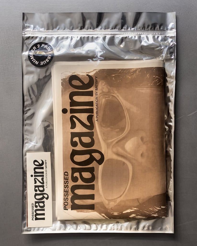
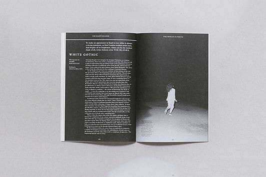
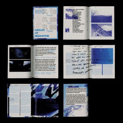
Cover 3
for the third cover what caught my eye was mostly the packaging as it is very interesting and diffent way to pressent a magazine. in my own design i could maybe use something like this but intergrated into the cover istead of having it as pachaging
Layout
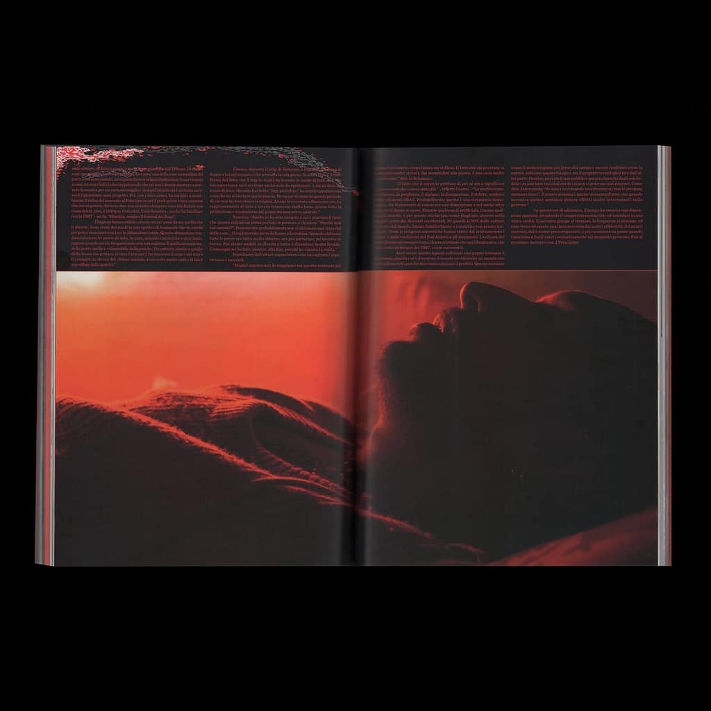
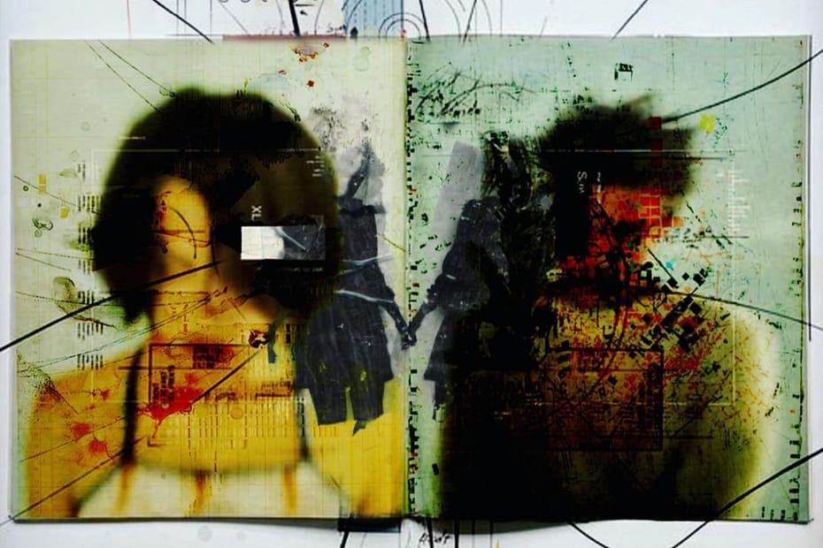
Layout 1
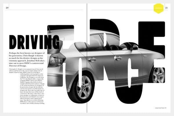
for the first layout what i liked the most was the contrast of image and text. the image is completly intergrated to the design as also the left part of the spread has a backround that connects to the image
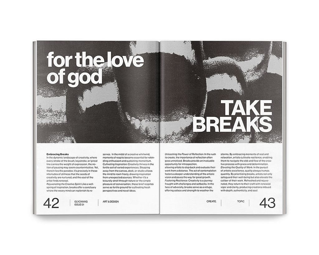
Layout 2
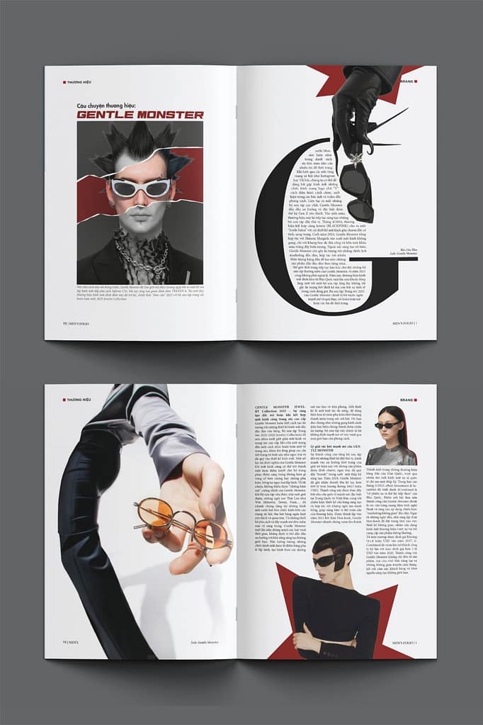
i choose the second design because of the combination of different typography in correlation to the photography. the typography that is on the image is completly different than the typography on the rest of the elements in order to create bold contrast. i also liked the fact that the page are very noticable which is not usually the case in most magazin designs
Layout 3
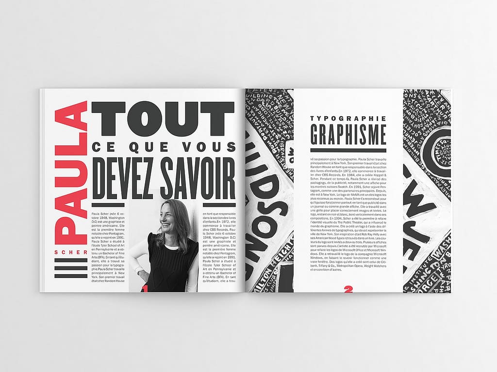
in the third design what inspired me was also the layout between text and image. there is a clear connection between the two which i really like. except from the visual aspect of it i think that maybe it wouldnt be completly practical if the text is the main focus as the color of the text doesnt make it very easy to read
Typography
In this inspirations i also focused on different ways of intergrating typography with photography.
Typography 2 & 4
for the second and fourth design i really liked how the images interact with the text instead of just using image to compliment the text or the other way around.
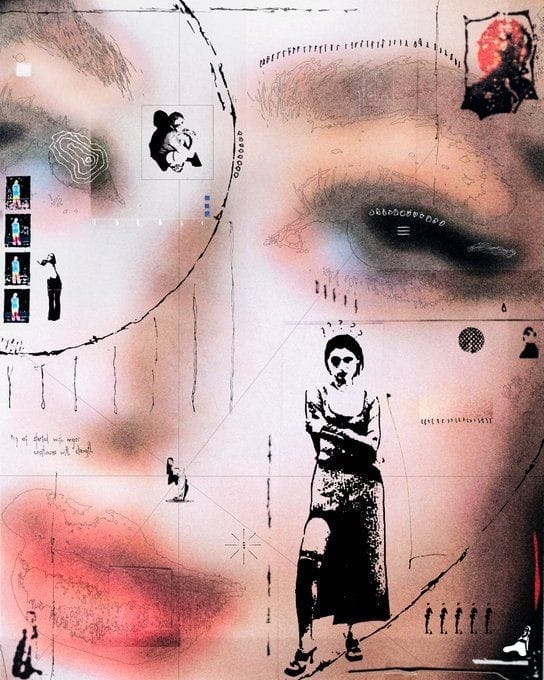
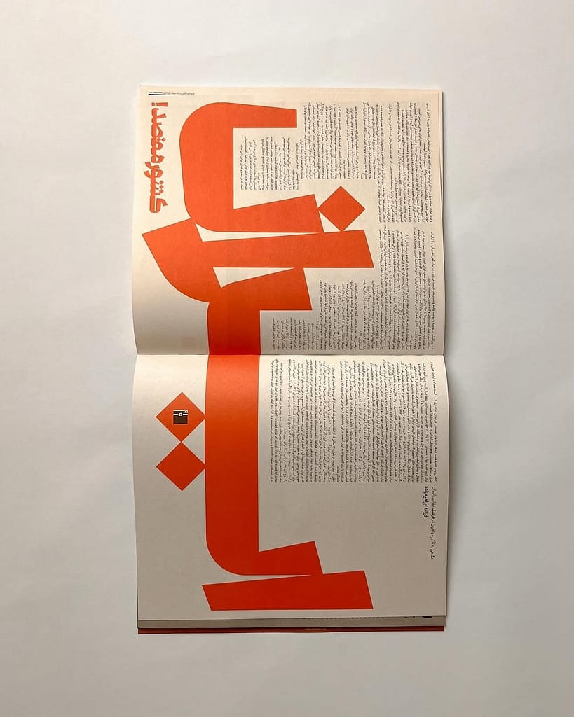
Typography 1 & 3
the first and third design are more focused on typography and as someone that hasnt really worked with typography as much i was very interested in how they use bold typography and the way that they also use typography as a visual medium and not only ac just a text
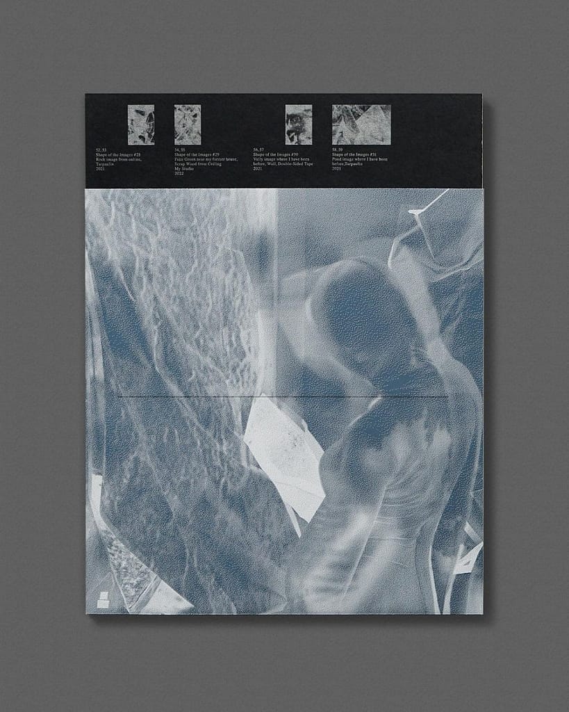
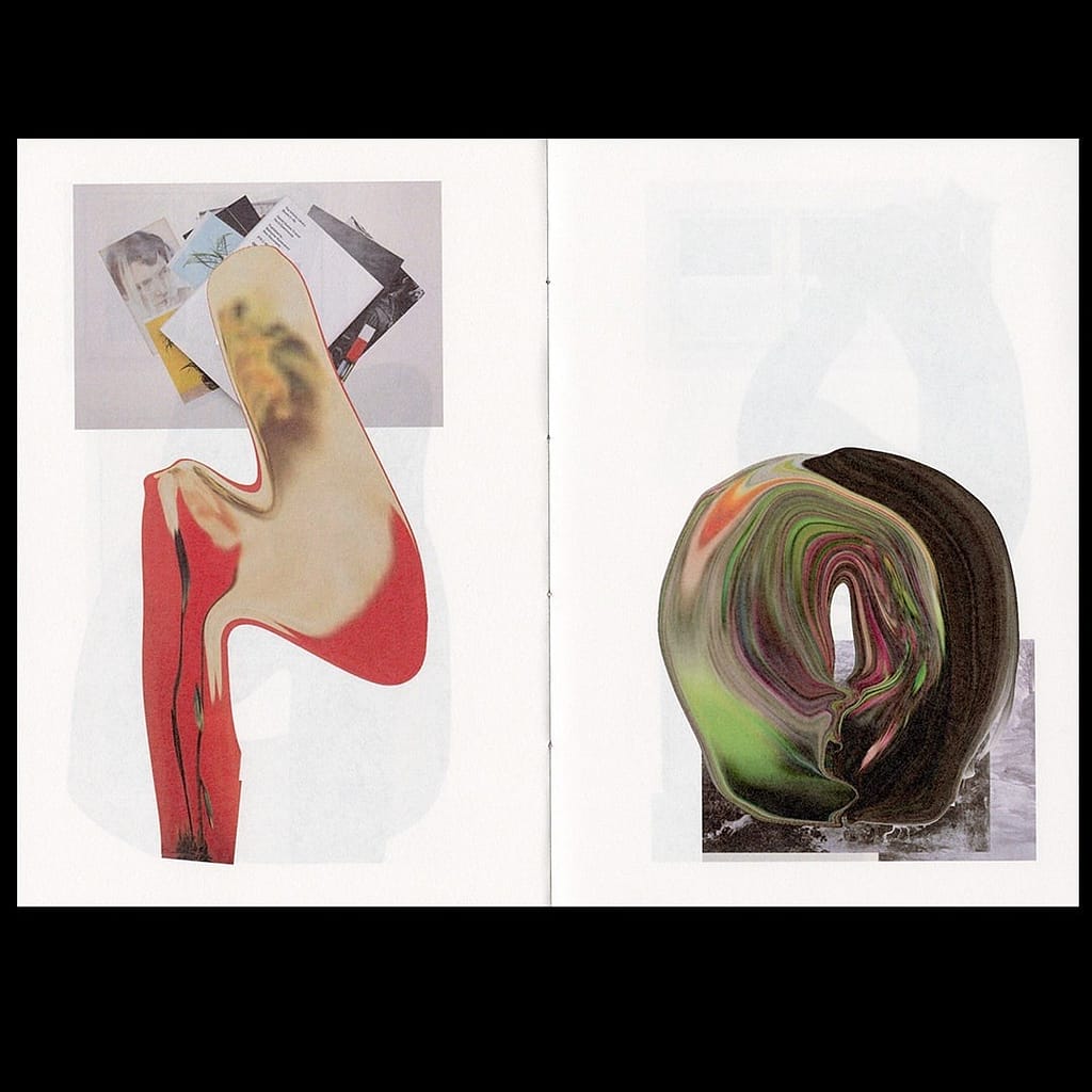
Concept Sequences
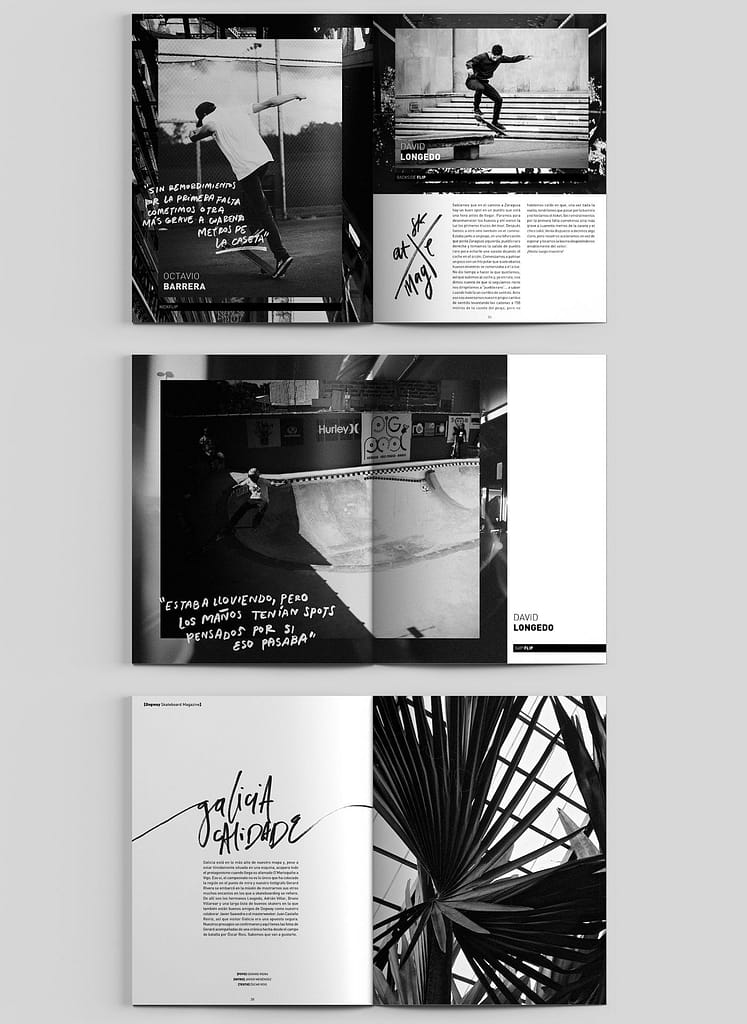
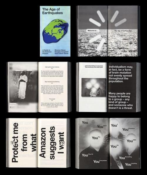
The reason i choose this design is because of the harmony between each spread. each spread is very obviously connected to the others which is something that i find difficult to make. In addition i liked the two color combinations which i think really help the designs seem connected as a collection. Finally in all of them there is a blend of photography together with typography with instances of them being used together instead of completly separate
Experimental
Designs 1 & 2
This two designs are different from each other but they both play with the use of white which i find very interesting and i would also like to experiment with.
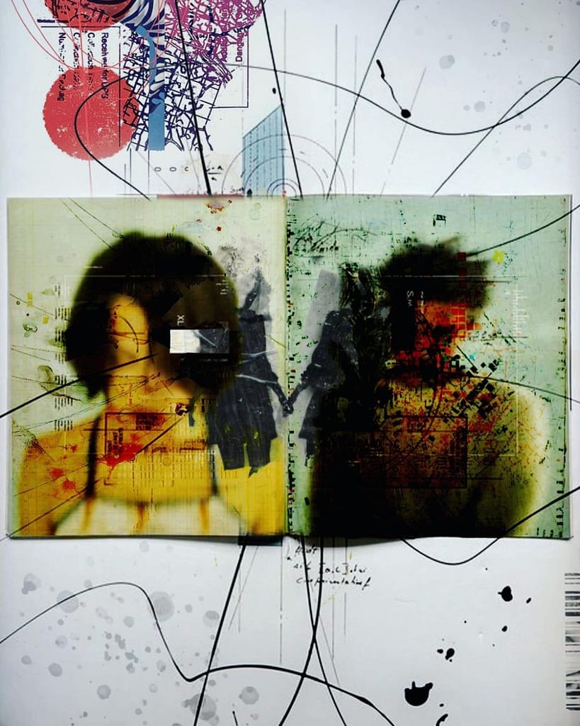
Designs 3 & 4
I added this experimental section because of my interest on connecting analogue with digital. this designs are complelty different but they play with combination of digital and analogue elements.