Inspiration
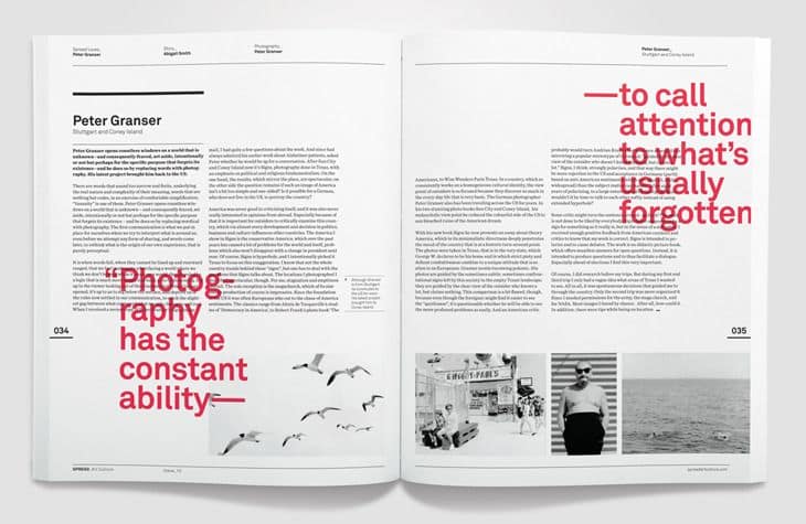
I like the contrast between the black and white and the one pop of color. I was also intrigued by the layering of the quote with the the text.
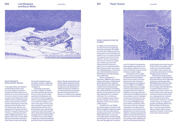
This spread caught my attention due to the texture in the images along with the use of a single color, and the fact that the text is not in the traditional black.
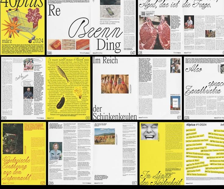
I like the playfulness of the layouts and the cut outs of the pictures, along with the yellow as a signature color. I also found the title type very beautiful, it really adds to the overall playfulness of the design.
I like the bold titles along with the monochromatic look of the spreads. It also has some dynamic layouts which give a more interesting look to the design.
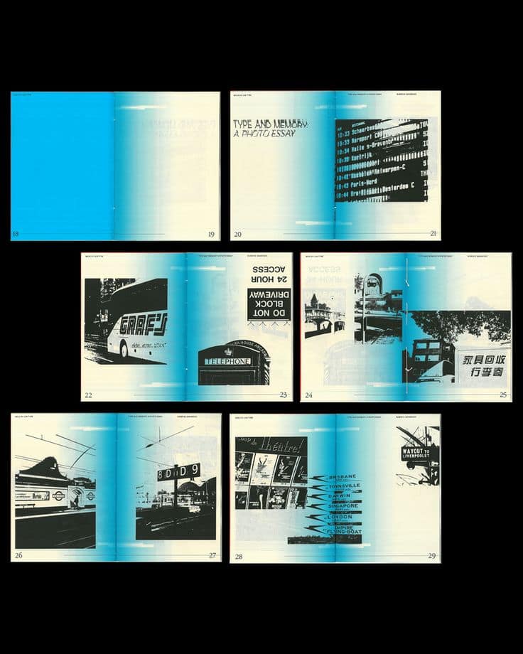
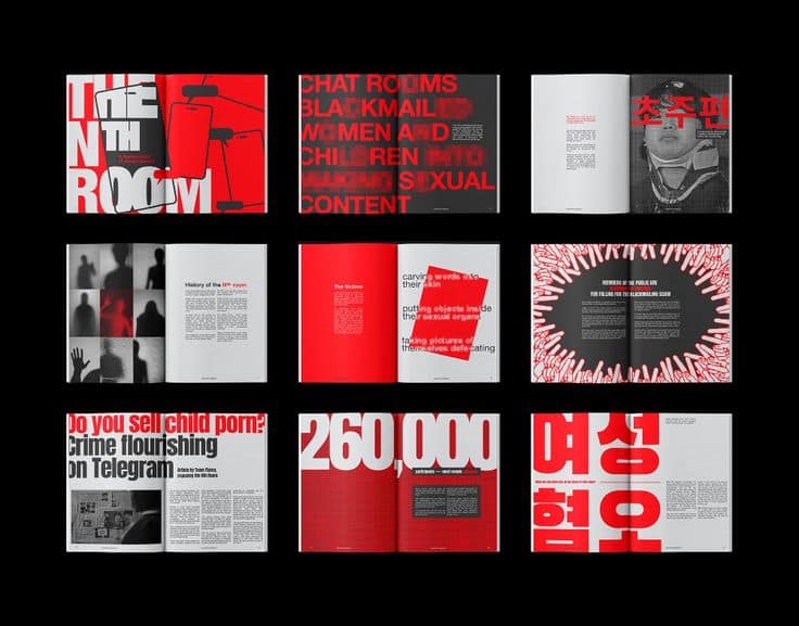
I enjoyed the creative way they placed the gradient in the middle of the spread witha signature color as well. I also like the aesthetic of only black and white photos.