Collect inspiring examples of editorial design along with a short description
Covers

- EE72 – What I find mostly interesting is the use of a very close-up picture for the cover of the magazine. The white text makes a beautiful contrast to her face, and the combination of the text and image really catches my eye.
2. Flow – With the cover of the flow magazine is the usage of the font and cover picture that I think work really well together.
3. Vogue Living – On the cover of Vogue Living, I first spotted the logo and the quote of the magazine. The way Vogue and living are combined in one is working very nicely with each other, as well as the chic and simple font.
Text/grids

- The thing I like the most about this grid is the way the text is askew to the side of the page. This is something new I found between the straight text boxes in all the magazines, and the reason why I chose this one.
2. This text inspires me because of the title that is bigly splayed across the two pages and fills the gaps. The text boxes in between the big letters are also a nice way to fill the gaps between the bigger words.
3. In this last magazine, I found this grid that I found interesting. The way the different text boxes are overlayed are a nice way of having a more playful spread.
Photographs

- The first photograph is interesting to me because it covers not only the left page but also a part of the right one. The combination of the smaller strip next to the photograph is something that connects nicely with the photograph.
2. This second photo is one I really love in this magazine. The way it spreads over the entire pages are nicely filling in a magazine between the other pages, which were mostly white. The text on the left page is positioned in a good place, which works well for me.
3. The last page with pictures, I liked because it has a collection of a few. The way they aren’t positioned perfectly but rather a little crooked is a nice playful touch I like a lot.
Collage

- With this collage of photos, I liked the way it has different sizes and looks like a photo wall you could have at home. The text explaining the images next to them is really nicely done.
2. In this second collage, I like the way they cut out a few items to layer over other images to create a 3D like effect.
3. The last one is like the first one, but only cut out the articles. This is something I like about the combination of the text that is vertically placed.
Infographic
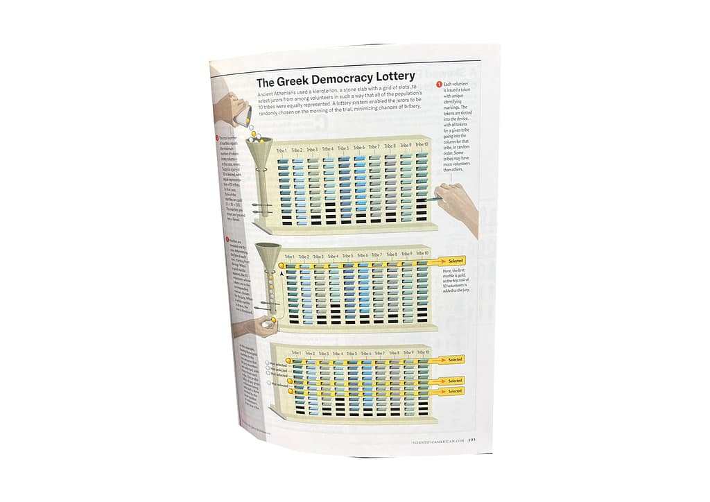
The last page I found was in a science magazine. The illustrative infographic is a graphic I found interesting because, as someone who doesn’t know much about science, it makes me feel like even I could understand what they are trying to tell.
