For the infographic assignment I thought it would be fun to make a cohesive design. I decided to include all parts of the homework and make something like a flyer.
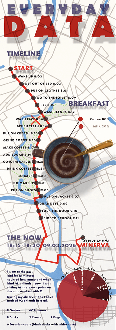
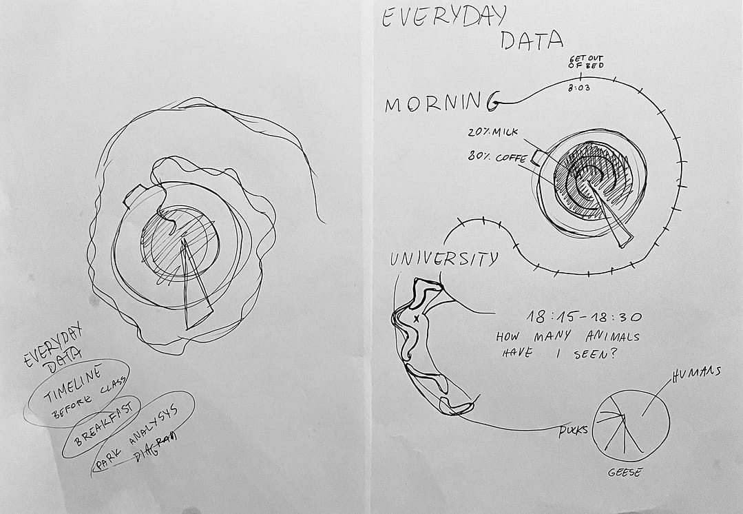
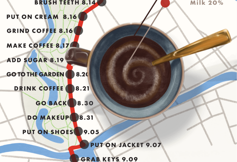
The original size of the file is as wide as a normal A4 and as tall as 2 A4 stuck on top of each other in vertical position. Every element of this flyer is hand drawn except of typography. When I started the background I went on google maps and found area that I am interested in and I took a screenshot. Later in procreate on the tablet I drew my version of the map over it. I wanted to have control over each puddle and each road. I decided to visualize the timeline as my road from home to school. It is not my exact home location, because I am not putting that information on the internet. For breakfast I had coffee. I chose this perspective of a cup, because the roundness of it reminded me of a diagram. The idea to make milk as a swirl was from when I was stirring the coffee. On the bottom of the flyer I put data that I have collected along with a diagram. I went to the park with my dog and for 15 minutes counted how many animals I saw. I included an X on the map as a spot for my observations. I thought it would be nice for a person reading it to have to go back up and see the flyer again to understand it. The results are on the design. I dropped shadow for the important typography, the coffee cup and diagram, to make it look more interesting and to make those objects appear to either be standing or floating on the map below them.
I also made a version of how it could potentially be printed. This is 4 flyers printed on A4.

Process
At first I thought I could visualize timeline as a swirl of hot air emanating from the cup of coffee, however I decided that I already have coffee for the breakfast assignment and I wanted to do something new. I have noticed that all activities I have done for this week happened in close distances in a nice vertical position on a map. That’s why I chose to use it as a background.