Visualizing everyday data (with infographics)
4. Find factual personal information (research and design)
4. A
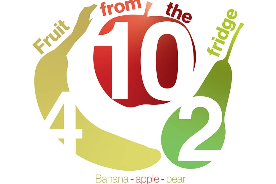
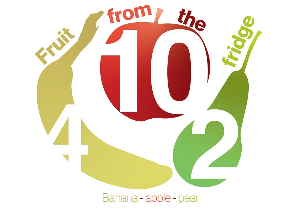
When I was going through my timeline I noticed the fruit drawer in the fridge. I started looking at the fruits we had and how many of a certain fruit we had. I thought that this could be interesting information to use for my infographic. With the outcome of this, the results will show what fruits we still have and how low we are on some of them.
Banana’s: 4 – Apples: 10 – Pears: 2
4. B
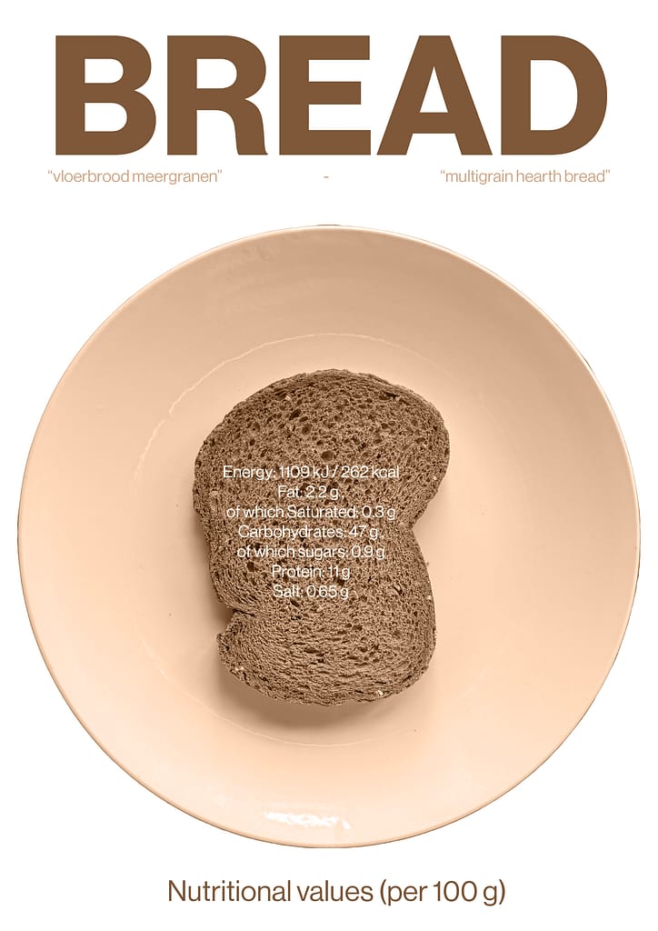
The part of my breakfast I chose was bread (“vloerbrood meergranen”/ “multigrain hearth bread”). The data I chose to make my design about was the Nutritional values, I found this information on the packaging of the bread. This isn’t something I usually look at, so I thought it would be interesting to see what and how much of everything is in this bread, to learn about this.
Nutritional values (per 100 g) / Energy: 1109 kJ / 262 kcal / Fat: 2.2 g of which Saturated: 0.3 g / Carbohydrates: 47 g of which sugars: 0.9 g / Protein: 11 g / Salt: 0.65 g
5. Find factual information (research and design)
5. A
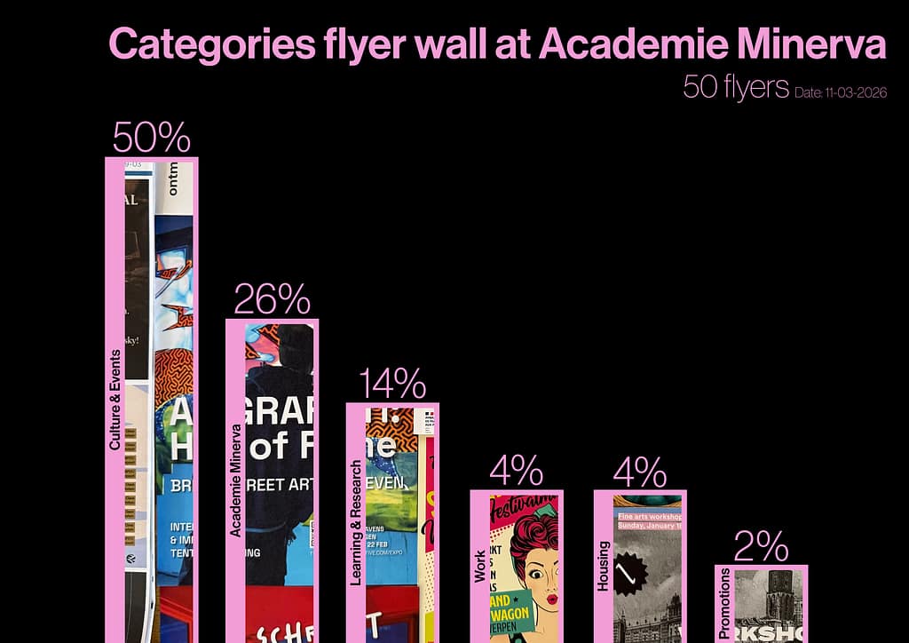
A part of Minerva I always find interesting is the flyer wall. I thought that this could be a good theme for this infographic, because it can inform students what type of folders and how many percentage of them they can find at this wall. I found it quite interesting that there was quite a broad category, from flyers for finding a job to festivals to promotion flyers. This was something that I didn’t necessarily expected.
5. B
Target group: Students from Academie Minerva.
Medium: Poster that could hang near/ next to the flyer wall to inform the students.
Sketches