The first magazine I chose was I-D magazine. I’ve always loved it since I was a teenager, I thought that their visual style was always borderline. Between abstract and funky, but also commercial and sticks strictly to the rules of graphic design.
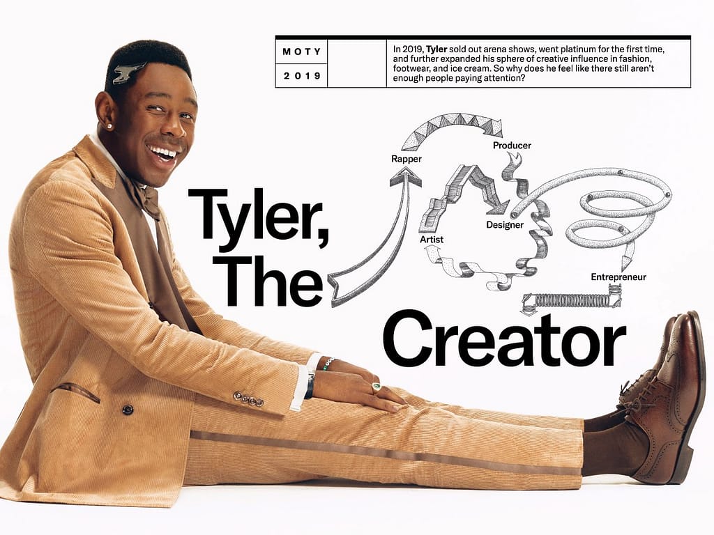
I absolutely look the imagery and photography being used here, it defies social norms. I really like to see that in famous magazines. The use of bold and big text is very well placed in these examples below. The diagram in Tyler, The Creator is also playful, as I love visual imagery.


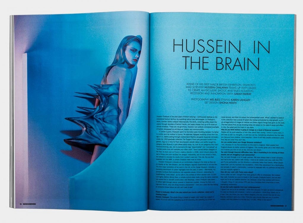
Next, a magazine I chose was Dazed and Confused. In my opinion, it does follow along the lines of the previous magazine. Again with the bold and expressive typography. It’s pleasing to my eye and catches it, I appreciate the diversity in the type like it being thinner. The colors are equally as striking and monochrome or duochromo. The real definition of less is more.

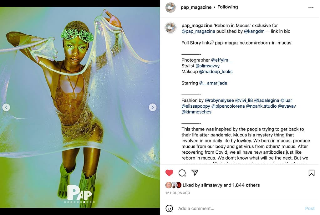
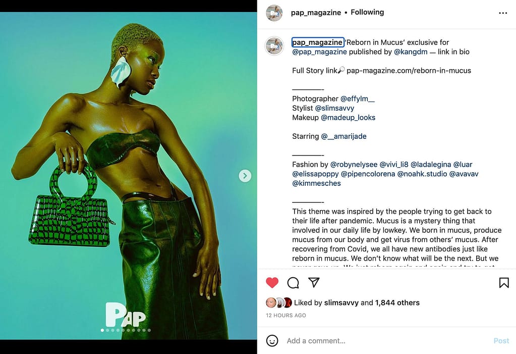
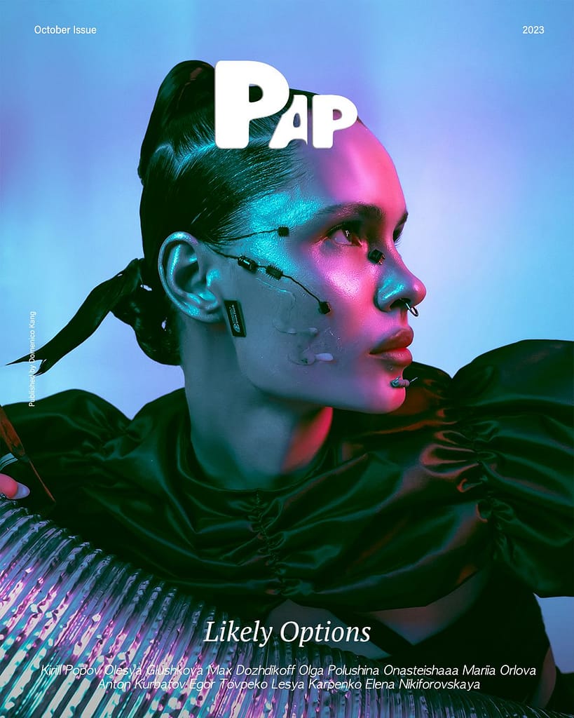
This magazine is a little different because it is an online magazine. Their typography is modern and fun, the cover font is iconic and easily recognizable. The different sizes of the font cover is well executed. I love the dimensions between the letters, it is very inspiring. For their layout, I find it very minimalistic and let’s the photograph be the main muse.
I absolutely love the color scheme that is going on here, the colors match perfectly, and use of lighting is beautiful. It definitely is a very interesting magazine.
Here are some photographic illustrations that genuinely inspire me. I wouldn’t know where every one of them is from, it’s pictures I’ve gathered from everywhere on the internet. You can definitely notice the boldness of these photographs with a very distinctive way of illustrating the subject. With a solid background and a “in your face” subject.


