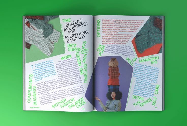
Inspiration/Research:

Shira Inbar

Shira Inbar – No Man’s Land Magazine, Issue 4

BusyBuilding – National Theatre of Greece

When I think of Coming of Age I think of bright colours and playfulness.
First Drafts:

I made a collage in photoshop and edited to look like a dream – with a lot of grain and using two main colours only. I liked to play with the opacity of the typography and of the mountain in the collage because it fits to the dreamy atmosphere of the poem. I’m not sure if I will keep the layout on the left page like this, it doesn’t really fit to the right page yet.
I added the page numbers as message bubbles because I want to have all my spreads in a “phone / messenger” theme, for me phones and technology play a huge role in Coming of Age.
Other tryouts:


Final Drafts:
Article:
first version:

I really wanted to try something with overlaying the title over the body of the text but I felt like it wasn’t very readable anymore. I chose red and blue as the main colours because I wanted it to be bright and still playful.
Final version:

I feel like this version of the title is more fun and way more readable. I also really liked to experiment with the typography and now it’s more in the focus.
I kept the two-column grid and I added the circles to have a contrast from the typography with the squares. I also tried to break the simple grid with the two quotes and the picture to add more playfulness.
Second article:

Poem:

I changed the design because I felt like the typography in the first draft is too much in the focus and the layout is too chaotic. This is calmer and the poem itself is more is in the focus.#
Cover:

First draft:
Text messages fit the theme of the page numbers and coming of age.


Second draft: I wanted to experiment more with different colours and overlaying them on top of each other, to fit the themes of my spreads more. First I made the digital draft and then I tried to risoprint it to have a nice texture. It turned out that it wasn’t that readable anymore which I don’t like.


The typography in the middle was designed from me with water drops. I put the red lines on top to symbolise a sort of “breaking out” which relates to the Coming of Age theme.

