This assignment was really interesting because I discovered something I liked and thought looked cool in typography. I read the article about fonts, and I had no idea that fonts had that many legal issues with copyright. I didn’t know they had such an extensive history, it was very interesting, I’m happy I read it, for the history and knowledge.
About Helvetica and Arial, to me it was no brainer that they were different. Although they are incredibly similar, I wouldn’t have confused them. It was interesting to explore the differences between them though and the way we did it unlocked a new way that I can work with text (the opacity tool).
First it started with the alphabet and glyphs.
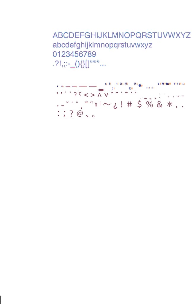

I thought it was so fun, and that its interesting (even though I still don’t know why, and haven’t done research) that the symbols and glyphs are the most different.
Next, was choosing a capital letter, small letter, number and glyph individually. That was very fun because you could zoom in and really see the difference, and being able to chose the different color that overlaps made me so happy. I know that it’s no brainer but I felt like I just unlocked a new aesthetic to keep in mind.
The following options I chose were: R, f, 2, and _
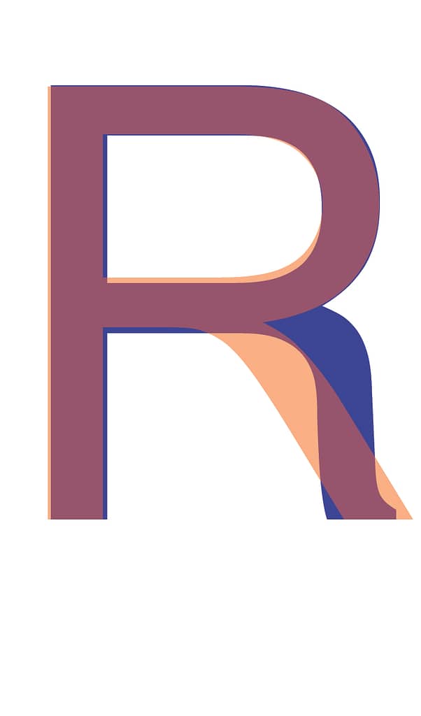


The differences are so apparent but subtle, I really liked that. I personally prefer Arial as it is sharper.