Research / inspiration
In general, I chose these magazines not just for their design but mainly to observe the grid systems used in the past and how their layouts looked.
U&lc (Upper & Lower Case) Magazine 1973-1999
In the first magazine I selected, I liked the use of columns. Despite having a lot of text, it still manages to remain readable and engaging


The Designer – August 1897
I also liked the grid in this magazine and found the combination of different fonts interesting. In the third photo, I liked how the text was used as a frame around the illustrations of women.


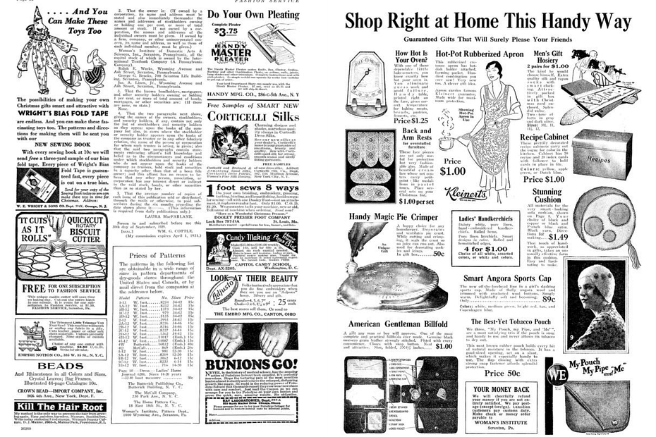
Fashion Service Magazine December 1929
Although it looks very chaotic, it still makes you want to examine each illustration individually. The contrast is used beautifully.


inspirational examples of photograhic illlustrations:

Yeji Yun

Cecile Perra

Ilias Walchshofer