SCROLL DOWN FOR THE LATEST UPDATE ON 06.05.2025!
1. Type One – Issue 6
Why it’s interesting:
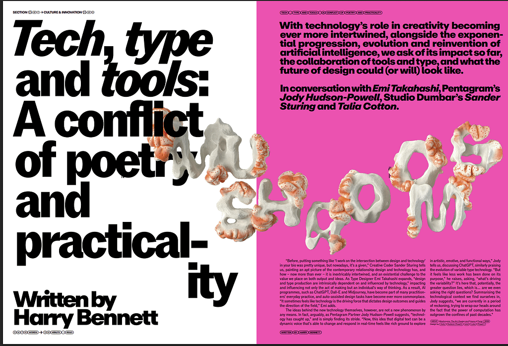
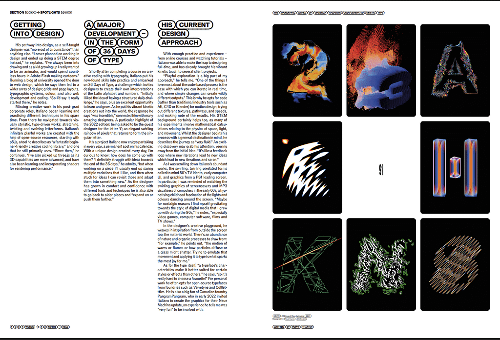
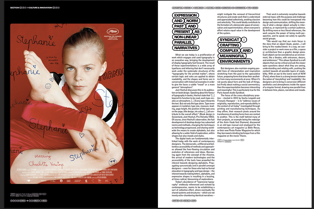
Type One is a magazine dedicated to typography and creative culture. Issue 6 specifically stands out because of its bold typographic choices and dynamic page layouts. The use of oversized, experimental typefaces creates a sense of movement and energy throughout the pages. The integration of text and imagery feels modern and interactive, making it visually engaging without overwhelming the reader. The color choices also play a key role, often featuring strong contrasts that enhance readability while maintaining an artistic touch.

2. The Gentlewoman
Why it’s interesting:
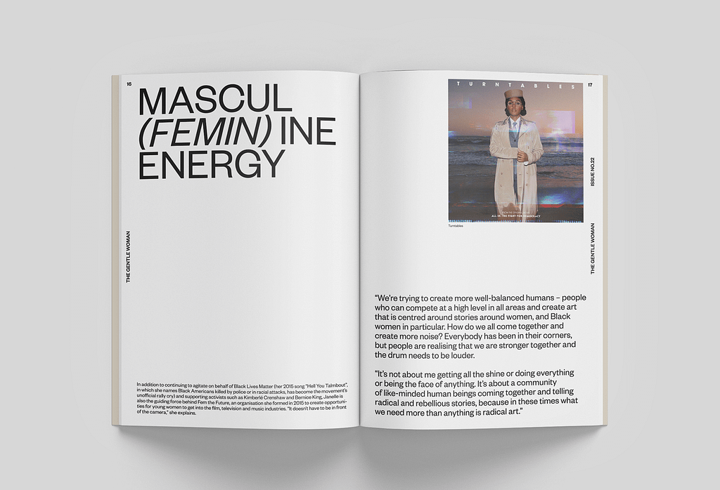
The Gentlewoman is known for its minimalist yet powerful design. It embraces generous white space, elegant typography, and carefully curated photography. This refined approach ensures that each page feels timeless and sophisticated. The magazine also uses a well-structured grid system, making it both aesthetically pleasing and easy to navigate.

3. Eye Magazine
Why it’s interesting:
Eye is a graphic design journal that experiments heavily with layout and composition. Each issue showcases a range of editorial styles, from highly structured grids to more free-flowing, experimental designs. The balance between print and digital-inspired aesthetics makes it very dynamic.


Inspirational Photographic Illustrations
Collage-style imagery:


first drafts:
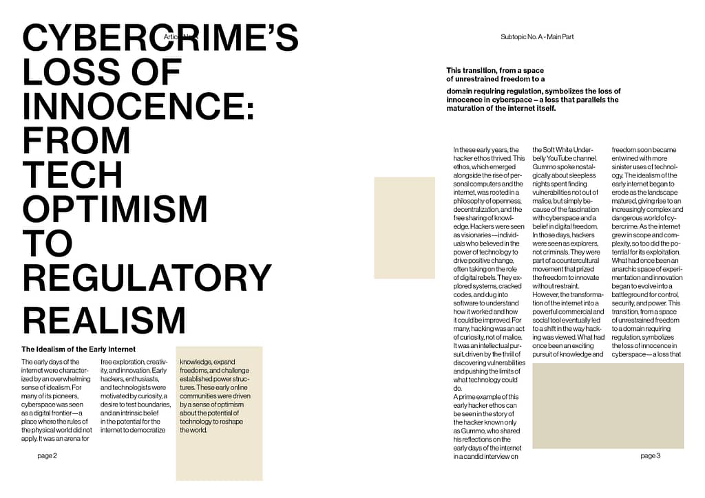
This spread explores a more academic-friendly layout for a Coming of Age article—structured, spacious, and focused on clarity. The text is given room to breathe, allowing it to explain itself without distraction.
Large blank areas act as placeholders for future imagery, hinting at what’s still to come—just like the theme itself. The layout reflects a transitional phase, where not everything is in place yet, but the framework is solid.
It’s a quiet design that speaks with intent and patience, mirroring the thoughtful, reflective tone of the article—a visual coming of age through space, rhythm, and typographic balance.
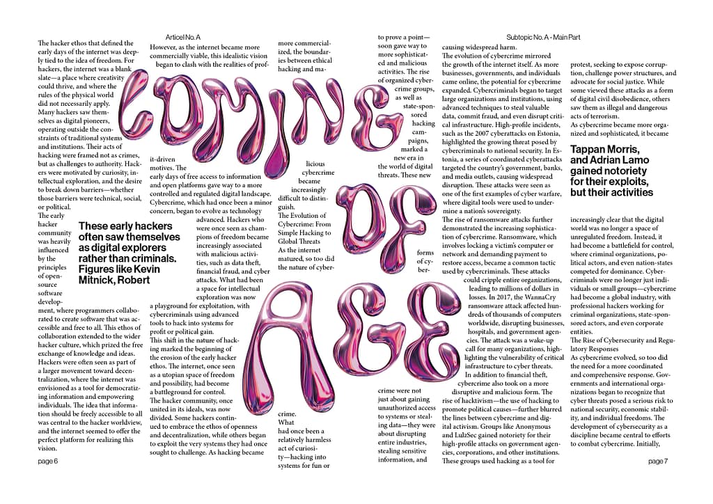
This spread features AI-generated chrome fluid letters in pink metallic, taking center stage as bold, sculptural forms. The body text wraps around them—disrupted, irregular, slightly harder to read, but intentionally so.
The layout embraces the rebelliousness and raw curiosity of coming of age. It’s playful, imperfect, a bit chaotic, yet undeniably charming. The fluid chrome forms reflect the way identity is still taking shape—unsteady but expressive.
Rather than prioritizing legibility, this design leans into emotion and experimentation, showing that even when things don’t fully “work,” they can still feel alive and full of potential.
UPDATE 06.05.2025
3 Designs to the poem Tounge Tilling
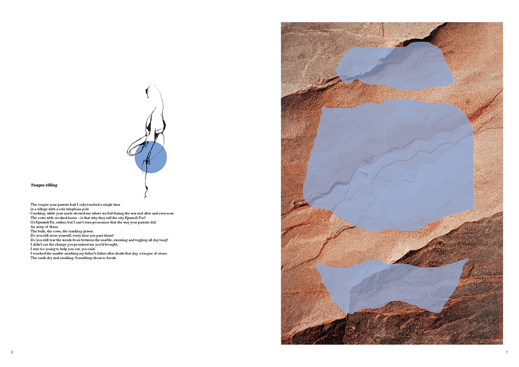
This is my first visual response to the Poem Tongue Tilling and to the poem’s rhythm and emotional weight. I used a warm blue to cut out abstract shapes, layering them over a stone wall texture to reflect tension between softness and structure.
A circular element with a flowy sketch anchors the composition. It creates movement and subtly draws attention to the poem’s core message—suggesting energy, voice, and release.
The layout aims to balance contrast and cohesion, allowing the poem’s power to come through without overpowering it.
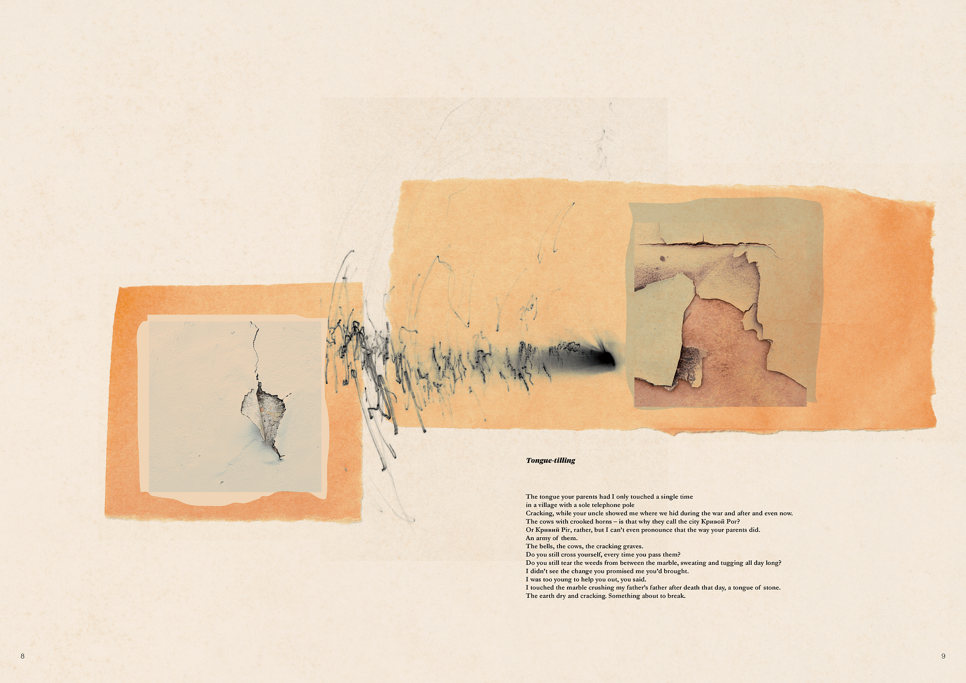
The second visual for Tongue Tilling builds on tension—brown paper stripes cut across the page, partially covering it, but carefully leaving space for the poem to breathe. The layout plays with obstruction and exposure, mirroring themes of silence, interruption, or withheld meaning.
Cracks emerge subtly beneath the surface, contrasting with fast, expressive sketch lines—as if the pen was pushed hard in a moment of urgency. The drawing adds a layer of rawness, a kind of emotional pressure.
The contrast between the soft textures, torn edges, and sharp, dramatic mark-making adds depth to the composition. It’s about what breaks through and what stays hidden.
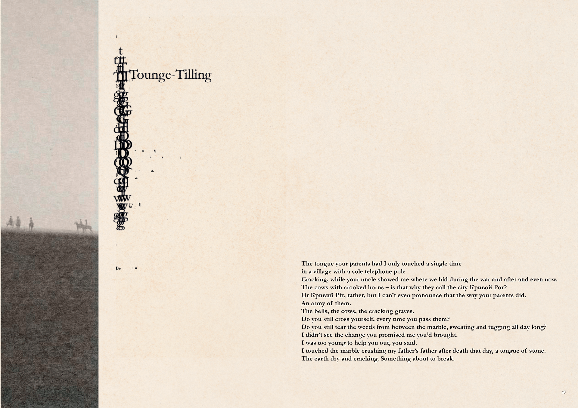
The third layout introduces a landscape with black-and-white figures on horseback, placed on a narrow slide along the side of the spread. The image feels distant, almost archival—a quiet metaphor for movement, endurance, and control.
Parallel to the slide, I layered typewriting “accidents”—misaligned letters, overstrikes, broken lines—capturing the raw struggle of expression. These glitches act as a visual echo of the poem’s theme: the friction of pushing language out.
The composition plays with contrast and alignment, creating a tension between the calm, steady image and the disrupted type. It’s about rhythm, resistance, and the effort to speak.
Design for the poem Dream unburdened
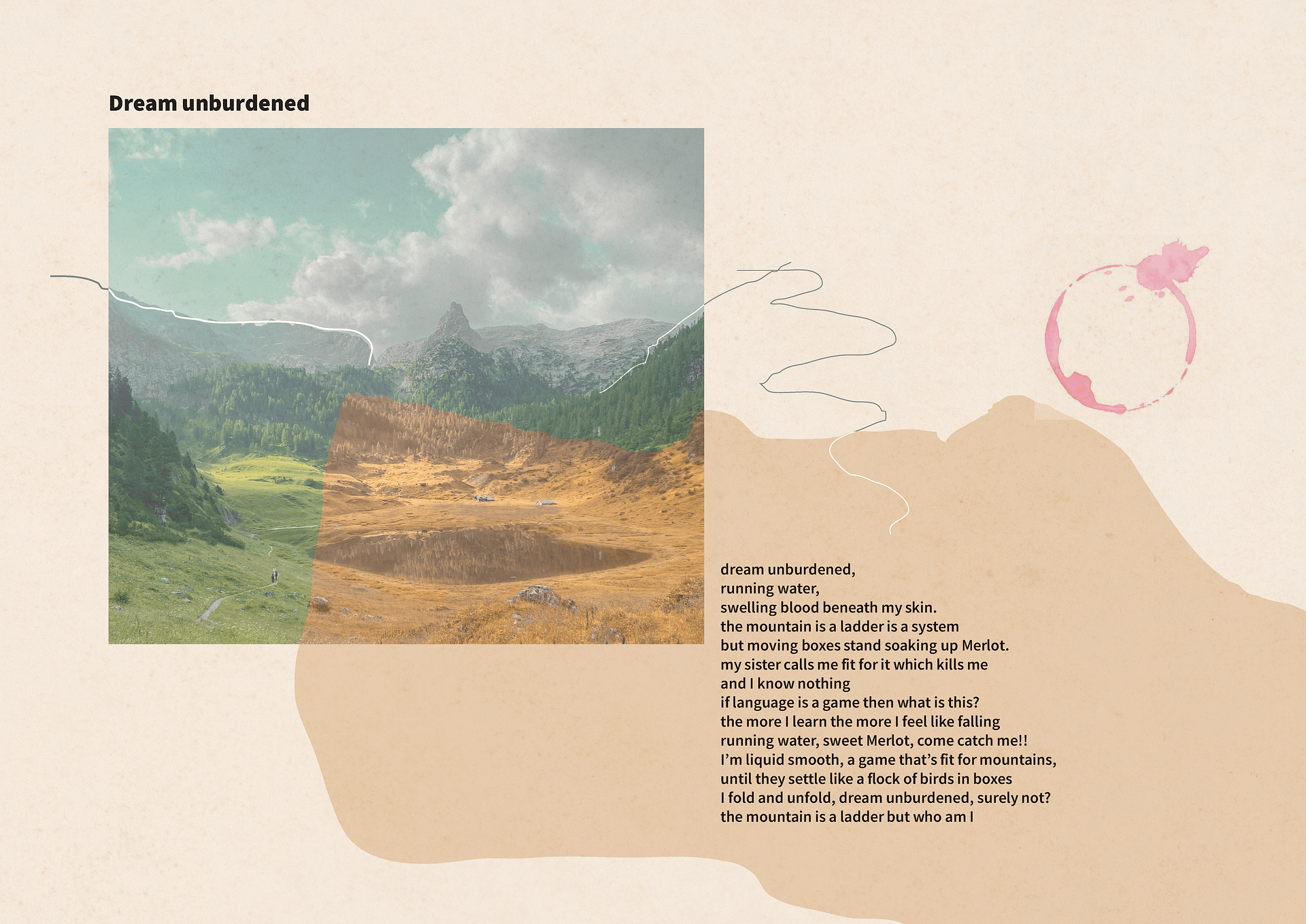
Dream Unburdened is built around a central image: a remote fairytale mountain landscape, deep in the Alps—only reachable by foot. The photograph sits like a memory or a dream, grounded in stillness yet filled with movement.
Loose, hand-drawn lines extend from the image, gently connecting it to the rest of the page—bridging visual and emotional space. A wine stain in merlot red sits subtly on the layout, as if the author had been there, writing the poem in a moment of solitude.
The design is meant to feel personal and untouched, as if the poem wasn’t designed but simply appeared—carried by the wind and a quiet hand.
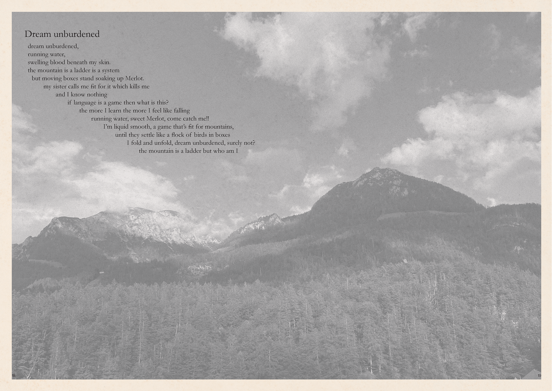
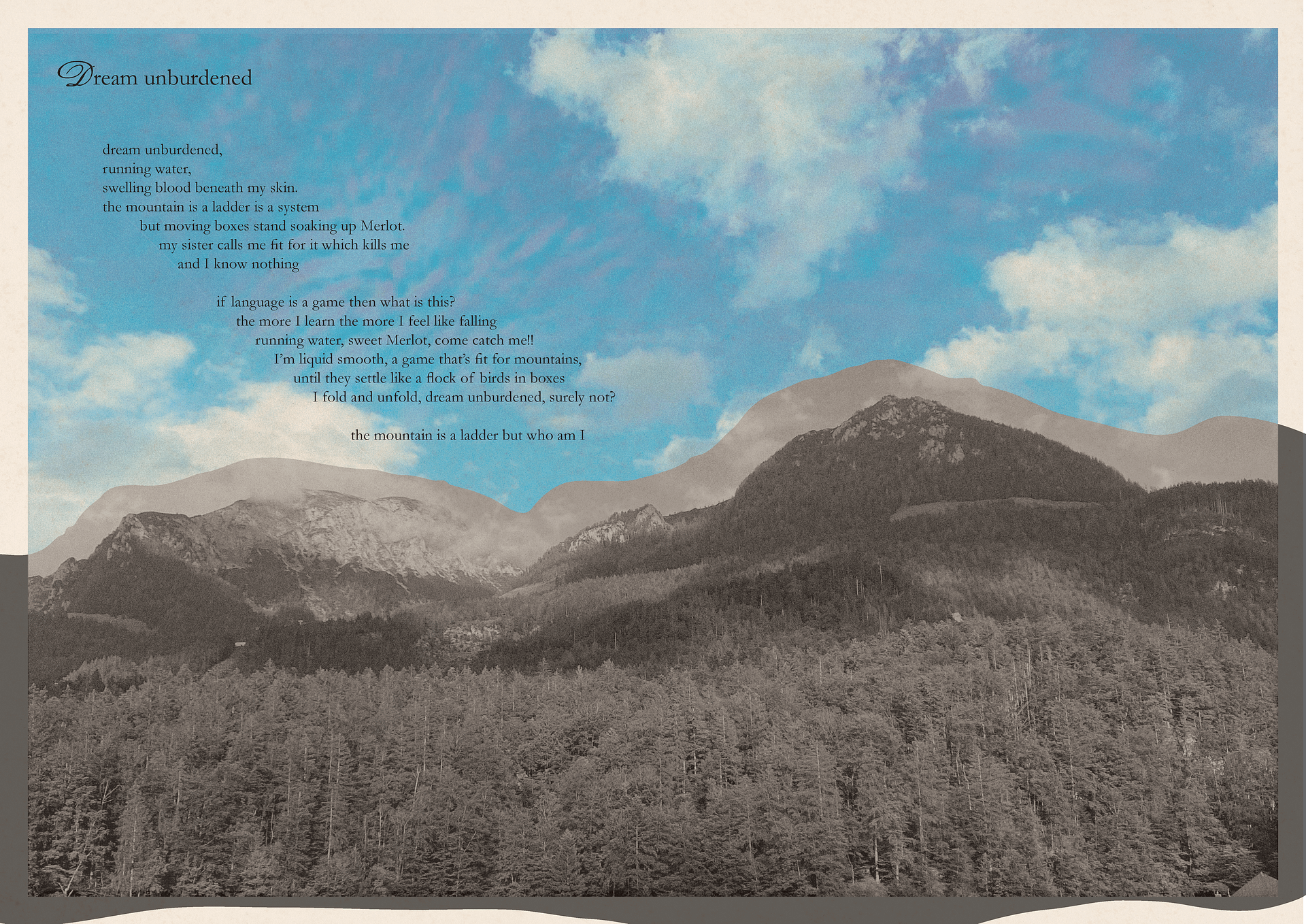
In this variation of Dream Unburdened, a black-and-white mountain landscape serves as the backdrop. The poem floats in the sky, its lines gently following the mountain’s skyline—as if carried by wind, “wie ein Hauch.”
The text placement blurs the line between earth and air, anchoring the words while keeping them weightless. The grayscale image adds a sense of distance and quiet, allowing the poem to breathe in the visual space.
This layout focuses on harmony between image and text, creating a moment of stillness where meaning and feeling meet.
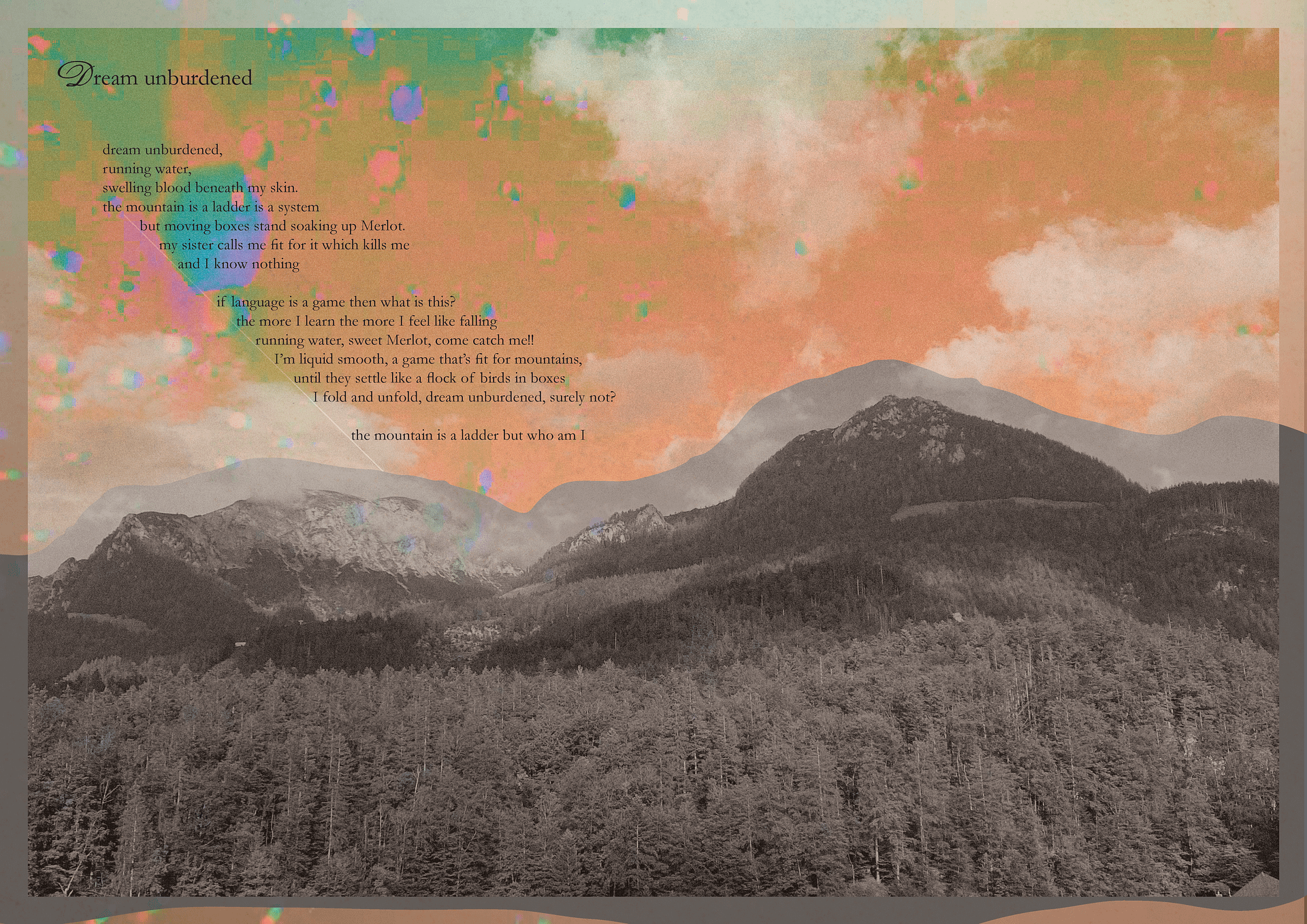
This variation of Dream Unburdened uses the same mountain image but shifts the mood through richer colors and playful splashes. The edit brings in a dreamlike, almost euphoric energy—like someone breathing in mountain air a little too deeply, or feeling light-headed from the altitude.
A small swirl in the heading adds a touch of movement and spontaneity, reinforcing the carefree, lifted tone. The color overlays break the stillness of the landscape and suggest a more personal, emotional layer—joy, dizziness, or just being present in a surreal moment.
The layout plays with contrast: grounding the image while letting the colors and type drift a bit beyond the frame.
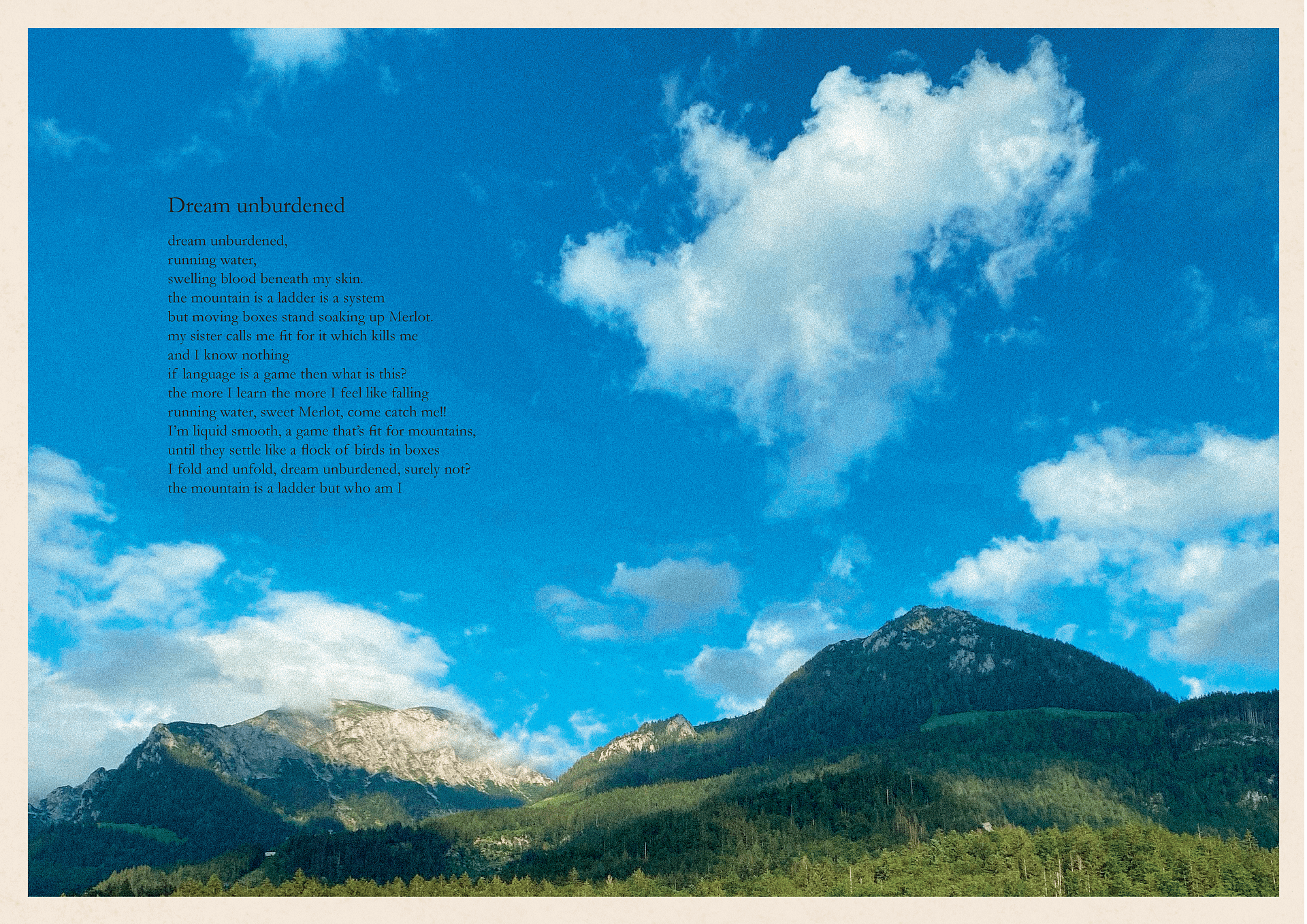
This version of Dream Unburdened keeps the original layout but brings the mountain to life through full color. The shift from black and white to vivid tones intensifies the atmosphere—you can almost feel the crisp mountain air and sunlight on your skin.
The color makes the landscape feel closer, more real—less like a dream and more like a memory you could step into. The poem still rests in the sky, aligned to the peaks, but the livelier palette gives the words a sense of warmth and presence.
It’s about being there fully—in breath, in color, in feeling.
In this variation of Dream Unburdened, the poem is left-aligned but floats high in the blue sky, no longer shaped by the landscape below. Its placement feels light, elevated—almost like a voice from above.
Detached from the mountain’s form, the text speaks freely, as if untouched by gravity. There’s a quiet power in its stillness—a feeling of something larger, like a thought dropped gently from the sky.
The layout holds tension between earth and air, grounding the viewer while letting the words drift just out of reach—calm, free, and slightly otherworldly.
Article Spread Design
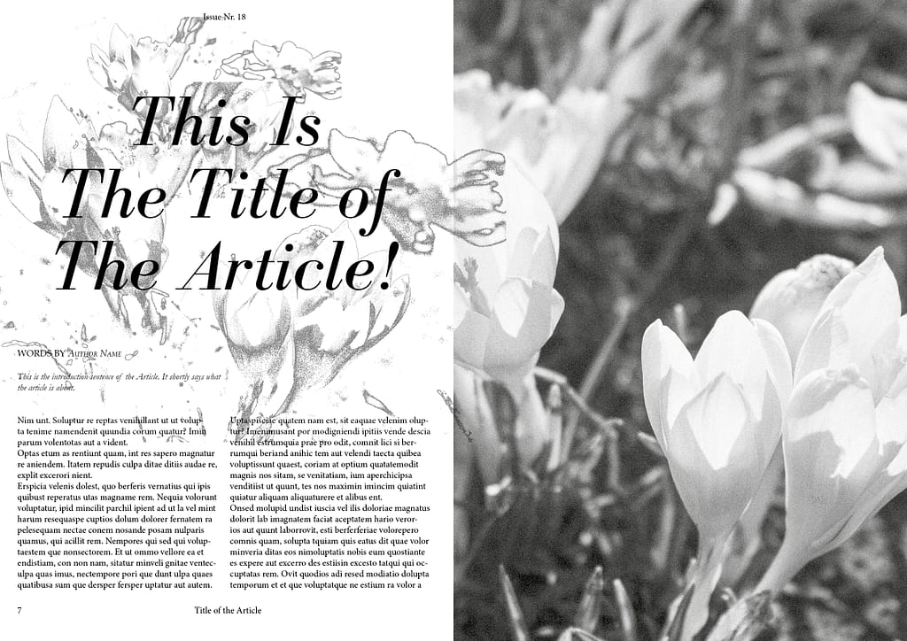
For this coming-of-age spread, the layout captures the explosive energy of spring’s arrival—a visual metaphor for personal growth and transformation. As flowers bloom, people step out of their houses, and suddenly, the world feels alive with possibility.
The imagery reflects a moment of uncontainable energy—colorful, chaotic, vibrant—as everyone emerges from the quiet, cocoon-like state of winter. This burst of life is mirrored in the design with bold splashes of color, fragmented shapes, and organic lines that seem to grow and stretch across the page.
The spread speaks to the freedom and unpredictability of coming into one’s own—like the world around us suddenly expanding, full of unexpected turns and new beginnings.
Cover Design
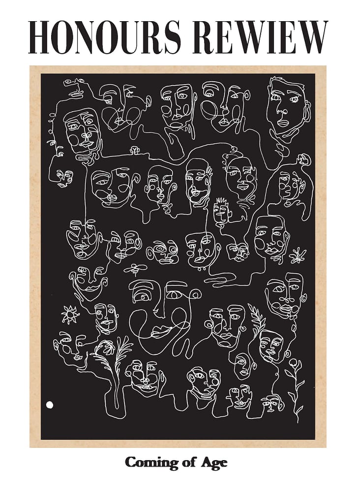
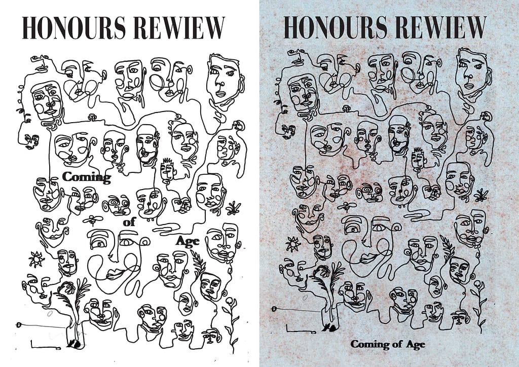
For the 18th issue of Honours Review, the cover visualizes the transition of life—a journey we all share. One-liner faces, fluidly connected and spread across the front page, represent the individual paths we take and how they ultimately converge.
The faces flow into one another, creating a seamless connection that speaks to the shared human experience of growing, changing, and learning. The design feels organic, interconnected, with lines that weave through the page, emphasizing how we’re all part of the same journey.
This cover captures the essence of coming of age—how we each carve our own way, yet remain intertwined in the larger story of life.
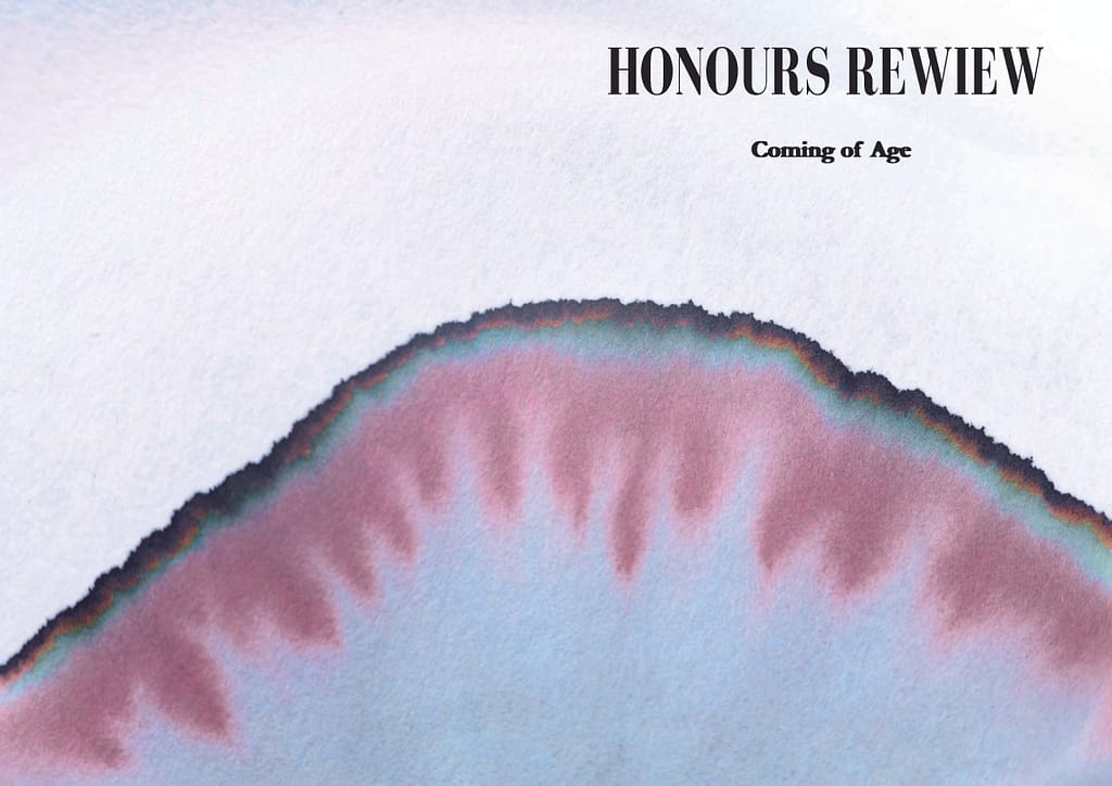
For this Coming of Age cover, the spread is dominated by a large watercolor bleed, seamlessly flowing from front to back. The vivid splashes represent the explosive creativity and emotional intensity of growing up, yet the soft, flowing nature of the watercolor keeps it grounded—calm and steady amidst the chaos.
The bleed offers a sense of freedom and openness, inviting the viewer to interpret it in their own way—capturing the unpredictability of youth while maintaining a sense of control and focus. The gradual transitions of color mirror the gradual changes that come with the coming-of-age journey, balancing fluidity with structure.
This cover speaks to the explosive potential and stillness of transformation, allowing space for interpretation while reflecting the quiet power of personal growth.
👍