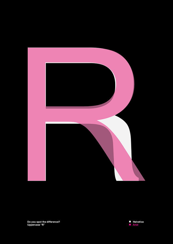
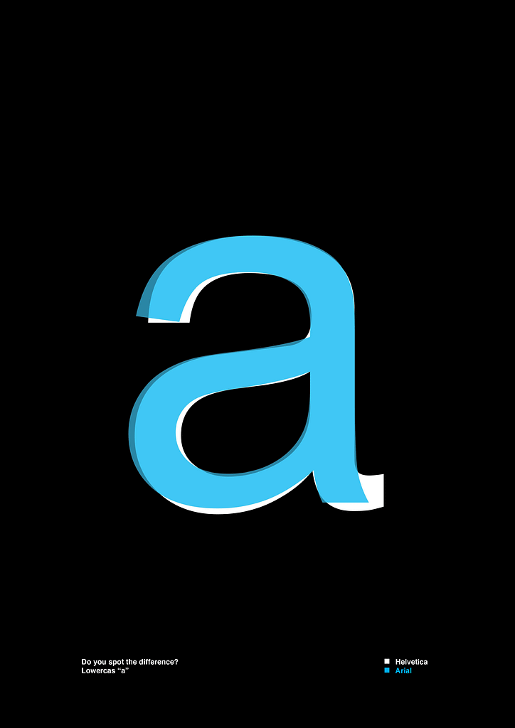
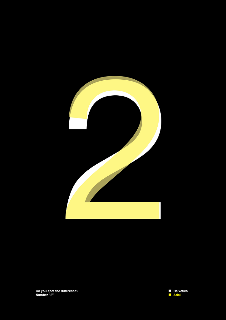
At first glance, Helvetica and Arial may seem identical, but typography is all about details. In this assignment, we dive into the subtle yet significant differences between these two typefaces.
I worked with a black background to enhance the contrast between the fonts. By layering Helvetica and Arial in different colors, I visually compared their forms and refined their alignment to highlight key distinctions. For the second part, I focused on two uppercase “R”s, a lowercase “a,” a number, and a punctuation mark “<“—showcasing the most striking differences in their design.
Through this process, I developed a sharper eye for typographic nuances and gained a deeper understanding of font design.